[CSS] 실습: 나만의 채팅방 만들기, 눈사람, 레이아웃 짜기
- 나만의 채팅방 만들기
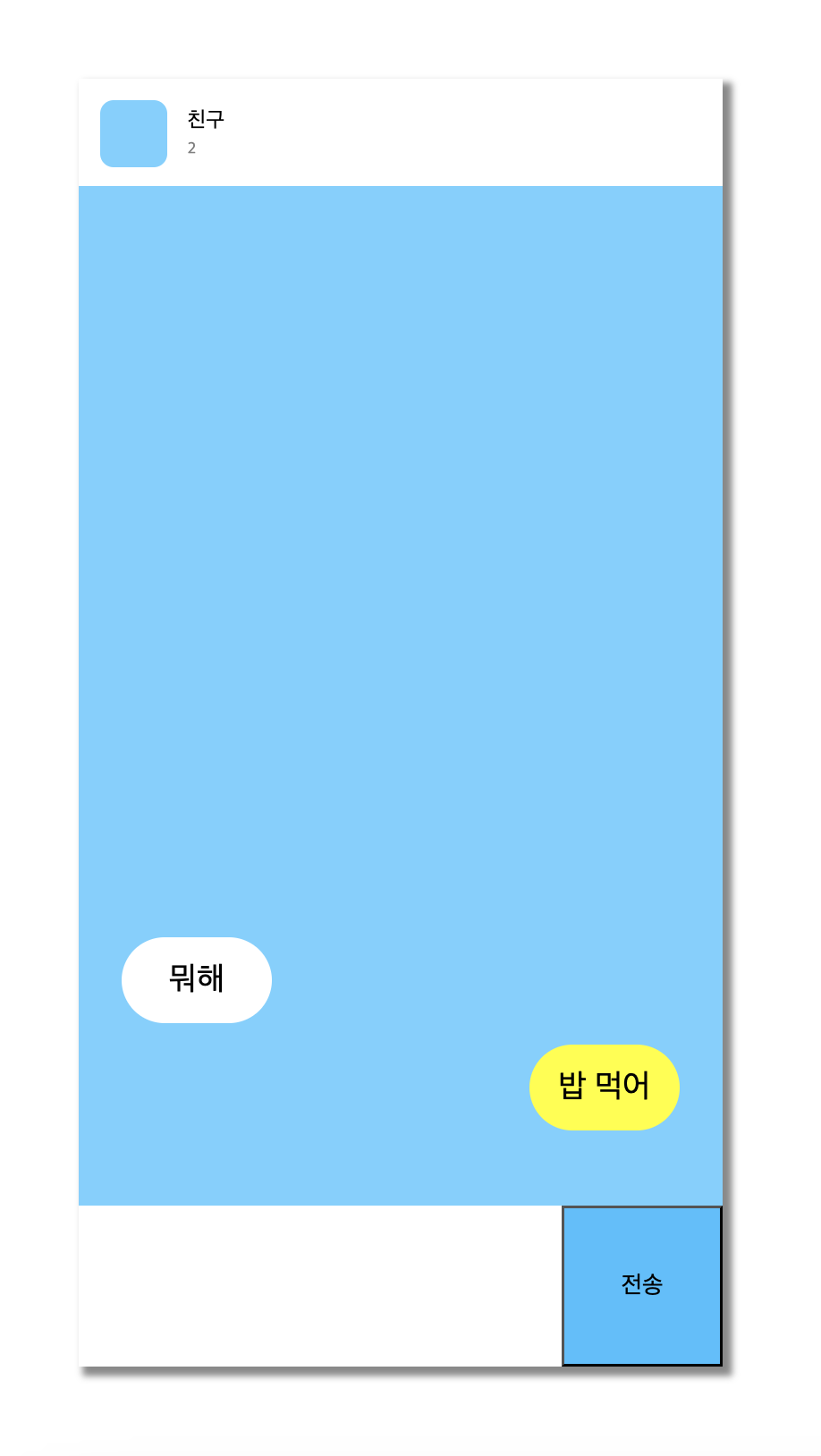
지금까지 배운 내용을 복습하기 위해 카톡과 비슷한 채팅방을 만들어 보았다.
html코드
<!DOCTYPE html>
<html lang="ko">
  <head>
    <meta charset="UTF-8" />
    <meta name="viewport" content="width=device-width, initial-scale=1.0" />
    <title>chatting room</title>
    <link href="chat.css" rel="stylesheet" />
  </head>
  <body>
    <div class="container">
      <div class="sub_container">

      <main class="chat-screen">
        <section class="chat-screen__bar">
          <div class="user">
            <div class="user__column">
              <div class="user__pic"></div>
            </div>

            <div class="user__column">
              <p class="user__nick">친구</p>
              <p class="user__count">2</p>
            </div>
          </div>
          <div id="chatting">
            <div>뭐해</div>
            <div>밥 먹어</div>
          </div>
        </section>
      </main>

      <form class="chat-form">
        <section class="chat-form__field">
          <textarea class="chat-form__msg"></textarea>
          <input type="submit" value="전송" class="chat-form__bt" />
        </section>
      </form>

    </div>
    </div>
  </body>
</html>
css코드
/* 전체 세팅 */
* {
    box-sizing: border-box;
}
html{
    height: 100%;
}
body{
    height: 100%;
    margin: 0;
}
.container{
    height: 100%;
    display: flex;
    justify-content: center;
    align-items: center;
}
.sub_container{
    box-shadow: 5px 5px 5px 2px rgb(136, 136, 136);
    background-color: #70D0FF;
    width: 30rem;
    height: 60rem;
    position: relative;
}

/* 스크린 크기 조정 */
.chat-screen{
    height: calc(100% - 120px);
}
.user{
    background-color: white;
    padding: 16px;
    height: 80px;
}
.user__column{
    float: left;
}
.user__pic{
    width: 50px;
    height: 50px;
    margin-right: 10px;
    border-radius: 10px;
    background-color: #70D0FF;
}
.user__nick, .user__count{
    margin: 5px;
}
.user__count{
    font-size: 12px;
    color: gray;
}
/* 채팅 */
#chatting > div {
    width: 7rem;
    height: 4rem;
    background-color: white;
    border-radius: 100rem;
    display: flex;
    justify-content: center;
    align-items: center;
    font-size: 24px;
    position: absolute;
}
#chatting > div:nth-child(1){
    top: 40rem;
    left: 2rem;
}
#chatting > div:nth-child(2){
    background-color: yellow;
    top: 45rem;
    right: 2rem;
}

/* 채팅 입력 창 */
.chat-form{
    height: 120px;
    background-color: white;
}
.chat-form__field{
    height: 120px;
}
.chat-form__msg{
    float: left;
    width: calc(100% - 120px);
    height: 120px;
    border: none;
    resize: none;
    font-size: 24px;
    padding: 10px;
    background-color: white;
}
.chat-form__bt{
    float: right;
    width: 120px;
    height: 120px;
    background-color: #3ebfff;
    font-size: 18px;
    cursor: pointer;
}
.chat-form__msg{
    outline: none;
}
.chat-form__bt:active{
    background-color: #2693c9;
}
- 코드 작성 방식
기존에는 html엘리먼트를 만들면서 css같이 병행하는 방식으로 만들었었다. 예를 들어 첫번째 container와 내부 컨텐츠를 만들고 css를 적용하고, 그 다음 컨테이너를 만들고 css적용하는 방식으로 작업했었다.
하지만 2가지를 병행하다보니 전체적인 레이아웃이 짜여지지 않은 상태에서 작업을 하는 느낌이 들었고 컨테이너나 구조 등등이 꼬이는 문제가 많이 발생하였다.
이를 방지하기 위해 전체적인 레이아웃을 짜놓고(선택자도 미리 적어두기) 그 다음 css를 적용하는 방식으로 바꿔보았더니 구조가 헷갈리는 일도 줄고 복잡한 구조를 조금 더 단순하게 바라볼 수 있게 된 것 같다.
위에 보이는 html과 선택자 등등은 모두 미리 써두고 그 후에 css적용한 형태이다.
- 사용한 css 복습
- 우선 전체 선택자에 border-box를 적용하여 정해둔 레이아웃들이 margin이나 padding에 구애받지 않도록 하였다.
- html과 body, .container의 height를 100%로 두어 보이는 화면 전체를 사용할 수 있도록 했다.
- 그 다음 상단 nav와 채팅방의 길이를 포함한 main height의 길이를 처음 사용해보는 calc함수를 사용하여 지정했다. calc는 수치화된 값을 사칙연산을 통해 계산하여 값을 지정해주는 함수로, 전체 100%에서 상단nav의 길이 값인 120px를 뺀 나머지 범위를 사용할 수 있게 하였다.
- 같은 함수를 사용하여 채팅 인풋창과 작성버튼의 가로 길이를 지정했다.
- 채팅 인풋창과 작성버튼의 너비를 수치에 맞춰 지정했지만 프로그램 렌더링의 문제로 작성 버튼이 밑으로 떨이지는 문제가 발생하여 두 엘리먼트에 float를 적용하여 각각 좌우로 붙게 만들었다.
회고: 기존에 css를 공부했었으나 잊혀져가던 부분이 많았었는데 이렇게 다시 복습하고 하나하나 정확히 공부해보니 내가 얼마나 css에 약했었는지 알게되었다. 이번 기회를 이용해 css에 대해 더 확실히 공부하고자 한다.
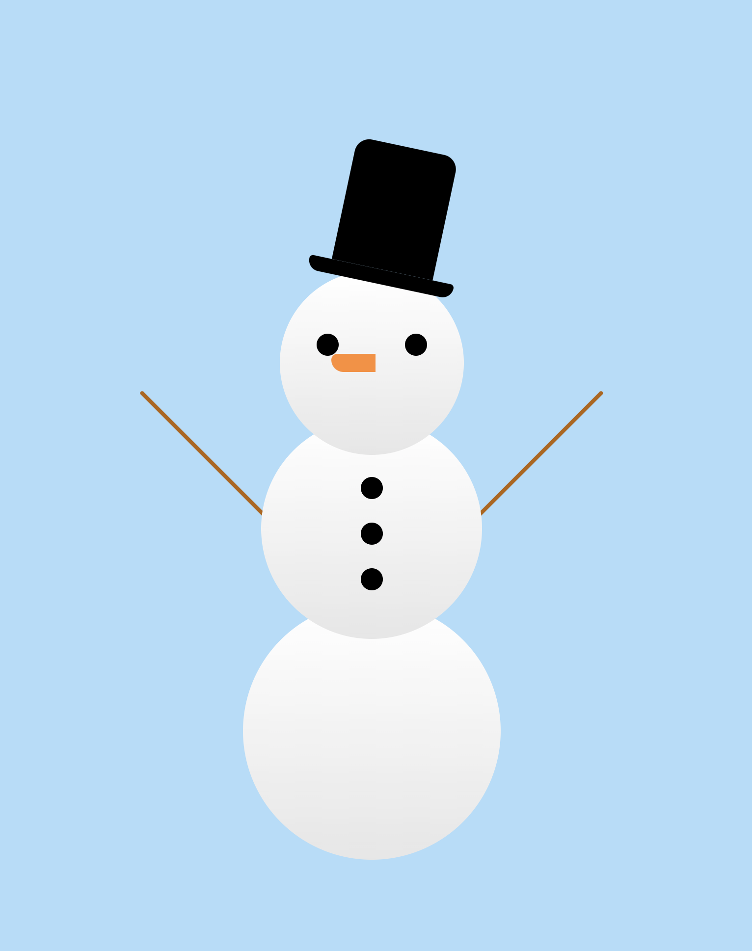
- 눈사람
html코드
<!DOCTYPE html>
<html lang="ko">
  <head>
    <meta charset="UTF-8" />
    <meta name="viewport" content="width=device-width, initial-scale=1.0" />
    <title>Document</title>
    <link href="snowman.css" rel="stylesheet" />
  </head>
  <body>
    <div class="container">
      <header>
        <div class="hat">
          <div class="hat1"></div>
          <div class="hat2"></div>
        </div>
        <div class="snow1">
          <div class="eyes">
            <div class="eye1"></div>
            <div class="eye2"></div>
          </div>
          <div class="nose"></div>
        </div>
      </header>

      <main>
        <div class="snow2">
          <div class="button">
            <div class="button1"></div>
            <div class="button2"></div>
            <div class="button3"></div>
          </div>
        </div>
        <div class="arm1"></div>
        <div class="arm2"></div>
      </main>

      <footer>
        <div class="snow3"></div>
      </footer>
    </div>
  </body>
</html>
css코드
/* setting */
html {
    height: 100%;
    background-color: rgb(175, 221, 250);
}

body {
    height: 100%;
    display: flex;
    justify-content: center;
    align-items: center;
}

.container {
    width: 50rem;
    display: flex;
    flex-direction: column;
    align-items: center;
    position: relative;
}

/* snow1, 2, 3 */
.snow1, .snow2, .snow3 {
    background: linear-gradient(white, rgb(230, 230, 230));
    border-radius: 100rem;
    position: relative;
}
.snow1 {
    width: 250px;
    height: 250px;
    top: 170px;
    z-index: 3;
    display: flex;
    justify-content: center;
    align-items: center;
}
.snow2 {
    width: 300px;
    height: 300px;
    top: 120px;
    z-index: 2;
    display: flex;
    flex-direction: column;
    align-items: center;
}
.snow3 {
    width: 350px;
    height: 350px;
    top: 70px;
    z-index: 1;
}

/* header */
.hat{
    display: flex;
    flex-direction: column;
    align-items: center;
    position: absolute;
    left: 330px;
    transform: rotate(12deg);
    z-index: 5;
}
.hat1{
    background-color: black;
    width: 140px;
    height: 170px;
    border-radius: 20px 20px 0 0;
}
.hat2{
    background-color: black;
    width: 200px;
    height: 20px;
    border-radius: 10px 10px 30px 30px;
}
.eyes{
    display: flex;
    justify-content: space-between;
    width: 150px;
    margin-bottom: 50px;
}
.eye1, .eye2{
    background-color: black;
    width: 30px;
    height: 30px;
    border-radius: 100rem;
}
.nose{
    background-color: rgb(255, 141, 47);
    width: 60px;
    height: 25px;
    position: absolute;
    left: 70px;
    border-radius: 10px 0 0 20px;
}

/* main */
.button{
    margin-top: 80px;
}
.button1, .button2, .button3{
    background-color: black;
    width: 30px;
    height: 30px;
    border-radius: 100rem;
    margin-bottom: 32px;
}
.arm1, .arm2{
    background-color: rgb(180, 99, 0);
    width: 250px;
    height: 5px;
    position: absolute;
    border-radius: 100rem;
    top: 420px;
}
.arm1{
    transform: rotate(45deg);
    left: 50px;
}
.arm2{
    transform: rotate(315deg);
    right: 50px;
}
눈사람도 마찬가지로 먼저 html로 뼈대를 잡고 css를 적용하는 방식으로 작업했다.
- 몸통의 배치는 전체적으로 flex와 flex-direaction, align-item으로 수직 정렬했다.
- 두 눈은 마찬가지로 flex를 사용하되 justify-content로 space-between으로 수평 정렬했다. 단추는 몸통고 같은 방법으로 수직 정렬하였다.
- 모자, 코, 두 팔은 position을 사용해 각각 부모 요소가 되는 엘리먼트에 position relative를 부여해 준 뒤 position absolute를 부여하여 위치를 조정했다.
- 레이아웃 짜기
hyohyo