애니메이션 효과에 대해 알아보기 전에 transition과 키프레임은 무슨 차이가 있을지 궁금해져서 찾아보았다.
transition은 요소의 변화에 초점을 맞춰 해당 요소의 상태가 변할 때만 애니메이션을 실행한다.
키프레임은 요소에 프레임을 씌워 재생횟수, 재생 방향 등 애니메이션 가이드를 더하는 느낌이다. 그리고 transition보다 규모도 더 크고 훨씬 다양한 기능을 가지고 있다.
요약하자면 transition은 요소가 특정한 상태가 되면 애니메이션 효과를 주는 반면
애니메이션은 요소 자체에 애니메이션처럼 동작하도록 프레임을 씌우는 느낌이라고 생각하면 될 것 같다.
이번 페이지에서는 키프레임이라는 애니메이션 효과에 대해 알아보려고 한다.
애니메이션을 표현하는 프레임은 @keyframe 모듈을 이용해 정의한다.
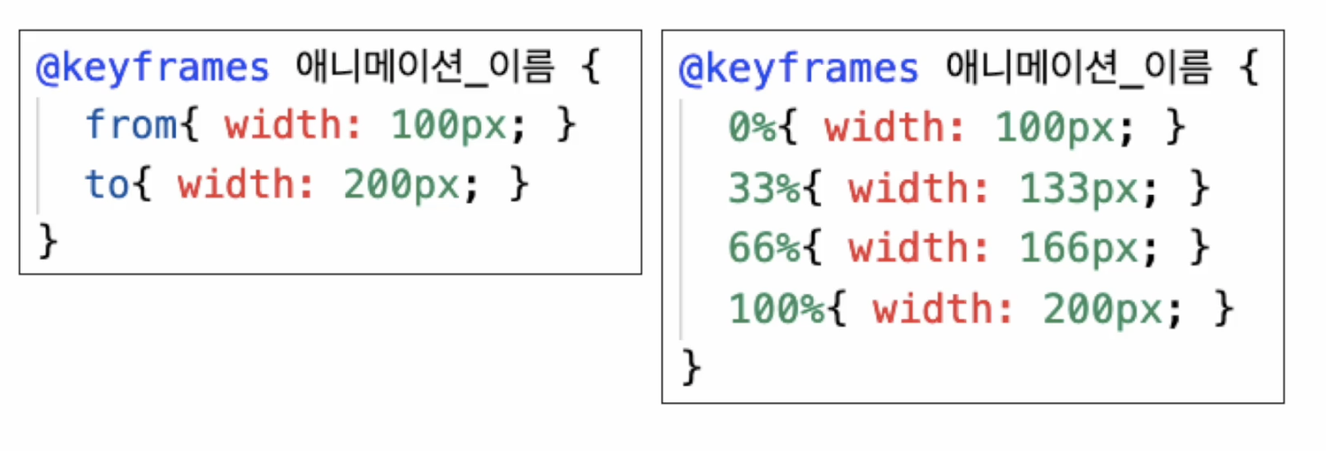
위 그림과 같이 from / to 2가지 프레임을 사용하거나
백분율을 사용해 n가지 프레임을 씌워 사용할 수 있다.
애니메이션의 단축 속성에는 아래와 같이 있다.
- name: 적용할 키프레임 이름
- duration: 애니메이션 지속 시간
- delay: 애니메이션 시작 전 시간
- timing-funtion: 속도 그래프
- direction: 동작 진행 방향
- iteration-count: 반복 횟수
- fill-mode: 전후 상태 설정
- play-state: 애니메이션 적용 여부
이 중 대표적인 속성의 코드 예시를 살펴보려고 한다.
    <style>
        .eyes{
            width: 480px;
            margin: auto;
        }
        .eye{
            width: 200px;
            height: 200px;
            border: 5px solid black;
            border-radius: 100px;
            position: relative;
        }
        .eye:nth-child(1){ float: left; }
        .eye:nth-child(2){ float: right; }

        .ball{
            width: 50px;
            height: 50px;
            background-color: black;
            border-radius: 100px;
            position: absolute;
            top: 80px;
            left: 30px;

            animation-name: moving;
            animation-duration: 2s;
            animation-delay: 0s;
            animation-timing-function: linear;
            animation-iteration-count: infinite;
            animation-direction: alternate;

            /* animation: moving 2s 0s linear infinite alternate; */
        }
        .ball:hover{
            animation-play-state: paused;
        }
        @keyframes moving {
            from{left: 30px;}
            to{left: 120px;}
        }
    </style>
</head>
<body>
    <div class="eyes">
        <div class="eye">
            <div class="ball"></div>
        </div>
        <div class="eye">
            <div class="ball"></div>
        </div>
    </div>
</body>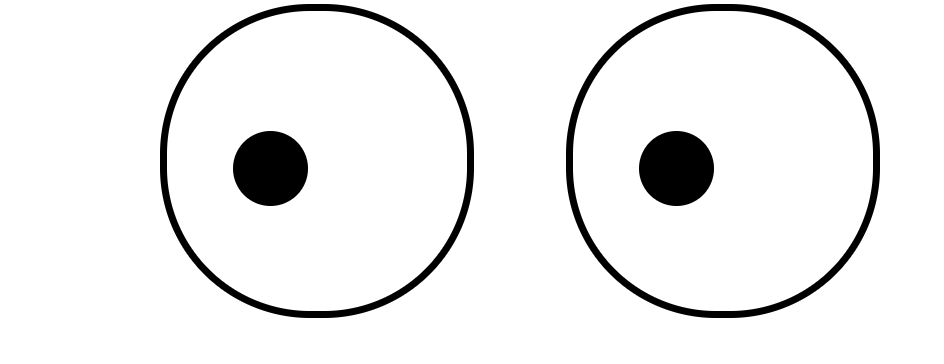
눈동자 두개가 움직이는 예제를 만들어 보았다.
- 우선 moving이라는 키프레임을 만들어 from과 to로 시작과 끝에 각각 해당 위치에 있도록 위치 수치를 입력했다.
- 그 다음 name, duration, delay, timing-function를 사용하여 스타일을 지정해주었다.
- iteration-count를 사용하여 눈동자 움직임 횟수를 infinite(무제한)으로 했고
- direction: alternate; 속성을 통해 눈동자 방향을 정방향>역방향>정방향 순으로 자연스럽게 움직이도록 만들었다.
transition과 마찬가지로 사이에 공백을 넣어 붙여서 사용할 수 있다.
이렇게 웹 요소에 애니메이션 속성을 넣어 움직이는 엘리먼트를 만들 수 있다.
hyohyo