Storybook을 이용해 공용 컴포넌트 구현하기

📚 스토리북이란?
스토리북이란, 다양한 방식으로 사용되고 있는 UI 컴포넌트 개발 도구이다.
기본 구성 단위는 스토리이며, 하나의 UI컴포넌트는 보통 하나 이상의 스토리를 가지게 된다. 각 스토리는 해당 UI 컴포넌트가 어떻게 사용될 수 있는지를 보여주는 하나의 예시라고 생각할 수 있다.
🤓 내가 생각하는 스토리북의 가장 큰 장점은 스토리북을 통해 컴포넌트가 어떻게 랜더링 되는지 직접 시각적으로 테스트할 수 있다는 점이다.
개발자 입장에서는 코드를 지웠다 썼다하면서 실행 결과를 보지 않아도 스토리북을 통해 볼 수 있다는 점이 큰 장점이라 생각했다.
스토리북 설치 & 기본 실행 방법
npx @storybook/cli sb init
npm run storybook
🔘 Button 컴포넌트 생성하기
버튼 뿐만 아니라 다른 컴포넌트에서도 사용될 공용스타일을 미리 만들어준다.
**1. 공용 스타일 지정 **

//theme.js
const color = {
	primary: {
		100: '#FFD1D1',
		200: '#FF9494',
		300: '#F87474',
		400: '#FF3647',
		500: '#FF0000',
	},
	subColor: '#FFECEC',
	hover: '#db2e3d',
	fontColor: {
		100: '#FFFFFF',
		200: '#646F7C',
		300: '#181D1F',
	},
	error: '#FF0000',
	success: '#028202',
	white: '#FFFFFF',
	black: '#000000',
	bg: 'rgb(238, 241, 245)',
	gray: {
		100: '#E9E9E9',
		200: '#D9D9D9',
		300: '#656565',
		400: '#333',
	},
};

const fontSize = {
	micro: '6px',
	es: '10px',
	xs: '12px',
	sm: '14px',
	base: '16px',
	md: '20px',
	big: '24px',
	lg: '28px',
	xl: '32px',
};

const fontWeight = {
	light: '300',
	regular: '400',
	bold: '700',
	bolder: '900',
};

export const theme = {
	color,
	fontSize,
	fontWeight,
};

// common.js
import { css } from 'styled-components';

export const flexAllCenter = css`
	display: flex;
	justify-content: center;
	align-items: center;
`;
**2. .storybook폴더 설정 **
// .storybook/preview.js
export const decorators = [
(Story) => (
// theme스타일을 스토리북에서 사용할 수 있게
<ThemeProvider theme = {theme}>
<Story />
</ThemeProvider>
)
]**3. CustomButton이라는 컴포넌트 생성 (후에 버튼 컴포넌트가 들어갈 예정) **
// button/button.js
function CustomButton() {
return <button></button>
}
export default CustomButton;**4. 버튼 스타일 생성 **
// button/button.style.js
import styled, {css} from "styled-components";
import { flexAllCenter } from "../../styles/common";
const variantCSS = {
primary : css`
background-color : ${({ theme }) => theme.color.gray[200]};
border : none;
cursor : pointer;
box-sizing : border-box;
`,
secondary: css`
background-color: ${({ theme }) => theme.color.primary[100]};
border: none;
${flexAllCenter};
cursor: pointer;
box-sizing: border-box;
`,
error: css`
background-color: ${({ theme }) => theme.color.error};
border: none;
${flexAllCenter};
cursor: pointer;
box-sizing: border-box;
`,
};
const sizeCSS = {
moreBtn: css`
width: 188px;
max-width: 200px;
height: 58px;
padding: 17px;
font-size: ${({ theme }) => theme.fontSize.base};
font-weight: ${({ theme }) => theme.fontWeight.regular};
`,
submitBtn: css`
width: 400px;
height: 52px;
font-size: ${({ theme }) => theme.fontSize.base};
font-weight: ${({ theme }) => theme.fontWeight.bold};
`,
checkBtn: css`
width: 6vw;
height: 5vh;
font-size: ${({ theme }) => theme.fontSize.sm};
font-weight: ${({ theme }) => theme.fontWeight.normal};
`,
small: css`
width: 40px;
max-width: 60px;
height: 40px;
padding: 16px 0;
font-size: ${({ theme }) => theme.fontSize.medium};
`,
medium: css`
width: 96px;
height: 48px;
padding: 16px 0;
font-size: ${({ theme }) => theme.fontSize.medium};
`,
large: css`
width: 128px;
height: 64px;
padding: 16px 9;
font-size: ${({ theme }) => theme.fontSize.medium};
`,
full: css`
width: 100%;
aspect-ratio: 8 / 1;
font-size: ${({ theme }) => theme.fontSize.medium};
`,
};
**5. CustomButton 컴포넌트의 PropsBtn 생성 후 props로 스타일 전달**
export const PropsBtn = styled.button`
		${({ variant }) => variantCSS[variant]}
		${({ shape }) => shapeCSS[shape]}
	    ${({ size }) => sizeCSS[size]}
`;
6. 스토리북에 보일 타이틀, 컴포넌트, 옵션, 컨트롤 설정
// button/button.stories.js
import CustomButton from "./button";
// 스토리북에 기본적으로 보이는 타입 설정
export default {
title : "Components/Button",
component : CustomButton,
argTypes : {
variant : {
// button.style에서 설정해준 스타일 옵션 넣어주기
opions : ["primary", "secondary", "error"],
// 어떻게 선택할지 선택 타입
control : {type : "radio"}
}
shape : {
options: ["small", "medium", "large", "full"],
control: { type: "select" },
},
},
}; **7. 스토리북에 기본으로 설정되어 있는 버튼 스타일**
export const Primary = {
args: {
variant: "primary",
shape: "moreBtn",
size: "small",
children: "Button",
},
}; **8. 3번에서 생성한 CustomButton을 다시 수정 **
import * as S from "./button.style";
function CustomButton(props) {
const { variant, shape, size, cildren, ...res} = props;
return (
<S.PropsBtn
variant = {variant}
shape = {shape}
size = {size}
{...rest}
>
{children}
</S.PropsBtn>
)
}
export default CustomButton;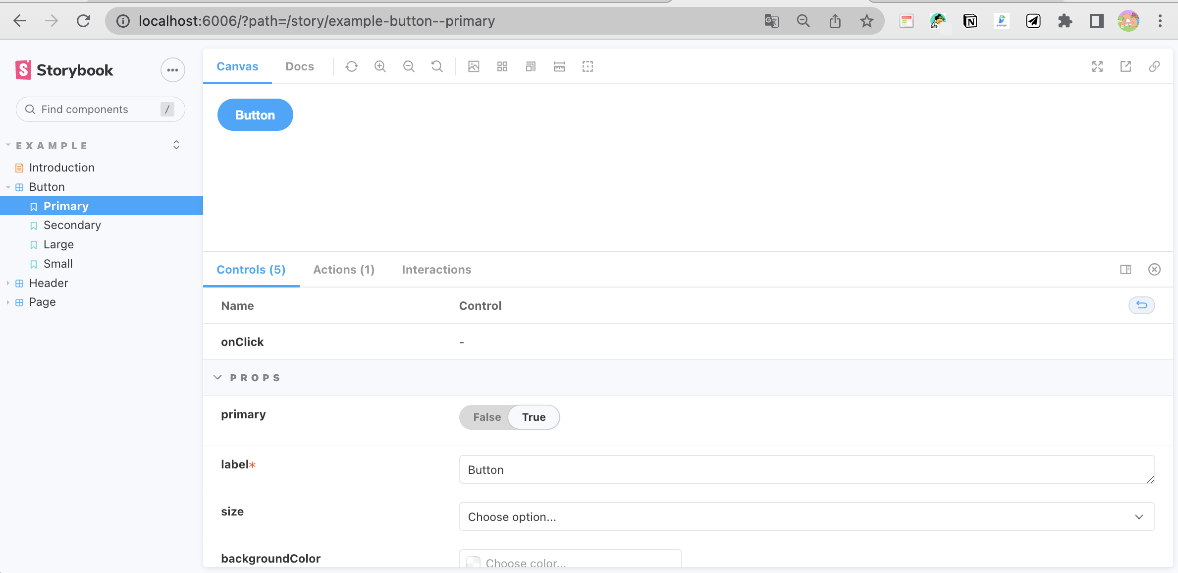
이제 스토리북을 실행하게 되면, 이런식의 모습을 띄게 된다.
⭐ 컴포넌트 기반의 뷰를 위한 독립적인 UI 개발 환경을 만들게 되고, 컴포넌트를 목록화하여 보고 싶은 컴포넌트를 언제든 확인 가능하게 된다.

프론트엔드 개발자입니다.