1. 사전계획
- html, css로 카드 그리기
- 페이지 입장 시, 카드 펼쳐지는 애니메이션
- mouseenter 시, 카드 움직임, 빛표현, 배경텍스트변경
- mouseleave 시, 카드 움직임, 빛표현, 배경텍스트변경
2. 개발과정
(css keyframe 및 전체소스는 github에서 확인해주세요!)
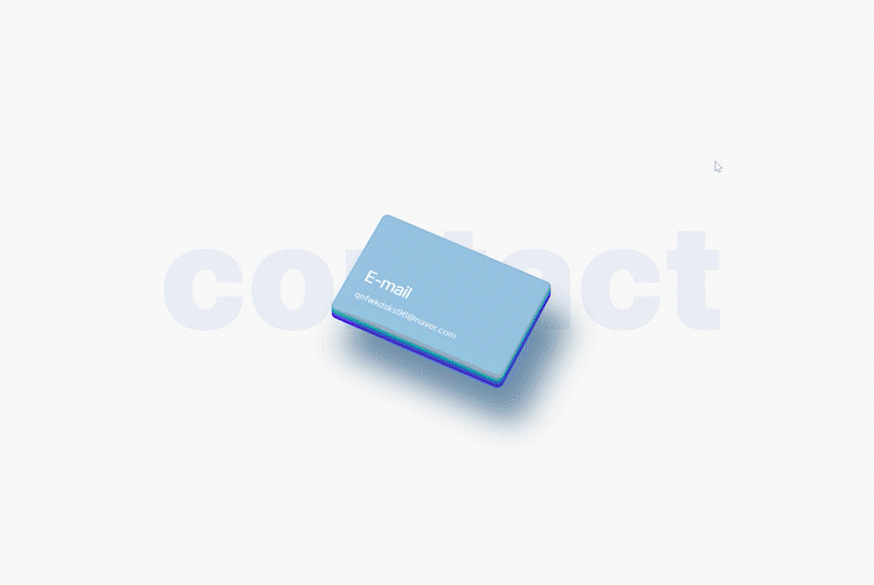
2-1. html, css로 카드 그리기
css 로 카드의 끝의 곡률도 표현하고 그림자도 넣고,
입체적인 애니메이션을 위해서 transform: rotate3d를 이용해서 기울여줌<div class="card card-email" data-id="E-MAIL"> <div class="card-inner"> <div class="card-inner-light"></div> <span>E-mail</span> <p>qnfwkdsks96@naver.com</p> </div> </div>.card { cursor: pointer; width: 300px; height: 200px; position: absolute; border: none; border-radius: 10px; transform: rotate3d(6, -1, 5, 40deg); box-shadow: 50px 50px 50px rgba(12, 66, 108, 0.2); overflow: hidden; } .card-inner { display: flex; flex-direction: column; justify-content: flex-end; border-radius: 10px; padding: 15px 25px; width: 100%; height: 100%; box-shadow: inset -1px -1px 4px rgba(12, 66, 108, 0.5); }
2-2. 페이지 입장 시, 카드 펼쳐지는 애니메이션
처음에 모여있다가 각자의 위치로 펼쳐지는 움직이는 애니메이션 만들기
(cardActionEmail, cardActionTel, cardActionGithub, cardActionBlog)
실제 소스에는 크로스 브라우징 작업 되어있음!.card-email { background-color: #95c1e0; bottom: 22.5%; z-index: 5; animation: cardActionEmail 0.5s linear forwards; } @keyframes cardActionEmail { 0%{bottom: 22.5%;} /* 모여있는 위치 */ 100%{bottom: 60%;} /* 카드마다 다른 위치 */ }
2-3. mouseenter : 빛 표현, 카드움직임, 배경글자
- 빛 표현: 미리 만들어 놓은 card-inner-light 를 0.7초 동안 left: 100% 까지 움직임
- 카드 움직임: transform을 사용, 애니메이트 후에도 유지되도록 forwards 사용
- 배경글자 움직임: 미리 html에 적어놓은 data-id의 내용으로 배경글자 삽입하기
//마우스 올렸을 때
$('.card').on('mouseenter', function (e) {
	//내부 빛 움직임
	if ($(window).width() >= 1320) {
		$(this).find('div').eq(1).animate({
			left: '100%'
		}, 700);
	}
	//카드 움직임
	this.animate({
		transform: 'rotate3d(6, -1, 5, 20deg) translate3D(-10px, 30px, 5px)'
	}, {
		duration: 300,
		fill: "forwards"
	});
	//배경글자 움직임
	var cardId = this.dataset.id;
	$('.bg-txt').html(`${cardId}`);
});
2-4. mouseleave : 빛 표현, 카드움직임, 배경글자
//마우스 제거 시
$('.card').on('mouseleave', function (e) {
	//내부 빛 제자리
	$('.card-inner-light').css({
		left: '-100%'
	});
	//카드 움직임 제자리
	this.animate({
		transform: 'rotate3d(6, -1, 5, 40deg)'
	}, {
		duration: 300,
		fill: "forwards"
	});
	//배경글자 움직임
	$('.bg-txt').html(``);
});
3. 결과물
4. 개인적 코멘트
"명함은 없지만 연락처는 드릴게요!"
개인적으로 제일 좋아하는 페이지다
디자인을 구상할때 꽤 공을 들이기도 했고,
일러스트,포토샵 없이 전부 html,css,js만으로 그린거라
프론트개발자로서 아주 뿌듯한!😎
움직임도 허접하지 않게,
실제 명함을 보여주듯 깔끔하고 젠틀하게 내려고 노력했음!
프론트 개발자