💻 학습 내용
💡css animation
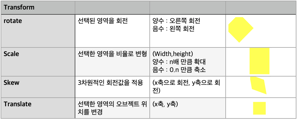
Transform
: 오브젝트의 크기를 확대, 축소, 각도 회전, 위치를 변경시킬때 사용
➕ 브라우저의 하위 버전 까지 고려해서 사용해야 한다면 프리픽스를 붙여주면 됨
-webkit-transform: rotate(10deg); 크롬 사파리
-moz-transform: rotate(10deg); 파이어폭스
-ms-transform: rotate(10deg); 익스플로어
-o-transform: rotate(10deg); 오페라
Transform 값을 디폴트로 넣어주면 됨
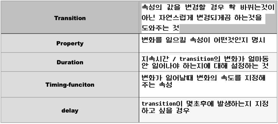
Transition
➕ 한줄로 정리가 가능
Transition: width 2s linear 1s;
- 가장 먼저 나오는 숫자가 duration이다 후 숫자가 delay
변화를 주고자 하는 속성은 ,를 넣으면서 늘려나갈 수 있다
Animation
오브젝트의 크기를 확대, 축소, 각도 회전, 위치를 변경시킬때 사용
Animation-direction : alternate ;: 변형이 되었다가 원래대로 돌아오게 함
✖️ 주의점 : itreation-count도 같이 생각해야 함
from에서 to 1번 to에서 from 1번 총 3번 반복된거임
움직임이 무한으로 되려면itreation-count infinite작성하면됨animation-timing-function: linear;: 일정한 속도를 갖게 함
	animation-name: spinlion;
	animation-duration: 1.5s;
	animation-timing-function: linear;
	animation-iteration-count: infinite;
	animation-direction: alternate;
=> 한줄로 정리 가능
animation: spinlion 1.5s linear infinite alternate;
✖️
animation-play-state: ;
Running : 브라우저 접속시 애니메이션 동작을 바로 시킴
Paused : 브라우저 접속시 애니메이션 동작을 멈춤
✖️
animation-fill-mode: backwards;
: 0%에 입력된 값을 최초 상태로 사용자들에게 보여주겠다는 뜻
@keyframes
1. From <-> to
2. 0% <-> 100% (애니메이션의 시작과 끝을 숫자로 표현 가능)
퍼센테이지로 특정 지점 변경사항을 지정할 수도 잇음
✖️ 프리픽스를 animation에 작성해줬으면 프리픽스를 단 @-webkit-keyframes 작성해줘야함
@-webkit-keyframes spinlion{
	from{
		-webkit-transform: rotate(-10deg);

	}

	to{
		-webkit-transform: rotate(10deg);

	}
}
메뉴버튼 실습
[메뉴버튼 실습]

.mouse-animation li {
	width:	250px;
	background-color: #000000;
	padding: 20px;

	border-top: solid 5px #dfdfdf;
	transition: opacity 0.5s, margin-left 0.5s;
}

.mouse-animation li:hover{
	opacity: 0.5;
	margin-left: 10px;
}

.mouse-animation li a {
	color: #ffffff;
	font-size: 20px;
}
글자에 영향을 주지 않고 배경색깔만 투명하게 바꾸고 싶을 때는 rgba()코드로 색상을 지정해줘야함
원하는 지점에 원하는 투명도를 적용해줄 수 있다
=> background-color: rgba(255, 255, 255,투명도 결정)
움직이면서 색깔이 바뀌는 애니메이션
.move-box{
	position: relative;
	width: 200px;
	height: 200px;
	background-color: red;

	animation-name: moveBox;
	animation-duration: 4s;
	animation-timing-function: linear;
	animation-delay: 1s;
	animation-iteration-count: infinite;
	animation-direction: alternate;
	animation-play-state: running;
	animation-fill-mode: backwards;
}

@keyframes moveBox {
	0%{
		background-color: green;
		left: 0;
		top: 0;

	}

	25%{
		background-color: yellow;
		left: 500px;
		top: 0px;

	}
	50%{
		background-color: gray;
		left: 500px;
		top: 500px;
		border-radius: 50%;

	}
	75%{
		background-color: blue;
		left: 0px;
		top: 500px;
	}


	100%{
		background-color: red;
		left: 0;
		top: 0;

	}
}
도형안에 도형
.outer-border{
	display: flex;
	justify-content: center;
	align-items: center;

	width: 200px;
	height: 200px;
	border: solid 15px red;
	border-radius: 50%;

	margin: 0 auto;
	margin-top: 200px;

	animation: outerBorder 2s infinite;

}


@keyframes outerBorder{
	0%{ border-color: red; transform: scale(1);}
	25%{border-color: yellow; transform: scale(1.2);}
	50%{border-color: blue; transform: scale(1.3);}
	75%{border-color: green; transform: scale(1.2);}
	100%{border-color: pink;transform: scale(1);}
}

.inner-border{
	box-sizing: border-box;
	width: 75px;
	height: 75px;
	border: 5px solid purple;

	animation: innerBorder 2s infinite alternate;
}
마리오 점프 효과
.mario-container{
	position: relative;
	width: 500px;
	height: 500px;
	border: solid 10px black;

	margin: 0 auto;
	margin-top: 200px;
}


.mario-container .mario-coin{
	position: relative;
	width: 70px;
	height: 70px;
	background-color: yellow;
	border-radius: 50%;

	margin: 0 auto;
	margin-top: 100px;

	animation: jumpCoin 0.8s linear infinite ;
}

@keyframes jumpCoin{
	0%{
		transform: translateY(0) ;
		opacity: 1;

	}

	50%{ transform: translateY(-100px) rotateY(180deg);
		opacity: 0;

	}

	100%{ transform: translateY(-100px) rotateY(360deg);
		opacity: 0;

	}

}


.mario-container .mario-box{
	width: 100px;
	height: 100px;
	background-color: blue;

	margin: 0 auto;

	animation: jumpBox 0.5s linear infinite alternate;
}


@keyframes jumpBox{
	0%{ transform: translateY(0px)}
	50%{transform: translateY(-10px)}
	100%{transform: translateY(0px)}
이미지 영역에 마우스를 올렸을 때 이미지가 확대
vertical-align: middle;
➡️ 기본값에 포함된 하단의 공백을 제거 가능
.hover-image .image-info{
	box-sizing: border-box;
	position: absolute;
	width: 100%;

	background-color: rgba(0, 0, 0, 0.5);
	padding: 20px;
	color: #ffffff;
}
➡️ 부모 hover-image는 하단의 image-info를 인식하지 못하고 있다
자식이 3차원이고 부모가 2차원이면 자식의 높이값이 부모의 높이값에 영향을 줄 수 없는 현상이 발생한것
Image-info를 호버 이미지에 넣어줘야 한다.
패딩영역이 width안쪽으로 형성되게 하기 위해 box-sizing을 해준다
부모가 3차원 적 특징을 갖고 있으면서 자식도 3차원이면 widhth값의 크기를 부모를 기준으로 설정 시킬 수 있다.
cursor: pointer;
➡️손가락 모양으로 바꿔줌
실습사이트
transform
rgb코드로 변환해주는 사이트
포물선을 그리는 효과
📝 마무리
강의 내용에서 나오는 속성들에 대해서 제대로 정리를 하고 넘어가야 할 필요를 느꼈다.
마지막 이미지 확대를 하는 부분이 너무 복잡하게 느껴져서 강의 선생님이 하는 말씀을 전부 타이핑해서 여러번 읽어 보았다.
2차원과 3차원 Position 속성을 실무에 대입하는 방법을 더 연습을 해봐야 겠다.