React로 게임 형식의 웹 프로젝트를 개발하면서 웹 페이지 반응형으로 고정 비율로만 화면이 보이게 하는 기능을 개발했다.
이 기능을 개발하게 된 이유는 사실 작년에 비슷한 게임 형식의 웹 페이지를 만들었었는데, 너무나 다양한 브라우저 규격에 따라 의도한 1920x1080 비율로 보이지 않게되는 경우가 생겨 너무 안타까웠다...
이번 프로젝트는 언제 어디서 실행해도 디자이너들이 의도한 화면 비율로 보이게끔하기 위해 1920x1080 고정 규격으로 개발해보았다.
처음 개발한 ver: create-react-app 파일 수정하기
src/index.css 파일
- 가장 바깥에 있는
#root속#App이 정가운데 정렬이 되도록 작성했다.
#root {
  width: 100vw;
  height: 100vh;
  background: black;

  display: flex;
  align-items: center;
  justify-content: center;
}

#App {
  background: white;
  position: relative;
}
src/App.js 파일
- 먼저
#App의 가로를 화면에 꽉차게 설정하고, 세로를 비율에 맞게 조정했다. - 만약 위에서 설정된 세로 값이 화면의 세로 값보다 크다면, 반대로
#App의 세로를 화면에 꽉차게 설정하고, 가로를 비율에 맞게 조정하도록 했다.
import React, { Component } from "react";
import './App.css';

class App extends Component {
  render() {
    return <div id="App"></div>;
  }
  componentDidMount() {
    const FixRatio = () => {
      const root = document.querySelector("#root");
      const app = document.querySelector("#App");

      // 가로를 화면에 딱 맞게
      let width = root.clientWidth;
      let height = width * 0.5625;	// 1080 ÷ 1920 ≒ 0.5625

      if (height > root.clientHeight) { // 설정된 세로 값이 화면보다 크다면
        // 세로를 화면에 딱 맞게
        height = root.clientHeight;
        width = height * 1.7777;	// 1920 ÷ 1080 ≒ 1.7777
      }

      // 설정한 값을 적용
      app.style.width = `${width}px`;
      app.style.height = `${height}px`;
    };

    window.onresize = FixRatio; // 화면의 사이즈가 변할 때마다 호출
    FixRatio(); // 맨 처음 실행 될 때도 호출
  }
}

export default App;
refactor: 구현한 기능을 모듈로 분리하기
파일 구조
src
 ㄴ services
 	 ㄴ responsiveFrame
     	 ㄴ index.js : 실제 기능을 구현한 코드
         ㄴ style.css : 필요한 style 설정 파일
         		(처음 ver의 index.css와 내용이 같다)
src/services/responsiveFrame/index.js 파일
- 모듈로 구현한 만큼, 설정하고 싶은 화면의 규격을 매개변수로 받아서 적용할 수 있도록 했다.
import "./style.css";

/**
 * @param {number} 원본 화면의 width (px 단위)
 * @param {number} 원본 화면의 height (px 단위)
 * @return {function()} 현재 화면의 크기대로 frame을 조정하는 함수
 */
export const getResizeEventListener = (standardWidth, standardHeight) => {
  const setFrames = () => {
    const root = document.querySelector("#root");
    const app = document.querySelector("#App");

    let width = root.clientWidth;
    let height = width * (standardHeight / standardWidth);

    if (height > root.clientHeight) {
      height = root.clientHeight;
      width = height * (standardWidth / standardHeight);
    }

    app.style.width = `${standardWidth}px`;
    app.style.height = `${standardHeight}px`;
  };

  return () => {
    setFrames();
  };
};
src/App.js 파일
import React, { Component } from "react";
import { getResizeEventListener } from "./services/responsiveFrame";
class App extends Component {
render() {
return <div id="App"></div>;
}
componentDidMount() {
const FixRatio = getResizeEventListener(1920, 1080);
window.onresize = FixRatio;
FixRatio();
}
}
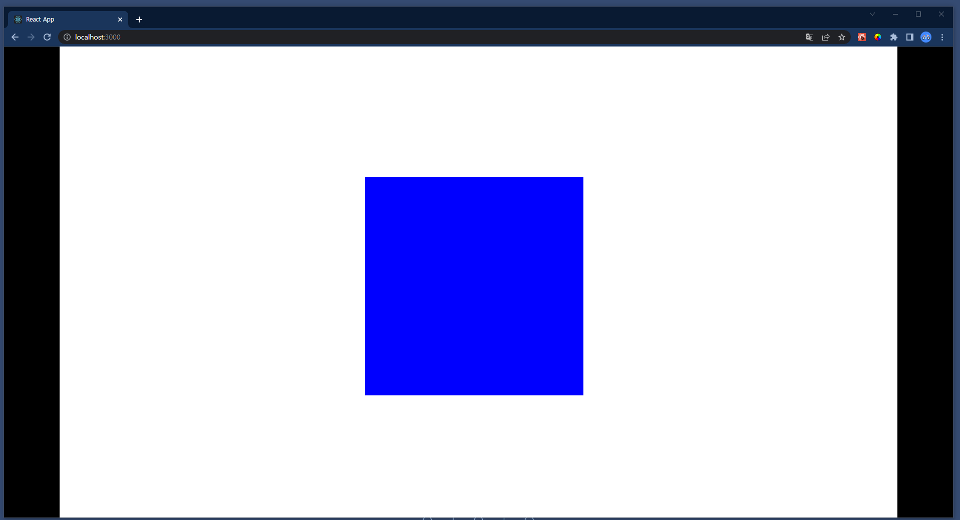
export default App;App 컴포넌트 속에 px 단위로 크기가 설정된 요소가 있다면?
다음과 같이 px 단위로 크기가 설정된 요소가 있다면, #App의 비율과는 상관없이 내부 요소는 크기가 고정된다.
import React, { Component } from "react";

import { getResizeEventListener } from "./services/responsiveFrame";

class App extends Component {
  render() {
    return (
      <div id="App">
        <div
          style={{
            position: "absolute",
            background: "blue",
            width: "500px",
            height: "500px",
            top: "300px",
            left: "700px",
          }}
        ></div>
      </div>
    );
  }
  componentDidMount() {
    const FixRatio = getResizeEventListener(1920, 1080);
    window.onresize = FixRatio;
    FixRatio();
  }
}

export default App;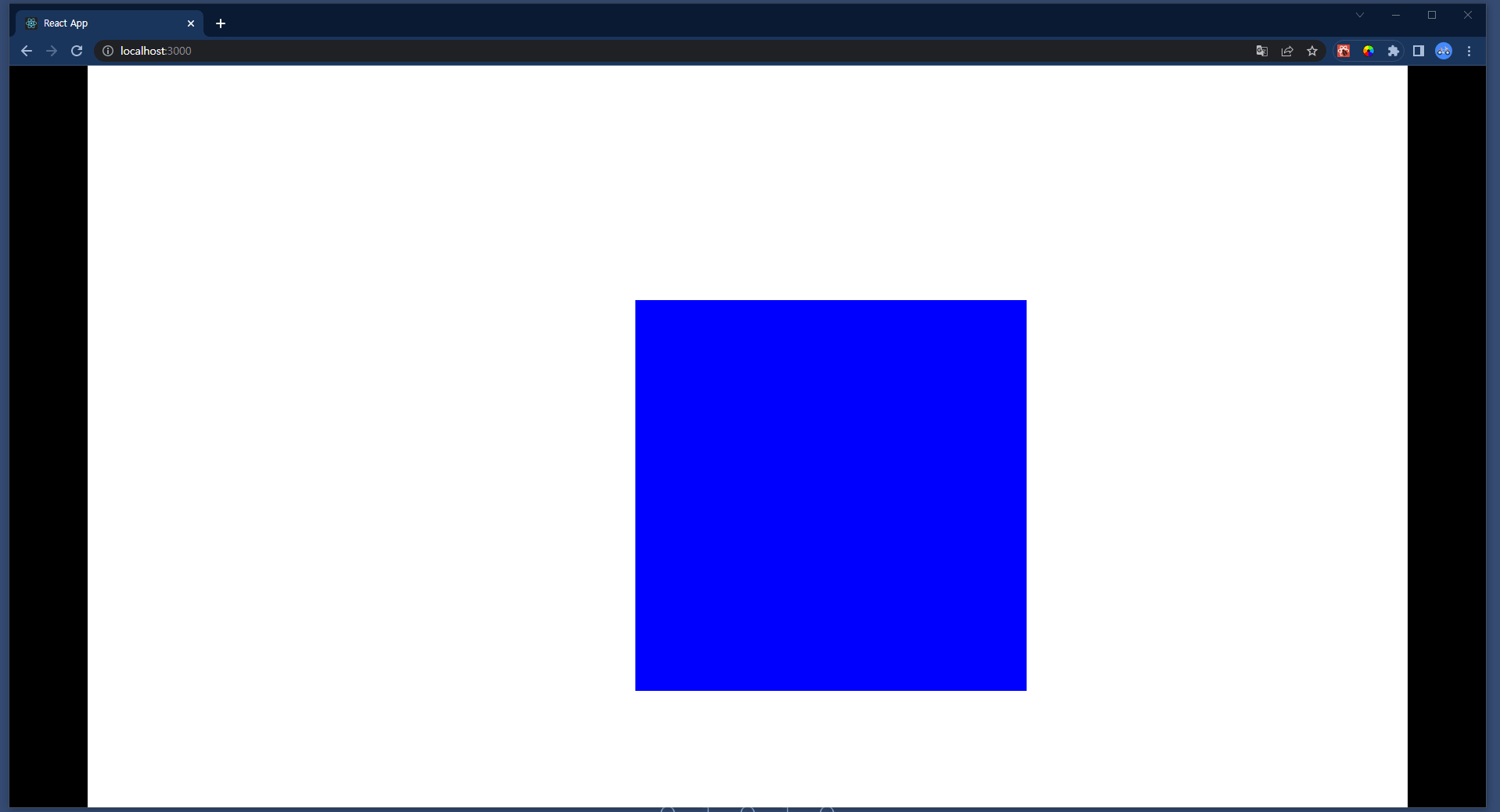
위 영상처럼 되어 버린다.
feat: 화면 비율에 맞게 내부 요소들 크기도 변경되게 하기
이를 어떻게 구현해야할까 고민했다가, #App의 width, height 값을 원하는 고정 사이즈로 설정하고, style의 zoom 속성을 사용해서 #App의 크기가 조정되게 코드를 고쳐보았다.
src/services/responsiveFrame/index.js 파일
import "./style.css";

/**
 * @param {number} 원본 화면의 width (px 단위)
 * @param {number} 원본 화면의 height (px 단위)
 * @return {function()} 현재 화면의 크기대로 frame을 조정하는 함수
 */
export const getResizeEventListener = (standardWidth, standardHeight) => {
  return () => {
    const root = document.querySelector("#root");
    const app = document.querySelector("#App");

    // 원하는 해상도로 width, height 고정
    app.style.width = `${standardWidth}px`;
    app.style.height = `${standardHeight}px`;

    let width = root.clientWidth;
    let height = width * (standardHeight / standardWidth);

    // style.zoom을 이용하여, 화면을 크기를 조정
    app.style.zoom = height / standardHeight;

    if (height > root.clientHeight) {
      height = root.clientHeight;
      width = height * (standardWidth / standardHeight);

      // style.zoom을 이용하여, 화면을 크기를 조정
      app.style.zoom = width / standardWidth;
    }
  };
};
수정 결과, 원하는 대로 구현되었다.

대학생에서 취준생으로 진화했다가 지금은 풀스택 개발자로 2차 진화함
2개의 댓글

2024년 9월 26일
안녕하세요 덕분에 컨텐츠 축소에대한 감을잡았습니다. 혹시 gif사진을 써도 될까요?
출처는 남기겠습니다. 혹시나 문제되면 삭제하겠습니다 감사합니다~
답글 달기
감사합니다 😘