문제 발생 => 버튼 사라짐 현상
독서 기록 서비스(이하 bovo 프로젝트)의 기능을 개선하기 위해 각 화면을 직접 테스트하다 보니 채팅 서비스가 불안정한 것을 확인할 수 있었다.
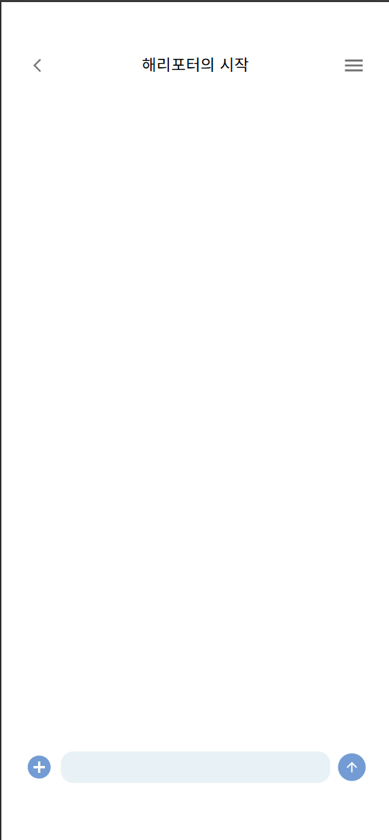
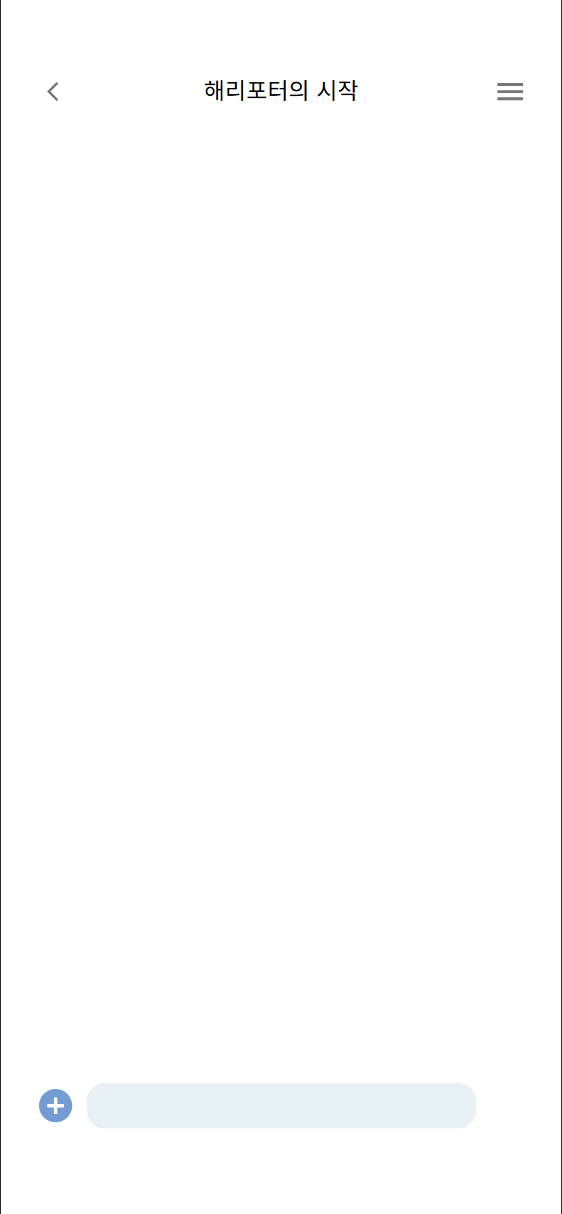
| 초기 채팅 화면 | 메시지 보내기 버튼 클릭 후 |
|
|
메시지 보내기 버튼을 클릭 전 초기 채팅 화면의 경우 의도한 화면이 그대로 보여지나, 버튼을 누른직후 메시지 보내기 버튼이 사라지는 상황이었다.
아직까지는 문제의 원인을 정확히 진단하기에는 부족하다는 느낌이 들어 가설을 설정하고 하나씩 고쳐나가기로 했다.
가설 1: 잦은 rerendering으로 인한 의도치 않은 동작?!
처음 생각한 문제의 원인은 잦은 rerendering에 의한 의도치 않은 동작이라 생각했다. 그동안 bovo 프로젝트 이외에도 다른 프로젝트를 진행하면서 정확한 키워드를 사용하지 않거나 오타를 내거나, rendering을 고려하지 않고 기능을 구현하면 잦은 rerendering으로 의도한 동작이 나타나지 않는다는 것을 경험했기 때문이다.
특히나 해당 Chat 페이지는 아래 첨부한 코드를 보면 알 수 있겠지만, ChatLayout으로 감싸져있는데 메시지 입력창이 통채로 ChatLayout에 포함되어 있어, 새로운 메시지로 인해 rerendering될 때마다, 메시지 입력창도 rerendering되는 구조였다.
왜냐하면, ChatLayout에 메시지 입력 관련 useState도 존재했고, 여러 함수들이 존재했기 때문이다.
import Container from '@mui/material/Container';
import Box from '@mui/material/Box';
import IconButton from '@mui/material/IconButton';
import TextField from "@mui/material/TextField";
import AddCircleIcon from '@mui/icons-material/AddCircle';
import ArrowUpwardIcon from '@mui/icons-material/ArrowUpward';
import styles from "./ChatLayout.module.css";
import { useLocation, useNavigate, useParams } from "react-router-dom";
import Header from "../header/Header";
import { useEffect, useState } from "react";
import Sidebar from "../sidebar/Sidebar";
import ReadingShareModal from "../../../components/forum/readingShareModal/ReadingShareModal";
import { connectChat, disconnectChat, sendChatMessage } from "../../../api/ChatService";
import { addMessage, clearChat } from "../../../store/chatInfo/ChatSlice.js";
import { deleteChatRoomUser, fetchUserList, getMemos } from "../../../api/ForumService.js";
import { useMutation, useQuery } from "@tanstack/react-query";

const ChatLayout = () => {
    const dispatch = useDispatch();
    const navigate = useNavigate();
    const { roomId } = useParams();
    const location = useLocation();

    const roomName = location.state?.roomName; // state로부터 roomName을 추출

    // ✅ Redux에서 채팅 메시지 가져오기
    const chatMessages = useSelector((state) => state.chat.chatMessages);


    const [modalOpen, setModalOpen] = useState(false); //독서 기록 공유 모달 상태 관리
    const [sidebarOpen, setSidebarOpen] = useState(false);
    const [exitModalOpen, setExitModalOpen] = useState(false); // 채팅방 나가기 모달 상태
    const [newMessage, setNewMessage] = useState("");
    const [selectedMemos, setSelectedMemos] = useState([]); // 메모 보내기

    중략...

    return (
        <Container className={styles.layout}>
            <Header toggleSidebar={toggleSidebar} roomName={roomName} />
            <Sidebar
                open={sidebarOpen}
                toggleSidebar={toggleSidebar}
                roomName={roomName}
                handleExitClick={handleExitClick}
                userList={userList}  // 사용자 목록 전달
            />
            <ForumChat chatMessages={chatMessages} />
              <Box className={styles.inputContainer}>
                <IconButton className={styles.addBtn} onClick={handleOpenModal}>
                    <AddCircleIcon sx={{fontSize: "3.5rem", color: "#739CD4"}} />
                </IconButton>
                <TextField
                    fullWidth
                    variant="outlined"
                    type="text"
                    sx={{
                        backgroundColor: "#E8F1F6",
                        width: "35.25rem",
                        height: "4rem",  // ✅ 입력창 높이 조정
                        display: "flex",
                        alignItems: "center",
                        justifyContent: "center",
                        borderRadius: "1.5625rem",
                        "& input": {
                            display: "flex",
                            alignItems: "center", // ✅ Y축 중앙 정렬
                            fontSize: "1.5rem",
                            height: "2.5rem",
                            padding: "1rem", // ✅ 내부 여백 제거
                        },
                        "& fieldset": { border: "none" }, // ✅ 아웃라인 제거
                    }}
                    value={newMessage}
                    onChange={(e) => setNewMessage(e.target.value)} // 메시지 상태 업데이트
                />
                <IconButton
                    className={styles.addBtn}
                    onClick={handleSendMessage}  // ✅ 메시지 전송 핸들러 추가
                    sx={{
                        borderRadius: "3.125rem",
                        backgroundColor: "#739CD4",
                    }}
                >
                    <ArrowUpwardIcon sx={{fontSize: "2rem", color: "#FFFFFF", fontWeight: "bold"}} />
                </IconButton>
            </Box>
            <ReadingShareModal
                open={modalOpen}
                onClose={handleCloseModal}
                handleSelectMemo={handleSelectMemo} // memo 선택 함수 추가
                handleShareMemo={handleShareMemo} // 확인 버튼 클릭 시 호출되는 함수
                memos={memos}  // 메모 데이터를 전달
            />
            {/* 채팅방 나가기 모달 */}
            <DeleteChatRoomModal
                open={exitModalOpen}
                onClose={handleCancelExit}
                onConfirm={handleConfirmExit}
            />
        </Container>
    );
};

export default ChatLayout;
즉, 현재 ChatLayout 상태의 변화가 발생하면, 메시지 입력 bar 쪽에서 상태변화가 발생되지 않더라도 rerendering이 발생하기 때문에 사실 이 메시지 버튼 사라지는 문제가 발생하지 않았더라도 수정해야 하는 사항이기 때문에 부담없이 시도할 수 있었다.
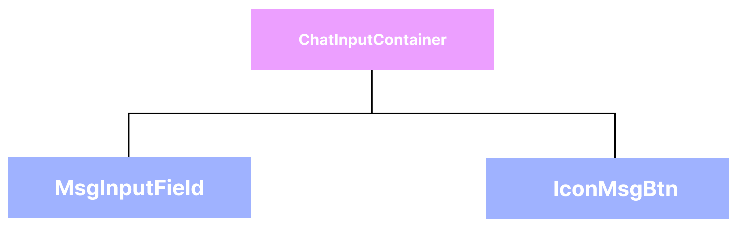
이 메시지 입력창 쪽을 ChatInputContainer로 묶고, 그 내부의 독서기록 공유 버튼과 메시지 보내기 버튼을 IconMsgBtn이라는 공용 컴포넌트로 분리하고, 메시지 입력창을 MsgInputField 컴포넌트로 분리하였다.
이에 따라 코드는 다음과 같이 변경하였다.
- ChatInputContainer
import React, { useState, useCallback } from 'react';
import Box from '@mui/material/Box';
import IconMsgBtn from '../IconMsgBtn/IconMsgBtn';
import MsgInputField from '../msgInputField/MsgInputField';
import AddCircleIcon from '@mui/icons-material/AddCircle';
import ArrowUpwardIcon from '@mui/icons-material/ArrowUpward';
import styles from './ChatInputContainer.module.css';

const ChatInputContainer = React.memo(function ChatInputContainer({ roomId, sendChatMessage, onOpenModal }) {
    const [newMessage, setNewMessage] = useState("");

    const handleSendMessage = useCallback(() => {
        if (newMessage.trim()) {
            sendChatMessage(roomId, newMessage);
            setNewMessage("");
        }
    }, [newMessage, roomId, sendChatMessage]);

    const handleInputChange = useCallback((e) => {
        setNewMessage(e.target.value);
    }, []);

    console.log('ChatInputContainer rendered'); // 리렌더링 확인용

    return (
        <Box
            className={styles.inputContainer}
            sx={{
                display: 'flex',
                alignItems: 'center',
                gap: '1rem'
            }}
        >
            <IconMsgBtn
                onClick={onOpenModal}
                className={styles.addBtn} // className도 이렇게 전달 가능
                sx={{
                    width: "3.5rem",   // <-- 여기 추가
                    height: "3.5rem",
                }}
            >
                <AddCircleIcon sx={{ fontSize: "3.5rem", color: "#739CD4" }} />
            </IconMsgBtn>

            <MsgInputField value={newMessage} onChange={handleInputChange} />

            <IconMsgBtn
                onClick={handleSendMessage}
                className={styles.msgBtn}
                sx={{
                    width: "3.5rem",   // <-- 여기 추가
                    height: "3.5rem",
                    borderRadius: "3.125rem",
                    backgroundColor: "#739CD4",
                }}
            >
                <ArrowUpwardIcon sx={{ fontSize: "2rem", color: "#FFFFFF", fontWeight: "bold" }} />
            </IconMsgBtn>
        </Box>
    )
});

export default ChatInputContainer;- IcnMsgBtn 컴포넌트
import IconButton from '@mui/material/IconButton';
import React from 'react';

const IconMsgBtn = React.memo(function IconMsgBtn({ sx, className, children, onClick }) {
    console.log('IconMessageButton rendered');

    console.log('IconMsgBtn rendered');
    console.log('IconMsgBtn sx prop:', sx); // sx prop이 제대로 전달되는지 확인
    console.log('IconMsgBtn className:', className); // className이 무엇인지 확인

    return (
        <IconButton
            sx={sx}
            onClick={onClick}
            className={className}
        >
            {children}
        </IconButton>
    );
});

export default IconMsgBtn;- MsgInputField
import TextField from '@mui/material/TextField';
import React from 'react';

const MsgInputField = React.memo(function MsgInputField ({ value, onChange }) {
    console.log('MessageInputField rendered'); // 리렌더링 확인용

    return (
        <TextField
            fullWidth
            variant="outlined"
            type="text"
            sx={{
                backgroundColor: "#E8F1F6",
                flexGrow: 1, // 남은 공간을 채우도록 설정
                height: "4rem",
                display: "flex",
                alignItems: "center",
                justifyContent: "center",
                borderRadius: "1.5625rem",
                "& input": {
                    display: "flex",
                    alignItems: "center",
                    fontSize: "1.5rem",
                    height: "2.5rem",
                    padding: "1rem",
                },
                "& fieldset": { border: "none" },
            }}
            value={value}
            onChange={onChange}
        />
    );
});

export default MsgInputField;
그러나 css로 addBtn에 대해 styling해도 sx 속성에 집어넣어봐도, 여전히 메시지 보내기 버튼은 클릭시 사라지는 문제가 발생되었다.
가설2 : CSS styling 문제?
이때부터는 원인을 파악하기 힘들었기 때문에 Gemini를 활용하여 문제의 원인을 추론하기 시작했다. Gemini는 개발자 도구를 활용하여 관찰하는 것을 추천했기 때문에 개발자 도구를 통해 메시지 보내기 버튼을 클릭시 변화되는 현상을 관찰하였다.
그러다 보니 이상 현상을 발견하였다.
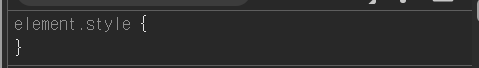
| 초기 채팅 화면에서의 button 속성 | 메시지 보내기 버튼 클릭 후 button 속성 |
|
|
초기 채팅 화면에서 button의 style 속성은 inline style 속성으로 나타나지 않고 class로 적용된 style 속성으로 나타나는데 이 style 속성이 button을 클릭한 직후 사라지는 현상이 나타난다.
console.log를 통해 sx props가 잘 전달되는지 확인하였지만
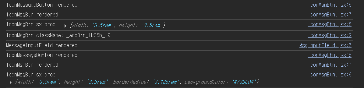
각각의 컴포넌트에 맞게 의도한 sx 속성이 잘 전달됨을 확인할 수 있었다.
inline style 속성으로 적용되지 않고, className으로 style이 적용된다는 것은 MUI는 emotion이라는 엔진을 활용한 css를 관리, 즉 CSS-in-JS 솔루션을 통해 CSS를 관리하기 때문이란 것을 인지했다.
그러나 클래스에 적용된 style이 사라지는 현상에 관한 문제의 원인에 대해서는 감을 잡지 못하였다. 이에 따라 MUI의 IconButton에 대한 공식 문서에서 예시를 확인하였다.
참조 문서
1. IconButtonAPI_MUI 공식 문서
2. sx props_MUI 공식 문서
3. sizing_MUI 공식 문서
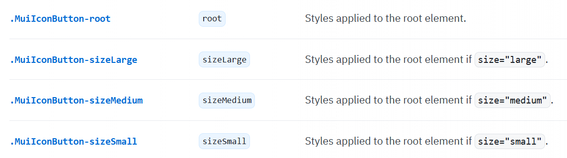
IconButton에 관련된 styling에서 보여준 예시들은 sx props로 직접 size를 조절하는 부분에 관련된 부분은 px 단위로 조절하던가 아니면 % 내지는 keyword로 크기를 조정하였다. 다만, class 이름을 활용하여 IconButton의 특정 상태에 대한 css를 적용시킬 수 있었는데,
Gemini의 설명과 공식문서를 참조해봤을 때, MUI는 Emotion과 같은 CSS-in-JS 라이브러리를 사용해서 각 상태별로 css를 적용시키는 것으로 파악했다. 따라서 내가 width와 height를 지정한 css 역시 버튼을 클릭했을 때 새로운 상태의 css 스타일로 오버라이드시킴으로써 설정한 width와 height가 사라진 것으로 추정했다.
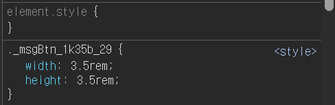
그렇다면 위 이미지에서 .MuiIconButton-root를 사용하여 root element, 즉 button 고유의 css로 지정해보았다.
급한대로 컴포넌트를 수정하지 않고, ChatInputContainer에서 IconMsgBtn의 props를 전달하여 test를 진행했다.
- ChatInputContainer
import React, { useState, useCallback } from 'react';
import Box from '@mui/material/Box';
import IconMsgBtn from '../IconMsgBtn/IconMsgBtn';
import MsgInputField from '../msgInputField/MsgInputField';
import AddCircleIcon from '@mui/icons-material/AddCircle';
import ArrowUpwardIcon from '@mui/icons-material/ArrowUpward';
import styles from './ChatInputContainer.module.css';

const ChatInputContainer = React.memo(function ChatInputContainer({ roomId, sendChatMessage, onOpenModal }) {
    const [newMessage, setNewMessage] = useState("");

    const handleSendMessage = useCallback(() => {
        if (newMessage.trim()) {
            sendChatMessage(roomId, newMessage);
            setNewMessage("");
        }
    }, [newMessage, roomId, sendChatMessage]);

    const handleInputChange = useCallback((e) => {
        setNewMessage(e.target.value);
    }, []);

    console.log('ChatInputContainer rendered'); // 리렌더링 확인용

    return (
        <Box
            className={styles.inputContainer}
            sx={{
                display: 'flex',
                alignItems: 'center',
                gap: '1rem'
            }}
        >
            <IconMsgBtn
                onClick={onOpenModal}
                sx={{
                    '&.MuiIconButton-root': {
                        width: "3.5rem",
                        height: "3.5rem",
                    },
                }}
            >
                <AddCircleIcon sx={{ fontSize: "3.5rem", color: "#739CD4" }} />
            </IconMsgBtn>

            <MsgInputField value={newMessage} onChange={handleInputChange} />

            <IconMsgBtn
                onClick={handleSendMessage}
                className={styles.addBtn}
                sx={{
                    '&.MuiIconButton-root': {
                        width: "3.5rem",
                        height: "3.5rem",
                        borderRadius: "3.125rem",
                        backgroundColor: "#739CD4",
                    },
                }}
            >
                <ArrowUpwardIcon sx={{ fontSize: "2rem", color: "#FFFFFF", fontWeight: "bold" }} />
            </IconMsgBtn>
        </Box>
    )
});

export default ChatInputContainer;
이렇게 각 IconMsgBtn의 sx 속성에 '&.MuiIconButton-root'로 css를 설정한 결과 메시지 보내기 버튼을 클릭하여도 버튼이 사라지지 않았다. AddCircleIcon을 활용한 Icon Button, 즉 독서기록 공유 버튼의 경우 클릭해도 사라지지는 않았으나 일관성을 위해 동일하게 작성하였다.
다만 이렇게 문제가 해결됐지만, 속성들을 각각 주입해야되서 IconMsgBtn로 공유 컴포넌트를 만들어 재사용성을 살리자라는 목적이 퇴색되는 느낌이 강해서, 차라리 메시지 보내기 버튼과 독서 기록 공유 버튼을 각각 따로 컴포넌트화시켜, ChatInputContainer 컴포넌트 코드의 간결성을 살리는 것이 좋을 것 같다는 생각이 들었다.
이번 기회를 통해 MUI의 styling이 어떻게 진행되는지, 에러 해결 과정에 대해 생각해본 계기가 된 것 같다.