What Your Packaging Says About Your Jewelry Brand Without Words
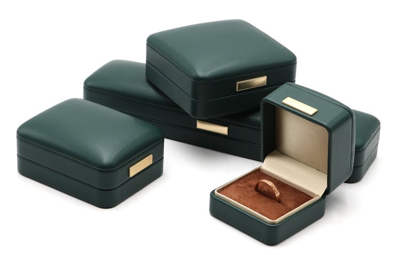
A box doesn't have a voice, but it talks anyway. It talks through the weight of it in someone's hands. Through the resistance of the closure. Through the way the interior cradles the piece inside. By the time your customer reads your brand name on the lid, they've already heard a dozen silent messages about who you are and whether your jewelry deserves the price tag.
The tricky part is that most of those messages are being sent by packaging choices you made months ago, maybe without realizing their impact. You picked a box that fit your budget and looked decent in a photo. But now it's out in the world, representing your brand in living rooms and bedrooms, and it's saying things you never intended. Let's break down exactly what your packaging communicates at each stage of the unboxing, and how working with the right supplier lets you control every silent signal.
The First Five Seconds: Weight, Texture, and Temperature
Before someone opens your box, they pick it up. Their hand wraps around it. Their fingers register the surface. And in that instant, a cascade of micro-judgments fires through their brain.
Leather, by its nature, reads as organic and intentional. It warms to the touch quickly, unlike synthetic materials that stay cold. It has a subtle grip to it, a slight friction that makes it feel secure in the hand. These sensations trigger associations with quality before the customer processes a single visual detail. A cardboard box or a synthetic wrap doesn't create the same response. They feel disposable. Leather feels kept.
But not all leather boxes send the same message. A thin, stiff leather that feels more like coated paper will read as cost-cutting. A supple full-grain leather with natural grain variation reads as investment. The difference in material cost is often less than you'd think. The difference in perceived brand value is enormous.
A skilled custom leather jewelry box supplier understands this language of materials intuitively. They know that the box isn't just a container. It's the first physical touchpoint between your brand and your customer. The leather grade, the board density, the corner construction—each choice sends a message. Your job is to make sure it's the right one.
The Lid Lift: What the Mechanism Tells Them
Now, this is where most people go wrong. They think the box design is about how it looks on a shelf. But the most memorable moment in the entire packaging experience happens when the lid is lifted. That motion—the hinge resistance, the speed of opening, the angle at which the lid settles—tells a story all by itself.
A lid that flops open loosely says "mass-produced." A lid that opens too stiffly says "over-engineered." The sweet spot is a lid that moves with controlled resistance and stays open at roughly ninety degrees without the customer having to hold it there. That requires a hinge calibrated to the weight of the lid, not just whatever hardware was cheapest that week.
Test this on your current packaging. Open the box and let go. Does the lid stay put, or does it fall backward? Does it feel like it's fighting you, or does it glide? These differences come down to hinge quality and installation precision. A good manufacturer tests this on every design, not just the flagship ones.
The Interior Reveal: Fit, Finish, and the Absence of Distraction
The jewelry is finally visible. The customer's eye goes to the piece, not the packaging, and that's exactly what you want. The box's job at this stage is to frame the jewelry without competing for attention. The interior should recede visually, serving as a quiet backdrop that makes the piece look its best.
Matte linings do this better than glossy ones. Neutral tones do it better than bright ones. Dark interiors make metal pop; light interiors can wash it out. These aren't rules, exactly, but they're patterns worth paying attention to.
The fit matters just as much as the finish. A necklace that slides around in a too-large cavity looks neglected. A ring forced into a slot that's too tight looks uncomfortable. The interior architecture should hold each piece with gentle precision. Not squeezed. Not swimming. Just right.
This is where customization pays for itself. Off-the-shelf inserts are designed for generic jewelry shapes that may or may not match your pieces. A bespoke insert, designed around your actual products, communicates that you cared enough to get the details exactly right. That message lands harder than any tagline ever could.
The Keepsake Factor: Why Longevity Is the Ultimate Brand Signal
There's a question your packaging answers that most brand owners never think to ask. "Am I worth keeping?" A box that gets thrown away was a cost. A box that stays on a dresser for years holding earrings or keepsakes was an investment that kept paying dividends.
Think about the boxes you've kept in your own life. The sturdy ones. The beautiful ones. The ones that felt too nice to toss. They probably came from brands you remember fondly, even if you haven't purchased from them in years. That's not a coincidence.
A box built by a quality-focused leather jewelry box manufacturer has a lifespan measured in decades, not months. The leather develops character. The hardware holds up. The interior doesn't shed or delaminate. Every year that box sits on a customer's shelf, it's sending a quiet message about who you are. No ad campaign can match that kind of sustained, silent presence.
Frequently Asked Questions
Does the color of the packaging affect how customers perceive the jewelry?
Yes. Dark, muted packaging tones tend to make jewelry look brighter and more prominent. Bright packaging can compete visually. There's a reason most luxury jewelry boxes are black, navy, or deep brown.
Should my packaging be the same color as my brand palette?
Not necessarily. The box should feel like it belongs to your brand, but matching it exactly to your logo colors can sometimes look forced. Complementary tones often work better than direct matches.
What's the most common packaging mistake small jewelry brands make?
Prioritizing how the box looks in a product photo over how it functions in real life. A box that photographs beautifully but falls apart after three months damages your brand more than a simpler box that lasts.
How do I know if my packaging feels premium enough?
Hand it to someone who's never seen your brand. Watch their face as they open it. Ask what they'd expect the jewelry inside to cost. If their guess is lower than your actual price, your packaging is underselling your work.
Can packaging alone justify a price increase?
Indirectly, yes. Better packaging raises perceived value, which makes a price increase feel more justified to customers. The packaging doesn't change the product, but it changes the context in which the product is evaluated.
Your packaging is running a continuous, silent marketing campaign. Every time a customer picks up the box, opens the lid, or catches a glimpse of it on their dresser, messages are being sent about quality, care, and worth. You can either leave those messages to chance, or you can partner with a supplier who understands that every material choice, every construction decision, and every tactile detail is part of your brand's voice. The box doesn't speak, but what it says matters.
