CSS - Flex
참조한 링크
Flex Grid 로 전부 대체 가능한가
“Grid가 나온 이상, Flex는 구시대의 유물일 뿐이다?”
아닙니다. Flex로는 구현이 가능하고 Grid로는 구현이 어려운 레이아웃이 있고 Flex를 쓰는게 더 편리한 경우도 있습니다. 따라서 둘다 이해해야합니다.
Flex 레이아웃 기본적인 HTML 구조
<div class="container">
	<div class="item">helloflex</div>
	<div class="item">abc</div>
	<div class="item">helloflex</div>
</div>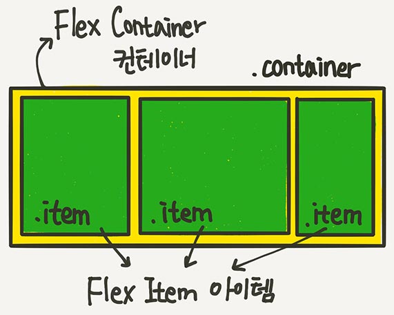
- 그림출처 : 1분코딩 스튜디오밀 https://studiomeal.com/archives/197
Flex 속성(컨테이너 속성 & 아이템 속성)
- 컨테이너에 적용하는 속성
- 아이템에 적용하는 속성
📌Flex 컨테이너에 적용하는 속성들
- display: flex;
- flex-direction(배치 방향 설정)
- flex-wrap(줄넘김 처리 설정)
- flex-flow
- justify-content(메인축 방향 정렬)
- align-items(수직축 방향 정렬)
- align-content(여러 행 정렬)
display: flex;
.container {
	display: flex;
	/* display: inline-flex; */
}
- 그림출처 : 1분코딩 스튜디오밀 https://studiomeal.com/archives/197
Flex 컨테이너에 display: flex;를 적용하는게 시작
이 한 줄의 CSS만으로 아이템들은 기본적으로 위 그림과 같이 배치
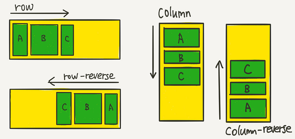
flex-direction(배치 방향 설정)
.container {
	flex-direction: row;
	/* flex-direction: column; */
	/* flex-direction: row-reverse; */
	/* flex-direction: column-reverse; */
}
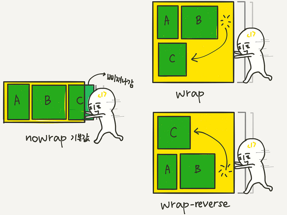
flex-wrap(줄넘김 처리 설정)
.container {
	flex-wrap: nowrap;
	/* flex-wrap: wrap; */
	/* flex-wrap: wrap-reverse; */
}
flex-flow
- flex-direction과 flex-wrap을 한꺼번에 지정할 수 있는 단축 속성
# flex-direction과 flex-wrap을 한꺼번에 지정할 수 있는 단축 속성이에요.
.container {
flex-flow: row wrap;
/* 아래의 두 줄을 줄여 쓴 것 */
/* flex-direction: row; */
/* flex-wrap: wrap; */
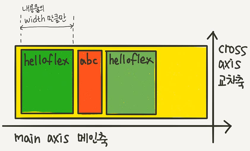
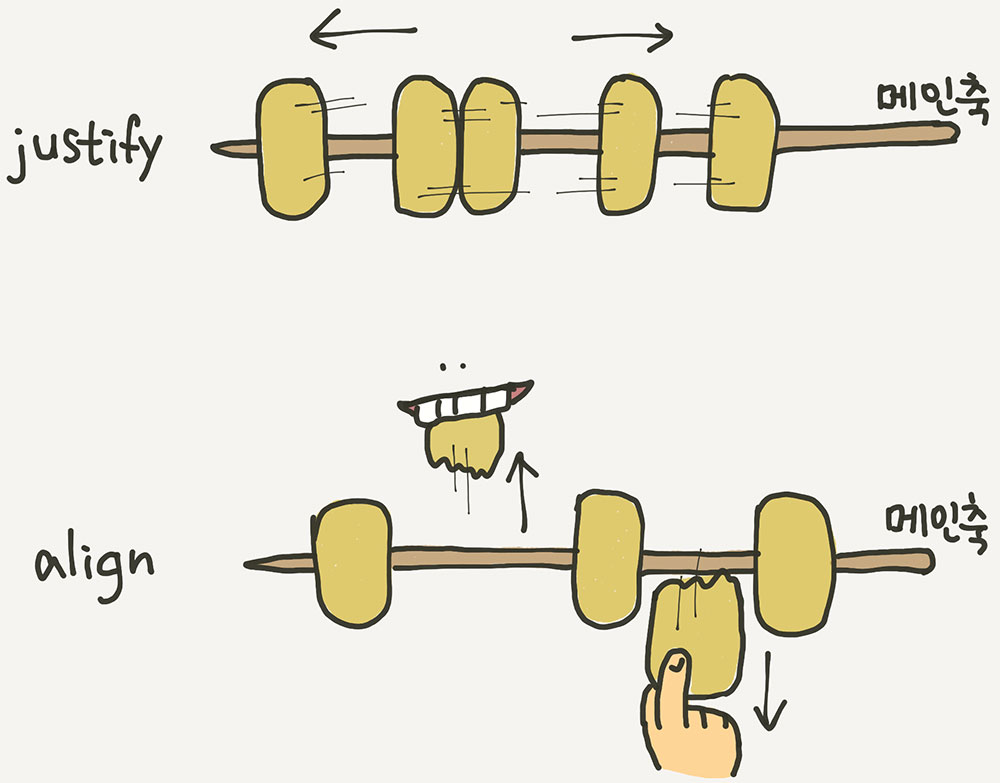
}“justify”는 메인축(오뎅꼬치) 방향으로 정렬
“align”은 수직축(오뎅을 뜯어내는) 방향으로 정렬
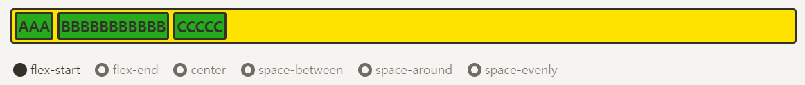
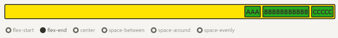
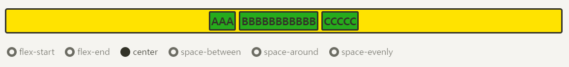
justify-content(메인축 방향 정렬)
.container {
justify-content: flex-start;
/* justify-content: flex-end; */
/* justify-content: center; */
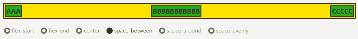
/* justify-content: space-between; */
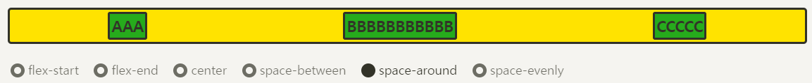
/* justify-content: space-around; */
/* justify-content: space-evenly; */
}-
flex-start
-
flex-end
-
center
-
space-between
-
space-around
-
space-evenly

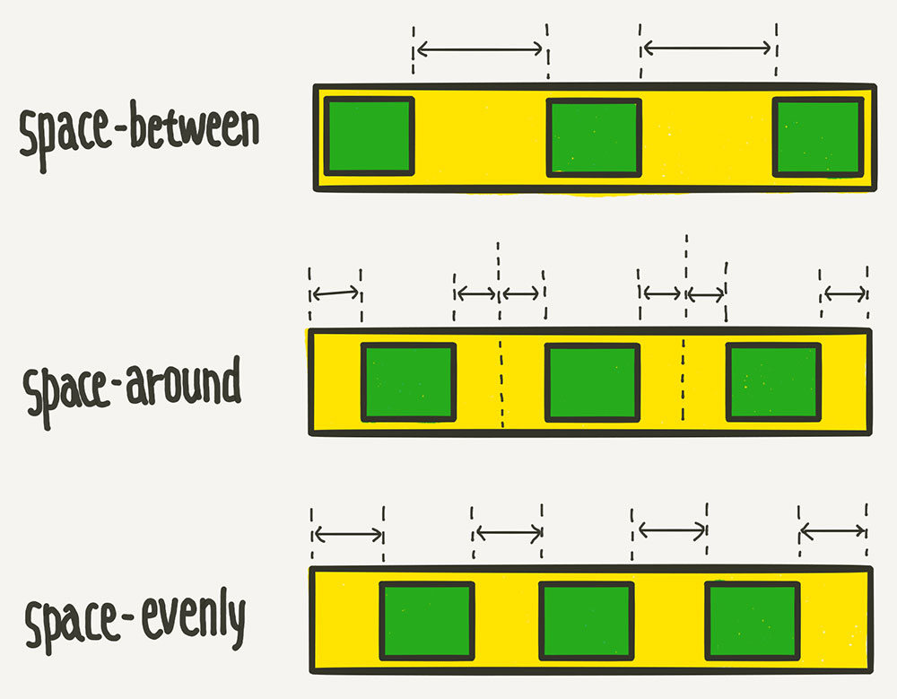
space-between, space-around, space-evenly 비슷한듯 하면서 살짝 다름
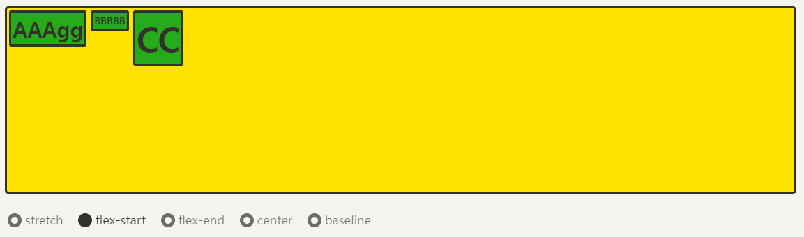
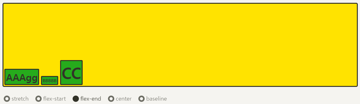
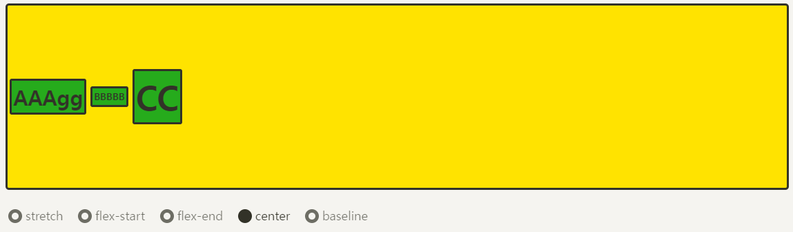
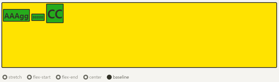
align-items(수직축 방향 정렬)
.container {
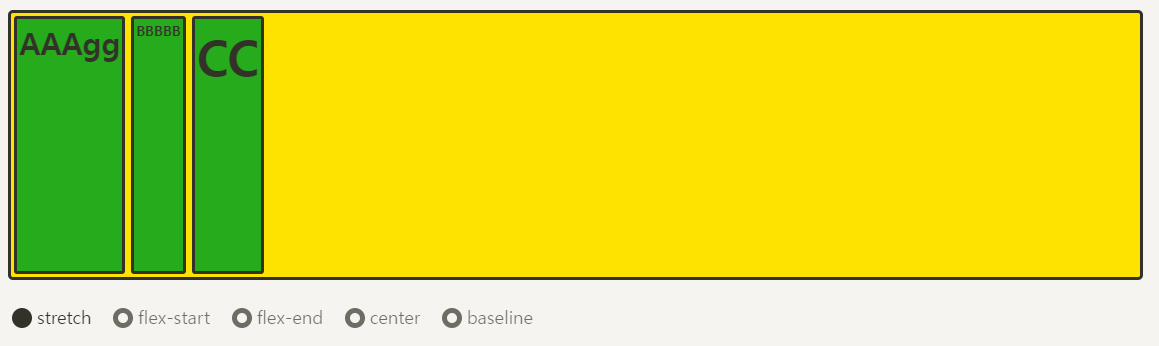
align-items: stretch;
/* align-items: flex-start; */
/* align-items: flex-end; */
/* align-items: center; */
/* align-items: baseline; */
}-
stretch
-
flex-start
-
flex-end
-
center
-
baseline
📌Flex 아이템에 적용하는 속성들
- flex-basis(유연한 박스의 기본 영역)
- flex-shrink(유연하게 줄이기)
- align-self(수직축으로 아이템 정렬)
- order(배치 순서)
- z-index
flex-basis(유연한 박스의 기본 영역)
.item {
	flex-basis: auto; /* 기본값 */
	/* flex-basis: 0; */
	/* flex-basis: 50%; */
	/* flex-basis: 300px; */
	/* flex-basis: 10rem; */
	/* flex-basis: content; */
}.item {
flex-basis: 100px;
}모든 item 을 100px로 정함 원래의 width가 100px이 안되는 item은 100px로 늘어나고 원래 100px이 넘는 item은 100px으로 정해짐
CSS에 word-wrap: break-word;를 적용해주세요. 안그러면 영역만 100px로 줄어들고 BBBBBB는 옆으로 쭉- 삐져나간답니다.
.item {
	flex-basis: 100px;
	width: 100px;
}
flex-shrink(유연하게 줄이기)
align-self(수직축으로 아이템 정렬)
order(배치 순서)
z-index

i have a dream and I will make my dreams come true.