📌소개
📌배운내용 정리
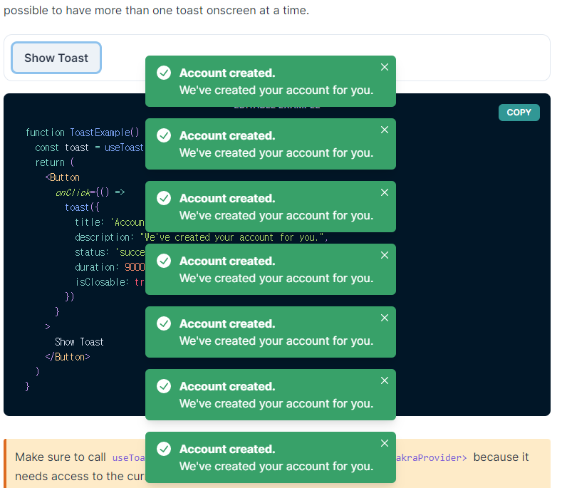
Toast
import { useToast } from '@chakra-ui/react'

function ToastExample() {
  const toast = useToast()
  return (
    <Button
      onClick={() =>
        toast({
          title: 'Account created.',
          description: "We've created your account for you.",
          status: 'success',
          duration: 9000,
          isClosable: true,
        })
      }
    >
      Show Toast
    </Button>
  )
}
"위 코드를 실행하면 아래 캡처사진과 같이 된다."
"Link to @chakra UI Doc - about Toast component"
react-icons
react-icons install
npm install react-icons --saveHow to use react-icons
import { FaAirbnb } from "react-icons/fa";

export default function Root() {
  return (
    <FaAirbnb size={"48"} /> 💖💖💖
}
// done
// 만약 위 아이콘에 색깔을 추가하고 싶을땐 어떻게 해야 할까.
// 먼저 아래 코드는 불가능하다.
<FaAirbnb size={"48"} color="red.500" />
// color="red.500" 와 같은 속성값은 오로지 chakra component 만 사용가능하다.
// 따라서 아래와 같은 '트릭'을 사용할 수 있다.
// 정답
<Box color="red.500">
<FaAirbnb size={"48"} />
</Box>);
// <Box> 는 chakra component 이므로 chakra 컬러를 사용할 수 있고
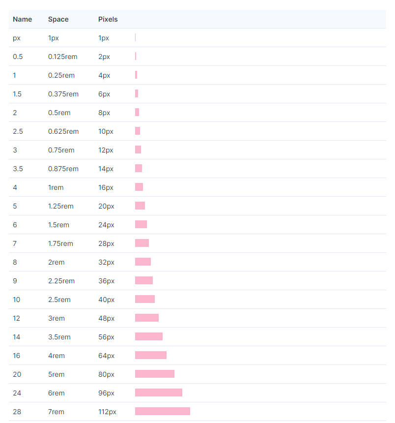
// <FaAirbnb> 는 <Box> 의 chakra 컬러를 상속받는다. 꼭 알아두자 사용되는 경우가 많을 것이다.chakra theme about 'rem'
- REM is defined "relative to the font size of the root element."
📌Grab a Keyword
react-icons [Link to react-icons Doc]
rem
📌Grab a pocket
1rem = 4 = 16px
2rem = 8 = 32px

i have a dream and I will make my dreams come true.