미디어 쿼리를 이용하여 반응형 웹 구현하기
추가적으로 CSS 애니메이션 및 Canvas 구현하기
요약
css 코드 대부분 styled-components로 구현하기 완료
미디어쿼리 구현 완료
CSS 애니메이션 구현 완료
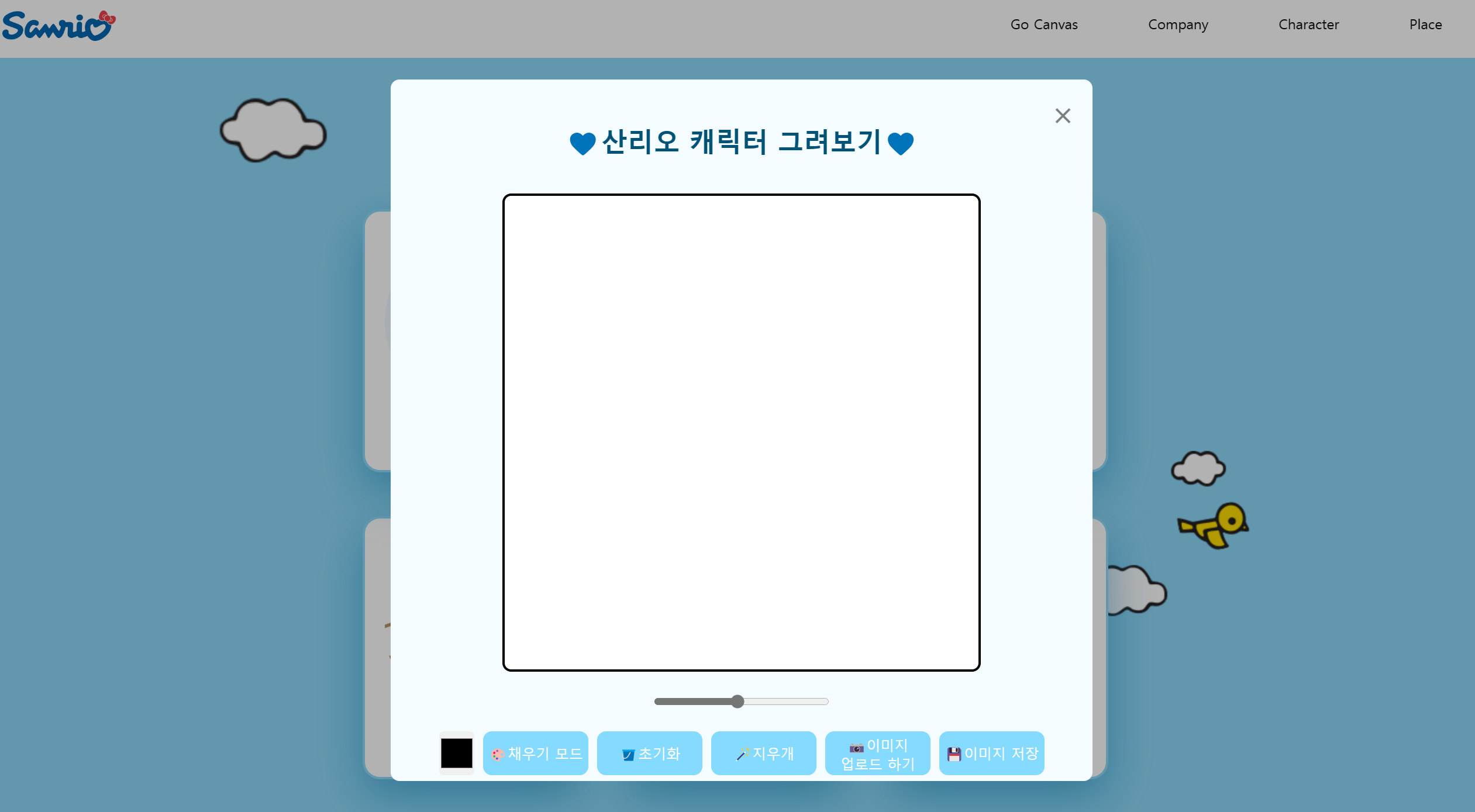
Canvas 컴포넌트는 다 만들었으나 getContext 오류로 미완성..
(바닐라 js파일에서는 되는데, 리액트 컴포넌트로 구현하니 계속 오류가 나왔다.. 해결하면 나중에 글 수정하겠습니다!)
//app.js
import './App.css';

import {
  Route,
  Routes,
} from 'react-router-dom';

import Footer from './component/Footer';
import Nav from './component/Nav';
import Main from './pages/Main';

function App() {
  return (
    <div className="App">
      <div className="splash-screen"><img className='splash-img' src="https://encrypted-tbn0.gstatic.com/images?q=tbn:ANd9GcTXCyfEDiz6cP9FNO5wx4KxIf6IPjpYLYpyQub2qBq3udG-oDIEFZpsf9QqDwCYXEfKGg&usqp=CAU"/></div>
      <Routes>
        <Route path="/" element={<Main />} />
      </Routes>
      <Nav />
      <Footer />
    </div>
  );
}

export default App;
//main.js
import Render from '../component/Render';
const Main = () => {
return (
<div className='section'>
<Render />
</div>
);
};
export default Main;//Nav.js
import '../App.css';
import { useState } from 'react';
import styled from 'styled-components';
const Wrapper = styled.div`
position:absolute;
top:0px;
background-color:white;
width: 100%;
height: 70px;
padding: 0 8px;
margin: auto;
display:flex;
justify-content:space-between;
.sanrio{
cursor: pointer;
width:130px;
margin:15px 0 0 10px;
}
#canvas{
background-color:white;
border: 3px solid black;
border-radius: 10px;
padding: 20px;
}
#color{
width:40px;
height:50px;
border:none;
}
`;
const Menu = styled.div`
display:flex;
span{
padding:20px 40px;
cursor: pointer;
}
`;
export const ModalBackdrop = styled.div`
position : fixed;
width:200%;
height:100%;
border-radius:10px;
background-color :rgba(0,0,0,0.3);
display : flex;
justify-content : center;
align-items : center;
`;
export const ModalBtn = styled.button`
cursor: grab;
color:white;
font-weight: bold;
background-color: rgb(255,174,197);
border-radius: 5px;
width:40px;
padding: 2px;
text-align: center;
font-size: 11px;
margin-top: 10px;
border:none;
`;
export const ModalView = styled.div.attrs((props) => ({
role: 'dialog',
}))`
z-index:99;
position:fixed;
top:10%;
left:27%;
z-index:100;
border-radius : 10px;
background-color : white;
display : flex;
flex-direction:column;
align-items : center;
width:800px;
height:800px;
background-color:#F4FCFF;
input{
border:2px solid black;
border-radius:5px;
margin-bottom:15px;
padding:4px 0;
}
.exitBtnno{
font-size : 40px;
cursor: pointer;
color:rgba(0,0,0,0.5);
position: absolute;
top:10px;
right:20px;
}
.helloModal{
font-size : 30px;
font-weight: bold;
margin-top:50px;
margin-bottom:40px;
color:#005377;
}
`;
const Nav = () => {
const [isOpen, setIsOpen] = useState(false);
const openModalHandler = () => {
setIsOpen(!isOpen);
};
return (
<Wrapper>
<div className="logo">
<a href='http://sanriokorea.co.kr/character/'>
<img className="sanrio" src="https://encrypted-tbn0.gstatic.com/images?q=tbn:ANd9GcTXCyfEDiz6cP9FNO5wx4KxIf6IPjpYLYpyQub2qBq3udG-oDIEFZpsf9QqDwCYXEfKGg&usqp=CAU"/>
</a></div>
<Menu>
<span className="ProfileNameChange" onClick={openModalHandler}>Go Canvas</span>
<span>Company</span>
<span>Character</span>
<span>Place</span>
</Menu>
{isOpen === true ?
<ModalBackdrop onClick={openModalHandler}>
<ModalView onClick={(e) => e.stopPropagation()}>
<div className='helloModal'>💙산리오 캐릭터 그려보기💙</div>
<canvas id="canvas" width="500px" height="500px"></canvas>
<input id="line-width" type="range" min="1" max="20" value="10"/>
<div className="btn-box">
<input type="color" id="color"/>
<button id="mode-btn">🎨채우기 모드</button>
<button id="destroy-btn" >🪣초기화</button>
<button id="eraser-btn" >🪄지우개</button>
<label htmlFor="file"
>📷이미지 <br/> 업로드 하기<input type="file" accept="image/*" id="file"
/></label>
<button id="save">💾이미지 저장</button>
</div>
<span className='exitBtnno' onClick={openModalHandler}>×</span>
</ModalView>
</ModalBackdrop>
:null}
</Wrapper>
);
};
export default Nav;//Render.js
import '../App.css';
import styled from 'styled-components';
const MainArea = styled.div`
display:flex;
justify-content:center;
align-items:center;
flex-direction:column;
`;
const Character = styled.div`
font-size:70px;
margin-top:100px;
`
const Container = styled.div`
width:100%;
height:auto;
margin-top:50px;
display:grid;
grid-template-columns:1fr 1fr 1fr;
grid-gap:50px;
@media screen and (max-width: 1100px) {
grid-template-columns:1fr 1fr;
}
`;
const Card = styled.div`
background-color:white;
width:250px;
height:300px;
border-radius:20px;
cursor: pointer;
display:flex;
flex-direction:column;
align-items:center;
font-size:15px;
font-weight:bold;
color:rgba(0,0,0,0.5);
border:3px solid #8ED9F9;
box-shadow:0px 20px 50px 0px rgba(0, 127, 181, 0.5);
img{
width:200px;
height:200px;
border-radius:50%;
margin:25px 0;
}
`;
const Reverse = styled.div`
perspective: 300px;
backface-visibility: hidden;
transition: 1s;
width:250px;
height:300px;
position:relative;
z-index:0; /*-1로 줘면 애니메이션은 안보이는 대신 모달창을 가리지 않음 */
.item {
/*카드의 뒷면을 안보이게 처리-카드가 뒤집히면 뒷면이 안보임*/
backface-visibility: hidden;
transition: 1s;
}
.item.front {
/* 앞면 카드가 부유하게 되어, 뒷면 카드가 아래에서 위로 올라감 -> 요소 두개가 겹치게 됨*/
position: absolute;
/* 명시적으로 기본값 설정, 없어도 됨*/
transform: rotateY(0deg);
}
&:hover .item.front {
transform: rotateY(180deg);
z-index:2;
}
.item.back {
/*y축을 중심으로 -180도 회전*/
transform: rotateY(-180deg);
}
&:hover .item.back {
transform: rotateY(0deg);
}
`;
const Cloud1 = styled.div`
position:fixed;
top:100px;
left:100px;
animation:clouds1 40s ease-in-out infinite;
z-index: -1;
@keyframes clouds1{
0%{
transform : translateX(0px);
}
50%{
transform : translateX(1700px);
}
100%{
transform : translateX(0px);
}
}
img{
width:130px;
}
`;
const Cloud2 = styled.div`
position:fixed;
top:500px;
right:100px;
animation:clouds2 40s ease-in-out infinite;
z-index: -1;
@keyframes clouds2{
0%{
transform : translateX(0px);
}
50%{
transform : translateX(-1700px);
}
100%{
transform : translateX(0px);
}
}
img{
width:200px;
}
`;
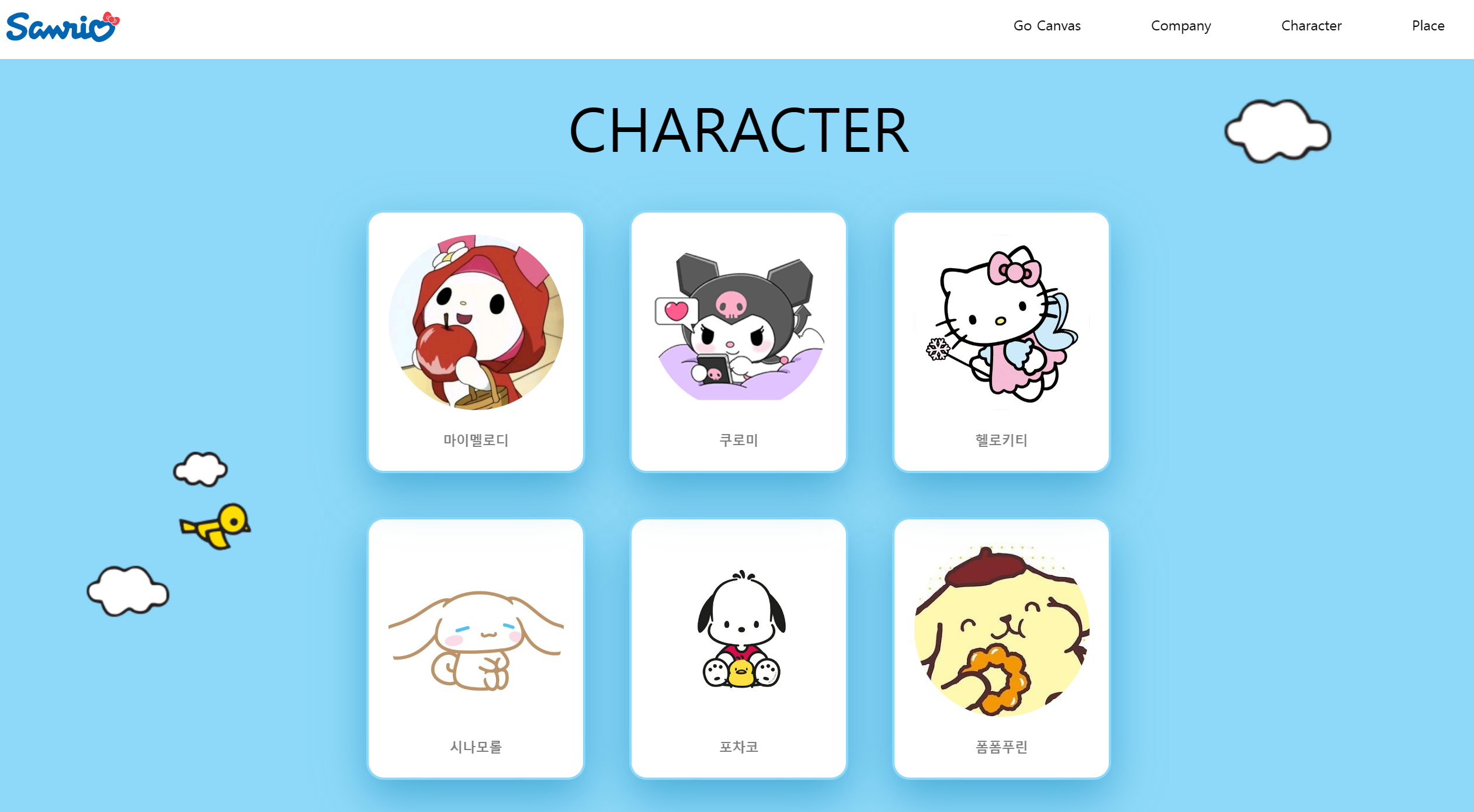
const Render = () => {
return (
<>
<MainArea>
<Character>CHARACTER</Character>
<Cloud1 className="cloud1"><img src="/img/구름.png"/></Cloud1>
<Cloud2 className='cloud2'><img src="/img/구름2.png"/></Cloud2>
<Container className='container-box'>
<Reverse>
<Card className="item front"><img src="https://mblogthumb-phinf.pstatic.net/MjAyMTA3MDJfMjg0/MDAxNjI1MjM3MDEwMDEx.16ZkPZkXZmj6MQyJIpZlTidJmYGFnehv2QoiaIWVHAsg.louS2WVp9f5dzxMHdh1MdS-3bZgOIm68sJhcToobTPAg.JPEG.yyabbj/IMG_3332.JPG?type=w800"/>마이멜로디</Card>
<Card className="item back"><img src="https://encrypted-tbn0.gstatic.com/images?q=tbn:ANd9GcQ1DJdzcB8-toRp4tSg-v14YkL0t1INu-kdcA-UYE3lz6D_cZaprYKm26E9FDTk2ADPRjo&usqp=CAU"/>MY MELODY</Card>
</Reverse>
<Reverse>
<Card className="item front"><img src="https://encrypted-tbn0.gstatic.com/images?q=tbn:ANd9GcRLgSAa1s7l94c46mhuXcZRj8K292LIINfRQj8Ja5FDx7Bwt3nME3MwEEErnVN8GsjtpLo&usqp=CAU"/>쿠로미</Card>
<Card className="item back"><img src="https://i.pinimg.com/474x/dc/88/77/dc8877e29f1804d55d0c12242d2aec0b.jpg"/>KUROMI</Card>
</Reverse>
<Reverse>
<Card className="item front"><img src="https://image.kmib.co.kr/online_image/2014/1103/201411030916_61130008820668_1.jpg"/>헬로키티</Card>
<Card className="item back"><img src="https://item.kakaocdn.net/do/949e4b91f9933ef7a878ca18ec6fa1be15b3f4e3c2033bfd702a321ec6eda72c"/>HELLO KITTY</Card>
</Reverse>
<Card><img src="https://mblogthumb-phinf.pstatic.net/MjAyMDA5MjlfMTMz/MDAxNjAxMzMwNjIxNjc0.nctqqFPlnSxArLMyovMJBZj1CDtGg3ctkC2jyvi0gSQg.E6jQXexNzN7yK-treO-OYcC0EzWx0iQEMvQI_WUwJkQg.PNG.connoharu/IMG_1672.PNG?type=w800"/>시나모롤</Card>
<Card><img src="https://m.c-star.co.kr/web/product/big/202111/191474ecf9de0424697fd0b08f7c638f.jpg"/>포차코</Card>
<Card><img src="https://pbs.twimg.com/profile_images/1096742447302959104/9u_surBb_400x400.jpg"/>폼폼푸린</Card>
</Container>
</MainArea>
</>
);
};
export default Render;//Footer.js
import '../App.css';
import styled from 'styled-components';
const BREAK_POINT_TABLET = 768;
const BREAK_POINT_PC = 1200;
const Wrapper = styled.div`
width: 100%;
height: 100px;
padding: 8px 28px 0 28px;
margin: auto;
text-align: center;
color: #868e96;
.footer_bottom {
width: 100%;
padding-top: 32px;
height: 48px;
}
// 태블릿 : 1200px ~ 768px :: 768px 이상 적용되는 css
@media only screen and (min-width: ${BREAK_POINT_TABLET}px) {
}
// PC : 1200px 이상 :: 1200px 이상 적용되는 css
@media only screen and (min-width: ${BREAK_POINT_PC}px) {
}
`;
const Footer = () => {
return (
<div className="footer">
<Wrapper>
<div className="footer_bottom">
<span>© Copyright ⓒ 2022 CodeStates</span>
</div>
</Wrapper>
</div>
);
};
export default Footer;//App.css
* {
font-family: 'NanumBarunGothic';
box-sizing: border-box;
padding: 0px;
margin: 0px;
list-style: none;
text-decoration: none;
-ms-overflow-style: none;
scrollbar-width: none;
}
*::-webkit-scrollbar {
display: none;
}
body {
height: 100%;
overflow: scroll;
background-color: #8ed9f9;
}
.section{
display:flex;
justify-content:center;
align-items:center;
flex-direction:column;
}
/*첫화면 로고 띄우기*/
@keyframes hideSplashScreen{
0%{
opacity: 1;
}
25%{
opacity: 1;
}
50%{
opacity: 1;
}
75%{
opacity: 1;
}
100%{
opacity: 0;
visibility: hidden;
}
}
.splash-screen{
background-color: white;
display: flex;
justify-content: center;
align-items: center;
z-index: 99;
height: 100vh;
width: 100vw;
justify-content: center;
align-items: center;
position: absolute;
top:0;
animation: hideSplashScreen 1s ease-in-out forwards;
}
.splash-img{
width:300px;
}
/*Canvas css*/
.btn-box{
display: flex;
gap:10px;
}
#line-width{
cursor: pointer;
width:200px;
margin: 20px 0;
}
#color,
.btn-box button,
input[type="file"]{
cursor: pointer;
}
.btn-box button,
.btn-box label{
all:unset;
width:110px;
height: 40px;
padding: 5px;
text-align: center;
background-color: #85daff;
color: white;
font-weight: 500;
cursor: pointer;
border-radius: 10px;
transition: opacity linear .1s;
}
button:hover{
opacity: 0.85;
}
input#file{
display: none;
}
신입 프론트엔드 웹 개발자입니다.