1. 학습 내용
- 덴마크 쇼핑몰 실습
index.html
<!DOCTYPE html>
<html>
<head>
	<meta charset="utf-8">
	<meta name="viewport" content="width=device-width, initial-scale=1.0">

	<meta name="description" content="덴마크 쇼핑몰 카피켓 연습">
	<meta name="author" content="이재경">
	<meta name="keywords" content="html, css, tutorial">

	<title>Helbak</title>

	<link rel="stylesheet" type="text/css" href="css/style.css">
</head>
<body>

	<header id="header">
		<h1>
			<a href="#" class="logo">
				<img src="https://via.placeholder.com/186x18">
			</a>
		</h1>

		<nav class="buttons">
			<ul>
				<li>
					<a href="#" class="menu-button">
						<img src="https://via.placeholder.com/22x20">
					</a>
				</li>
				<li>
					<a href="#" class="menu-button">
						<img src="https://via.placeholder.com/22x20">
					</a>
				</li>
				<li>
					<a href="#" class="menu-button">
						<img src="https://via.placeholder.com/22x20">
					</a>
				</li>
			</ul>
		</nav>
	</header>

	<main role="main" class="main-content">
		<ul class="product-group">
			<li>
				<a href="#" class="product-group-link">
					<article>
						<h2 class="link-text">Product 1</h2>
						<img src="https://via.placeholder.com/1000x563">
					</article>
				</a>
			</li>
			<li>
				<a href="#" class="product-group-link">
					<article>
						<h2 class="link-text">Product 2</h2>
						<img src="https://via.placeholder.com/1000x563">
					</article>
				</a>
			</li>
			<li>
				<a href="#" class="product-group-link">
					<article>
						<h2 class="link-text">Product 3</h2>
						<img src="https://via.placeholder.com/1000x563">
					</article>
				</a>
			</li>
			<li>
				<a href="#" class="product-group-link">
					<article>
						<h2 class="link-text">Product 4</h2>
						<img src="https://via.placeholder.com/1000x563">
					</article>
				</a>
			</li>
		</ul>
	</main>

	<footer id="footer">

		<nav class="left-nav">
			<ul>
				<li><a href="#">Terms and Conditions</a></li>
				<li><a href="#">Cookies</a></li>
			</ul>
		</nav>
		<nav class="right-methods">
			<h3>Payment Methods</h3>
			<ul>
				<li><span class="payment-icon one"></span></li>
				<li><span class="payment-icon two"></span></li>
				<li><span class="payment-icon three"></span></li>
				<li><span class="payment-icon four"></span></li>
				<li><span class="payment-icon five"></span></li>
			</ul>
		</nav>

		<a href="#" class="to-top-button"></a>
	</footer>
</body>
</html>
style.css
/* padding으로 인해서 공간의 크기가 달라지는 것을 방지 : box-sizing: border-box */
* {
	margin: 0;
	padding: 0;
	box-sizing: border-box;
}
html, body {
	width: 100%;
	height: 100%;
}
body {
	overflow-x: hidden;
	font-family: sans-serif;
	color: #585858;
}
/* 폰트는 100단위로 올라감 높아질수록 폰트 굵기는 굵어진다. */
h1, h2, h3, h4, h5, h6, p {
	font-weight: 400;
}
li {
	list-style: none;
}
a {
	text-decoration: none;
}
/* img의 미세한 공백 제거 */
img	{
	vertical-align: middle;
}
/* 원래 span은 inline */
span {
	display: block;
}
#header h1 {
	background-color: yellow;
}
/* a태그는 inline요소의 성격을 가지기 떄문에 display:block 처리 */
#header h1 .logo {
	position: relative;
	display: block;
	width: 100%;
	height: 65px;
	/*background-color: yellow;*/
}
#header .logo img {
	position: absolute;
	top: 0;
	margin-top: 23px;
	left: 50%;
	margin-left: -93px;
}
/* 부모에게 overflow:hidden값이 있다면
자식으로서 float을 사용했을 떄 자식의 높이값을 부모가 인식 할 수 있다.*/
#header .buttons ul {
	overflow: hidden;
}
#header .buttons li {
	position: relative;
	float: left;
	width: 33.3333%;
	height: 65px;
}
/* text-align은 inline,inline-block요소에만 적용 된다. */
#header .buttons .menu-button {
	display: block;
	width: 100%;
	height: 100%;
	text-align: center;
}
#header .buttons li:nth-child(1) .menu-button {
	background-color: blue;
}
#header .buttons li:nth-child(2) .menu-button {
	background-color: pink;
}
#header .buttons li:nth-child(3) .menu-button {
	background-color: green;
}
/* y축 중앙정렬 */
/* tip */
/* top: 50%; transform: translateY(-50%); */
#header .buttons li .menu-button img {
	position: relative;
	height: 20px;
	top: 50%;
	transform: translateY(-50%);
}
/* 1em = 16px */
@media (min-width: 47em) {
	#header {
		position: fixed;
		width: 100%;
		height: 80px;
		top: 0;
		left: 0;
		z-index: 99999;
	}
	#header h1 {
		width: 50%;
	}
	#header h1 .logo {
		width: 200px;
		height: 80px;
	}
	#header .logo img {
		margin-top: 30px;
	}
	#header .buttons {
		position: absolute;
		width: 50%;
		left: 50%;
		top: 0;
	}
	#header .buttons li {
		height: 80px;
	}
}
/* main */
.main-content .product-group-link {
	position: relative;
	display: block;
	/*float: left;*/
	width: 100%;
	height: 56.25%;
	border: 5px solid red;
	overflow: hidden;
}
.main-content .product-group-link img {
	width: 100%;
	height: 100%;
}
/* 먼저나오는 형제가 3차원이면 레이어는 뒤쪽으로 들어간다. */
.main-content .product-group .link-text {
	position: absolute;
	left: 25px;
	bottom: 25px;
	color: black;
	font-size: 25px;
}
@media (min-width: 47em) {
	.main-content {
		padding-top: 80px;
	}
}
@media (min-width: 60em) {
	.main-content {
		overflow: hidden;
	}
	.main-content .product-group-link {
		float: left;
		width: 50%;
		height: 28.125%;
	}
}
/* footer */
#footer {
	position: relative;
	padding-bottom: 66px;
}
#footer .left-nav {
	padding-top: 20px;
	text-align: center;
}
#footer .left-nav li {
	padding: 5px 0;
}
#footer .right-methods {
	text-align: center;
	margin-bottom: 20px;
	margin-top: 30px;
}
#footer .right-methods li {
	display: inline-block;
	padding: 7px 4px;
}
#footer .right-methods .payment-icon {
	display: inline-block;
	width: 30px;
	height: 20px;
}
#footer .right-methods .payment-icon.one {
	background-color: black;
}
#footer .right-methods .payment-icon.two {
	background-color: red;
}
#footer .right-methods .payment-icon.three {
	background-color: pink;
}
#footer .right-methods .payment-icon.four {
	background-color: blue;
}
#footer .right-methods .payment-icon.five {
	background-color: gray;
}
#footer .to-top-button {
	position: absolute;
	display: block;
	width: 66px;
	height: 66px;
	background-color: green;
	bottom: 0;
	left: 50%;
	margin-left: -33px;
}
@media (min-width: 60em) {
	#footer .left-nav {
		float: left;
		width: 50%;
		background-color: yellow;
		text-align: left;
		padding-top: 32px;
		padding-left: 40px;
	}
	#footer .right-methods {
		float: right;
		width: 50%;
		background-color: greenyellow;
		margin: 0;
		padding-top: 32px;
		padding-right: 40px;
		text-align: right;
	}
	#footer ul, #footer li, #footer h3 {
		display: inline-block;
		vertical-align: middle;
	}
	#footer .left-nav a {
		font-size: 14px;
		padding: 0 5px;
	}
	#footer .right-methods li {
		padding: 0 4px;
	}
	#footer h3 {
		padding-right: 10px;
	}
}
결과
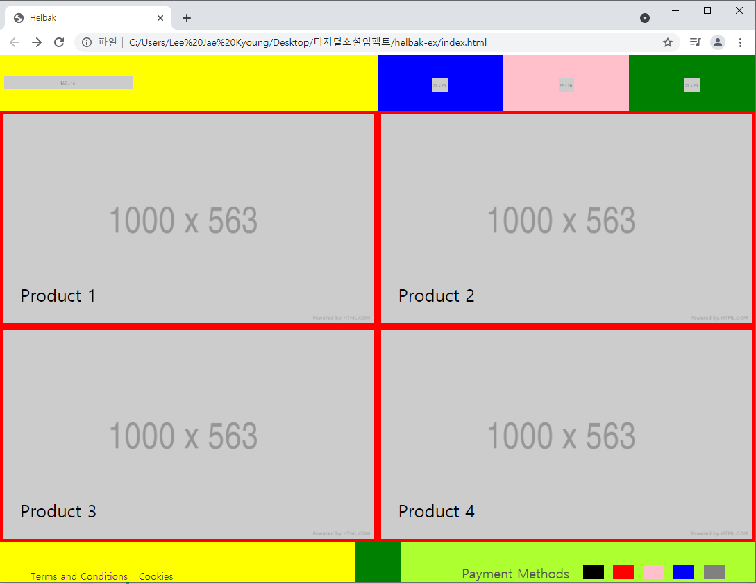
PC버전
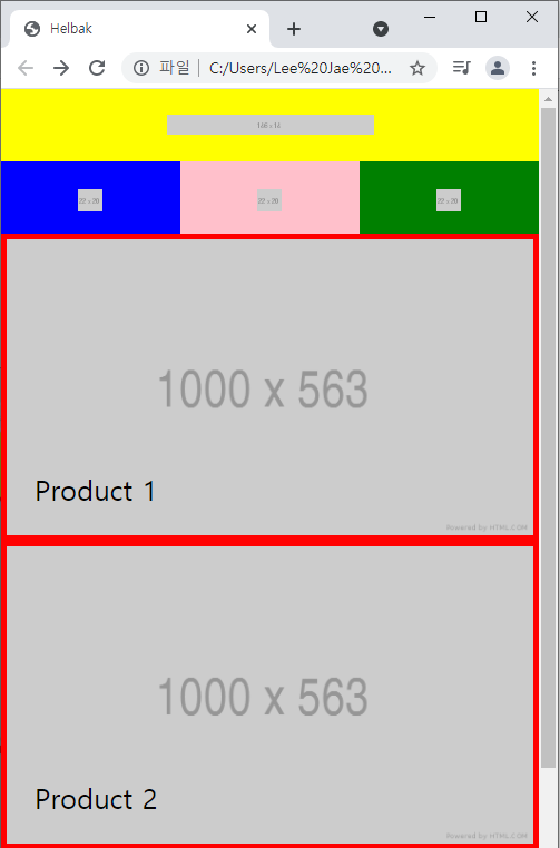
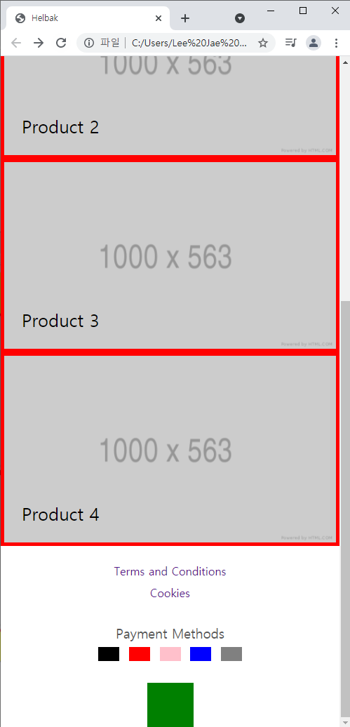
모바일버전
- 기타 HTML, CSS 실무팁
- a 태그의 위치 경로를 id값으로 넣을 수 있다.
- 자주 사용하는 속성을 클래스명으로 만들어두고 사용하여 불필요한 코드를 줄인다.
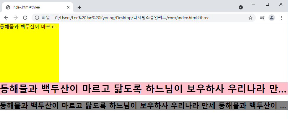
ex) 말줄임 표시
.ellipsis {
white-space: nowrap;
overflow: hidden;
text-overflow: ellipsis;
}
/ 배치작업할 때 사용되는 클래스명 /
.m-b-10 {
margin-bottom: 10px;
}
.m-b-15 {
margin-bottom: 15px;
}
.m-b-20 {
margin-bottom: 20px;
}
index.html
<!DOCTYPE html>
<html>
<head>
	<meta charset="utf-8">
	<title>
	</title>
	<link rel="stylesheet" type="text/css" href="css/style.css">
</head>
<body>
<!--a 태그의 위치 경로를 id값으로 넣을 수 있다.-->
<!--
<ul>
	<li><a href="#one">one</a></li>
	<li><a href="#two">two</a></li>
	<li><a href="#three">three</a></li>
</ul>

<div id="one">One</div>
<div id="two">Two</div>
<div id="three">Three</div>
-->

<p class="text-box ellipsis">
	동해물과 백두산이 마르고 닳도록 하느님이 보우하사 우리나라 만세
	동해물과 백두산이 마르고 닳도록 하느님이 보우하사 우리나라 만세
	동해물과 백두산이 마르고 닳도록 하느님이 보우하사 우리나라 만세
	동해물과 백두산이 마르고 닳도록 하느님이 보우하사 우리나라 만세
	동해물과 백두산이 마르고 닳도록 하느님이 보우하사 우리나라 만세
	동해물과 백두산이 마르고 닳도록 하느님이 보우하사 우리나라 만세
	동해물과 백두산이 마르고 닳도록 하느님이 보우하사 우리나라 만세
	동해물과 백두산이 마르고 닳도록 하느님이 보우하사 우리나라 만세
</p>
<h1 class="ellipsis m-b-20">
	동해물과 백두산이 마르고 닳도록 하느님이 보우하사 우리나라 만세
	동해물과 백두산이 마르고 닳도록 하느님이 보우하사 우리나라 만세
	동해물과 백두산이 마르고 닳도록 하느님이 보우하사 우리나라 만세
	동해물과 백두산이 마르고 닳도록 하느님이 보우하사 우리나라 만세
	동해물과 백두산이 마르고 닳도록 하느님이 보우하사 우리나라 만세
	동해물과 백두산이 마르고 닳도록 하느님이 보우하사 우리나라 만세
	동해물과 백두산이 마르고 닳도록 하느님이 보우하사 우리나라 만세
	동해물과 백두산이 마르고 닳도록 하느님이 보우하사 우리나라 만세
</h1>
<h2 class="ellipsis">
	동해물과 백두산이 마르고 닳도록 하느님이 보우하사 우리나라 만세
	동해물과 백두산이 마르고 닳도록 하느님이 보우하사 우리나라 만세
	동해물과 백두산이 마르고 닳도록 하느님이 보우하사 우리나라 만세
	동해물과 백두산이 마르고 닳도록 하느님이 보우하사 우리나라 만세
	동해물과 백두산이 마르고 닳도록 하느님이 보우하사 우리나라 만세
	동해물과 백두산이 마르고 닳도록 하느님이 보우하사 우리나라 만세
	동해물과 백두산이 마르고 닳도록 하느님이 보우하사 우리나라 만세
	동해물과 백두산이 마르고 닳도록 하느님이 보우하사 우리나라 만세
</h2>style.css
* {
	margin: 0;
	padding: 0;
	box-sizing: border-box;
}
#one, #two, #three {
	width: 100%;
	height: 800px;
}
#one {
	background-color: yellow;
}
#two {
	background-color: pink;
}
#three {
	background-color: gray;
}
/* 줄바꿈현상 제거 : white-space:nowrap */
/* 글이 끊기는 경우 ... 으로 표시 : text-overflow: ellipsis; */
.text-box {
	width: 200px;
	height: 200px;
	background-color: yellow;
}
h1 {
	background-color: pink;
}
h2 {
	background-color: gray;
}
/* 말줄임 표시를 사용할 때 유용한 팁 */
.ellipsis {
	white-space: nowrap;
	overflow: hidden;
	text-overflow: ellipsis;
}
/* 배치작업할 때 사용되는 클래스명  */
.m-b-10 {
	margin-bottom: 10px;
}
.m-b-15 {
	margin-bottom: 15px;
}
.m-b-20 {
	margin-bottom: 20px;
}
결과
학습한 내용 중 어려웠던 점 또는 해결못한 것들
각각의 태그가 block, inline-block, inline중 어떤 속성인지 구분하는 것.
부모에게 height값이 존재하지 않고, 자식에게 height값이 존재할 때 position:relative는 자식의 높이값이 부모의 높이값에 영향을 주는데 이 때 부모는 높이값의 영향을 받지만 인식할 수는 없다. 하지만 이때 부모에 overflow:hidden 속성이 존재하면 부모가 자식의 높이값을 인식 할 수가 있다.
text-align은 inline,inline-block요소에만 적용된다.
y축정렬
top: 50%; transform: translateY(-50%);
먼저 나오는 형제가 3차원이면 레이어는 뒤쪽으로 들어간다.
해결방법 작성
개발자 도구와 친해지기, 오타가 안나올 수 있게끔 정확한 타이핑 연습이 필요
학습 소감
하면 할 수록 복잡해지는 것 같다. 레이아웃 구조 파악 연습이 시급하다.

I'm Closer