SVG 로고 애니메이션
원하는 로고의 svg를 카피해와서 path를 motion.path로 변경한다.
const Svg = styled.svg`
  width: 300px;
  height: 300px;
  path {
    stroke: white;
    stroke-width: 3;
  } // 여기에 path 설정해도 됨
`;

<Svg xmlns="http://www.w3.org/2000/svg" viewBox="0 0 448 512">
          <motion.path
            initial={{
              fill: "rgba(255, 255, 255, 0)", //색상과 투명도
              pathLength: 0, // 로고가 그려진 정도
            }}
            animate={{
              fill: "rgba(255, 255, 255, 1)",
              pathLength: 1,
            }}
            transition={{ duration: 3 }}
            strokeWidth={3} // 테두리 두께
            stroke="white" // 로고의 테두리
            d="M224 373.12c-25.24-31.67-40.08-59.43-45-83.18-22.55-88 112.61-88 90.06 0-5.45 24.25-20.29 52-45 83.18zm138.15 73.23c-42.06 18.31-83.67-10.88-119.3-50.47 103.9-130.07 46.11-200-18.85-200-54.92 0-85.16 46.51-73.28 100.5 6.93 29.19 25.23 62.39 54.43 99.5-32.53 36.05-60.55 52.69-85.15 54.92-50 7.43-89.11-41.06-71.3-91.09 15.1-39.16 111.72-231.18 115.87-241.56 15.75-30.07 25.56-57.4 59.38-57.4 32.34 0 43.4 25.94 60.37 59.87 36 70.62 89.35 177.48 114.84 239.09 13.17 33.07-1.37 71.29-37.01 86.64zm47-136.12C280.27 35.93 273.13 32 224 32c-45.52 0-64.87 31.67-84.66 72.79C33.18 317.1 22.89 347.19 22 349.81-3.22 419.14 48.74 480 111.63 480c21.71 0 60.61-6.06 112.37-62.4 58.68 63.78 101.26 62.4 112.37 62.4 62.89.05 114.85-60.86 89.61-130.19.02-3.89-16.82-38.9-16.82-39.58z"/>
</Svg>
fill과 stroke 값을 바꿔서 테두리만 보이게 할 수 있다.
fill="transparent" : 투명, fill="currentColor" : Svg의 color를 갖겠다
stroke="white" 테두리
initial과 animate 안에
fill : 색상 설정. rgba로 투명도 변화를 준다.
pathLength: 로고가 그려지는 완성도. 그려지는 모습이 보여지게 만들 수 있음.
variants 만들어서 적용
const svgVariants = {
  start: { pathLength: 0, fill: "rgba(255, 255, 255, 0)" },
  end: {
    fill: "rgba(255, 255, 255, 1)",
    pathLength: 1,
  },
};
transition 개별 지정해주기
transition={{
  default: { duration: 5 }, // 모든 속성에 적용
  fill: { duration: 2, delay: 2 }, // fill에만 적용
}}
AnimatePresence - exit
AnimatePresence를 사용하면 React 트리에서 컴포넌트가 제거될 때 제거되는 컴포넌트에 애니메이션 효과를 줄 수 있다. React에는 다음과 같은 수명 주기 메서드가 없기 때문에 종료 애니메이션을 활성화해야 함.
exit: 컴포넌트가 트리에서 제거될 때 애니메이션할 대상
import { motion, AnimatePresence } from "framer-motion"

export const MyComponent = ({ isVisible }) => (
  < AnimatePresence>
    {isVisible && (
    initial={{ opacity: 0 }} // 초기
    animate={{ opacity: 1 }} // 보여짐
    exit={{ opacity: 0 }} // 사라짐
    />
    )}
  < /AnimatePresence>
)AnimatePresence로 대상을 감싸야 함AnimatePresence는 visible 상태여야하고 내부에 조건문이 필요하다. 나타나거나 사라지는 것을 감지하고 animate을 해줌
const Box = styled(motion.div)`
  width: 400px;
  height: 200px;
  background-color: rgba(255, 255, 255, 1);
  border-radius: 40px;
  position: absolute;
  top: 100px;
  box-shadow: 0 2px 3px rgba(0, 0, 0, 0.1), 0 10px 20px rgba(0, 0, 0, 0.06);
`;

const boxVariants = {
  initial: {
    opacity: 0,
    scale: 0,
  },
  visible: {
    opacity: 1,
    scale: 1,
    rotateZ: 360,
  },
  leaving: {
    opacity: 0,
    scale: 0,
    y: 50,
  },
};

---
function Animation() {
  const [showing, setShowing] = useState(false);
  const toggle = () => setShowing((prev) => !prev);

  return (
    <AnimatePresence>{showing ? <Box variants={boxVariants}
    initial animate exit /> : null}
	</AnimatePresence>
    <button onClick={toggle}>버튼</button>
  );
}
Slider
AnimatePresence의 단일 자식 key를 변경하여 슬라이드쇼(슬라이더)와 같은 컴포넌트를 쉽게 만들 수 있다.
export const Slideshow = ({ image }) => (
< AnimatePresence>
key={image.src}
src={image.src}
initial={{ x: 300, opacity: 0 }}
animate={{ x: 0, opacity: 1 }}
exit={{ x: -300, opacity: 0 }}
/>
< /AnimatePresence>
)
const Box = styled(motion.div)`
width: 100px;
height: 100px;
background-color: rgba(255, 255, 255, 1);
position: absolute;
top: 300px;
`
const boxVariants = {
start: {
opacity: 0,
scale: 0,
x: 500,
},
visible: {
opacity: 1,
scale: 1,
x: 0,
},
leaving: {
opacity: 0,
scale: 0,
x: -500,
},
};
function Animation() {
const [visible, setVisible] = useState(1);
const next = () => setVisible((prev) => (prev === 5 ? 5 : prev + 1));
return (
<Wrapper>
<AnimatePresence>
{[1, 2, 3, 4, 5].map((i) =>
(i === visible ? (
<Box
variants={boxVariants}
initial="start"
animate="visible"
exit="leaving" // 사라질 때 x -500으로 이동하고 사라짐
key={i}> {i}
</Box>) : null))}
</AnimatePresence>
<button onClick={next}>click</button>
</Wrapper>
);
}
`;
버튼을 누르면 visible 값이 1씩 증가, box의 i와 같을 때 보여주게해서 한개의 박스만 보임
위에서 map으로 1씩 index를 늘리고 visible과 값이 같은 것만 보여주게 하고 있다.
map을 지우고 visible을 <Box /> 컴포넌트의 key와 내용에 대신해도 됨!
key가 바뀌면 react js는 element가 바뀌었다고 생각함
버튼을 눌러서 기존에 있던 박스가 사라지면서 exit 애니메이션, 새로운 박스 컴포넌트가 생기기에 initial 애니메이션.
<Box
  variants={boxVariants}
  initial="start"
  animate="visible"
  exit="leaving"
  key={visible}>
  {visible}
</Box>
값에 따라 슬라이드 방향 변경하기
앞선 코드의 개선해야 하는 점
1. next와 prev 버튼 만들기 - 버튼과 useState 하나씩 더 추가함
2. 각 버튼에 따라 애니메이션 방향을 다르게 하기
3. 버튼을 연달아 누르면 애니메이션이 중복되어 나타나는 문제
애니메이션 방향 - custom prop 사용하기
custom prop : 각 애니메이션 구성 요소에 대해 동적 variants 다르게 적용할 때 사용할 수 있는 사용자 지정 데이터이다. 필수로 variants를 객체를 리턴하는 함수로 바꿔줘야 함.
//Custom data to use to resolve dynamic variants differently
//for each animating component.

<Box custom={0} />

const variants = {
  visible: (custom) => ({
    opacity: 1,
    transition: { delay: custom * 0.2 }
  })
}- 누른 버튼을 확인하기
useState로 앞, 뒤 버튼에 따라 boolean 값을 받는다.
그리고 그 값을 custom에 넣어주기!
const [back, setBack] = useState(false)
  const next = () => {
    setBack(false) // 다음 버튼을 누를땐 back이 F
    setVisible((prev) => (prev === 5 ? 5 : prev + 1))
  };
  const pre = () => {
    setBack(true)
    setVisible((prev) => (prev === 1 ? 1 : prev - 1))
  };

return (
<AnimatePresence custom={back}> //AnimatePresence에 custom 추가
	<Box custom={back} //custom에 back 넣기 (앞, 뒤 버튼에 따라 T & F)
	variants={boxVariants}
	initial="start" animate="visible" exit="leaving"
	key={visible}> {visible}
	</Box>
</AnimatePresence>
)- variants를 함수로 바꾸기
앞서custom={back}을 이용해서 variants에 back을 인수로 사용한다.
entry: (back)의back은<Box />custom prop에서 오는 argument.
이름을 back으로 안해도 되지만 같게 작성함.
const boxVariants = {
  entry: (back) => ({
    opacity: 0,
    scale: 0,
    x: back ? -500 : 500, // back 기본값 false. 앞버튼 눌러도 false 유지.
  }), // 둘러싼 ()가 return을 한다는 의미이다.
  visible: {
    opacity: 1,
    scale: 1,
    x: 0,
  },
  exit: (back) => ({
    opacity: 0,
    scale: 0,
    x: back ? -500 : 500,
  }),
};

<Box custom={back}
	variants={boxVariants}
	initial="entry" animate="visible" exit
    key={visible}>
	{visible}
</Box>
exit와 initial 애니메이션 중복 없애기
AnimatePresence에 mode="wait" 추가해준다.
앞선 컴포넌트의 exit가 완전히 실행됐을 때 다음 컴포넌트가 initial 된다.
<AnimatePresence mode="wait" custom={back}>모달창 애니메이션
박스를 누르면 가운데로 모달창이 뜨게 만들기
- 박스를 누르면 특정 element를 보여주기 (Overlay 안에 다른 Box)
- click를 알기 위해 useState 사용
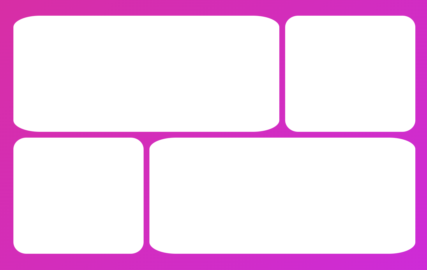
const Grid = styled.div`
  width: 70vw;
  display: grid;
  grid-template-columns: repeat(3, 1fr);
  div:first-child,
  div:last-child {
    grid-column: span 2;
  }
  gap: 10px;
`;
const Box = styled(motion.div)`
  height: 200px;
  background-color: rgba(255, 255, 255, 1);
  border-radius: 10%;
`;

const Overlay = styled.div`
  width: 100%;
  height: 100%;
  background-color: rgba(0, 0, 0, 0.5);
  position: absolute;
`;
function Animation() {

  const [clicked, setClicked] = useState(false);
  const toggle = () => setClicked((prev) => !prev);

return (
    <Wrapper onClick={toggle}>
      <AnimatePresence>
        {clicked ? <Overlay
         initial={{ opacity: 0 }}
         animate={{ opacity: 1 }}
         exit={{ opacity: 0 }} /> : null}
      </AnimatePresence>
  </Wrapper>
  )
}
Overlay 모습
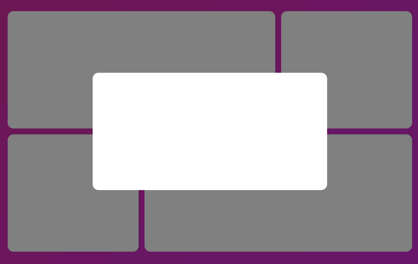
	<AnimatePresence>
        {clicked ? (
        <Overlay initial={{ opacity: 0 }}
        nimate={{ opacity: 1 }} exit={{ opacity: 0 }}>
         <Box style={{ width: 400, height: 200 }} />
        </Overlay>
        ) : null}
    </AnimatePresence>
layoutId 를 동일하게 추가하면 사진처럼 움직임이 연결된다.

<Wrapper onClick={toggle}>
    <Grid>
          <Box layoutId="box" />
          <Box />
          <Box />
          <Box />
    </Grid>
    <AnimatePresence>
      	{clicked ? (
          <Overlay initial={{ opacity: 0 }}
          animate={{ opacity: 1 }} exit={{ opacity: 0 }}>
          <Box layoutId="box" style={{ width: 400, height: 200 }} />
          </Overlay>
        ) : null}
   </AnimatePresence>
</Wrapper>
박스마다 layoutId 연결하기.
useState로 id를 만들어서 박스를 누르면 setId로 값을 변경, 그 값으로 layoutId 줌
<Wrapper onClick={toggle}>
    <Grid>
      {[1, 2, 3, 4].map((n) => (
        <Box onClick={() => setId(n)} key={n} layoutId={n} />
      ))}
    </Grid>
    <AnimatePresence mode="wait">
      {clicked ? (
        <Overlay
       initial={{ opacity: 0 }} animate={{ opacity: 1 }}
       exit={{ opacity: 0 }}>
          {" "}
          <Box layoutId={id} style={{ width: 400, height: 200 }} />
        </Overlay>
      ) : null}
    </AnimatePresence>
</Wrapper>