
리액트 강의의 과제 1번!
useState를 활용해서 상태를 바꿔보는 것이었다.
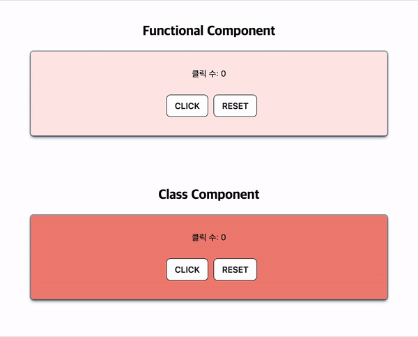
나는 클릭수 업데이트와 스타일을 바꾸는 걸 함수형 컴포넌트와 클래스형 컴포넌트 두 개로 만들어 봤다.
(회사 레거시 코드에 클래스형 컴포넌트도 있어서 구조를 대충은 알아야 한다고 함)
이건 간단한 거여서 클래스형 컴포넌트를 구현하는 데에 어려움은 없었는데 복잡해지면...^^
아기 또 백퍼 몰라...^^
- TestComponent.js
import React, { useState } from 'react';
import styled from 'styled-components';

const Wrapper = styled.div`
  display: flex;
  flex-direction: column;
  align-items: center;
  padding: 50px;

  & .title {
    padding-bottom: 25px;
    font-size: 25px;
    font-weight: 800;
    font-family: 'Roboto', sans-serif;
  }

  & .text {
    padding-bottom: 30px;
  }

  & .button {
    background-color: #FFFFFF;
    border: 1px solid #222222;
    border-radius: 8px;
    box-sizing: border-box;
    color: #222222;
    cursor: pointer;
    display: inline-block;
    font-family: Circular,-apple-system,BlinkMacSystemFont,Roboto,"Helvetica Neue",sans-serif;
    font-size: 16px;
    font-weight: 600;
    line-height: 20px;
    margin-left: 10px;
    outline: none;
    padding: 10px 15px;
    position: relative;
    text-align: center;
    text-decoration: none;
    touch-action: manipulation;
    transition: box-shadow .2s,-ms-transform .1s,-webkit-transform .1s,transform .1s;
    user-select: none;
    -webkit-user-select: none;
    width: auto;

  .button:focus-visible {
    box-shadow: #222222 0 0 0 2px, rgba(255, 255, 255, 0.8) 0 0 0 4px;
    transition: box-shadow .2s;
  }

  .button:active {
    background-color: #F7F7F7;
    border-color: #000000;
    transform: scale(.96);
  }

  .button:disabled {
    border-color: #DDDDDD;
    color: #DDDDDD;
    cursor: not-allowed;
    opacity: 1;
  }
}

  & .box-shadow {
    box-shadow: rgba(6, 24, 44, 0.4) 0px 0px 0px 2px, rgba(6, 24, 44, 0.65) 0px 4px 6px -1px, rgba(255, 255, 255, 0.08) 0px 1px 0px inset;
    width: 50%;
    height: 100%;
    border-radius: 5px;
    text-align: center;
    padding: 35px;
  }
`

const TestComponent = () => {
  let [count, setCount] = useState(0);
  const [color, setColor] = useState('#ffe9e9');

  const handleCount = () => {
    setColor('#f08579');
    setCount(count += 1);
  }

  const handleReset = () => {
    setColor('#ffe9e9');
    setCount(count = 0);
  }

  return (
    <Wrapper>
      <div className="title">Functional Component</div>
      <div className="box-shadow" style={{ backgroundColor: color}}>
        <div className="text">클릭 수: {count}</div>
        <button onClick={handleCount} className="button">CLICK</button>
        <button onClick={handleReset} className="button">RESET</button>
      </div>
    </Wrapper>
  );
};

export default TestComponent;- TestClassComponent.js
import React, { Component } from 'react';
import styled from 'styled-components';

const Wrapper = styled.div`
  display: flex;
  flex-direction: column;
  align-items: center;
  padding: 50px;

  & .title {
    padding-bottom: 25px;
    font-size: 25px;
    font-weight: 800;
    font-family: 'Roboto', sans-serif;
  }

  & .text {
    padding-bottom: 30px;
  }

  & .button {
    background-color: #FFFFFF;
    border: 1px solid #222222;
    border-radius: 8px;
    box-sizing: border-box;
    color: #222222;
    cursor: pointer;
    display: inline-block;
    font-family: Circular,-apple-system,BlinkMacSystemFont,Roboto,"Helvetica Neue",sans-serif;
    font-size: 16px;
    font-weight: 600;
    line-height: 20px;
    margin-left: 10px;
    outline: none;
    padding: 10px 15px;
    position: relative;
    text-align: center;
    text-decoration: none;
    touch-action: manipulation;
    transition: box-shadow .2s,-ms-transform .1s,-webkit-transform .1s,transform .1s;
    user-select: none;
    -webkit-user-select: none;
    width: auto;

  .button:focus-visible {
    box-shadow: #222222 0 0 0 2px, rgba(255, 255, 255, 0.8) 0 0 0 4px;
    transition: box-shadow .2s;
  }

  .button:active {
    background-color: #F7F7F7;
    border-color: #000000;
    transform: scale(.96);
  }

  .button:disabled {
    border-color: #DDDDDD;
    color: #DDDDDD;
    cursor: not-allowed;
    opacity: 1;
  }
}

  & .box-shadow {
    box-shadow: rgba(6, 24, 44, 0.4) 0px 0px 0px 2px, rgba(6, 24, 44, 0.65) 0px 4px 6px -1px, rgba(255, 255, 255, 0.08) 0px 1px 0px inset;
    width: 50%;
    height: 100%;
    border-radius: 5px;
    text-align: center;
    padding: 35px;
  }
`

class TestClassComponent extends Component {
  constructor(props) {
    super(props);
    this.state = {
      count: 0,
      color: '#f08579'
    };
  }


  render() {
    const { count, color } = this.state;

    const handleCount = () => {
      this.setState({ color: '#ffe9e9' });
      this.setState({ count: count + 1 });
    }

    const handleReset = () => {
      this.setState({ color: '#f08579' });
      this.setState({ count: 0 });
    }

    return (
      <Wrapper>
        <div className="title">Class Component</div>
        <div className="box-shadow" style={{ backgroundColor: color }}>
          <div className="text">클릭 수: {count}</div>
          <button onClick={handleCount} className="button">CLICK</button>
          <button onClick={handleReset} className="button">RESET</button>
        </div>
      </Wrapper>
    );
  }
}

export default TestClassComponent;