create-react-app 버전 업데이트에 따라 별도의 설정 없이 사용가능
- webpack의 css-loader를 이용해 일반 CSS를 불러오는 방식 사용
- 클래스 네임의 중복 가능성 방지 위해 다음과 같이 작성 방식
.App{...}
.App .header{...}
.App .logo{...}
.App .intro{...}
CSS Module
모듈화된 CSS로 CSS 클래스를 만들면 자동으로 고유한 클레스 네밍릉 생성하며 scope를 지역적으로 제한하는 방식
CSS Module 세팅
CSS 모듈 사용을 위해 webpack.config.dev.js 옵션 조정 필요 X
링크 App.css 대신 App.module.css로 확장자만 변경해주면 됩!!
CSS Module 사용
- css에 box 클래스 만들기
.box {
  display: inline-block;
  width: 100px;
  height: 100px;
  border: 1px solid black;
  position: fixed;
  top: 50%;
  left: 50%;
  transform: translate(-50%, -50%);
}

.blue {
  background: blue;
}
2. 클래스에 여러개 style 적용
yarn add classnamesimport React,{Component} from "react";
import classNames from "classnames";
import styles from "./App.module.css";
(...)
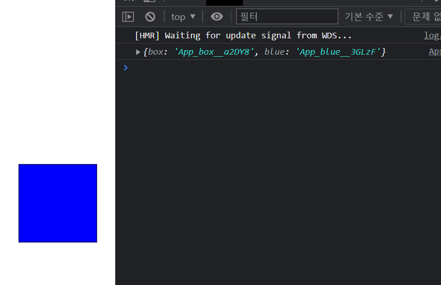
<div className={className(styles.box, styles.blue)}</div>
(...)- css module 사용하면 고유한 클래스 네임 부여 가능
- className의 bind 기능 사용해 styles 생략 가능
작성한 클래스 이름을 파라미터로 나열하기만 하면 됨
import React,{Component} from "react";
import styles from './App.module.css';
import classNames from "classnames/bind";

console.log(styles);

const cx=classNames.bind(styles);


class App extends Component{

  render(){
    return (
      <div className={cx("box","blue")}></div>
    )
  }

}
export default App;
classNames 사용 예제
classNames("foo","bar"); //=>"foo bar"
classNames("foo",{bar:true}); //=>"foo bar"
classNames({"foo-bar":true}); //=>"foo-bar"
classNames({"foo-bar":false}); //=>""
classNames({foo:true},{bar:true}); //=>"foo bar"
classNames({foo:true, bar:true}); //=>"foo-bar"
classNames(["foo","bar"]); //=>"foo bar"
동시에 여러개 받아 올 수 있음
classNames("foo",{bar:true, duck:false},"baz",{quux:true}); //=>"foo bar baz quux"false,null,0,undefined는 무시됨
classNames(null,false,"bar",undefined,0,1,{baz:null});//=>"bar 1"isBlue가 true일 때만 blue 클래스 적용되는 코드
import React,{Component} from "react";
import styles from './App.module.css';
import classNames from "classnames/bind";


const cx=classNames.bind(styles);


class App extends Component{

  render(){
    const isBlue=true;
    return (
      <div className={cx("box",{"blue":isBlue})}></div>
    )
  }

}
export default App;
- 고유한 클래스네임 만들어 편리하게 스코프 제한 가능
- 코드가 복잡해져 가독성이 떨어질 우려 발생
Sass
자주 사용되는 CSS 전처리기이며, 확장된 CSS 코드를 쉽게 작성하는 방식
Sass 세팅
yarn add node-sass@4.14.1현재 선택자 참조
&:이용해 높은 가독성 제공
.box {

  &:hover { /*css에서 .box:hover와 동일*/
    background: red;
  }
  &:active { /*css에서 .box:active와 동일*/
    background: yellow;
  }

  display: inline-block;
  width: 100px;
  height: 100px;
  border: 1px solid black;
  position: fixed;
  top: 50%;
  left: 50%;
  transform: translate(-50%, -50%);
}
감싸인 구조
- DOM 트리 구조와 동일하게 클래스 작성 가능
- 특정 클래스가 특정 클래스 내부에서만 적용됨
- 높은 가독성과 편리함
box-inside 클래스가 box 클래스 내부에 있는 코드 작성
import React,{Component} from "react";
import styles from './App.scss';
import classNames from "classnames/bind";

const cx=classNames.bind(styles);
class App extends Component{
  render(){
    const isBlue=false;
    return (
      /*큰상자영역*/
      <div className={cx("box",{"blue":isBlue})}>
      /*그 안의 작은 상자*/
        <div className={cx("box-inside")}/>
      </div>
    );
  }
}
export default App;.box { /*큰 상자*/
display: inline-block;
width: 100px;
height: 100px;
border: 1px solid black;
position: fixed;
top: 50%;
left: 50%;
transform: translate(-50%, -50%);
.box-inside { /*그 안의 작은 상자*/
background: black;
width: 50px;
height: 50px;
}
&.blue {
background: blue;
}
&:hover {
/*css에서 .box:hover와 동일*/
background: red;
}
&:active {
/*css에서 .box:active와 동일*/
background: yellow;
}
}
다음과 같은 구조로 작성해 높은 가독성 가짐
.box{
  .box-inside{

  }
}
변수 사용
- 자주 사용하는 값은 변수에 넣음
box의 width와 height에 설정된 100px 값을 size 변수에 넣은 코드
/*size 변수 선언과 대입*/
$size: 100px;

.box {
  display: inline-block;
  width: $size;
  height: $size;
  border: 1px solid black;
  position: fixed;
  top: 50%;
  left: 50%;
  transform: translate(-50%, -50%);
  (....)
}
믹스인 사용
- 자주 사용하는 구문은 믹스인에 넣음
place-at-center 믹스인 생성해 요소를 화면 가운데 위치시키는 구문
/*요소 가운데 위치시키는 믹스인*/
@mixin place-at-center() {
  top: 50%;
  left: 50%;
  transform: translate(-50%, -50%);
}

/*size 변수 선언과 대입*/
$size: 100px;


.box {
  @include place-at-center();
  display: inline-block;
  width: $size;
  height: $size;
  border: 1px solid black;
  position: fixed;
  (...)
  }
변수와 믹스인 전역적 사용
- 변수와 믹스인 전역적인 사용 위해 style 디렉토리 생성해 코드 따로 관리
src디렉토리 내style디렉토리 생성style디렉토리 내utills.scss파일 생성
App.scss에 작성했던 변수($size)와 믹스인(place-at-center)을utills.scss파일로 옮기기
utills.scss
/*size 변수 선언과 대입*/
$size: 100px;

/*요소 가운데 위치시키는 믹스인*/
@mixin place-at-center() {
  top: 50%;
  left: 50%;
  transform: translate(-50%, -50%);
}
App.scss에./styles/utils.scssimport해 전역적인 변수/믹스인 사용
App.scss
@import "./styles/utils.scss";

.box {
  @include place-at-center();
  display: inline-block;
  width: $size;
  height: $size;
  border: 1px solid black;
  position: fixed;

  .box-inside {
    background: black;
    width: 50px;
    height: 50px;
  }
  &.blue {
    background: blue;
  }
  &:hover {
    /*css에서 .box:hover와 동일*/
    background: red;
  }
  &:active {
    /*css에서 .box:active와 동일*/
    background: yellow;
  }
}
sass-loader 커스타마이징 : incluedPaths 사용한 경로 간소화
1. git 커밋
2. yarn eject -> react-script eject -> y
3. config 폴더 -> webpack.config.js -> sassRegex 찾기
4. 'sass-loader' 대신 다음 코드 추가
concat({
        loader: require.resolve('sass-loader'),
        options: {
          sassOptions: {
            includePaths: [paths.appSrc + '/styles'],
          },
          sourceMap: isEnvProduction && shouldUseSourceMap,
          //prependData: `@import 'utils';`,
        },
}),- 서버 재시작
@import "utils.scss";형태로 간편하게 import 가능
Sass 라이브러리
- include-media 믹스인 라이브러리 : 반응형 디자인
- open-color 변수 세트 라이브러리 : 여러 색상 쉽게 선택
- 라이브러리 설치
npm add include-media open-colorutils.scss에 import 하기
@import "~open-color/open-color";
@import "~include-media/dist/include-media";
npm 또는 yarn은 ~ 사용해 node_modules에 접근 가능
3. $breakpoints 설정해 반응형 디자인 기준점 작성
//utils.scss
@import "~open-color/open-color";
@import "~include-media/dist/include-media";

$breakpoints: (
  small: 376px,
  medium: 768px,
  large: 1024px,
  huge: 1200px,
);

/*size 변수 선언과 대입*/
$size: 100px;

/*요소 가운데 위치시키는 믹스인*/
@mixin place-at-center() {
  top: 50%;
  left: 50%;
  transform: translate(-50%, -50%);
}
버튼 생성
Sass 라이브러리 이용한 반응형 버튼 생성
- 컴포넌트 생성 파일
//button.js
import React from 'react';
import styles from "./button.scss";
import classNames from 'classnames';

/*CSS Module 형식으로 클래스 지정*/
const cx =classNames.bind(styles);

/*함수형 컴포넌트 구성*/
const Button = ({children,...rest})=>{
  /*props : chilren과 나머지는 모두 지칭하는 ...rest*/
    return (
        <div className={cx("button")} {...rest}>
      /*jsx에 {...rest} 넣어 객체 안에 모든 값을 DOM/props로 지정*/
            {children}
        </div>
    );
};

export default Button;- 스타일 작성
//button.scss
@import "utils";

.button {
  background: $oc-green-6;
  transition: all 0.2s ease-in;
  display: inline-block;
  padding-top: 2rem;
  padding-bottom: 2rem;
  text-align: center;
  color: white;
  position: fixed;
  font-size: 2rem;
  font-weight: 500;
  border-radius: 4px;
  cursor: pointer;

  @include palace-at-center();

  width: 1200px;

  //반응형 디자인
  @include media("<huge") {
    width: 1024px;
  }
  @include media("<large") {
    width: 768px;
  }
  @include media("<medium") {
    width: 90%;
  }

  //마우스 상태에 따라 다른 효과 지정
  &:hover {
    background: $oc-green-6;
  }
  &:active {
    margin-top: 3px;
    background: $oc-green-8;
  }
}
- include-media
이전styles/utils.scss에서 작성한$breakpoints를 이용해 다음과 같이 반응형 디자인 구성
  //반응형 디자인
  @include media("<huge") {
    width: 1024px;
  }
3.index 파일로 컴포넌트 불러온 후 바로 내보내기
//index.js
export {default} from "./button";
/*import Button from "./button";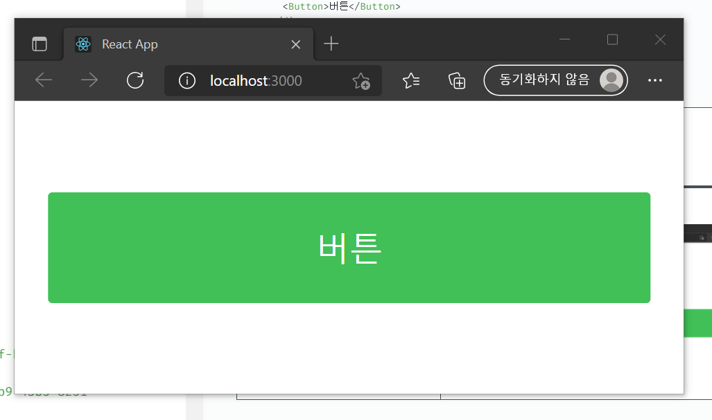
export default Button;*/- App.js에 랜더링
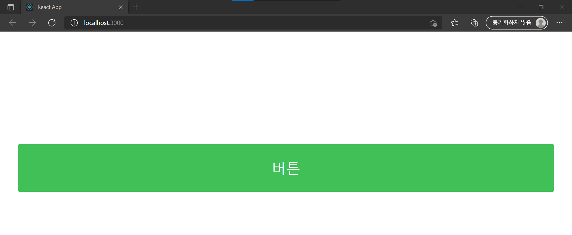
//App.js
import React,{Component} from "react";
import styles from './App.scss';
import Button from "./components/Button"
class App extends Component{
render(){
return(
<div>
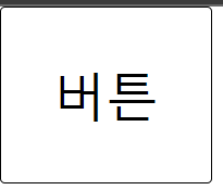
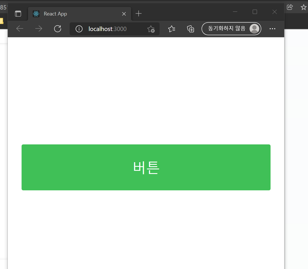
<Button>버튼</Button>
</div>
)
}
}
export default App;
| 반응형 1 | 반응형 2 | 반응형 3 |
|---|---|---|
 |  |  |
Styled-component
컴포넌트 스타일링 방식으로 JS 코드 내부에서 스타일 정의
Tagged Template Literals
styled'...'
1.개발자 도구 콘솔창에 다음의 함수 입력
function myfunction(...args){
  console.log(args)
}
myfunction`1+1=${1+1} and 2+2=${2+2}`
2. 출력되는 결과
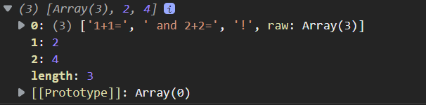
backquote 사이 js 표현 (${...})이 들어가면 그곳을 기준으로 끊어서 전달
styling 할 때 props에 접근할 때 사용
예제 1
버튼 생성 후 props로 폰트 사이즈 지정
StyledButton.js은 Tagged Template Literals 문법을 사용하여 끊어진 값 참조해서 스타일링 가능하게 작성
import React from 'react';
import styled from "styled-components"

const Wrapper=styled.div`
    border: 1px solid black;
    display : inline-block;
    padding : 1rem;
    border-radius:3px;
    font-size:${(props)=>props.fontSize};
    &:hover{
        background:black;
        color:white;
    }
`;


const StyledButton=({children,...rest})=>{
    return (

        <Wrapper fontSize="1.25rem" {...rest}>
            {children}
        </Wrapper>
    )
};

export default StyledButton;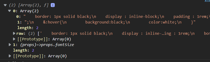
->(props)=>props.fontsize가 따로 인식된 것을 볼 수 있음 (props 참조해서 스타일링 가능!)
App.js작성해 랜더링
import React,{Component} from "react";
import styles from './App.scss';
import StyledButton from "./components/StyledButton"

class App extends Component{

  render(){
    return(
    <div>
      <StyledButton>버튼</StyledButton>
    </div>
    )
  }
}
export default App;
예제 2
버튼 생성 후 props로 big인 경우, 그에 맞는 font-size와 padding 적용
StyledButton.js에서Wrapper를 다음과 같이 수정
const Wrapper=styled.div`
    border: 1px solid black;
    display : inline-block;
    padding : 1rem;
    border-radius:3px;
    font-size:${(props)=>props.fontSize};
    ${(props)=>((props.big) &&
        `
        font-size:2rem;
        padding:2rem;
        `)
    }
    &:hover{
        background:black;
        color:white;
    }
`;- Props로
fontsize와big여부를 명시해 스타일링 진행
const StyledButton=({children,...rest})=>{
    return (

        <Wrapper fontSize="1.25rem" big={true} {...rest} >
            {children}
        </Wrapper>
    )
};