구현 배경
프론트엔드 UX 개선 작업 중 요구사항이 들어왔다.
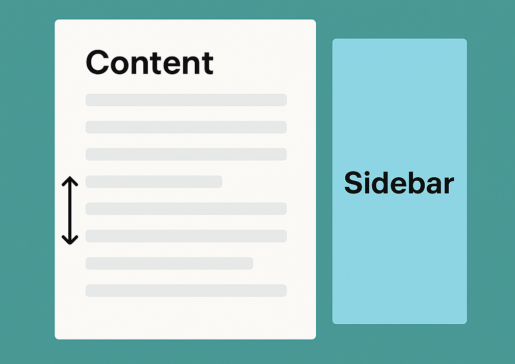
프로젝트 메인 페이지에는 메인섹션과 서브 섹션이 배치되어 있는 Flex 컴포넌트가 개발되어 있었다.
이 Flex 컴포넌트에 대해 콘텐츠 좌우에 나란히 위치한 두 개의 컴포넌트 중 상대적으로 높이가 작은 컴포넌트를 스크롤 시 고정시키는 UI/UX를 구현할 필요가 생겼다.
단순히 position: sticky 속성만 적용하면 되는 문제처럼 보였지만, 실제로는 다음과 같은 복잡한 요구 조건이 있었다
요구사항 분석
-
메인 섹션과 서브 섹션 두 영역 모두 콘텐츠의 height가 유동적이다. 두 섹션이 모두 뷰포트보다 클 수도 있고, 아닐 수 있다. (보통은 더 크다)
-
메인 섹션이 반드시 서브 섹션보다 height이 크다는 보장도 없다.
-
height이 더 낮은 컴포넌트가 스크롤 중 먼저 끝나게 되는데, 이때 낮은 컴포넌트를 화면에 자연스럽게 고정시키고 싶었다.
-
height이 더 낮은 컴포넌트가 고정된 상태에서 다시 스크롤을 올릴 경우에 스크롤을 같이 따라 올라가다가 Top 에서 고정되어야 한다.
-
윈도우 기준 가로 방향 스크롤이 발생할 수 있다. (반응형 대응)
즉, 주어진 요구사항의 핵심은
좌우 컴포넌트가 height이 뷰포트보다 클 경우에 스크롤이 동기화되고 둘 중 하나의 컨텐츠가 끝날 경우 더 작은 컴포넌트의 position이 sticky처리된다
레퍼런스를 탐색해보았다..
첫번째는 네이버 뉴스 메인 페이지다.
스크롤을 내리면 사이드바가 화면에 고정되는 UI로 구현되어있다.
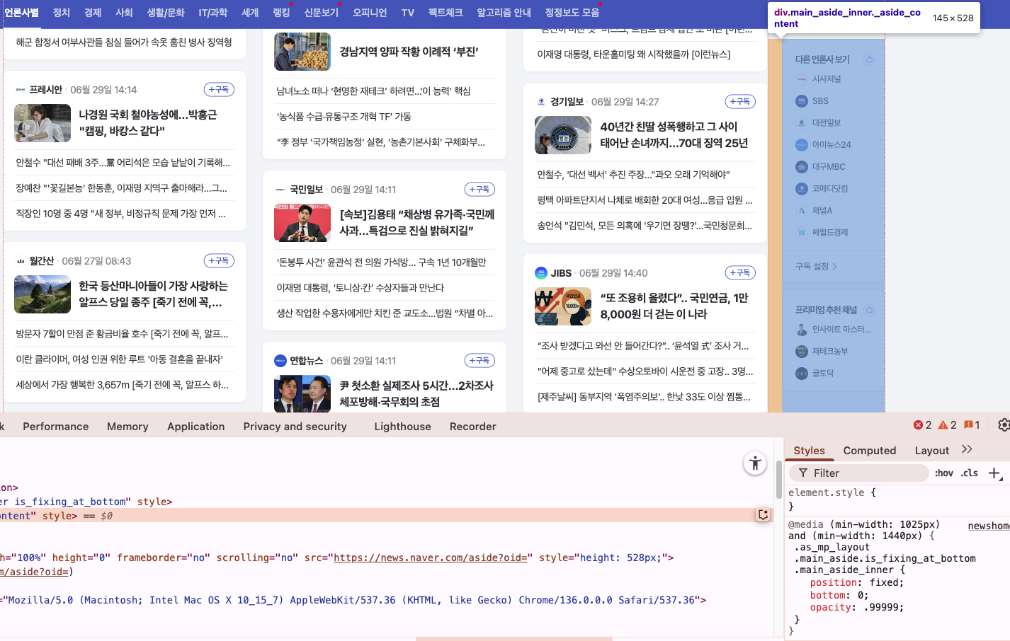
구현 방식을 확인해본 결과
1. position은 fixed
2. 브라우저 뷰포트의 높이에 따라 top / bottom 속성이 바뀐다.
3. 브라우저 뷰포트의 넓이를 줄여보니 사이드바가 사라진다.
일단 기본적으로 브라우저가 풀스크린일 때 사이드바가 뷰포트에 비해 height이 너무 작았고, 뷰포트의 높이를 사이드바의 height보다 작게 줄여도 스크롤이 동기화되지 않았다. fixed 포지션이기 때문이다.
그래서 주어진 요구사항 구현을 위해 참고하기에는 부적절하다고 판단했다.
다음으로 찾은 레퍼런스 페이지는 토스증권 메인 페이지다.
사용해보니 주어진 요구사항과 거의 완벽하게 일치했다. 와우
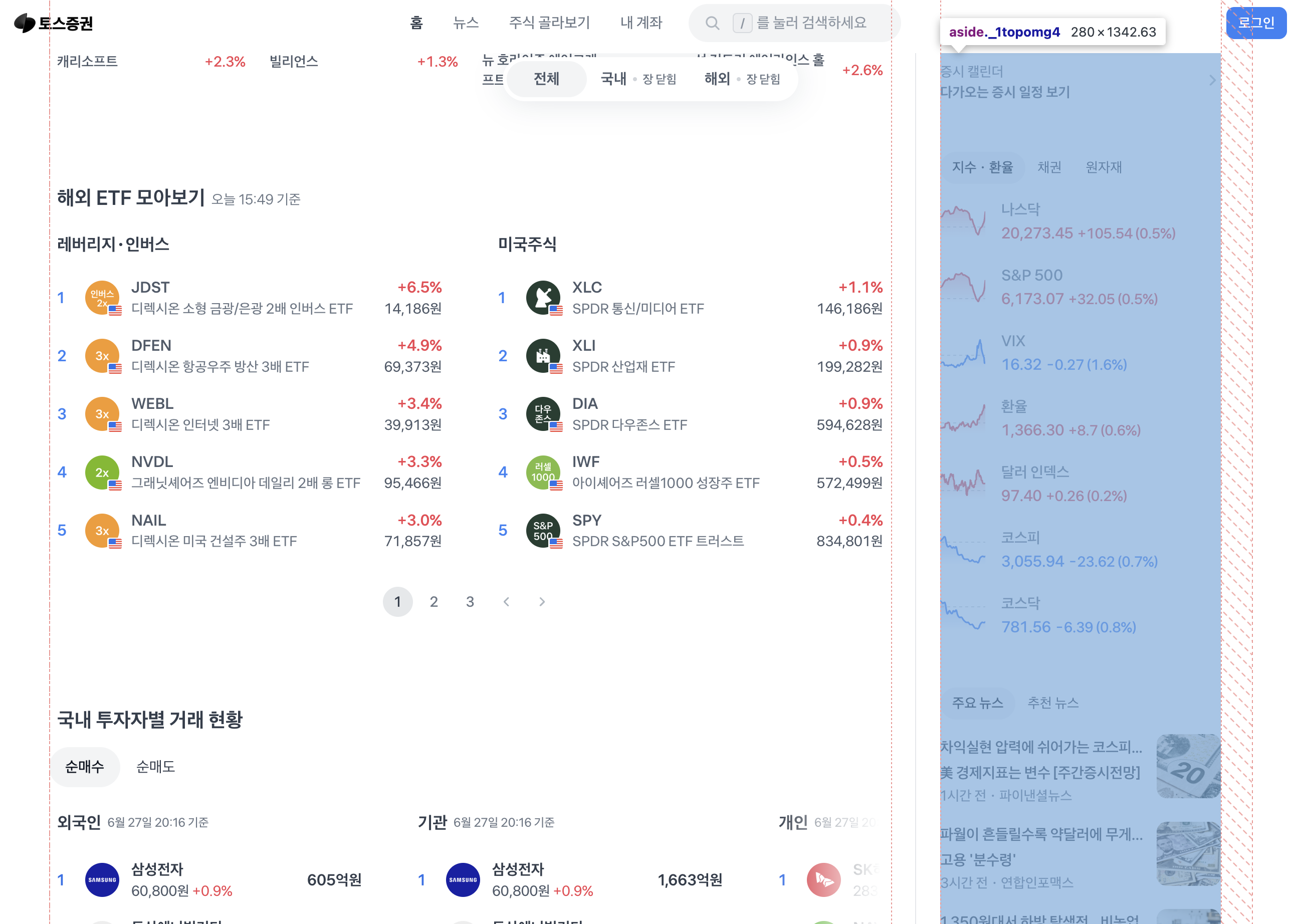
당장 개발자 도구를 열고 분석을 시작했다.
-
position은
sticky -
스크롤을 내리면 top 속성이 음수값으로 지정된다.
-
스크롤을 올리면 top 속성이 사라지고 bottom 속성이 음수값으로 지정된다.
-
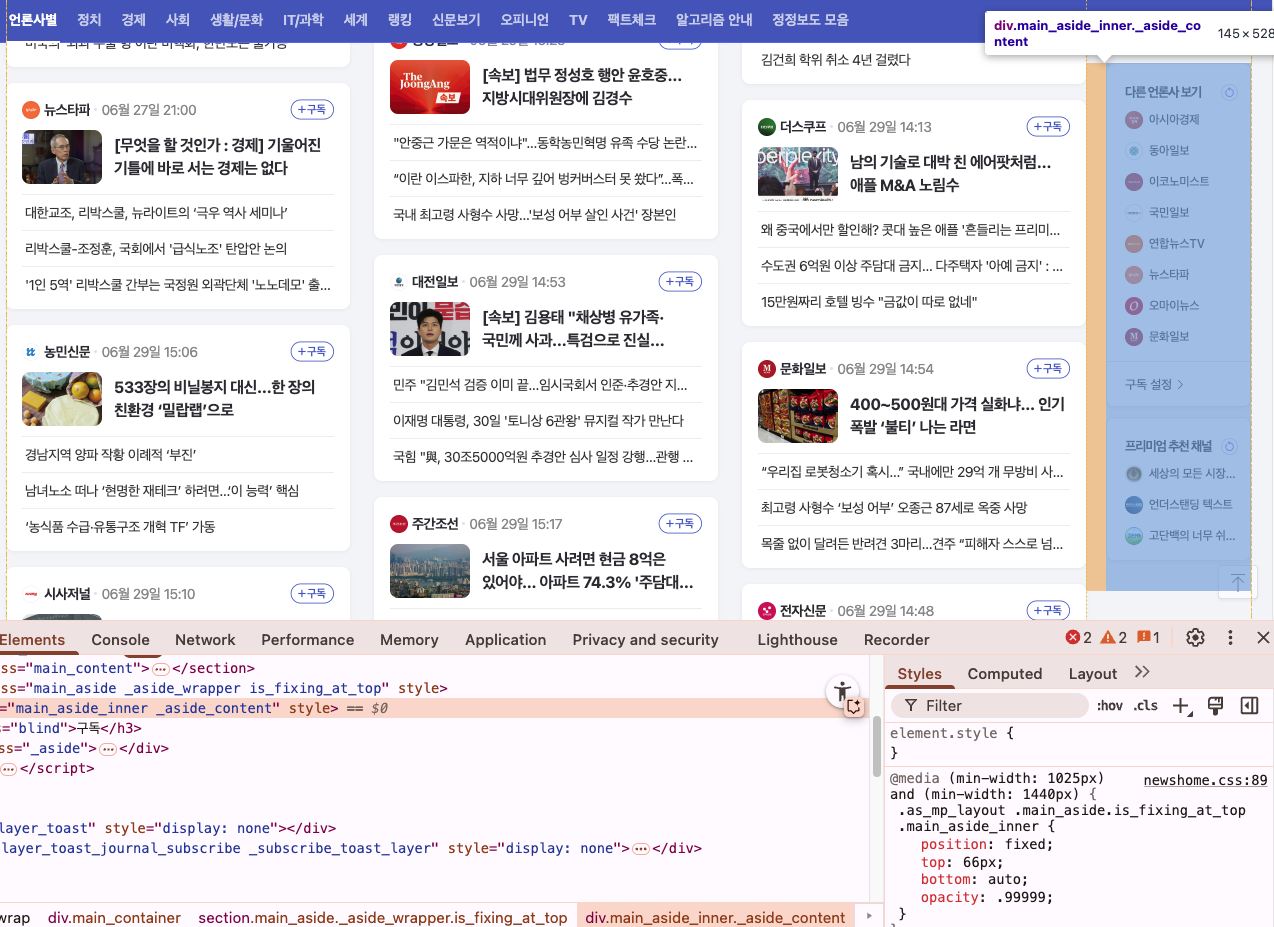
사이드바 섹션과 동일한 DOM 레벨의 가상의 컴포넌트가 존재한다. 하단의 이미지를 보면,
margin-top이 0px인 컴포넌트가 하나 있다.
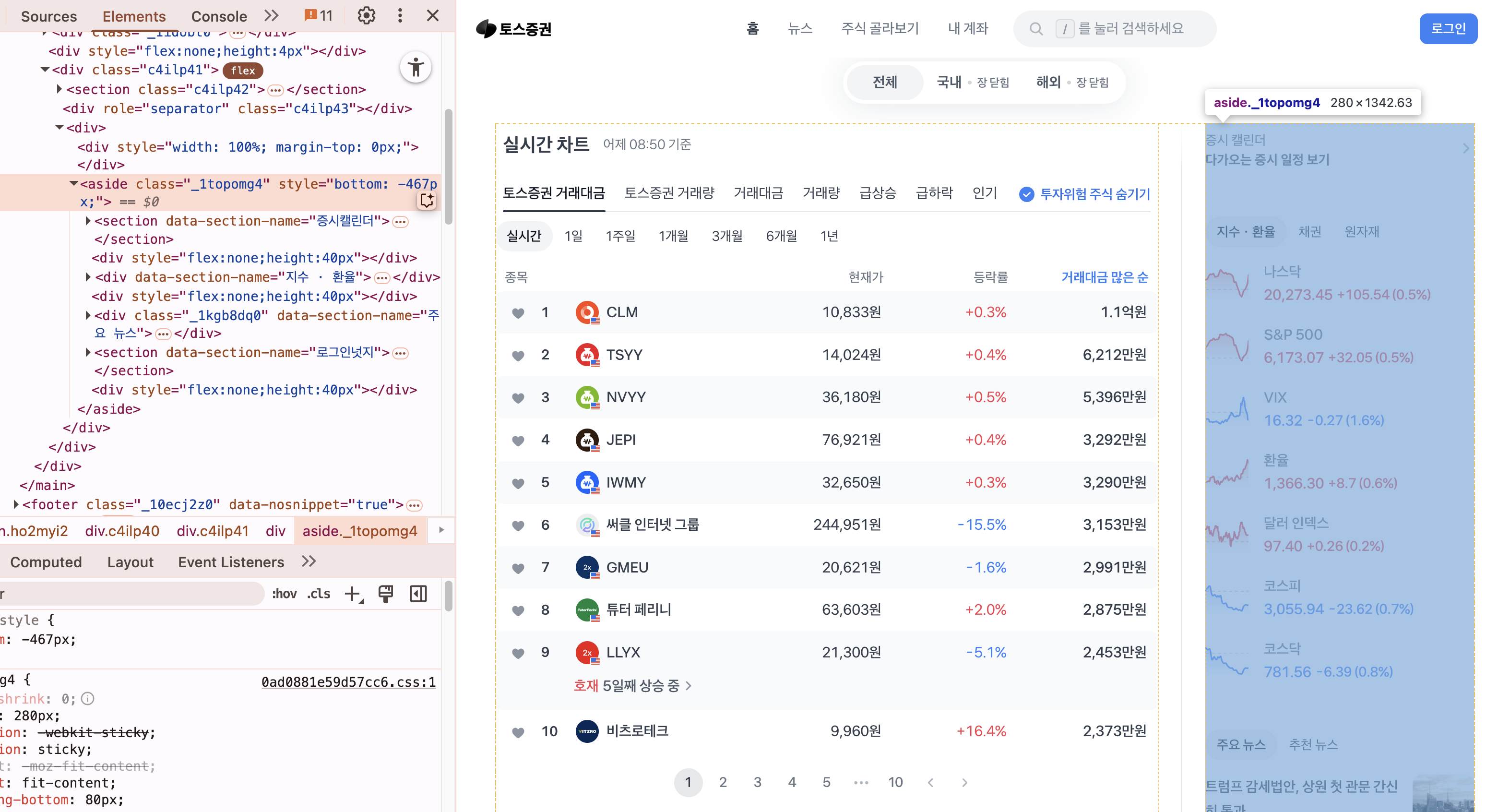
-
스크롤을 아랫 방향으로 내리다가 사이드바의 bottom이 뷰포트 안에 들어오고, 더이상 사이드 바의 컨텐츠가 존재하지 않고 메인 섹션의 스크롤만 남았을 때
margin-top이 추가 스크롤량 만큼 실시간으로 동기화된다. -
스크롤을 다시 올리면
margin-top값은 변하지 않다가 사이드바의 top이 뷰포트 안에 들어오고나서 부터,margin-top이 추가 스크롤량 만큼 실시간으로 빠진다.
역시 토스다. 스크롤 방향이 바뀜에 따라 sticky 포지션의 top, bottom이 바뀌면서 사이드바가 갑자기 튀거나 위치가 어그러지는 현상을 막기 위해 margin-top 을 지정하는 "범퍼" 컴포넌트를 따로 생성했다.
동작 원리 분석
스크롤을 아래로 내리다가 지정한 top 값에 걸리면 사이드바는 상단에서 걸려서 위치가 고정된다.
스크롤 방향이 위로 바뀐다면 아래 bottom쪽에서 sticky로 걸려서 위치가 고정되어한다.
top에 걸린 상태로 스크롤을 추가로 더 아래로 내렸기 때문에 갑자기 bottom으로 속성을 변경하면 sticky top에서 고정되던 속성이 사라지면서 원래 위치대로 이동한다. 그래서 위치가 확 튀는 현상이 발생한다.
위로 확 튀는 현상을 막기 위해 "범퍼" 가 필요하고, 추가 스크롤량에 대해 공간을 차지하게끔 margin-top 을 준다.
구현기
1. sticky 무시 이슈
처음에는 sticky 요소가 화면에 보이는데도 고정이 되지 않는 문제가 있었다.
알고 보니 조상 요소 중 하나라도 overflow-x: auto 혹은 overflow: hidden이 설정되어 있으면 sticky가 무시된다는 사실을 알게되었다.
확인해보니 필요하지 않은 overflow-x: auto 속성이 있어 제거했더니 제대로 동작했다.
2. 스크롤 방향에 따라 top/bottom 고정 전환 구현
스크롤이 아래로 내려갈 때는 sticky 요소가 top: -maxScroll 위치에 고정되고, 다시 위로 스크롤할 때는 bottom: -maxScroll로 고정되도록 했다. 이를 위해 scrollY 값을 추적하고 이전 scrollY와 비교해 방향을 판단했다.
const maxScroll = useRef(0);

// in useEffect
maxScroll.current =
      stickyRef.current?.clientHeight -
      document.documentElement.clientHeight;
const updateSticky = (direction: "up" | "down") => {
if (direction === "down") {
sticky.style.top = `${-maxScroll.current}px`;
sticky.style.bottom = "";
} else {
sticky.style.top = "";
sticky.style.bottom = `-${maxScroll.current + TOP_OFFSET}px`;
}
};3. marginTopRef와 stickyRef의 분리
처음에는 sticky 요소 자체에 marginTop을 적용했지만, 이 경우 sticky bottom이 정상적으로 작동하지 않았다.
sticky 컴포넌트에 marginTop이 포함되면 기준이 어그러진다고 추측했다.
따라서 아래와 같이 wrapper를 따로 두고 sticky 요소와 분리하는 방식으로 구조를 변경했다.
<div id="side-bar">
  	<div ref={marginTopRef} />
	<div ref={stickyRef} style={{ position: "sticky"}} />
</div>
4. margin-top 동기화
sticky에 걸린 후의 Flex 컨테이너의 top 위치와 사이드바의 top 위치값의 차이만큼 margin-top을 준다.
const containerTop = container.getBoundingClientRect().top;
const stickyTop = sticky.getBoundingClientRect().top;
const offset = Math.abs(containerTop - stickyTop);

marginTopRef.style.marginTop = `${offset}px`;
최종 코드
  const [stickyTarget, setStickyTarget] = useState<"left" | "right" | null>(
    null
  );

  const containerRef = useRef<HTMLDivElement>(null); // 전체 wrapper
  const marginTopRef = useRef<HTMLDivElement>(null); // marginTop 적용될 wrapper
  const stickyRef = useRef<HTMLDivElement>(null); // sticky 요소

  const lastScrollY = useRef(0);
  const maxScroll = useRef(0);
  const TOP_OFFSET = 100; // 원하는 top 여백

  useEffect(() => {
    if (!dataLoaded) return;
    const leftRef = document.querySelector(".left-component");
    const rightRef = document.querySelector(".right-compoent");

    if (!leftRef || !rightRef) return;

    const leftHeight = (leftRef as HTMLElement).offsetHeight;
    const rightHeight = (rightRef as HTMLElement).offsetHeight;

    if (leftHeight === 0 && rightHeight === 0) return;

    if (leftHeight < rightHeight) {
      setStickyTarget("left");
    } else if (rightHeight < leftHeight) {
      setStickyTarget("right");
    } else {
      setStickyTarget(null); // 둘 다 같으면 비활성화
    }
  }, [dataLoaded]);

  useEffect(() => {
    if (!dataLoaded || !stickyTarget) return;

    if (!containerRef.current || !marginTopRef.current || !stickyRef.current)
      return;

    lastScrollY.current = window.scrollY;
    maxScroll.current =
      stickyRef.current?.clientHeight -
      document.documentElement.clientHeight +
      30;

    const container = containerRef.current;
    const stickyWrapper = marginTopRef.current;
    const sticky = stickyRef.current;

    if (!container || !stickyWrapper || !sticky) return;

    let ticking = false;

    const getMaxScroll = () =>
      sticky.clientHeight - document.documentElement.clientHeight;

    const updateSticky = (direction: "up" | "down") => {
      if (maxScroll.current <= 0) {
        stickyWrapper.style.marginTop = "0px";
        sticky.style.top = "0px";
        sticky.style.bottom = "";
        return;
      }

      const containerTop = container.getBoundingClientRect().top;
      const stickyTop = sticky.getBoundingClientRect().top;
      const offset = Math.abs(containerTop - stickyTop);

      stickyWrapper.style.marginTop = `${offset}px`;

      if (direction === "down") {
        sticky.style.top = `${-maxScroll?.current}px`;
        sticky.style.bottom = "";
      } else {
        sticky.style.top = "";
        sticky.style.bottom = `-${maxScroll.current + TOP_OFFSET}px`;
      }
    };

    const handleScroll = () => {
      if (!ticking) {
        window.requestAnimationFrame(() => {
          const currentY = window.scrollY;
          const direction = currentY > lastScrollY.current ? "down" : "up";
          lastScrollY.current = currentY;
          updateSticky(direction);
          ticking = false;
        });
        ticking = true;
      }
    };

    const handleResize = () => {
      window.requestAnimationFrame(() => {
        const oldMax = maxScroll.current;
        maxScroll.current = getMaxScroll();
        updateSticky(maxScroll.current < oldMax ? "up" : "down");
      });
    };

    const observer = new ResizeObserver(handleResize);
    observer.observe(container);
    observer.observe(sticky);

    window.addEventListener("scroll", handleScroll);
    window.addEventListener("resize", handleResize);

    return () => {
      observer.disconnect();
      window.removeEventListener("scroll", handleScroll);
      window.removeEventListener("resize", handleResize);
    };
  }, [dataLoaded, stickyTarget]);
후기..
단순해 보였던 sticky UI는 실제로 구현해보니 생각보다 훨씬 복잡한 요소들이 얽혀 있었다.
스크롤 방향에 따라 top/bottom을 전환하는 로직과 sticky 요소의 위치 보정(marginTop)을 해준 범퍼의 역할이 핵심 포인트였다.
역시 갓토스