
📖 학습 주제
Seaborn시각화 라이브러리WordCloud라이브러리
✏️ 주요 메모 사항 소개
Seaborn
- 스크래핑 시 결과 값이 정리가 안 된 텍스트 형식으로 출력이 되다보니 결과가 너무 분산되어있어 한 눈에 보기 어렵다. 때문에 시각화(Visualization) 작업으로 정보를 요약해서 한 눈에 보여줄 필요가 있다.
Seaborn은matplotlib을 기반으로 하는 시각화 라이브러리로 다양한 그래프를 고수준(high-level)에서 쉽게 그릴 수 있다.
설치
pip install seabornLine Plot & Bar Plot
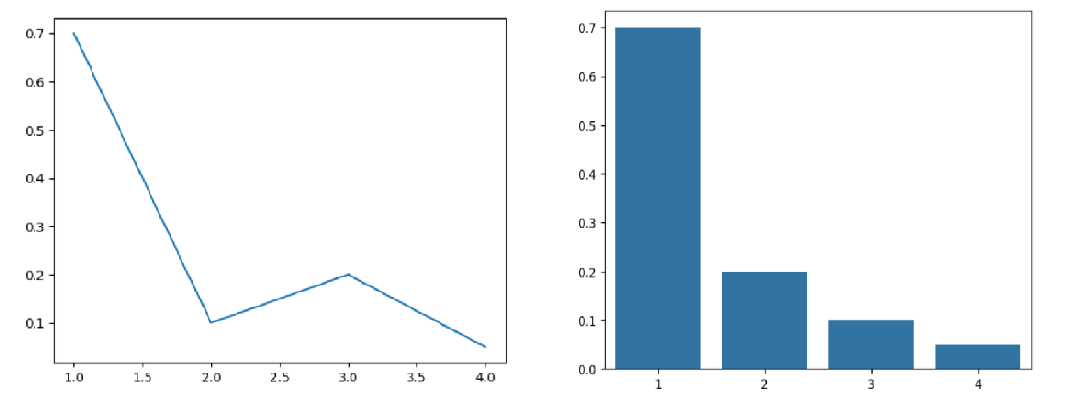
seaborn은 다양한 그래프를 그릴 수 있다. 꺾은선 그래프는.lineplot(), 막대 그래프는.barplot()으로 사용할 수 있다.
import seaborn as sns

sns.lineplot(x=[1, 3, 2, 4], y=[0.7,0.2,0.1,0.05])
sns.barplot(x=[1,2,3,4],y=[0.7,0.2,0.1,0.05])
- Plot의 속성 :
seaborn은 파이썬의 시각화 라이브러리matplotlib을 기반으로 만들어 졌다.matplotlib.pyplot의 속성을 변경해서 그래프에 다양한 요소를 변경/ 추가할 수 있다.
plt.title(): 제목 추가plt.xlabel(): x 축 이름plt.ylabel(): y 축 이름plt.xlim(): x 축 범위plt.ylim(): y 축 범위plt.figure(figsize = (x,y)): 그래프의 크기 지정 (figure는 항상 코드 제일 앞에 작성해야함)
실습 1 : 기상청 날씨 정보 조회
# 스크래핑에 필요한 라이브러리를 불러오기
from selenium import webdriver
from selenium.webdriver import ActionChains
from webdriver_manager.chrome import ChromeDriverManager
from selenium.webdriver.common.actions.action_builder import ActionBuilder
from selenium.webdriver import Keys, ActionChains
from selenium.webdriver.chrome.service import Service
from selenium.webdriver.common.by import By

# driver를 이용해 기상청 날씨 데이터를 가져와봅시다.

driver = webdriver.Chrome(service=Service(ChromeDriverManager().install()))

driver.get("https://www.weather.go.kr/w/weather/forecast/short-term.do")
driver.implicitly_wait(1)
temps = driver.find_element(By.ID, "my-tchart").text

temps = [int(i) for i in temps.replace("℃","").split("\n")]


# 받아온 데이터를 통해 꺾은선 그래프를 그려봅시다.
# x = Elapsed Time(0~len(temperatures)
# y = temperatures

import seaborn as sns
import matplotlib.pyplot as plt

plt.ylim(min(temps) - 2, max(temps) + 2)
plt.title("Expected Temperature from now on")

sns.lineplot(
    x = [i for i in range(len(temps))],
    y = temps
)

plt.show()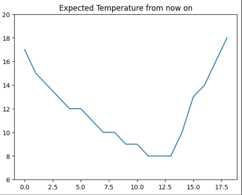
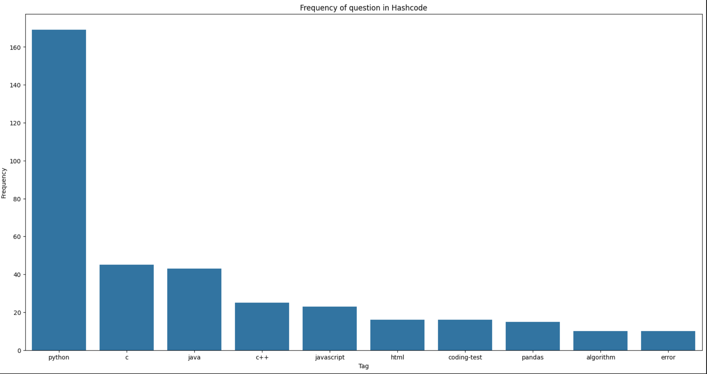
실습 2 : 해시코드 질문태그 빈도 시각화
# 다음 User-Agent를 추가해봅시다.

user_agent = {"User-Agent": "Mozilla/5.0 (Macintosh; Intel Mac OS X 10_15_4) AppleWebKit/537.36 (KHTML, like Gecko) Chrome/83.0.4103.97 Safari/537.36"}

# 필요한 라이브러리를 불러온 후, 요청을 진행해봅시다.

from bs4 import BeautifulSoup
import requests
import time
from collections import Counter
import seaborn as sns
import matplotlib.pyplot as plt

frequency = {}

for i in range(1,11):
    res = requests.get("https://qna.programmers.co.kr/?page={}".format(i), user_agent)
    soup = BeautifulSoup(res.text, "html.parser")

    # 1. ul 태그를 모두 찾기
    # 2. 1번 안에 있는 li 태그의 text를 추출

    ul_tags = soup.find_all("ul", "question-tags")
    ul_tags
    for ul in ul_tags:
        li_tags = ul.find_all("li")
        for li in li_tags:
            tag = li.text.strip()
            if tag not in frequency:
                frequency[tag] = 1
            else:
                frequency[tag] += 1
    time.sleep(0.5)

# Counter 라이브러리를 이용해 빈도 수를 나타내는 딕셔너리로 변경
counter = Counter(frequency)

# 그래프 그리기
x = [elem[0] for elem in counter.most_common(10)]
y = [elem[1] for elem in counter.most_common(10)]

plt.figure(figsize=(20,10))
plt.title("Frequency of question in Hashcode")
plt.xlabel("Tag")
plt.ylabel("Frequency")


sns.barplot(x=x, y=y)
Wordcloud
자주 등장하는 텍스트를 중요도나 인기도를 고려해 표현한 것. 자연어 문장에서 키워드를 추출하고 키워드가 등장한 빈도를 측정. 앞에서 전처리한 정보와
Wordcloud라이브러리를 바탕으로Wordcloud생성
설치
pip install wordcloudt
pip install konlpy
Wordcloud 만들기
WordCloud를 만드는 방법은 다음과 같다.
1. KoNLPy 라이브러리로 한국어 문장을 전처리
2. Counter를 이용해 빈도수 측정
3. WordCloud를 이용해 시각화
# 시각화에 쓰이는 라이브러리
import matplotlib.pyplot as plt
from wordcloud import WordCloud

# 횟수를 기반으로 딕셔너리 생성
from collections import Counter

# 문장에서 명사를 추출하는 형태소 분석 라이브러리
from konlpy.tag import Hannanum


# 워드클라우드를 만드는 데 사용할 애국가 가사입니다.

national_anthem = """
동해물과 백두산이 마르고 닳도록
하느님이 보우하사 우리나라 만세
무궁화 삼천리 화려 강산
대한 사람 대한으로 길이 보전하세
남산 위에 저 소나무 철갑을 두른 듯
바람 서리 불변함은 우리 기상일세
무궁화 삼천리 화려 강산
대한 사람 대한으로 길이 보전하세
가을 하늘 공활한데 높고 구름 없이
밝은 달은 우리 가슴 일편단심일세
무궁화 삼천리 화려 강산
대한 사람 대한으로 길이 보전하세
이 기상과 이 맘으로 충성을 다하여
괴로우나 즐거우나 나라 사랑하세
무궁화 삼천리 화려 강산
대한 사람 대한으로 길이 보전하세
"""

# Hannanum 객체를 생성한 후, .nouns()를 통해 명사를 추출합니다.

hannanum = Hannanum()
nouns = hannanum.nouns(national_anthem)
words = [noun for noun in nouns if len(noun) > 1]

# counter를 이용해 각 단어의 개수를 세줍니다.

counter = Counter(nouns)

# WordCloud를 이용해 텍스트 구름을 만들어봅시다.
# WordCloud를 한국어로 사용하려면 한국어 폰트를 인자로 넣어줘야함

wordcloud = WordCloud(
    font_path="C:\\Sangwon\\font\\Noto_Sans_KR\\NotoSansKR-VariableFont_wght.ttf",
    width= 1000,
    height = 1000
)

img = wordcloud.generate_from_frequencies(counter)
plt.imshow(img)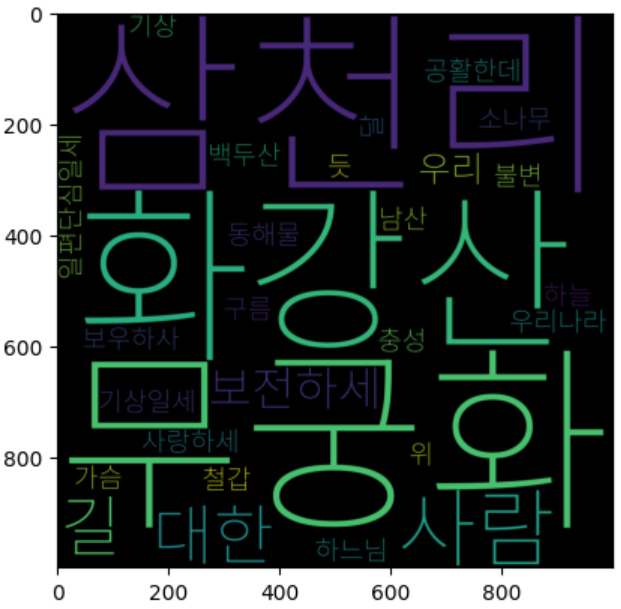
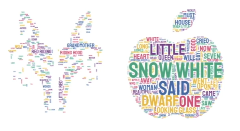
실습 3 : 해시코드 질문 키워드
# 다음 User-Agent를 추가해봅시다.

user_agent = {"User-Agent": "Mozilla/5.0 (Macintosh; Intel Mac OS X 10_15_4) AppleWebKit/537.36 (KHTML, like Gecko) Chrome/83.0.4103.97 Safari/537.36"}

# 라이브러리 불러오기

import time
from bs4 import BeautifulSoup
import requests
import matplotlib.pyplot as plt
from wordcloud import WordCloud
from collections import Counter
from konlpy.tag import Hannanum

# Pagination이 되어있는 질문 리스트의 제목을 모두 가져와 리스트 questions에 저장해봅시다.
# https://hashcode.co.kr/?page={i}
# 과도한 요청을 방지하기 위해 0.5초마다 요청을 보내봅시다.
questions = []

for i in range(1, 6):
    res = requests.get("https://hashcode.co.kr/?page={}".format(i), user_agent)
    soup = BeautifulSoup(res.text, "html.parser")

    parsed_datas = soup.find_all("li", "question-list-item")

    for data in parsed_datas:
        questions.append(data.h4.text.strip())
    time.sleep(0.5)

# Hannanum 객체를 생성한 후, .nouns()를 통해 명사를 추출합니다.

words = []

hannanum = Hannanum()

for question in questions:
    nouns = hannanum.nouns(question)
    words += nouns

print(len(words))

# counter를 이용해 각 단어의 개수를 세줍니다.

counter = Counter(words)

# WordCloud를 이용해 텍스트 구름을 만들어봅시다.

wordcloud = WordCloud(
    font_path="C:\\Sangwon\\font\\Noto_Sans_KR\\NotoSansKR-VariableFont_wght.ttf",
    background_color="white",
    height=1000,
    width=1000
)

img = wordcloud.generate_from_frequencies(counter)
plt.imshow(img)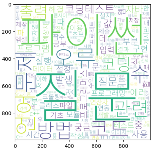
💦 공부하며 어려웠던 내용
- 어려운건 아니고 오늘 학습을 하면서 오류를 두 번 생겼는데 이를 해결하느라 좀 시간이 걸렸다.
1. JAVA_HOME 환경 변수를 jvmfinder.py 에서 읽지 못하는 상황
JAVA_HOME 환경 변수를 계속 못찾아서 왜그럴까 생각하는데 JAVA_HOME 환경변수의 path에 한글이 껴 있으면 오류가 날 때가 있다는 것이 생각나서 한글이 포함되지 않는 경로로 바꾸니까 잘 해결되었다.
2. WordCloud 폰트 적용
폰트를 적용하려고 하는데 계속 유니코드 오류가 뜨길래 검색을 해보니 경로명에 \가 한개 있으면 \n 과 같은 유니코드로 인식을 한다고 한다. 따라서 \ 를 \\로 바꾸어서 해결하였다.