이번 글에서는 크게 세가지를 살펴볼 것이다.
tailwind 개별 css 합치기, 커스텀 plugin 추가하기, 반응형이다.
1. tailwind 개별 css 합치기
반복적으로 사용해야 하는 버튼이 있다고 치자. 매번 많은 class를 일일이 치는것은 너무 귀찮은 일이다.
css에서 여러 테일윈드 클래스명을 합쳐 새로 묶을 수 있다.
@tailwind base;
@tailwind components;
@tailwind utilities;

@layer components {
  .btn-base {
    @apply py-2 px-4 bg-blue-500 text-white font-semibold rounded-lg shadow-md hover:bg-blue-700 focus:outline-none focus:ring-2 focus:ring-blue-400 focus:ring-opacity-75;
  }
}
@layer components안에서 평범한 css 항목처럼 선택자를 먼저 써주고 괄호 안에 스타일을 작성한다. 다른 class를 가져오기 위해 @apply를 먼저 써주고 뒤에 class 명을 나열한다.
이렇게만 하면 class에 btn-base만 추가하면 동일한 버튼을 여러개 만들 수 있다.
확인을 위해 Page_Home.tsx파일을 수정해보자
// ./src/pages/Page_Home.tsx
import React from "react";
import tw, { css } from "twin.macro";
const Home = () => {
    return (
        <div className="">
            <div
                css={[
                    tw`text-3xl font-bold underline`,
                    css`
                        background: #ff802c;
                    `,
                ]}
            >
                hello
            </div>
            <button className="btn-base">hi</button>
            <button className="btn-base">bye</button>
        </div>
    );
};

export default Home;
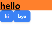
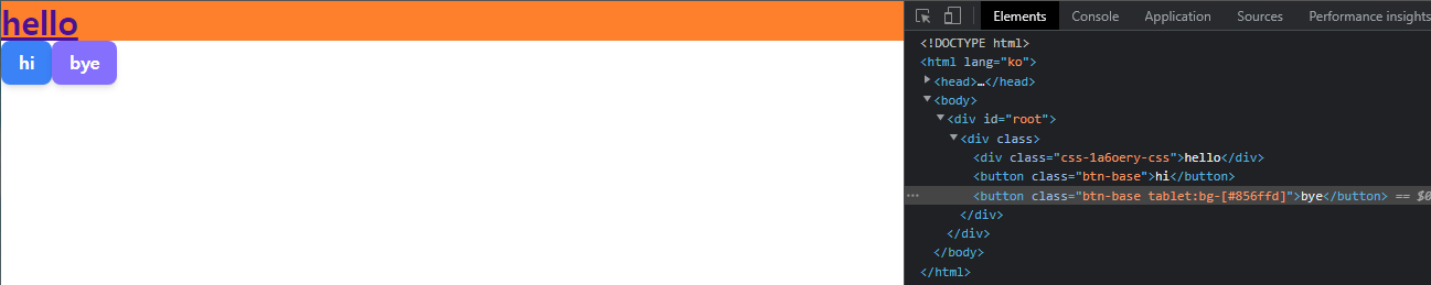
버튼이 잘 생성되었다.
2. 커스텀 plugin 추가하기
tailwind에 새 스타일을 css가 아니라 js로 추가하는 것이 plugin이다.
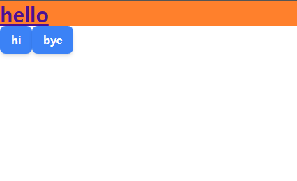
이후에 리팩토링을 쉽게 하기 위해 primary 글자색과 secondary글자색을 만들어 재사용 해보자.
이 코드도 typescript로 작성하고 싶지만 tailwind.config.js에서 불러와서 사용해야하다보니 javascript를 사용해야한다.
css에 관여하는 부분이니 css폴더에 tailwind.js를 만들자.
// ./public/css/tailwind.js

const plugin = require('tailwindcss/plugin');

const color = plugin(({ addUtilities }) => {
    addUtilities({
        ".text-primary": {
            color: "#4c1192",
        },
        ".text-secondary": {
            color: "#212529",
        },
    });
});
module.exports = {color};
그리고 플러그인을 tailwind.config.js에 적용한다.
// tailwind.config.js

/** @type {import('tailwindcss').Config} */
const {color} = require('./public/css/tailwind')

module.exports = {
    content: ["./src/**/*.{js,jsx,ts,tsx}"],
    theme: {
        extend: {},
    },
    plugins: [color],
};
확인을 위해 Page_Home.tsx파일을 수정해보자
// ./src/pages/Page_Home.tsx
...
const Home = () => {
    return (
        <div className="">
            <div
                css={[
                    tw`text-3xl font-bold underline text-primary`,
                    css`
                        background: #ff802c;
                    `,
                ]}
            >
...
글자 색이 잘 변경된 것을 확인할 수 있을 것이다.
3. 반응형 설정하기
tailwind는 기본적으로 반응형을 위한 @media (min-width) 스타일을 제공한다.

적용된 반응형 스타일은 해당 중단점 이상에서 적용된 상태로 유지된다.
<div class="md:bg-white">
  <!-- ... -->
</div>
위 코드는 md(768px) 이상에서 배경을 흰색으로 만든다.
범위를 지정하고 싶다면 max-*을 사용한다.
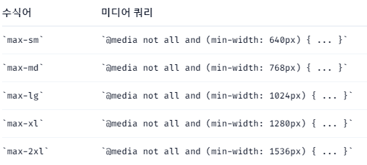
<div class="md:max-xl:bg-black">
  <!-- ... -->
</div>
위 코드는 md~xl(768px~1280px) 범위에서 배경을 흰색으로 만든다.
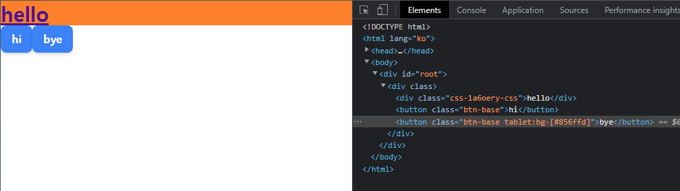
tailwind.config.js에서 사이즈를 수정할 수 있다.
// tailwind.config.js

/** @type {import('tailwindcss').Config} */
const {color} = require('./public/css/tailwind')
const defaultTheme = require('tailwindcss/defaultTheme')

module.exports = {
    content: ["./src/**/*.{js,jsx,ts,tsx}"],
    theme: {
        screens: {
            ...defaultTheme.screens,
            '3xl': '1600px',
            'tablet': '640px',
            // => @media (min-width: 640px) { ... }
        }
    },
    plugins: [color],
};
기존값을 가져와서 쓸 수도 있고 다른 이름을 사용해 새 중단점을 추가할 수도 있다.
확인을 위해 Page_Home.tsx파일을 수정해보자
// ./src/pages/Page_Home.tsx
...
const Home = () => {
    return (
      	...
            <button className="btn-base tablet:bg-[#856ffd]">bye</button>
		...
	...
이렇게 하면 스크린 사이즈에 따라 bye 버튼의 컬러가 변하는 것을 확인할 수 있다.
코드 링크:
https://github.com/hokim2407/react-typescript/tree/7b3382670bb6460373905a3ae8915b58ed247de2