💡 발단
Udemy 강의를 듣던 중 relaxer app이라는 프로그램이 작동하는 원리를 보고 이 원리를 이용하면 시계를 만들 수 있지 않을까 생각했다.
🐱🏍 프로젝트 시작
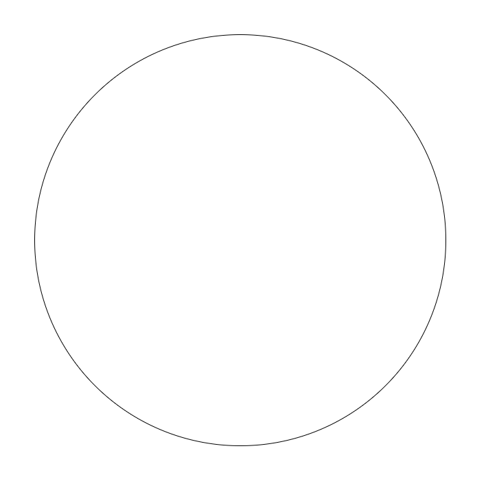
✔ 원 만들기
index.html
<div class="container">
  <div id="circle1" class="circle1"></div>
</div>
style.css
* {
  box-sizing: border-box;
}

body {
  display: flex;
  justify-content: center;
  align-items: center;
  min-height: 100vh;
  margin: 0;
}

.container {
  position: relative;
  width: 600px;
  height: 600px;
}

.circle1 {
  width: 100%;
  height: 100%;
  border: 1px solid black;
  border-radius: 50%;
}
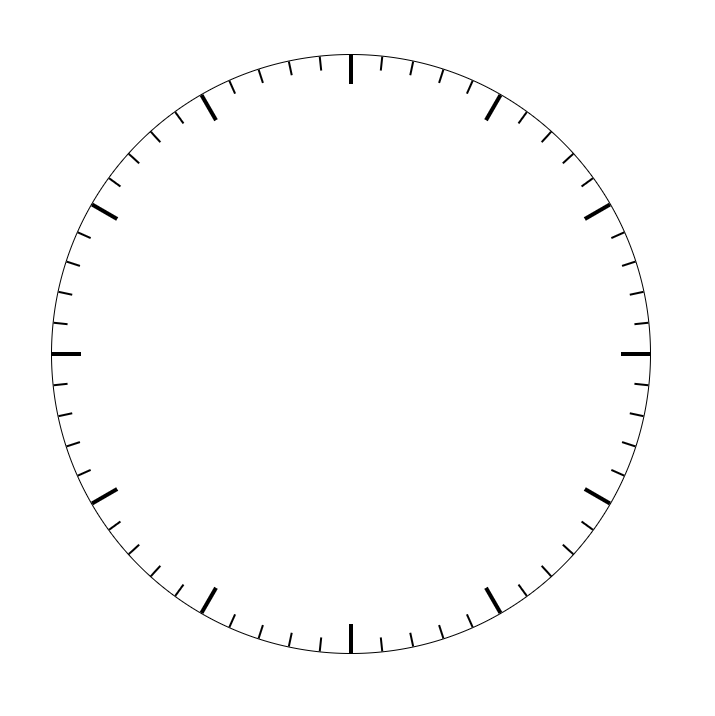
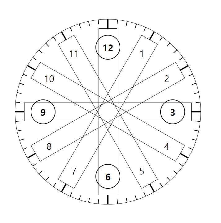
✔ 눈금 만들기
원을 그렸으니 눈금을 그려야 했는데 원하는 위치에 눈금을 그릴 방법이 막막했다.
아이디어를 얻었던 강의에서는 conic gradient를 사용해서 구역을 나누는 방법을 사용했는데 conic gradient는 색으로 경계를 구분하는 방법이기 때문에 내가 원하는 선으로 구역을 나누는 방법에 적합하지 않았다.
여러가지 방법을 검색해 보다가 원하는 결과를 얻지 못해서 잘 알지 못하는 svg나 canvas를 이용해서 그려봐야 되나 싶던 와중에 내가 필요로 하던 정보를 얻었다.
단순히 div를 만들고 rotate를 이용해서 원하는 각도로 돌리면 된다.
style.css
.circle1 .line {
  position: absolute;
  width: 598px;
  background-color: black;
}

.circle1 .line.thick {
  top: calc(50% - 2px);
  height: 4px;
  z-index: 1;
}

.circle1 .line.thin {
  top: calc(50% - 0.5px);
  height: 1px;
}
script.js
const circle_1 = document.getElementById('circle1');

// 눈금 그리기
for (let i = 0; i < 30; i++) {
  const line = document.createElement('div');
  line.classList.add('line');
  line.style.transform = `rotate(${6 * i}deg)`;
  if (i % 5) {
    line.classList.add('thin');
  } else {
    line.classList.add('thick');
  }
  circle_1.appendChild(line);
}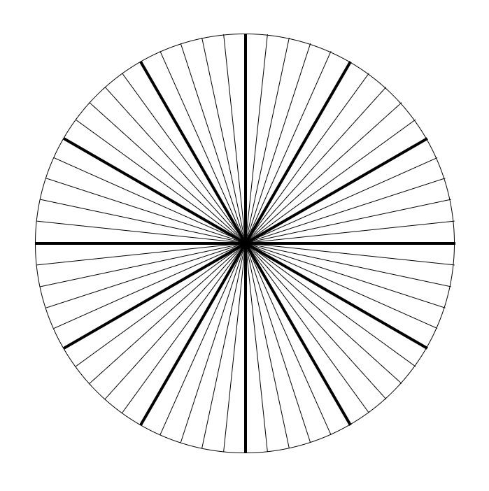
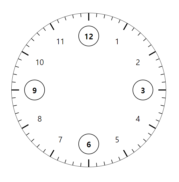
맨 뒤에 위치할 circle1을 만들고 나면 그 위를 덮을 원을 두 개 더 만들어서 크기와 z-index를 이용해서 눈금의 길이를 조절한다.
index.html
<div class="container">
  <div id="circle1" class="circle1"></div>
  <div class="circle2"></div>
  <div id="circle3" class="circle3"></div>
</div>
style.css
.circle2 {
  position: absolute;
  top: 50%;
  left: 50%;
  width: 95%;
  height: 95%;
  background-color: #ffffff;
  border-radius: 50%;
  transform: translate(-50%, -50%);
}

.circle3 {
  position: absolute;
  top: 50%;
  left: 50%;
  width: 90%;
  height: 90%;
  background-color: #ffffff;
  border-radius: 50%;
  transform: translate(-50%, -50%);
  z-index: 2;
}
✔ 숫자 넣기
style.css
.num-container {
  position: absolute;
  top: calc(50% - 30px);
  display: flex;
  justify-content: space-between;
  align-items: center;
  width: 100%;
  height: 60px;
  padding: 0 20px;
  transform-origin: center 30px;
}

.num {
  display: flex;
  justify-content: center;
  align-items: center;
  width: 60px;
  height: 60px;
  font-size: 30px;
}

.num.highlight {
  width: 80px;
  height: 80px;
  border: 2px solid black;
  border-radius: 50%;
  font-size: 30px;
  font-weight: bold;
}
script.js
let right = 3;
let left = 9;

for(let i = 0; i < 6; i++) {
  const num_container = document.createElement('div');
  num_container.classList.add('num-container');
  num_container.style.transform = `rotate(${30 * i}deg)`;
  num_container.innerHTML = `
    <div class="num ${i === 0 || i === 3 ? 'highlight' : ''}"
      style="transform: rotate(-${30 * i}deg)">${left > 12 ? left - 12 : left}</div>
    <div class="num ${i === 0 || i === 3 ? 'highlight' : ''}"
      style="transform: rotate(-${30 * i}deg)">${right}</div>
  `;
  circle_3.appendChild(num_container);
  right++;
  left++;
}
숫자를 위치 시키는 방법을 한참 고민하다가 눈금을 만들었던 과정과 같은 방법으로 해결했다.
양쪽에 숫자를 가지는 num-container를 만들고 30도씩 회전시킨다.
num-container가 회전하면 숫자도 회전하므로 숫자는 -30도 회전하도록 한다.
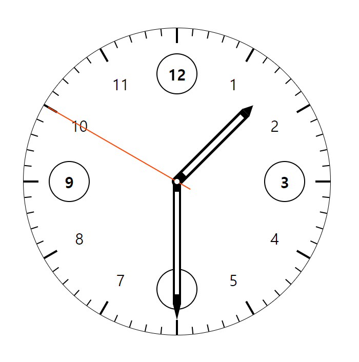
✔ 바늘 만들기
transform-origin
애니메이션을 적용하는 대상에 transform-origin 속성으로 애니메이션을 실행할 기준점을 정할 수 있다.
시침, 분침, 초침이 회전하는 기준점이 내가 원하는 곳이 아니어서 어떻게 해결하면 될지 검색하다가 transform-origin 속성을 알게 되었는데 대상 요소 내부에서 기준점으로 정할 x좌표, y좌표를 정한다고 생각하면 될 것 같다.
x좌표, y좌표에 더해서 z좌표도 있는데 나중에 활용하면 유용하게 쓸 수 있을 것 같다.
CSS로 삼각형 만들기
The Shapes of CSS | CSS-Tricks
시침, 분침의 끝 부분을 뾰족하게 만들고 싶었는데 네모난 div를 자체적으로 뾰족하게 깎는 방법은 찾지 못하고 ::before 선택자에 같은 너비의 삼각형을 만들어서 시침과 분침에 연결했다.
index.html
<div class="container">
  ...
  <div id="hour-hand" class="hour-hand">
    <div class="white-space"></div>
  </div>
  <div id="minute-hand" class="minute-hand">
    <div class="white-space"></div>
  </div>
  <div id="second-hand" class="second-hand"></div>
  <div class="center"></div>
</div>
style.css
.hour-hand {
  position: absolute;
  bottom: calc(50% - 10px);
  left: calc(50% - 10px);
  display: flex;
  flex-direction: column;
  justify-content: flex-end;
  align-items: center;
  width: 20px;
  height: 200px;
  background-color: #000000;
  border-bottom-left-radius: 10px;
  border-bottom-right-radius: 10px;
  transform: rotate(45deg);
  transform-origin: center 190px;
  z-index: 3;
}

.hour-hand::before {
  content: '';
  position: absolute;
  top: -20px;
  width: 0;
  height: 0;
  border-right: 10px solid transparent;
  border-bottom: 20px solid black;
  border-left: 10px solid transparent;
}

.minute-hand {
  position: absolute;
  bottom: calc(50% - 10px);
  left: calc(50% - 8px);
  display: flex;
  flex-direction: column;
  justify-content: flex-end;
  align-items: center;
  width: 16px;
  height: 250px;
  background-color: #000000;
  border-bottom-left-radius: 10px;
  border-bottom-right-radius: 10px;
  transform: rotate(180deg);
  transform-origin: center 240px;
  z-index: 3;
}

.minute-hand::before {
  content: '';
  position: absolute;
  top: -30px;
  width: 0;
  height: 0;
  border-right: 8px solid transparent;
  border-bottom: 32px solid black;
  border-left: 8px solid transparent;
}

.second-hand {
  position: absolute;
  bottom: calc(50% - 30px);
  left: calc(50% - 1px);
  width: 2px;
  height: 320px;
  background-color: orangered;
  transform: rotate(300deg);
  transform-origin: center 290px;
  z-index: 3;
}

.white-space {
  width: 50%;
  height: 80%;
  margin-bottom: 30px;
  background-color: #ffffff;
}

.center {
  position: absolute;
  top: calc(50% - 5px);
  left: calc(50% - 5px);
  width: 10px;
  height: 10px;
  background-color: #ffffff;
  border-radius: 50%;
  z-index: 4;
}
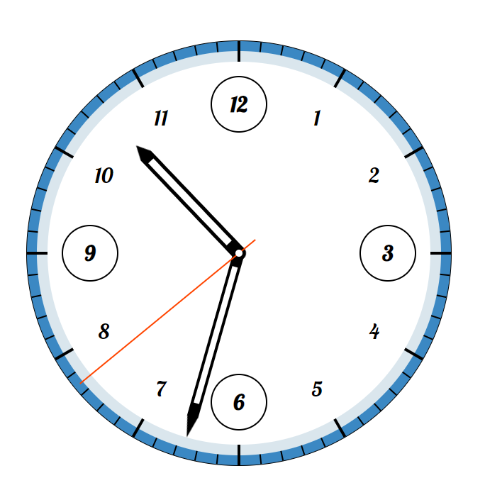
✔ 바늘 회전시키기
우선 바늘들의 모습을 확인하기 위해서 각 속성에 적용했던 transform:rotate() 속성들을 지우고
바늘들을 어떻게 회전시킬지 오래 고민하다가 내린 결론은 Date 객체로 현재 시간을 받아서 바늘들의 현재 위치만 정해주면 애니메이션의 duration값에 따라서 바늘들이 속도를 달리해서 움직일 수 있겠다는 거였다.
그러기 위해선 애니메이션의 from값과 to값에 javascript로 값을 대입해야 했는데 애니메이션을 javascript로 조작 가능한지 몰랐다.
문서를 읽어보니 Element.animate()를 이용해서 애니메이션을 설정할 수 있다는 걸 확인하고 적용했다.
각도 계산하는 것도 단위 변환등 고려해야 될게 많았다... 헷갈려서 각도 구하는 것만 하루종일 잡고 있었던 것 같다...
script.js
const hour = document.getElementById('hour-hand');
const minute = document.getElementById('minute-hand');
const second = document.getElementById('second-hand');
const date = new Date();
// 시침, 분침, 초침 현재 위치 각도 계산
const secDeg = (360 * (date.getSeconds() / 60)) + (6 * (date.getMilliseconds() / 1000));
const minDeg = (360 * (date.getMinutes() / 60)) + (6 * (secDeg / 360));
const hourDeg = (360 * (date.getHours() / 12)) + (30 * (minDeg / 360));
// 시침, 분침, 초침 rotate 적용 함수
function rotateAnimation(hand, duration, deg) {
hand.animate([
{ transform: `rotate(${deg}deg)` },
{ transform: `rotate(${deg + 360}deg)` }
], {
duration: duration,
iterations: Infinity
});
}
rotateAnimation(hour, 43200000, hourDeg);
rotateAnimation(minute, 3600000, minDeg);
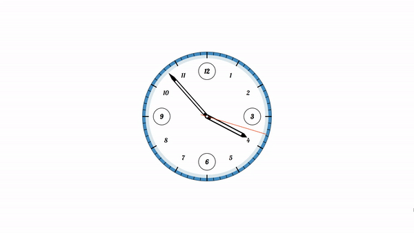
rotateAnimation(second, 60000, secDeg);🚩 완성
🤔 후기
그리기에 특화된 것 같은 svg나 canvas를 이용하면 좀 더 손쉬운 방법으로 만들 수 있지 않았을까...
시계를 만들었으니 이 프로젝트를 활용해서 알람, 스탑워치, 세계시간 같은 기능도 추가할 수 있지 않을까...
코딩 하는데 수학 중요하지 않다던 사람들 그거 다 거짓말이야...
일단 완성했으니 뿌듯하다
개선할 부분, 참고할 자료 등등 피드백 환영합니다~


우와...감동 받고 갑니다 🐥