Flutter에서 값을 입력하는 필드가 바로 TextField와 TextFormField입니다.
TextField를 아웃라인, 언더라인, 무라인(?)으로 설정을 할때마다 InputDecoration이라는 함수를 사용하고 그 안에서 color 설정하고, 언더라인, 아웃라인 ... 등등을 설정해야 하는데 코드가 너무 길어지고 손도 아프죠?
그걸 조금이나마 낫게 해드리고 싶어서 위젯을 한번 만들어 봤어요!
1. enum TextFieldType
- outline
- 초기 radius는 10으로 설정되있으니 바꾸면서 사용하시면 될거예요~
CustomTextField(textFieldType: TextFieldType.outline)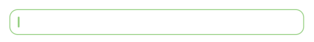
- none
CustomTextField(textFieldType: TextFieldType.none)
- underline
CustomTextField(textFieldType: TextFieldType.underline)
enum TextFieldType { outline, none, underline }CustomTextField의 타입을 설정을 도와줍니다.
2. Widget CustomTextField
전체 코드
class CustomTextField extends StatelessWidget {

  final TextEditingController? controller;
  final TextInputType? keyboardType;
  final TextInputAction? textInputAction;
  final TextStyle? textStyle;
  final TextAlign? textAlign;
  final bool? autofocus;
  final bool? obscureText;
  final bool? readOnly;
  final bool? enabled;
  final int? maxLength;
  final int? maxLines;
  final int? minLines;
  final double? height;
  final double? width;
  final double? borderRadius;
  final String? hintText;
  final String? labelText;
  final String? counterText;
  final String? helperText;
  final Widget? suffixIcon;
  final Widget? prefixIcon;
  final Alignment? alignment;
  final EdgeInsets? margin;
  final EdgeInsets? padding;
  final EdgeInsets? contentPadding;
  final Color? cursorColor;
  final Color? sideColor;
  final Color? fillColor;
  final List<TextInputFormatter>? inputFormatters;
  final Function()? onTap;
  final Function(String value)? onFieldSubmitted;
  final Function(String)? onChanged;
  final String? Function(String?)? validator;
  final TextFieldType textFieldType;

  const CustomTextField({Key? key,
    required this.textFieldType,
    this.controller,
    this.keyboardType,
    this.textInputAction,
    this.textAlign,
    this.textStyle,
    this.autofocus,
    this.obscureText,
    this.readOnly,
    this.enabled,
    this.maxLength,
    this.maxLines,
    this.minLines,
    this.height,
    this.width,
    this.borderRadius,
    this.hintText,
    this.labelText,
    this.counterText,
    this.helperText,
    this.suffixIcon,
    this.prefixIcon,
    this.alignment,
    this.margin,
    this.padding,
    this.contentPadding,
    this.cursorColor,
    this.sideColor,
    this.fillColor,
    this.inputFormatters,
    this.onTap,
    this.onFieldSubmitted,
    this.onChanged,
    this.validator}) : super(key: key);
  @override
  Widget build(BuildContext context) {

    InputBorder _border(textFieldType){
      switch(textFieldType){
        case TextFieldType.underline: return UnderlineInputBorder(
            borderSide: BorderSide(color: sideColor ?? Colors.blue)
        );
        case TextFieldType.outline: return OutlineInputBorder(
            borderRadius: BorderRadius.circular(borderRadius ?? 10),
            borderSide: BorderSide(color: sideColor ?? Colors.blue)
        );
        default: return InputBorder.none;
      }
    }

    EdgeInsets _contentPadding(textFieldType){
      switch(textFieldType){
        case TextFieldType.underline: return contentPadding ?? const EdgeInsets.symmetric(vertical: 30);
        case TextFieldType.outline: return contentPadding ?? const EdgeInsets.symmetric(horizontal: 30, vertical: 15);
        default: return contentPadding ?? const EdgeInsets.symmetric(horizontal: 30);
      }
    }

    return Container(
      width: width,
      height: height,
      alignment: alignment ?? Alignment.center,
      margin: margin,
      padding: padding,
      child: TextFormField(
        validator: validator,
        enabled: enabled,
        textInputAction: textInputAction,
        style: textStyle,
        onTap: onTap,
        onFieldSubmitted: onFieldSubmitted,
        onChanged: onChanged,
        readOnly: readOnly ?? false,
        inputFormatters: inputFormatters,
        textAlign: textAlign ?? TextAlign.start,
        autofocus: autofocus ?? true,
        cursorColor: cursorColor,
        obscureText: obscureText ?? false,
        controller: controller,
        maxLength: maxLength,
        maxLines: maxLines ?? 1,
        minLines: minLines,
        keyboardType: keyboardType,
        decoration: InputDecoration(
          isDense: true,
          focusColor: Colors.green,
          filled: true,
          fillColor: fillColor ?? Colors.white,
          hintText: hintText,
          labelText: labelText,
          counterText: counterText ?? '',
          helperText: helperText,
          prefixIcon: prefixIcon,
          suffixIcon: suffixIcon,
          contentPadding: _contentPadding(textFieldType),
          border: _border(textFieldType),
          enabledBorder: _border(textFieldType).copyWith(borderSide: BorderSide(color: sideColor ?? Colors.grey, width: 1)),
          disabledBorder: _border(textFieldType).copyWith(borderSide: const BorderSide(color: Colors.grey, width: 1)),
          focusedBorder: _border(textFieldType),
        ),
      ),
    );
  }
}
필요에 따라 parameters나 arguments를 추가 및 제거 해서 사용하시면 되요 ~
고수분들은 위젯을 자주 만들어 쓰셔서 생소할 수 있겠지만 초보자분들을 위해서 최대한 편하게 코딩할 수 있도록 만들어 봤어요 ~❗️

Short code for the most efficient way...
자주 쓰진 않을 것 같지만 유용한 거 같아요 🥳