Flutter 에서 디바이스 크기에 따라 width나 height를 잡아주는 class가 바로 MediaQuery입니다.
사용 방법은 아래와 같습니다.
첫번째 사진 코드
class Example extends StatelessWidget {
  const Example({Key? key}) : super(key: key);
  @override
  Widget build(BuildContext context) {
    return Scaffold(
      body: Container(
        color: Colors.red,
        height: MediaQuery.of(context).size.height,
        width: MediaQuery.of(context).size.width,
      ),
    );
  }
}
두번째 사진 코드
class Example extends StatelessWidget {
  const Example({Key? key}) : super(key: key);
  @override
  Widget build(BuildContext context) {
    return Scaffold(
      body: Container(
        color: Colors.red,
        height: MediaQuery.of(context).size.height / 2,
        width: MediaQuery.of(context).size.width / 2,
      ),
    );
  }
}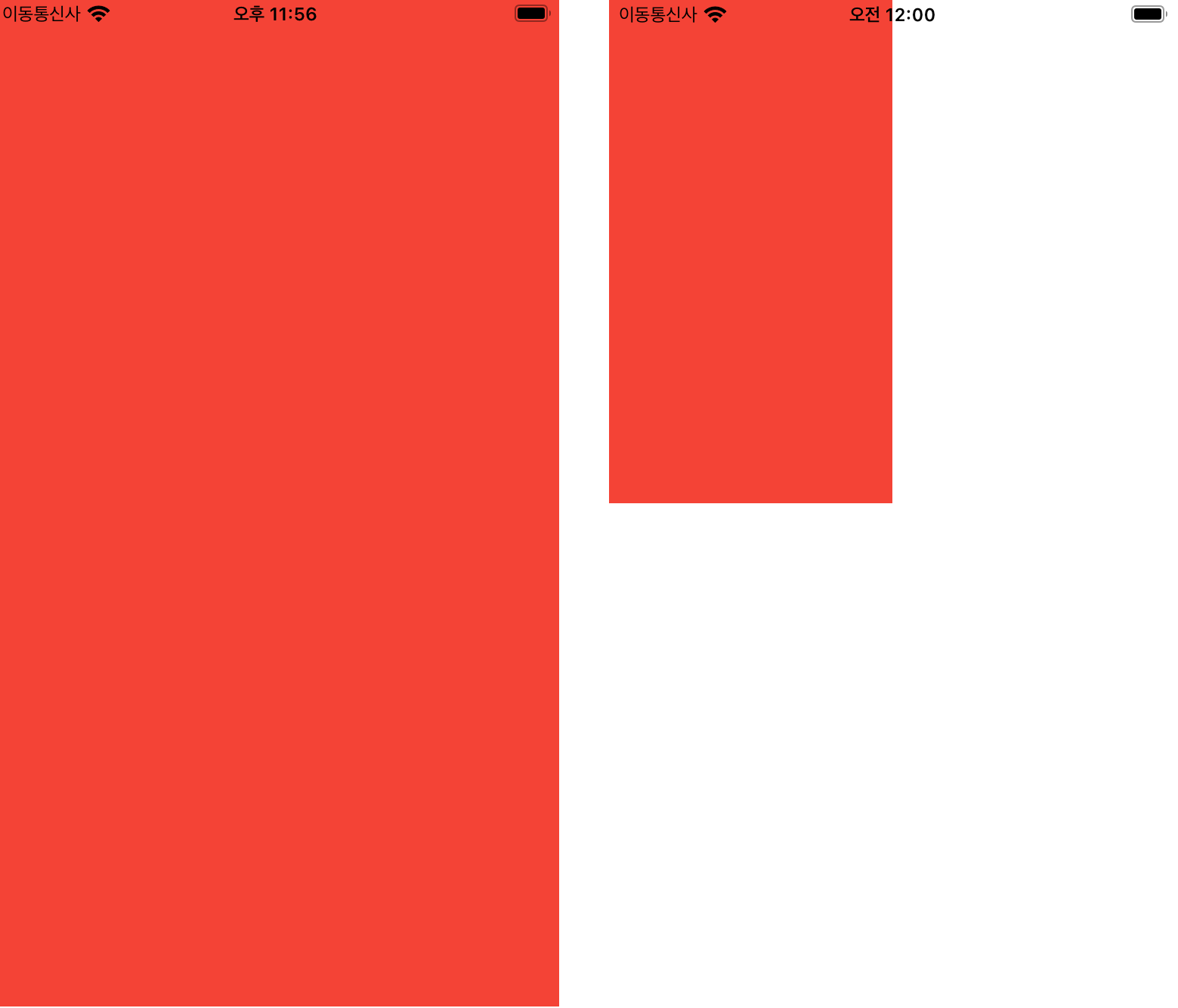
디바이스 height, width 크기의 1/2 정도만 차지하게끔 했습니다.
하지만 매번 디바이스 크기별로 불러오려고 MediaQuery.of(context).size.~를 쓰기에는 코드도 너무 길고 코드도 지저분해 보이죠 ㅠㅠ
중~고수분들은 비슷하게 사용하실테지만 초보자분들을 위해 자주 쓰는 제 함수를 보여드릴게요!
1. 미디어쿼리 높이를 잡아주는 함수
double mediaHeight(BuildContext context, double scale) => MediaQuery.of(context).size.height * scale;2. 미디어쿼리 넓이를 잡아주는 함수
double mediaWidth(BuildContext context, double scale) => MediaQuery.of(context).size.width * scale;위에 두개의 코드를 그대로 가져다 쓰시면 되는데 사용방법은 간단해요!
1을 기준으로 디바이스 전체 사이즈예요!
scale 값에 0.1을 넣게 되면 디바이스 전체 사이즈의 1/10이 되겠죠 ~?
첫번째 사진 코드
class Example extends StatelessWidget {
  const Example({Key? key}) : super(key: key);
  @override
  Widget build(BuildContext context) {
    return Scaffold(
      body: Container(
        color: Colors.red,
        height: mediaHeight(context, 1),
        width: mediaWidth(context, 1),
      ),
    );
  }
}
두번째 사진 코드
class Example extends StatelessWidget {
  const Example({Key? key}) : super(key: key);
  @override
  Widget build(BuildContext context) {
    return Scaffold(
      body: Container(
        color: Colors.red,
        height: mediaHeight(context, 0.5),
        width: mediaWidth(context, 0.5),
      ),
    );
  }
}
이상 미디어 쿼리에 대해서 알아봤습니다!

Short code for the most efficient way...
플러터 고수시네요!🥺