GridView
return Scaffold(
      appBar: AppBar(
        backgroundColor: Colors.blue,
        title: const Text('Assignment 3'),
        actions: [
          IconButton(onPressed: (){}, icon: const Icon(Icons.add)) ,
          IconButton(onPressed: (){}, icon: const Icon(Icons.search)),
          IconButton(onPressed: (){}, icon: const Icon(Icons.person))// appbar 오른쪽에 플러스 버튼
        ],
      ),
      body:

        // 아래는 GridView이다. 내가 설정한 행의 개수에 따라서 그리드 형식의 뷰를 볼 수 있다.
      GridView.count(
        crossAxisCount: 3,  // column을 몇개를 할 것이냐
        children: [
          Container(
            color: Colors.red,
            width: 100,
            height: 100,
            padding: EdgeInsets.all(8.0),
            margin: EdgeInsets.all(8.0),
          )
        ],
      ),
    );
PageView
return Scaffold(
      appBar: AppBar(
        backgroundColor: Colors.blue,
        title: const Text('Assignment 3'),
        actions: [
          IconButton(onPressed: (){}, icon: const Icon(Icons.add)) ,
          IconButton(onPressed: (){}, icon: const Icon(Icons.search)),
          IconButton(onPressed: (){}, icon: const Icon(Icons.person))// appbar 오른쪽에 플러스 버튼
        ],
      ),
      body:

        // 아래는 PageView, children으로 넣은 page를 좌우 스크롤을 통해 볼 수 있다.
      PageView(
        children: [
          Container(
            color: Colors.red,
          ),
          Container(
            color: Colors.blue,
          ),
          Container(
            color: Colors.green,
          )
        ],
      )
);- 위의 코드를 적용하여 좌우 스크롤을 통한 화면 전환이 가능하다.
- 이때 Tab bar를 사용할 수 있는데 Tab bar를 사용하기 위해서는 Scaffold를 Container로 감싼 후 Container를 DefaultTabController로 변경한다. 이후에 원하는 값으로 length를 설정하면 Tab bar를 사용할 수 있다.
- 추가로 위의 코드에서 TabBar를 적용하기 위해서는 PageView를 TabBarView로 변경해야 한다.
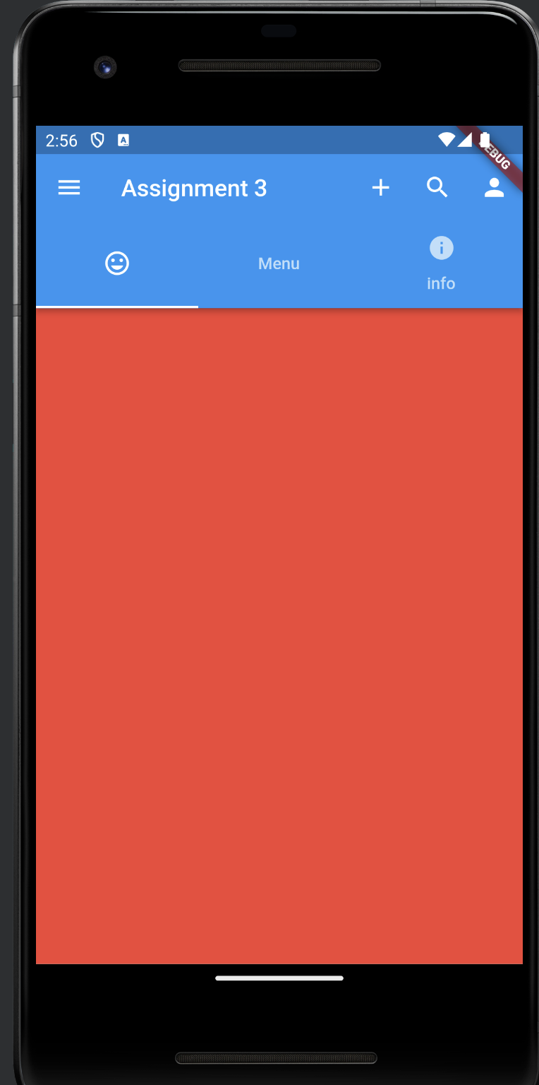
    return DefaultTabController(
      length: 3,
      child: Scaffold(
        appBar: AppBar(
          backgroundColor: Colors.blue,
          title: const Text('Assignment 3'),
          actions: [
            IconButton(onPressed: (){}, icon: const Icon(Icons.add)) ,
            IconButton(onPressed: (){}, icon: const Icon(Icons.search)),
            IconButton(onPressed: (){}, icon: const Icon(Icons.person))// appbar 오른쪽에 플러스 버튼
          ],
          bottom: const TabBar(
            tabs: [
              Tab(icon: Icon(Icons.tag_faces)),
              Tab(text: 'Menu',),
              Tab(icon: Icon(Icons.info), text: 'info',)
            ],
          ),
        ),
        body:

          // 아래는 PageView, children으로 넣은 page를 좌우 스크롤을 통해 볼 수 있다.
        TabBarView(
          children: [
            Container(
              color: Colors.red,
            ),
            Container(
              color: Colors.blue,
            ),
            Container(
              color: Colors.green,
            )
          ],
        ),
        drawer: const Drawer(),
      ),
);- 위의 코드에서 appBar의 bottom에 TabBar를 추가하였다.
- 위의 코드를 실행하면 다음과 같은 앱이 만들어진다.
하단 네비게이션바 추가하기
- 위의 코드에서 Scaffold의 하단에 navigationbar를 추가해준다
        bottomNavigationBar: BottomNavigationBar(
          items: const [
            BottomNavigationBarItem(icon: Icon(Icons.home), label: 'Home'),
            BottomNavigationBarItem(icon: Icon(Icons.person), label: 'Profile'),
            BottomNavigationBarItem(icon: Icon(Icons.notifications), label: 'Notification'),
          ],
        ),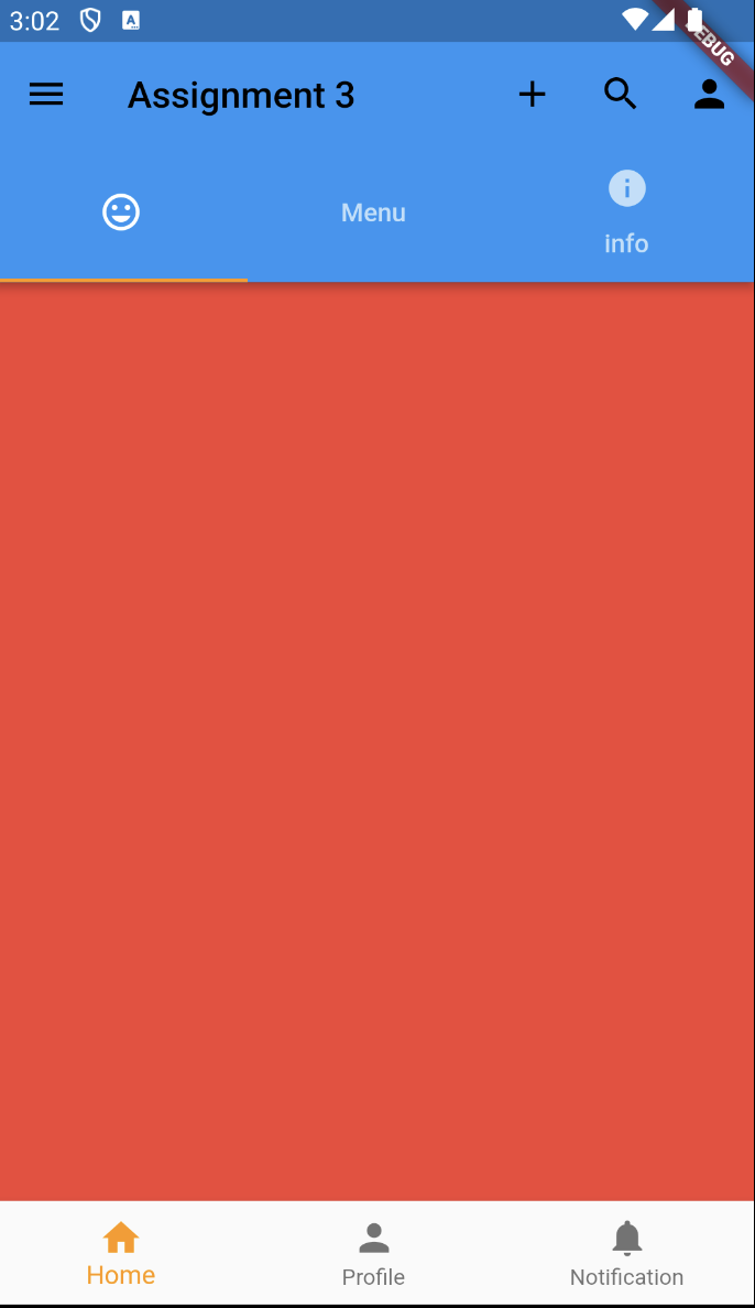
- Home 버튼이 노랗게 보이는 것은 MyApp 클래스에서 primarySwatch: Colors.orange 속성 때문에 적용된 것
Container를 좀 더 다루기
- TabBarView의 자식으로 있는 Container를 Widget으로 감싸고 Tab으로 변경
- 이렇게 하면 width, height 같은 속성을 적용하여 내용물을 조작할 수 있게 된다.
        TabBarView(
          children: [
            Tab(
              child: Container(
                color: Colors.red,
                width: 100,
                height: 100,
              ),
            ),
            Container(
              color: Colors.blue,
            ),
            Container(
              color: Colors.green,
            )
          ],
        ),
위치 조정 및 padding 적용하기
- 위의 코드에서 width와 height를 조절하여 크기를 줄였는데 만약 크기를 줄인 뷰가 가운데에 위치하지 않는다면 Container를 Center로 감싸면 된다.
- 위의 코드에서 Container는 자체적으로 padding 속성을 가지고 있지만 만약 padding 속성을 가지고 있지 않는 뷰에 padding을 적용하고 싶다면 Padding으로 감싸면 된다.
        TabBarView(
          children: [
            Tab(
              child: Column(
                children: [
                  Padding(
                    padding: const EdgeInsets.all(8.0),
                    child: Container(
                      color: Colors.red,
                      width: 100,
                      height: 100,
                    ),
                  ),
                  Padding(
                    padding: const EdgeInsets.all(8.0),
                    child: Container(
                      color: Colors.red,
                      width: 100,
                      height: 100,
                    ),
                  ),
                ],
              ),
            ),
            Container(
              color: Colors.blue,
            ),
            Container(
              color: Colors.green,
            )
          ],
        ),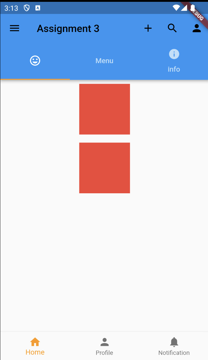
padding 속성 값 조절하기
- EdgeInsets.all(8.0) 이렇게 padding을 적용하고 있는데 이것을 all 대신 fromLTRB를 적용해서 EdgeInsets.fromLTRB(1.0, 2.0, 3.0, 4.0) 이렇게 사용하는 것도 가능. 순서는 왼쪽, 위, 오른쪽, 아래
- only를 사용하면 left, top 이렇게 원하는 대로 설정할 수 있음
위치 조정하기
- 원하는 위치에 내용물을 위치시키고 싶을 때 Container를 Widget으로 감싸고 Align로 변경 및 alignment 속성값으로 위치를 조정
TabBarView(
children: [
Tab(
child: Align(
alignment: Alignment.centerLeft,
child: Container(
color: Colors.red,
width: 100,
height: 100,
),
),
),
Container(
color: Colors.blue,
),
Container(
color: Colors.green,
)
],
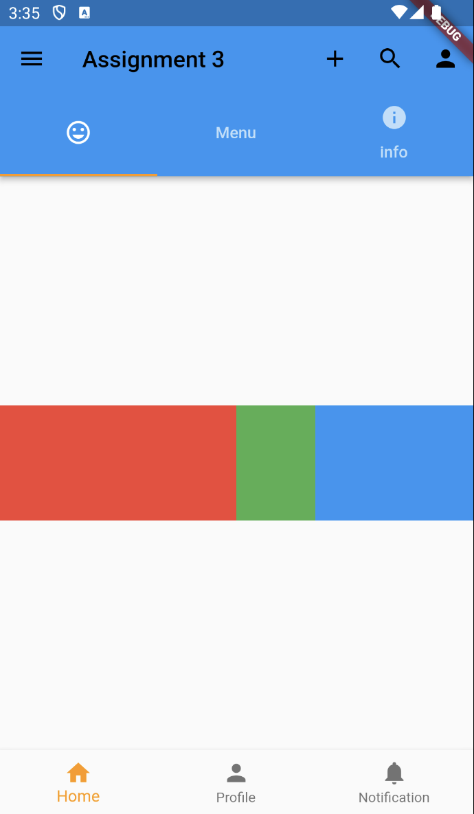
),아이템의 크기를 동적으로 조절하기
- 고정값을 가지는 아이템은 width와 height에 값을 주어 고정시키고 남은 아이템들은 비율에 따라 조절하거나 남는 공간을 꽉 채우게 하는 등 상황에 따라 조절할 수 있다.
- Container를 Widget으로 감싼 후 Widget을 Expended로 변경한다. 이렇게 되면 알아서 비어있는 공간을 채우도록 크기가 조절된다. Expanded가 적용된 아이템이 두개라면 동일한 비율로 크기가 조절됨.
- 내가 원하는 비율을 적용하기 위해서는 flex 속성을 추가하여 조절할 수 있음
        TabBarView(
          children: [
            Tab(
              child: Row(
                children: [
                  Expanded(
                    flex: 3,
                    child: Container(
                      color: Colors.red,
                      width: 100,
                      height: 100,
                    ),
                  ),
                  Expanded(
                    flex: 1,
                    child: Container(
                      color: Colors.green,
                      width: 100,
                      height: 100,
                    ),
                  ),
                  Expanded(
                    flex: 2,
                    child: Container(
                      color: Colors.blue,
                      width: 100,
                      height: 100,
                    ),
                  ),
                ],
              ),
            ),
            Container(
              color: Colors.blue,
            ),
            Container(
              color: Colors.green,
            )
          ],
        ),
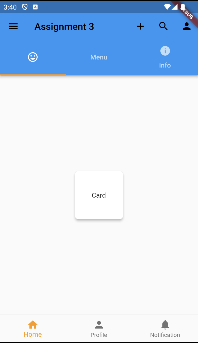
Card 만들어보기
        TabBarView(
          children: [
            Tab(
              child: Card(
                shape: RoundedRectangleBorder(
                  borderRadius: BorderRadius.circular(8.0),
                ),
                elevation: 4.0,
                child: Container(
                  width: 100,
                  height: 100,
                  child: Center(child: Text('Card')),
                ),
              )
            ),
            Container(
              color: Colors.blue,
            ),
            Container(
              color: Colors.green,
            )
          ],
        ),
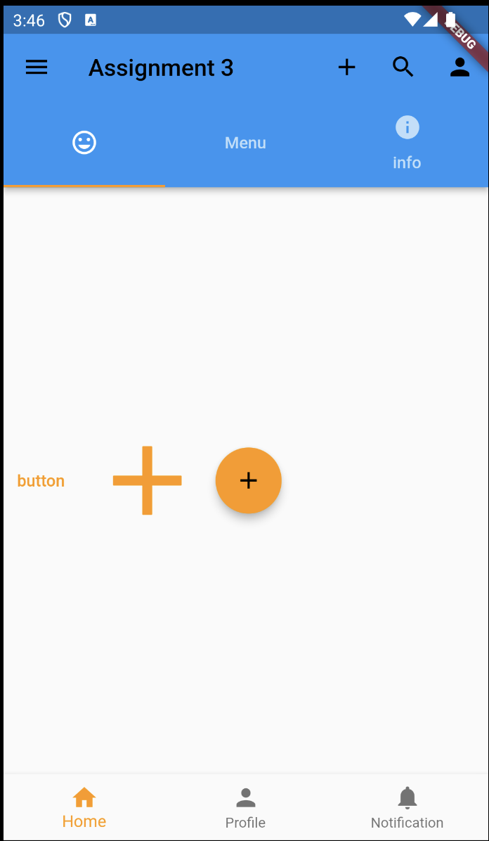
버튼 만들어보기
        TabBarView(
          children: [
            Tab(
              child: Row(
                children: [
                  TextButton(
                    onPressed: (){},
                    child: Text('button'),
                  ),
                  IconButton(
                    onPressed: (){},
                    icon: Icon(Icons.add),
                  iconSize: 100,
                  color: Colors.orange,),
                  FloatingActionButton(
                    onPressed: (){},
                    child: Icon(Icons.add),
                  )
                ],
              )
            ),
            Container(
              color: Colors.blue,
            ),
            Container(
              color: Colors.green,
            )
          ],
        ),
로딩 화면 만들어보기
        TabBarView(
          children: [
            Tab(
              child: CircularProgressIndicator()
            ),
            Container(
              color: Colors.blue,
            ),
            Container(
              color: Colors.green,
            )
          ],
), TabBarView(
children: [
Tab(
child: LinearProgressIndicator()
),
Container(
color: Colors.blue,
),
Container(
color: Colors.green,
)
],
),
안녕하세요.