앞에서 구현한 프로젝트에 스티키 헤더 지원을 추가하고, 스크롤 식별을 이용해 사용자가 지정한 거리 이상으로 리스트를 스크롤했을 때, "맨 처음으로 이동하기" 버튼이 표시되도록 확장한다.
리스트 아이템 데이터 그룹핑
@Composable
fun MainScreen(itemArray: Array<out String>) {

    val context = LocalContext.current
    val groupedItems = itemArray.groupBy { it.substringBefore(' ') }
	.
    .
    .
}
헤더와 아이템 표시하기
리스트 아이템을 그룹핑했으므로 MainScreen의 LazyColumn의 코드를 수정한다.
    LazyColumn() {
        groupedItems.forEach { (manufacturer, models) ->
            stickyHeader {
                Text(
                    text = manufacturer,
                    color = Color.White,
                    modifier = Modifier
                        .background(Color.Gray)
                        .padding(5.dp)
                        .fillMaxWidth()
                )
            }

            items(models) { model ->
                MyCardListItem(item = model, onItemClick = onListItemClick)
            }
        }
    }
스티키 헤더를 표시할 외부 루프를 추가하고 내부 루프에서 각 모델에 대해서 MyCardListItem을 생성한다.
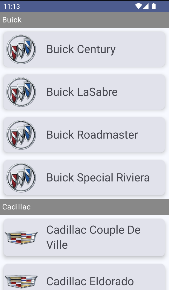
그 후에 코드를 실행하면 다음과 같은 화면이 렌더링된다.
스크롤 위치에 반응하기
리스트의 4번 아이템 이상 스크롤했을 때 리스트의 처음으로 이동하는 버튼이 등장하도록 구현한다. 이 버튼은 화면 맨 아래 LazyColumn 바깥에 배치되며 화면 밖으로 스크롤되지 않아야 한다.
먼저, LazyColumn을 Box 컴포넌트로 감싸주고 리스트 상태 변수와 코루틴 변수를 추가한다. 그 다음으로는 버튼 표시 여부를 나타내는 boolean 변수를 추가한다.
    val listState = rememberLazyListState()
    val coroutineScope = rememberCoroutineScope()
    val displayButton = listState.firstVisibleItemIndex > 5 // 버튼 표시 여부를 나타내는 bool 변수

    Box {
        LazyColumn(
            state = listState,
            contentPadding = PaddingValues(bottom = 40.dp)
        ) {
            groupedItems.forEach { (manufacturer, models) ->
                stickyHeader {
                    Text(
                        text = manufacturer,
                        color = Color.White,
                        modifier = Modifier
                            .background(Color.Gray)
                            .padding(5.dp)
                            .fillMaxWidth()
                    )
                }

                items(models) { model ->
                    MyCardListItem(item = model, onItemClick = onListItemClick)
                }
            }
        }
    }
스크롤 버튼 추가하기
    Box {
        LazyColumn(
            state = listState,
            contentPadding = PaddingValues(bottom = 40.dp)
        ) {
            groupedItems.forEach { (manufacturer, models) ->
                stickyHeader {
                    Text(
                        text = manufacturer,
                        color = Color.White,
                        modifier = Modifier
                            .background(Color.Gray)
                            .padding(5.dp)
                            .fillMaxWidth()
                    )
                }

                items(models) { model ->
                    MyCardListItem(item = model, onItemClick = onListItemClick)
                }
            }
        }

        AnimatedVisibility(visible = displayButton,
            Modifier.align(Alignment.BottomCenter)
        ) {
            OutlinedButton(
                onClick = {
                    coroutineScope.launch {
                        listState.scrollToItem(0)
                    }
                },
                border = BorderStroke(1.dp, Color.Gray),
                shape = RoundedCornerShape(50),
                colors = ButtonDefaults.outlinedButtonColors(
                    contentColor = Color.DarkGray
                ),
                modifier = Modifier.padding(5.dp)
            ) {
                Text("Top")
            }
        }
    }
Box 컴포넌트의 다음 컴포넌트로 OutlinedButton을 추가해준다. OutlinedButton은 테두리가 있는 버튼으로 테두리 굵기, 둥근 모서리와 같은 효과를 함께 이용할 수 있다.
이때 4번 아이템 이상 스크롤한 경우에만 버튼이 보이도록 조건을 추가하기 위해 AnimatedVisibility 컴포저블로 버튼을 감싸준다. 완성한 앱을 실행시키면 다음과 같다.

안녕하세요.