1. Flexbox란?
-
1차원 직선의 형태(행과 열)로 요소들을 정렬하기 위해서 나온 개념
-
컨테이너와 아이템이 함께 있어야 함
-
항목은 부족한 공간에 맞추기 위해 축소되거나 여분의 공간을 채우기 위해 변형됨
2. 용어 - flex container, flex item, main axis, cross axis
-
flex: 부모자식관계가 성립되야 flex개념 도입 가능 -
item은 아이템이자 컨테이너 일 수 있다 -
표(테이블): 2차원, 행과열이 존재 / flexbox: 1차원, 직선정렬에 대한 것
-
main axis: 가로 (좌->우) -
cross axis: 세로 (상->하) -
주축의 방향 변경 가능
3. Container
3-1. display
-
Container 속성 -
요소를 블록과 인라인 요소 중 어느 쪽으로 처리할지와 함께, 플로우, 그리드 , 플렉스처럼 자식 요소를 배치할 때 사용할 레이아웃을 설정함
-
display-outside: block / inline
-
display-inside: flow-root, table, grid, ruby
3-2. flex-direction
-
Container 속성 -
flex container내의 아이템을 배치할 때 사용할 주축 및 방향(정방향, 역방향)을 지정
- 주축의 위치 (수평 / 수직)
- 주축의 방향 (정방향 / 역방향)
-
값
css

.container {
    - flex-direction: row 기본값. 좌 -> 우
    - flex-direction: row-reverse 우 - > 좌
    - flex-direction: column 상 -> 하
    - flex-direction: column-reverse 하 > 상
}
3-3. flex-wrap, flex-flow (shorthand)
Container 속성
1) flex-wrap
- 요소들이 강제로 한줄에 배치되게 할 것인지, 여러행으로 나누어 표현 할 것인지 결정하는 속성
flex-wrap:nowrap
- 기본값
flex-wrap: wrap;
- 자기의 원래 크기를 유지함.
크기 유지못할 시 다음 블록으로 넘어감
flex-wrap: wrap-reverse;
- 시작점과 끝점 변경
.container {
    height: 500px;
    border: 5px dashed orange;
    display: flex;

    /* flex-direction: column; */

    flex-wrap: wrap;

    /* flex-wrap: wrap-reverse; */
}
2) flex-flow (shorthand)
- flex-direction, flex-wrap 속성의 단축 속성
flex-direction: column;
flex-wrap: wrap;
=
flex-flow: column wrap;
4. Item
4-1. order
-
item 속성 -
플렉스 또는 그리드 컨테이너 안에서 현재 요소의 배치 순서를 지정한다
-
직접적으로 html을 수정한게 아니기 때문에 개발자 도구에서는 변화가 없고 단순히 눈에 보일때만 순서가 변경되어 있다.
-
기본값: 0
-
개별 order를 주는 요소의 부모에게 display: flex; 값이 설정되어 있어야 한다.
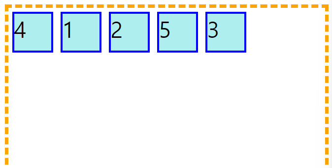
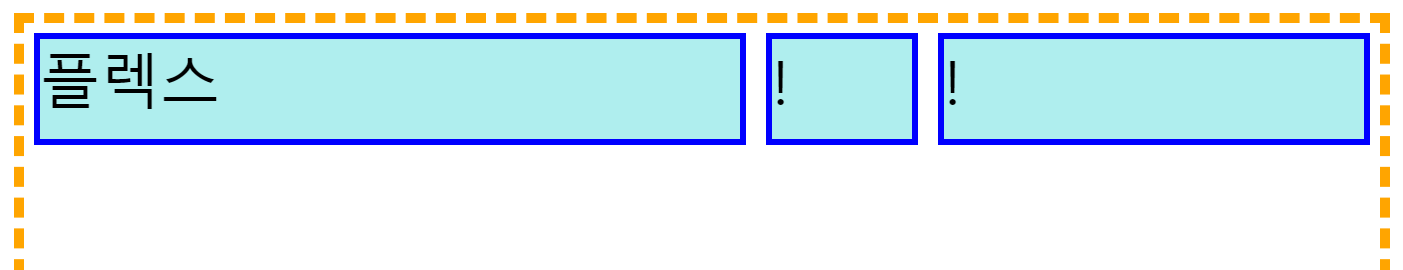
.container {
    height: 500px;
    border: 5px dashed orange;
    display: flex;
}

.item {
    width: 50px;
    height: 50px;
    margin: 5px;
    background-color: paleturquoise;
    border: 3px solid blue;
    font-size: 30px;
}

.item:nth-child(3) {
    order: 1;
}

.item:nth-child(4) {
    order: -100;
}
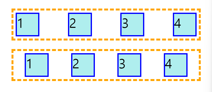
4-2. flex-grow
-
item 속성 -
본인이 차지할 수 있는 길이보다 더 많은/적은 자리를 차지할 수 있게끔 함
-
남는 공간 여유롭게 사용
-
조건: 아이템의 크기가 컨테이너의 크기보다 작아서 남는공간이 생겨야만 가능
-
기본값: 0
-
컨테이너에 flex-warp: warp;을 주고, flex-grow: 1;을 설정하면 남은 공간 유연하게 사용
input
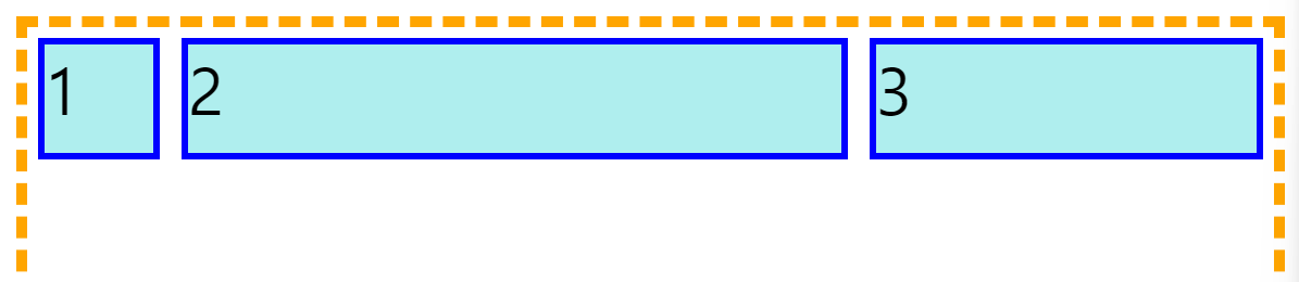
.item:nth-child(2) {
    flex-grow: 2;
}

.item:nth-child(3) {
    flex-grow: 1;
}
output
- 개별 order를 주는 요소의 부모에게 display: flex; 값이 설정되어 있어야 한다.
4-3. flex-shrink
-
item 속성 -
grow는 늘어나고 shrink는 줄어듬
-
조건: 아이템의 크기가 컨테이너의 크기보다 클 때
-
컨테이너가 작아지는 바람에 아이템도 작아질때 얼마나 작아질지에 대한 이야기
-
줄어든 영역을 나눠가지는 비율 설정해주는 것
-
기본값: 1
-
음수 x, 소수점 가능
input
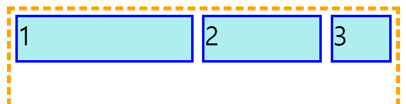
}
.item:nth-child(1) {
    flex-shrink: 0;
}

.item:nth-child(3) {
    flex-shrink: 2;
}
output
개별 order를 주는 요소의 부모에게 display: flex; 값이 설정되어 있어야 한다.
4-4. flex-basis
-
플렉스 아이템의 초기 크기를 지정한다
- grow, shrink 되지 않았을 때 기본 영역
-
기본값: auto
-
width값을 지우면 자기가 차지하고 있는 영역의 콘텐츠 크기만큼만 width를 가지게 됨
-
width가 없는 상태에서 flex-grow 값을 1로 주면 기존의 콘텐츠 크기는 그대로 가지고 있고 늘어나는 길이가 1씩 동일하게 늘어남
(basis를 제외한 나머지가 1:1:1)- flex-bais: 0;으로 만들면 가 없기때문에 아이템들의 가로길이 그 자체가 1:1:1이 됨
-
grow나 shrink를 계산할 때 basis를 같이 계산해야함. 제외하고 계산하면 정확한 값을 구하기 어려움
input
.container {
    height: 200px;
    border: 5px dashed orange;
    display: flex;
}

.item {
    /* width: 200px; */
    height: 50px;
    margin: 5px;
    background-color: paleturquoise;
    border: 3px solid blue;
    font-size: 30px;

    /* flex-grow: 1; */
    flex-basis: 0;
}

.item:nth-child(1) {
    flex-grow: 5;
}

.item:nth-child(2) {
    flex-grow: 1;
}

.item:nth-child(3) {
    flex-grow: 3;
}
output
개별 order를 주는 요소의 부모에게 display: flex; 값이 설정되어 있어야 한다.
4-5. flex (shorthand)
-
flex-grow, shrink, basis 3개중 하나만 작성 가능
-
초기값:
- flex-grow: 0
- flex-shrink: 1
- flex-basis: auto (작성하지 않는다고 auto가 되지않음)
- 값이 하나일 때 none, auto, initial 중 하나를 지정할 수 있다.
1-1. 한개의 값, unitless number: flex-grow
- flex: 2;
1-2. 1개의 값, length or percentage: flex-basis
-
flex: 10em;
-
flex: 30%;
2-1. 2개의 값: flex-grow | flex-basis
- flex: 1 30px;
2-2. 2개의 값: flex-grow | flex-shrink
- flex: 2 2;
- 3개의 값:
flex-grow | flex-shrink | flex-basis
-
flex: 2 2 10%;
-
initial
- 아이템 크기가 각각의 width와 height 속성에 따라 정해집니다. 플렉스 컨테이너의 크기를 넘지 않기 위해 최소 크기로 줄어들 수는 있지만, 남은 공간을 채우려 늘어나지는 않습니다.
flex: 0 1 auto와 동일합니다.
- 아이템 크기가 각각의 width와 height 속성에 따라 정해집니다. 플렉스 컨테이너의 크기를 넘지 않기 위해 최소 크기로 줄어들 수는 있지만, 남은 공간을 채우려 늘어나지는 않습니다.
-
auto
- 아이템 크기가 각각의 width와 height 속성에 따라 정해집니다. 플렉스 컨테이너의 크기를 넘지 않기 위해 최소 크기로 줄어들 수 있으며, 남은 공간을 채우기 위해 늘어날 수도 있습니다.
flex: 1 1 auto와 동일합니다.
- 아이템 크기가 각각의 width와 height 속성에 따라 정해집니다. 플렉스 컨테이너의 크기를 넘지 않기 위해 최소 크기로 줄어들 수 있으며, 남은 공간을 채우기 위해 늘어날 수도 있습니다.
-
none
- 아이템 크기가 각각의 width와 height 속성에 따라 정해지며, 컨테이너의 크기에 관계 없이 변하지 않습니다.
flex: 0 0 auto와 동일합니다
- 아이템 크기가 각각의 width와 height 속성에 따라 정해지며, 컨테이너의 크기에 관계 없이 변하지 않습니다.
5. Container
5-1. justify-content
-
Container 속성 -
content가 붙으면 여러줄, 여러개의 item에 대한 정렬을 뜻함 -
주축을 기준으로 아이템들을 어떻게 정렬할지에 대한 속성
-
주축을 기준으로 시작부분인지 끝부분인지를 확인해야함
1) justify-content: space-between;
- 시작과 끝은 딱 붙고 요소 사이사이의 여백만 동일함
2) justify-content: space-around;
- 모든 요소의 여백이 동일함
5-2. align-items
-
cross asix. 교차축 -
덩어리. 한 줄 자체에 대한 정렬
-
기본값
-
align-items: stretch;
-
align-items: flex-start;
-
align-items: flex-end;
-
align-items: center;
-
-
콘텐츠가 한 줄일때: align-items: ;
-
콘텐츠가 두 줄일때: align-content: ;
- flex-wrap: wrap; 일때 두 줄로 넘어가면 두 줄에 대한 제어 속성
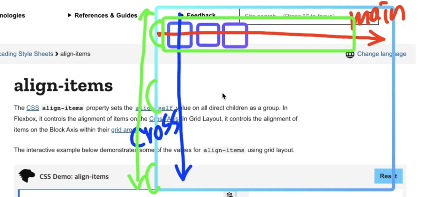
input
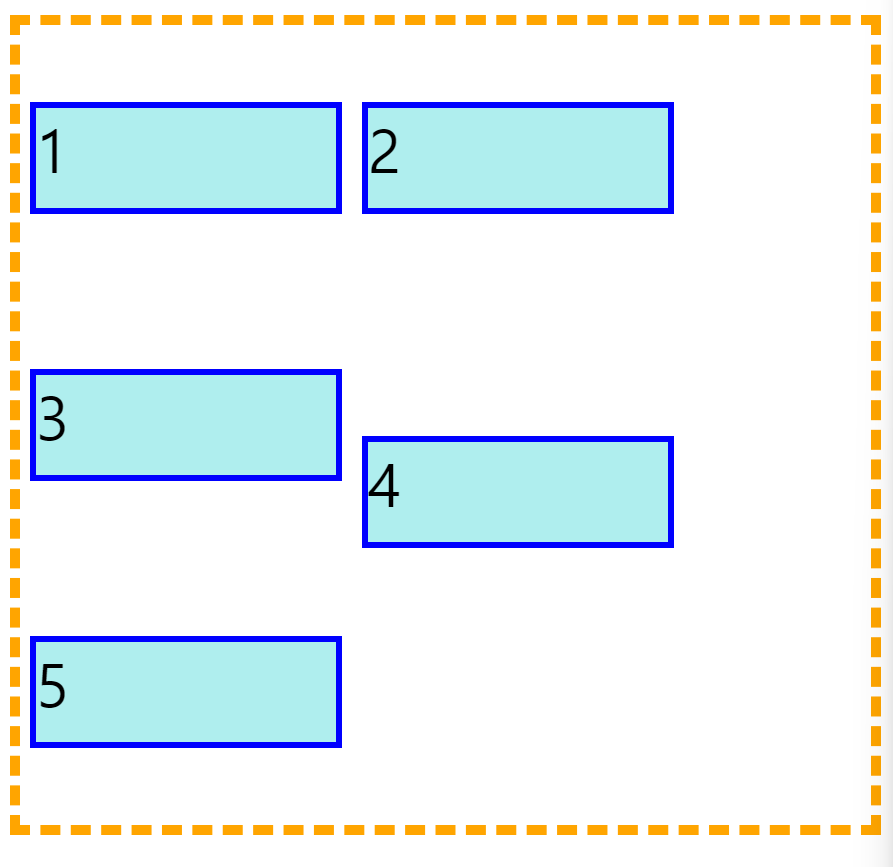
css

.container {
    height: 400px;
    border: 5px dashed orange;
    display: flex;

    justify-content: space-between;
    align-items: flex-end;

    flex-wrap: wrap;
}
output
5-3. align-content
-
cross asix. 교차축 -
content가 붙으면 여러줄, 여러개의 item에 대한 정렬을 뜻함 -
여러줄이기 때문에
align-content: space-between;align-content: space-around;사용 가능
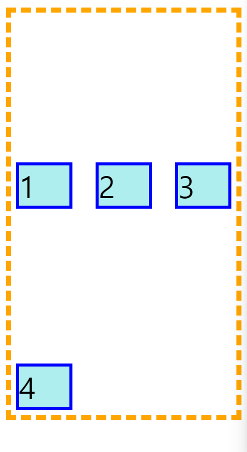
6. Item
align-self
-
item 속성 -
아이템 중에 단독으로 재정렬 하고 싶을 때
-
기본값
align-self: self-start- self-end
- flex-start
- flex-end
- center
- stretch
input
.container {
    height: 400px;
    border: 5px dashed orange;
    display: flex;
    flex-wrap: wrap;

    align-items: center;
}

.item {
    width: 150px;
    height: 50px;
    margin: 5px;
    background-color: paleturquoise;
    border: 3px solid blue;
    font-size: 30px;
}

.item:nth-child(4) {
    align-self: flex-end;
}
output