안녕하세요?
오늘은 소나기가 내렸는데도 불구하고 날씨는 똑같이 덥군요
그래도 포스팅은 해야하니까!!
열심히 달려보자구요
오늘은 display의 속성 중 flex에 대해 알아볼거예요
그럼 출발~
Flex
어렵고 복잡했던 display, float, position 같은 css를 사용했었던 과거와는 달리
최근엔 flex를 많이 사용한다고 합니다
flex는 flex-box, flexible-box라고 불리기도 하는데 레이아웃 배치에 아주 탁월한 기능을 가지고 있어요.
flex는 부모인 flex container와 flex item들로 구성됩니다
flex container는 부모로서 flex 태그에 직접적으로 영향을 받고 flex item들은 정렬, 배치등 속성을 통해 영향을 받습니다
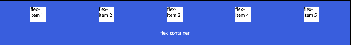
Flex-Container
flex-item들을 감쌀 부모입니다
flexible하게 사용하기 위해서 flex-container에
display: flex;를 작성하면 됩니다
flex-container가 가질 수 있는 속성은
flex-direction, align-items, align-content, justify-content,
gap, flex-wrap, flex-flow 등이 있습니다
flex-direction : 아이템들이 배치되는 축의 방향을 설정합니다. row가 기본값이며, 왼쪽에서 오른쪽으로 향하는 가로축입니다(Horizontal)
flex-direction:row> 가로축(Horizontal, 행)flex-direction:column> 세로축(Vertical, 열)flex-direction:row-reverse> 역방향 가로축(Horizontal, 행, 오른쪽에서 왼쪽)flex-direction:column-reverse> 역방향 세로축(Horizontal, 열, 아래쪽에서 위쪽)
align-items : 교차 축(cross-axis) 정렬기준을 설정합니다
align-content : 2줄 이상의 아이템을 가질 때, 교차 축(cross-axis) 정렬기준을 설정합니다
justify-content : 주 축(main-axis)의 정렬기준을 설정합니다
gap : 아이템 끼리의 간격을 설정합니다
flex-wrap : flex-item들을 여러 줄로 묶습니다
flex-flow : flex-direction과 flex-wrap의 빠른 사용을 위해 단축 속성입니다
Flex-item
flex-container 내부의 아이템들입니다
가지고 있는 속성은 order, flex, flex-grow, flex-shrink, flex-basis, align-self등이 있습니다
order : 아이템의 순서를 설정합니다
flex : flex-grow, flew-shrink, flex-basis순으로 작성하는 단축 속성입니다
flex-grow : 아이템의 총 너비 대비 비율을 설정합니다
flex-shrink : 아이템의 감소하는 너비 비율을 설정합니다
flex-basis : 아이템의 기본 너비를 설정합니다
align-self : 교차 축(cross-axis)에서 아이템들 간 정렬방법을 설정합니다
<!DOCTYPE html>
<html lang="ko-KR">
<head>
    <meta charset="UTF-8">
    <meta name="viewport" content="width=device-width, initial-scale=1.0">
    <title>flex playground</title>
    <style>

        body {
            margin: 0 auto;
            padding: 0 auto;
        }

        .flex-container {
            display: flex;
            flex-direction: row;
            justify-content: space-between;
            align-items: center;
            gap: 10px;
            padding: 10px;
        }
        .flex-items {
            background-color: white;
            width: 50px;
            height: 50px;
        }
        .main {
            background-color: royalblue;
            border: 2px solid black;
            padding: 10px;
        }
        .main p {
            text-align: center;
            color: white;
        }

    </style>
</head>
<body>
    <main class="main">
        <div class="flex-container">
            <div class="flex-items">flex-item 1</div>
            <div class="flex-items">flex-item 2</div>
            <div class="flex-items">flex-item 3</div>
            <div class="flex-items">flex-item 4</div>
            <div class="flex-items">flex-item 5</div>
        </div>
        <p>flex-container</p>
    </main>

</body>
</html>
속성들을 연습해볼 수 있도록 기본 세팅을 한 코드
오늘은 display 속성 중 최근 제일 많이 활용되고 있는 flex에 대해서 알아보았는데 어떤가요?
뷰를 그리는데 훨씬 편하지 않나요?
저는 개인적으로 앱개발을 하면서 UI를 짰던 방식과 가장 비슷한 방법인 것 같아서 아주 반가웠습니다
오늘은 여기까지 알아보고 좀 더 알고싶다면 구글링 하기로 약속~
감사합니다