
선행지식
Compose 컴포넌트에 대한 기본적인 이해독자에게 전하는 말
이 글은 Compose를 처음 사용하면서 작성한 내용이라 일부 오류가 있을 수 있습니다. 내용을 더블 체크해주시고, 혹시 틀린 부분이 있다면 댓글로 알려주시면 감사하겠습니다.
목차
- Intro
- Lazy lists란?
- LazyColumn과 LazyRow
- Lazy lists를 활용해 스타카토의 복잡한 UI 그리기
- Outro
Intro
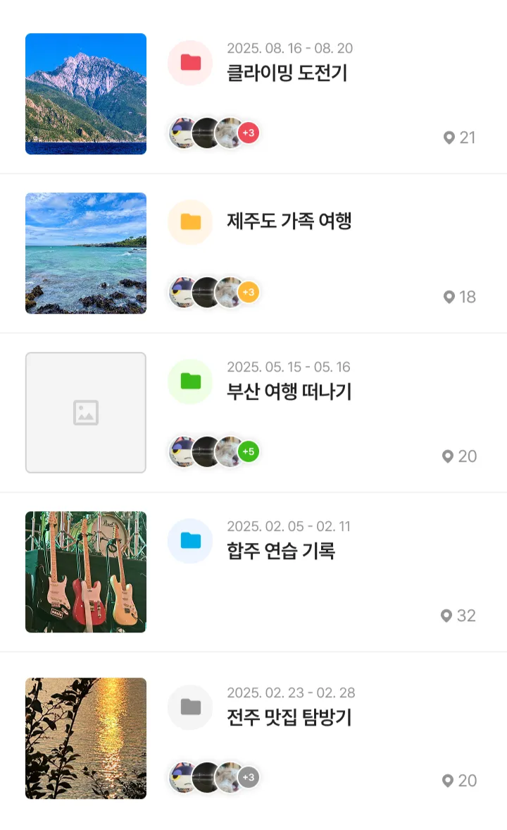
오늘은 Lazy lists에 대해 알아보고 스타카토 프로젝트에 적용해 보려고 한다. 아래 사진과 동일한 UI를 Lazy lists를 활용해 구현할 예정이다.
Lazy lists란?
안드로이드 공식 문서 - Lazy lists
If you need to display a large number of items (or a list of an unknown length), using a layout such asColumncan cause performance issues, since all the items will be composed and laid out whether or not they are visible.
Compose provides a set of components which only compose and lay out items which are visible in the component’s viewport. These components include
LazyColumnandLazyRow.
많은 수의 아이템을 가진 리스트나 길이를 알 수 없는 리스트를 표시해야 하는 경우, Column과 같은 레이아웃을 사용하면 아이템의 표시 여부와 관계없이 모두 준비해 배치한다. 문제는 아이템의 수가 많아질수록 보이지 않는 정보까지 미리 준비하느라 앱이 느려지고 버벅거릴 수 있다는 것이다.
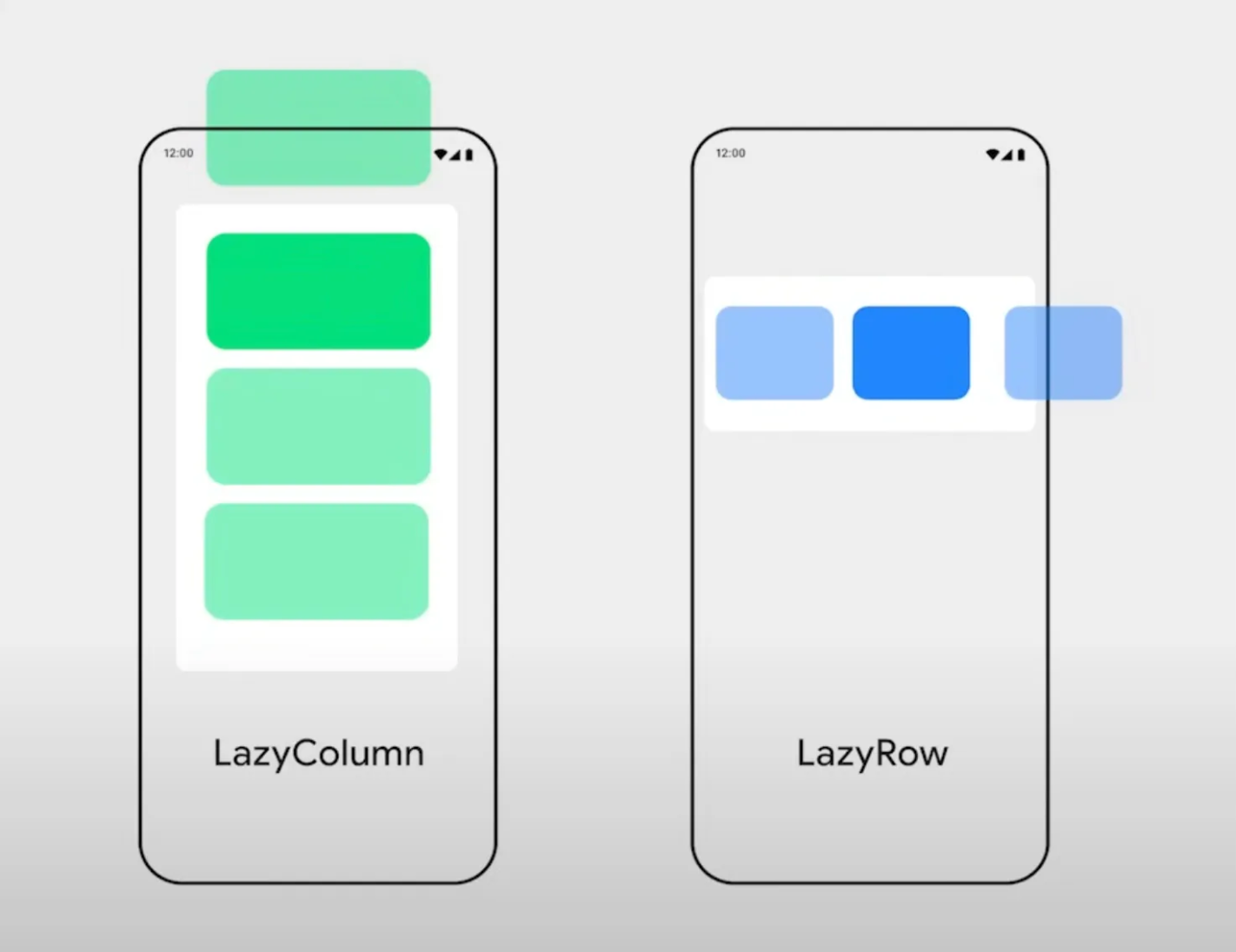
Compose에서 이러한 문제를 해결하는 컴포넌트가 바로 Lazy lists이다. 화면에 지금 당장 보이는 아이템만 만들고 배치하며, 스크롤 해서 새로운 아이템이 화면에 들어오면 그때 새로운 아이템을 만들어서 보여준다. 즉, Recyclerview와 동일한 역할을 한다고 생각하면 된다. Lazy lists의 종류로는 LazyColumn과 LazyRow가 있다.
LazyColumn과 LazyRow
안드로이드 공식 문서 - LazyColumn
The vertically scrolling list that only composes and lays out the currently visible items.안드로이드 공식 문서 - LazyRow
The horizontally scrolling list that only composes and lays out the currently visible items.
LazyColumn과 LazyRow의 차이는 스크롤 방향뿐이다. LazyColumn은 세로로 스크롤 할 수 있는 리스트이고, LazyRow는 가로로 스크롤 할 수 있는 리스트이다.
Lazy lists 종류
LazyListScope.item을 사용하여 단일 아이템을 추가하고, LazyListScope.items을 사용하여 아이템 목록을 추가할 수 있다. LazyListScope.itemsIndexed는 index 값을 인식해야 할 때 사용한다.
LazyColumn {
    items(itemsList) { Text("Item is $it") }

    item { Text("Single item") }

    itemsIndexed(itemsIndexedList) { index, item -> Text("Item at index $index is $item") }
}
Lazy lists를 활용해 스타카토의 복잡한 UI 그리기
Lazy lists에 대해 간단히 살펴봤으니 이제 실전에 적용해 보자. 앞서 언급한 것처럼 위 사진과 같은 UI를 Lazy lists를 활용해 구현할 예정이다.
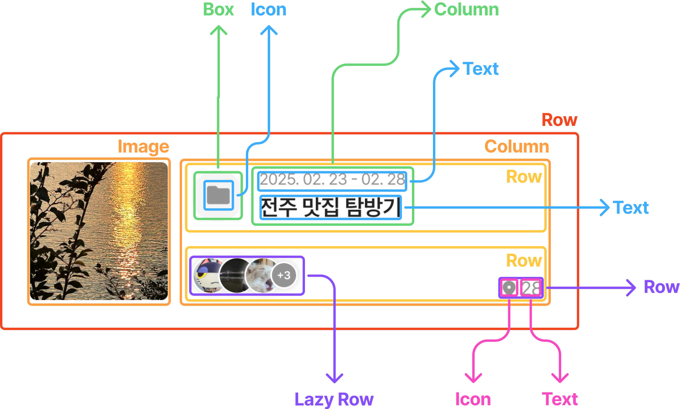
Compose가 처음이라 바로 구현하기는 힘들 것 같아서 위와 같이 그림으로 정리하면서 시각적으로 이해해 보았다. 우선, 카테고리에 함께하는 사람들을 표시하는 Lazy Row부터 구현해 보자!
LazyRow 구현하기: 함께하는 사람들 리스트

RecyclerView를 만드는 방식과 거의 비슷하다. 먼저 목록에 필요한 아이템을 만들고 아이템을 모아주는 컴포넌트를 구성하면 된다. 위 Lazy Row는 두 가지 Item이 필요하다. 사용자 프로필을 나타내는 MemberItem, 다른 하나는 숨겨진 사용자의 수를 표시하는 HiddenMembersCountItem이다. 이 두 아이템을 구현한 뒤 이를 묶어주는 Members 컴포넌트를 만들어보겠다.
1. 사용자 프로필 아이템 구현(MemberItem)

이미지를 표시할 ImageComponent와 사용자 프로필을 보여줄 MemberItem을 각각 분리해서 작성했다.
이 글은 Lazy Lists에 대해 다루는 글이므로, Compose 컴포넌트의 구현 방식은 코드와 간단한 설명으로만 다루고자 한다.
ImageCompoent는 공용 컴포넌트라 radius를 외부에서 받아 자유롭게 사용하도록 구현했다.
ImageComponent.kt
@Composable
fun ImageComponent(
    modifier: Modifier = Modifier,
    url: String? = null,
    @DrawableRes placeHolder: Int,
    contentDescription: String,
    contentScale: ContentScale = ContentScale.Crop,
    radius: Float = 0f,
) {
    val painter =
        rememberAsyncImagePainter(
            model =
                ImageRequest.Builder(LocalContext.current)
                    .data(url)
                    .transformations(RoundedCornersTransformation(radius.dpToPx(LocalContext.current)))
                    .placeholder(placeHolder)
                    .fallback(placeHolder)
                    .build(),
        )

    Image(
        modifier = modifier,
        painter = painter,
        contentDescription = contentDescription,
        contentScale = contentScale,
    )
}

@Preview
@Composable
private fun ImageComponentPreview() {
    ImageComponent(
        url = "https://avatars.githubusercontent.com/u/103019852?v=4",
        placeHolder = R.drawable.default_image,
        contentDescription = stringResource(id = R.string.all_category_thumbnail_photo_description),
    )
}
MemberItem은 Modifier에 shadow를 설정해 그림자를 만들고 border의 width를 1, color를 White로 설정해 하얀색 테두리를 만들었다.
MemberItem.kt
@Composable
fun MemberItem(memberImageUrl: String? = null) {
    ImageComponent(
        modifier =
            Modifier
                .shadow(2.dp, shape = CircleShape, clip = false) // 그림자
                .border(width = 1.dp, color = White, shape = CircleShape) // 하얀색 테두리
                .size(25.dp),
        url = memberImageUrl, // 이미지 URL
        placeHolder = R.drawable.icon_member, // 기본 이미지
        contentDescription = stringResource(id = R.string.mates_profile_image_description), // content 설명
    )
}

@Preview(showBackground = true, backgroundColor = 0xFFFFFFFF)
@Composable
private fun MemberItemPreview() {
    MemberItem(
        memberImageUrl = "https://avatars.githubusercontent.com/u/103019852?v=4",
    )
}
2. 숨겨진 사용자 수 아이템 구현(HiddenMembersCountItem)
이제 숨겨진 사용자 수를 표시할 아이템을 구현해 보자. 숫자를 표시할 TextComponent와 숨겨진 사용자 수를 보여줄 HiddenMembersCountItem을 각각 분리해서 작성했다.
@Composable
fun TextComponent(
    modifier: Modifier = Modifier,
    color: Color = StaccatoBlack,
    description: String,
    style: TextStyle,
) {
    Text(
        text = description,
        modifier = modifier,
        style = style,
        color = color,
    )
}

@Preview(showBackground = true)
@Composable
private fun TextComponentPreview() {
    TextComponent(description = "Staccato", style = Title1) // Title1은 직접 정의한 값이다.
}
Box를 활용해 배경을 만들어주고 contentAlignment를 Alignment.Center로 설정해 TextComponent가 Box의 중앙에 위치하도록 구현했다. Color 값을 전달받는 이유는 스타카토에서 카테고리의 색상을 설정할 수 있는데 이 값에 따라 숫자 뒤의 배경색도 달라져야 하기 때문이다.
@Composable
fun HiddenMembersCountItem(
    count: Int,
    @ColorRes color: Int,
) {
    Box(
        modifier =
            Modifier
                .size(19.dp)
                .shadow(2.dp, shape = CircleShape, clip = false) // 그림자
                .background(color = colorResource(id = color), shape = CircleShape) // 숫자 뒤 배경
                .border(width = 1.dp, color = White, shape = CircleShape), // 하얀색 테두리
        contentAlignment = Alignment.Center, // TextComponent를 중앙에 정렬하기 위함
    ) {
        TextComponent(description = "+$count", color = White, style = Body6)
    }
}

@Preview
@Composable
private fun HiddenMembersCountPreview(
    @PreviewParameter(HiddenMembersCountPreviewParameterProvider::class)
    count: Int,
) {
    HiddenMembersCount(
        count = count,
        color = R.color.gray3,
    )
}

// 다양한 인자를 넣어서 Preview를 보기 위한 ParameterProvider이다.
private class HiddenMembersCountPreviewParameterProvider : PreviewParameterProvider<Int> {
    override val values: Sequence<Int> =
        sequenceOf(
            3,
            10,
            88,
        )
}
3. 함께하는 사람들 리스트 구현 - LazyRow
아이템이 현재는 4개뿐이라 Row로도 구현할 수 있지만 향후 항목 수가 늘어나거나 터치 이벤트, 스크롤 같은 기능이 추가될 가능성을 고려해 LazyRow로 구현했다.
LazyListScope.items을 사용하여 사용자 프로필 아이템 목록을 추가하고, LazyListScope.item을 사용하여 숨겨진 사용자 수 아이템을 추가했다. 또한 spacedBy에 음수 값을 전달해 아이템들이 겹치게 배치했다.
@Composable
fun Members(
    members: List<Member>,
    hiddenMembersCount: Int,
    @ColorRes color: Int,
) {
    LazyRow(
        contentPadding = PaddingValues(2.dp),
        horizontalArrangement = Arrangement.spacedBy((-8).dp), // 아이템들이 겹치게 배치
        verticalAlignment = Alignment.CenterVertically,
    ) {
		    // 사용자 프로필 아이템 목록
        items(members) { member ->
            MemberItem(memberImageUrl = member.memberImage)
        }

				// 숨겨진 사용자 수(단일 아이템)
        item {
            HiddenMembersCount(hiddenMembersCount, color = color)
        }
    }
}

@Preview
@Composable
private fun MembersPreview() {
    Members(
        members = members,
        hiddenMembersCount = 3,
        color = R.color.gray3,
    )
}
LazyColumn 구현하기: 타임라인 리스트
하나의 아이템이 굉~~~장히 복잡하다… 예쁜 만큼 구현 난이도는 상승하는 것 같다. 먼저 타임라인 아이템 컴포저블을 구현할 것이다. 타임라인 아이템을 만들기 위해 함께하는 사람들 리스트 외에 아래의 요소들을 추가로 구현해야 한다.
- 카테고리 색상(Box)
- 카테고리 기간과 제목(Column)
- 카테고리에 담긴 스타카토 수(Row)
1. 카테고리 색상을 나타낼 Box 구현

숨겨진 사용자 수 아이템을 구현한 방법과 비슷하게 Box를 활용해 만들었다. Compose에서는 Icon을 활용해 아이콘을 그릴 수 있다.
@Composable
private fun CategoryColor(
    @ColorRes color: Int = R.color.gray3,
) {
    Box(
        modifier =
            Modifier
                .size(36.dp)
                .background(color = Gray1, shape = CircleShape),
        contentAlignment = Alignment.Center,
    ) {
        Icon(
            imageVector = ImageVector.vectorResource(id = R.drawable.icon_folder),
            contentDescription = stringResource(id = R.string.category_creation_color),
            tint = colorResource(id = color),
        )
    }
}
2. 카테고리의 기간과 제목을 표시할 Column 구현

카테고리의 기간과 제목을 표시할 UI는 Column을 활용했다. 기간이 있는 경우에만 해당 기간을 보여주는 TextComponent를 그리도록 구현했다. XML과 달리 Compose에서는 visibility와 같은 속성을 제공하지 않는다. 대신 Component의 가시성을 코드에서 조건문으로 직접 결정한다. Compose는 필요한 UI만 그리는 선언적인 방식이기 때문이다.
@Composable
private fun CategoryPeriodAndTitle(
    startAt: LocalDate? = null,
    endAt: LocalDate? = null,
    categoryTitle: String,
) {
    val period =
        if (startAt != null && endAt != null) {
		        // LocalDate를 2025.02.23 - 2026.03.03 와 같은 형식으로 보여주기 위한 처리
            stringResource(
                R.string.category_period_dot,
                startAt.year,
                startAt.monthValue,
                startAt.dayOfMonth,
                endAt.year,
                endAt.monthValue,
                endAt.dayOfMonth,
            )
        } else {
            null
        }

    Column {
		    // 가시성 설정
        if (period != null) {
            TextComponent(
                color = Gray3,
                description = period,
                style = Body4,
            )
        }
        Spacer(modifier = Modifier.size(2.dp))
        TextComponent(
            description = categoryTitle,
            style = Title3,
        )
    }
3. 카테고리에 담긴 스타카토(일상 기록)의 수를 표시할 Row 구현
Compose Material3 기본 제공 Icon
@Composable
fun Icon(
    imageVector: ImageVector,
    contentDescription: String?,
    modifier: Modifier = Modifier,
    tint: Color = LocalContentColor.current // 기본 설정 Color.Black
) {
    ...
}

val LocalContentColor = compositionLocalOf { Color.Black }
그래서 아이콘의 tint를 따로 설정해 주지 않으면 아래 사진처럼 아이콘이 검은색으로 보이는 현상이 발생한다.
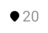
ImageVector.vectorResource(...)로 불러온 벡터 리소스는 이미 색상이 지정된 경우가 많기 때문에 tint에 Color.Unspecified를 설정해 주어야 한다. Color.Unspecified는 아이콘에 색상을 지정하지 않는다는 설정으로 원래 리소스에 정의된 색상 그대로 사용하겠다는 뜻이다.
@Composable
private fun StaccatosCount(count: Int = 0) {
    Row(
        modifier = Modifier.padding(bottom = 4.dp),
        verticalAlignment = Alignment.CenterVertically,
    ) {
        Icon(
            imageVector = ImageVector.vectorResource(id = R.drawable.icon_marker),
            contentDescription = "Marker Icon",
            tint = Color.Unspecified,
        )
        Spacer(modifier = Modifier.width(3.dp))
        TextComponent(color = Gray3, description = count.toString(), style = Body4)
    }
}
4. 타임라인 아이템 구현

1 ~ 3에서 만든 요소들을 이제 Row에 하나씩 배치해 보자. 여백은 Spacer를 활용했다.
@Composable
fun TimelineItem(
    timeline: TimelineUiModel,
    onCategoryClicked: (Long) -> Unit,
) {
    Row(
        modifier =
            Modifier
                .padding(horizontal = 18.dp, vertical = 13.dp)
                .fillMaxWidth()
                .clickable { onCategoryClicked(timeline.categoryId) },
        verticalAlignment = Alignment.CenterVertically,
    ) {
			  // 카테고리 썸네일
        ImageComponent(
            modifier = Modifier.size(90.dp),
            url = timeline.categoryThumbnailUrl,
            placeHolder = R.drawable.default_image,
            contentDescription = stringResource(R.string.all_category_thumbnail_photo_description),
            radius = 4f,
        )

        Spacer(modifier = Modifier.width(15.dp))

				// 카테고리 색상, 기간, 제목
        Column {
            Row(
                verticalAlignment = Alignment.CenterVertically,
            ) {
                CategoryColor(color = timeline.color)

                Spacer(modifier = Modifier.width(10.dp))

                CategoryPeriodAndTitle(
                    timeline.startAt,
                    timeline.endAt,
                    timeline.categoryTitle,
                )
            }

            Spacer(modifier = Modifier.size(22.dp))

						// 함께하는 사람들, 스타카토 개수
            Row(
                verticalAlignment = Alignment.Bottom,
            ) {
                if (members.isNotEmpty()) {
                    Members(
                        members = members,
                        hiddenMembersCount = 3,
                        color = timeline.color,
                    )
                }

                Spacer(modifier = Modifier.weight(1f))

                StaccatosCount(count = 21)
            }
        }
    }
}

@Preview(showBackground = true, backgroundColor = 0xFFFFFFFF)
@Composable
private fun TimelineItemPreview(
    @PreviewParameter(TimelineItemPreviewParameterProvider::class)
    category: TimelineUiModel,
) {
    TimelineItem(category, onCategoryClicked = {})
}

class TimelineItemPreviewParameterProvider : PreviewParameterProvider<TimelineUiModel> {
    override val values: Sequence<TimelineUiModel> =
        sequenceOf(*timeline.toTypedArray())
}
4. 타임라인 리스트 구현 - LazyColumn
LazyListScope.items을 사용하여 타임라인 목록을 추가했다. 각 item 사이에는 HorizontalDivider를 활용해 회색 구분 선을 그려주었다.
@Composable
fun Timeline(
    timeline: List<TimelineUiModel>,
    onCategoryClicked: (Long) -> Unit,
) {
    LazyColumn {
        items(timeline) { timelineCategory ->
            TimelineItem(
                timeline = timelineCategory,
                onCategoryClicked = onCategoryClicked,
            )
            HorizontalDivider(thickness = 1.dp, color = Gray1)
        }
    }
}

@Preview(showBackground = true, backgroundColor = 0xFFFFFFFF)
@Composable
private fun TimelinePreview() {
    Timeline(timeline = timeline, onCategoryClicked = {})
}
Outro
Compose의 Lazy Lists를 활용해 리스트를 구성해보니 기존의 RecyclerView처럼 ViewHolder나 Adapter를 따로 만들 필요가 없어서 훨씬 간결하고 직관적으로 느껴졌다. (무슨 말을 더 써야할지…)
참고 자료
https://developer.android.com/develop/ui/compose/lists
https://www.youtube.com/watch?v=1ANt65eoNhQ