[matplotlib] 그래프 그리기 | line chart | bar chart | histogram | pie chart | box plot | scatter plot
데이터 분석 | 시각화
목록 보기
11/20
Line
데이터 가져오기
import seaborn as sns
data = sns.load_dataset('flights')
data
전처리
data_grouped = data[['year', 'passengers']].groupby('year').sum().reset_index()
data_grouped
그래프 그리기
plt.plot(data_grouped['year'], data_grouped['passengers'])
plt.xlabel('year')
plt.ylabel('passengers')
plt.show()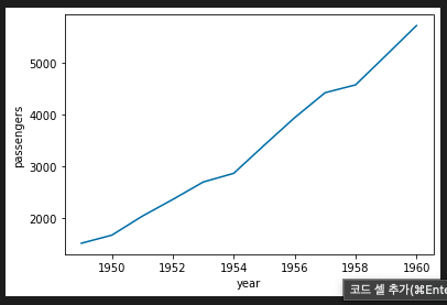
Bar
데이터 생성
df = pd.DataFrame({
    '도시': ['서울', '부산', '대구', '인천'],
    '인구': [990, 250, 250, 290]
})
df
bar 차트 그리기
plt.bar(df['도시'], df['인구'])
plt.xlabel('도시')
plt.ylabel('인구')
plt.show()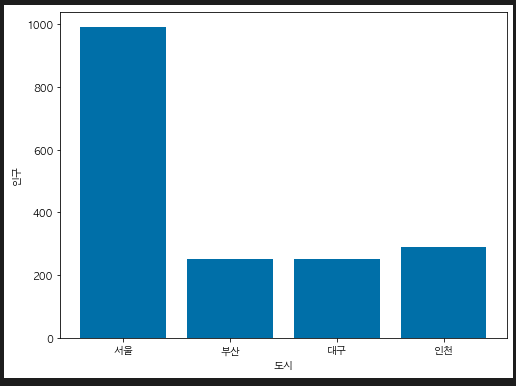
histogram
- 연속형 데이터의 분포 확인
데이터 생성
import numpy as np
data = np.random.randn(1000)
histogram 그리기
- bins: 구간의 개수
plt.figure(figsize = (8, 6))
plt.hist(data, bins = 30)
plt.xlabel('value')
plt.ylabel('frequency')
plt.title('histogram')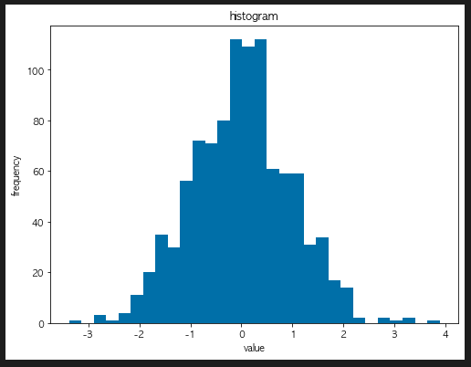
pie chart
데이터 생성하기
sizes = [30, 20, 23, 15, 10]
labels = ['A', 'B', 'C', 'D', 'E']
pie chart 그리기
plt.pie(sizes, labels = labels)
plt.title('Pie chart')
plt.show()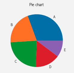
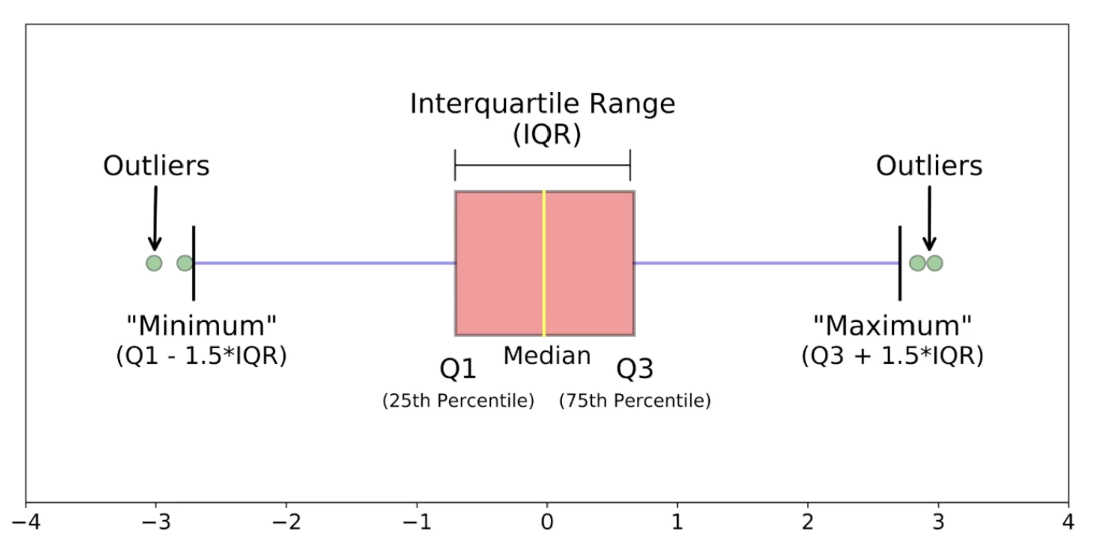
Box plot
데이터 가져오기
iris = sns.load_dataset('iris')

sepal_length_list = [iris[iris['species']== s]['sepal_length'] for s in iris['species'].unique()]
box plot 그리기
plt.boxplot(sepal_length_list, labels = iris['species'].unique())
plt.ylabel('Sepal Length')
plt.xlabel('Species')
plt.title('Box plot')
plt.show()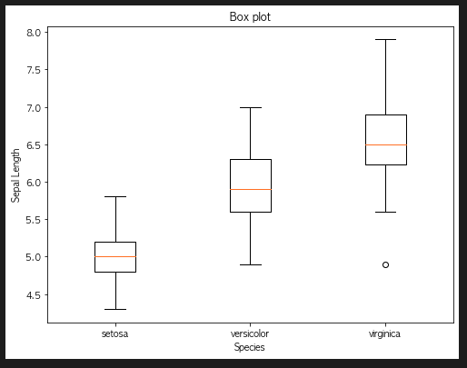
seaborn으로 box plot 그리기
sns.boxplot(x = 'species', y = 'sepal_length', data = iris)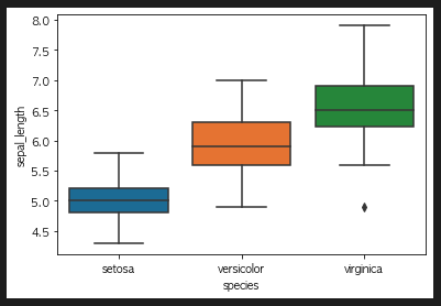
scatter plot
scatter plot 그리기
plt.scatter(iris['petal_length'], iris['petal_width'])
plt.xlabel('petal length')
plt.ylabel('petal_width')
plt.show()
case 2
plt.scatter(iris['sepal_length'], iris['sepal_width'])
plt.xlabel('sepal length')
plt.ylabel('sepal_width')
plt.show()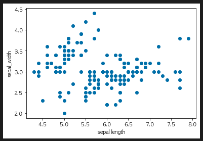
corr()
- 상관계수를 보여줌
iris.corr()
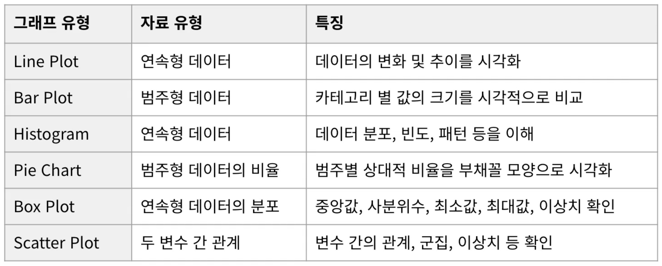
그래프 요약

To Dare is To Do