
✏️ 오늘 공부한 내용
- [알고리즘] 백준 5622 다이얼
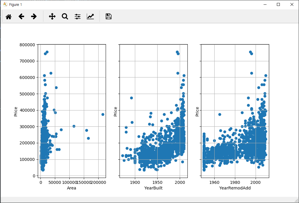
- 각 변수 별 집값 차이를 나타내는 그래프 그리기
각 변수 별 집값 차이를 나타내는 그래프 그리기
Matplot을 써보기 위해 Kaggle에 있는 HousePrice 데이터를 이용해 그래프를 그려보았다. 가격과 조건들과의 상관관계를 간단하게 그렸다.
import pandas as pd
import matplotlib.pyplot as plt
train = pd.DataFrame(pd.read_csv("~\\HousePrices\\train.csv"))

fig, ax = plt.subplots(1, 3, figsize=(9,3), sharey=True)
ax[0].scatter(train["LotArea"].astype(int), train["SalePrice"].astype(int))
ax[0].grid()
ax[0].set(xlabel='Area', ylabel='Price')

ax[1].scatter(train["YearBuilt"].astype(int), train["SalePrice"].astype(int))
ax[1].grid()
ax[1].set(xlabel='YearBuilt', ylabel='Price')

ax[2].scatter(train["YearRemodAdd"].astype(int), train["SalePrice"].astype(int))
ax[2].grid()
ax[2].set(xlabel='YearRemodAdd', ylabel='Price')
plt.show()
📆 오늘 하루 돌아보기
오늘 컴퓨터 비전을 이용한 인체 관절을 표시하는 동영상을 보았다. 동영상 속에서 많은 댄서들이 격렬하게 춤을 추는데 각 인물마다 관절을 표시해주는 것이다. 머신러닝이 쓰이는 사례를 보니 신기하기도 하고 어떻게 했을까 궁금하기도 했다. 머신러닝에도 다양한 분야가 있는 것으로 안다. 아직 기초단계이지만 어떤 분야가 나랑 잘 맞고 재밌을까 기대가 된다.🤩