CSS 내용 정리
CSS의 의미와 구성 요소
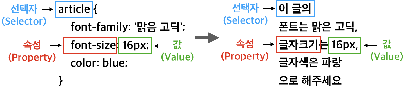
CSS의 기본 구조
-
CSS는 웹에 적용할 스타일을 적어둔 일종의 스타일 명세서
- 선택자: 스타일을 적용하고자 하는 HTML 요소를 선택
- 프로퍼티: 스타일 속성 이름
- 값: 속성에 대응되는 값
-
선언 블록(Declaration Block): 선택자 뒤에 위치한
{}(중괄호) 안의 한 블록 또는 덩어리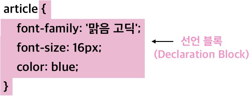
- 적용 예시
- 적용 예시
-
선언(Declaration): CSS에서 프로퍼티와 값의 짝
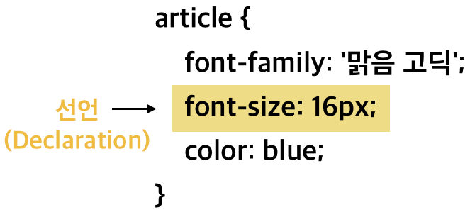
- 선언 블록 내부의 다른 선언과 ;(세미콜론)으로 구분
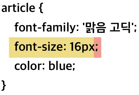
- 선언 블록 내부의 다른 선언과 ;(세미콜론)으로 구분
선택자(Selector)에 대하여
- 선택자는 스타일을 적용하고자 하는 HTML 요소를 선택하는 역할을 수행

<h1>,<p>,<div>와 같은 일반적인 태그 이름을 선택자로 사용-
CSS에서는
,(콤마)로 선택자 여러 개의 스타일을 한꺼번에 지정h1, p { color: red; }
-
CSS의 기본 단위
**고정 크기 단위**
- px(픽셀): 웹에서 대표적으로 쓰이는 고정 크기 단위 제목 없음
**px**
px:pixel이라는 단위
-
1920X1080가 바로 픽셀 수

-
CSS에서 쓰는 1px은 정해진 절대 길이로 쓰인다
-
**가변 크기 단위**
**em과 rem**
e**m은 현재 스타일이 지정되는 요소의 폰트 크기를 기준**rem은 최상위 요소의 폰트 크기를 기준em과rem은 다음과 같은 계산방식으로 계산
**%(퍼센트)**
- 예시
<div id="main">
	단위
	<div id="per">per</div>
</div>
html { background-color: skyblue; font-size: 32px; } #main { background-color:bisque; width: 50%; } #per { background-color: blue; width: 50%; }#main의 경우html의50%너비만큼 가지고, 다시#per의 경우#main을 기준으로50%를 가진다.%는 기준이 되는 상위 요소의font-size를 기준으로 하지 않고 너비, 높이, 폰트 크기 등 각각의 프로퍼티 값의 상대적인 값을 가진다.- 상위
font-size가18px이고 해당 요소의font-size가50%면, 해당 요소의font-size는9px이 된다.
CSS의 색상
- HTML 색상표 페이지 HTML 컬러 코드
**키워드**
- 브라우저는 140가지 색상 이름을 지원
- 다른 표현 방식에 비해 수가 제한적 HTML Color Names
.box {
	 width: 200px;
	 height: 100px;
   background-color: blue;
}
- 다른 표현 방식에 비해 수가 제한적 HTML Color Names
**RGB**
- 빛의 3원색인 빨간색(Red), 초록색(Green), 파란색(Blue)를 혼합하여 색을 표현하는 방식
- RGB 값은 0 ~ 255의 값으로 나타냅니다.
.box {
	 width: 200px;
	 height: 100px;
   background-color: rgb(102, 205,170)
}
- RGB 값은 0 ~ 255의 값으로 나타냅니다.
HEX Code
- HEX 값은 16진수 6자리 코드로 색상을 표현하는 방식
- 6자리 코드는 각각 2자리씩 빨간색, 녹색, 파란색에 대한 값을 표현
- 예를 들어 빨간색은 #FF0000, 보라색은 #800080으로 표현
.box {
	width: 200px;
	height: 100px;
	background-color: #F08080;
}
- 예를 들어 빨간색은 #FF0000, 보라색은 #800080으로 표현
**Alpha**
- HEX code와 RGB에는 alpha라는 값이 존재
- rgb는 rgba를 통해 alpha 값을 표현할 수 있고, hex code는 6자리에 2자리를 추가하여 alpha 값을 표현
- rgba에서 alpha 값은 0~1사이의 숫자로 결정

.box { width: 200px; height: 100px; background-color: rgba(102, 205, 170, 0.5); } - HEX Code에서 alpha 값은 00~FF사이의 16진수 숫자로 결정

.box {
	width: 200px;
	height: 100px;
	background-color: #F0808055;
}
단순 선택자
**타입 선택자(Type Selector)**
- 타입 선택자(Type Selector)는 해당 태그를 가지는 모든 요소에 스타일을 적용
p {
	color: red;
}
아이디 선택자(ID Selector)
- 아이디 선택자(ID Selector)는 아이디 이름으로 스타일을 적용
- HTML 문서 내에서 중복된 아이디는 존재할 수 없으며, 이는 서로 다른 요소들을 구별하기 위한 장치로 사용
p { color: red; } #goorm { background-color: blue; }<p>태그 중에서 해당하는 아이디를 가진 요소만 배경이 파란색으로 바뀜
- HTML 문서 내에서 중복된 아이디는 존재할 수 없으며, 이는 서로 다른 요소들을 구별하기 위한 장치로 사용
**클래스 선택자(Class Selector)**
- 클래스(Class)는 Id와 마찬가지인 HTML 속성
- 클래스 선택자는 HTML의 클래스 속성을 선택자로 사용하여 스타일을 적용
- 예시
<p>사회자</p>
<p class="mafia">마피아</p>
<p class="citizen">시민</p>
<p class="mafia">마피아</p>
<p>경찰</p>
<p class="citizen">시민</p>
<p class="citizen">시민</p>
.mafia { color: white; background-color: black; } .citizen { color: white; background-color: green; }
전체 선택자(Universal Selector)
- 전체 선택자(Universal Selector)는 모든 요소에 스타일을 적용
- 전체 선택자를 사용하고 싶다면 선택자 자리에
*를 입력* { color: yellow; }
- 전체 선택자를 사용하고 싶다면 선택자 자리에
**속성 선택자(Attribute Selector)**
- 속성 선택자(Attribute Selctor)는 특정 HTML 속성을 가지고 있는 모든 요소에 스타일을 적용
- 선택자 오른쪽에
[](대괄호)로 속성과 속성 값을 넣어 작성선택자[속성명="속성값"] { color: red; }
- 선택자 오른쪽에
복합 선택자
**부모 - 자식 - 후손 요소**
<div>안에 포함되는 하위 요소인<p>는<div>의 자식 요소(Child Element)<div>의 상위 요소인article은<div>의 부모 요소(Parent Element)
- 부모 - 자식 관계는 상대적
<article> 부모 요소 <div> 나 <div>자식 요소 1</div> <p>자식 요소 2</p> <div>자식 요소 3</div> </div> </article><div>의 하위에 있는<div>,<p>는 모두 자식 요소
- 자식 요소와 그 아래에 포함된 모든 태그들을 아울러 후손 요소(Descendant Element)

**자식 선택자(Child Selector)**
- 자식 선택자(Child Selector)는 선택자 A의 모든 자식 중 선택자 B와 일치하는 요소를 선택
- 자식 선택자는 복합 선택자이기 때문에 선택자를 두 개 사용하며 중간에
>(꺽쇠)를 써준다선택자A > 선택자B { color: green; }
- 자식 선택자는 복합 선택자이기 때문에 선택자를 두 개 사용하며 중간에
- 하위에 해당하는 자식 요소에만 스타일을 적용하고 싶을 때 자식 선택자를 사용
<article>
	부모 요소
	<div id="me">
		나
		<div>자식 요소 1
			<p>후손 요소 1</p>
		</div>
		<p>자식 요소 2</p>
		<div>자식 요소 3
			<p>후손 요소 2</p>
		</div>
	</div>
</article>
#me > p { background-color: green; } - 자식 선택자를 사용할 때 한 가지 주의해야 할 점
- 자식 선택자를
div > p라고 사용하면div > p라는 구조를 가진 모든 요소에 스타일이 적용div > p { background-color: green; }
- 자식 선택자를
후손 선택자(Descendant Selector)
- 후손 선택자(Descendant Selector)는 선택자 A의 모든 후손 중 선택자 B와 일치하는 요소를 선택
선택자A 선택자B { background-color: yellow; } - 후손 선택자를 사용하면
#me의 하위에 있는 모든<p>태그가 선택#me p { background-color: yellow; }
가상 클래스 선택자
- 클래스와 달리 가상 클래스는 직접 정의할 수 없고 실제 HTML에 보이지 않습니다
제목 없음선택자:pseudo-class{ color: red; }
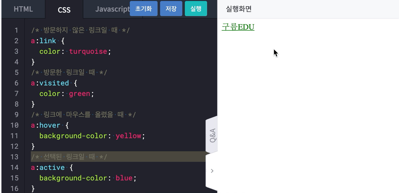
**a:link**
- 방문하지 않은 링크 상태. 방문하지 않은 상태의 링크에 대한 스타일을 지정
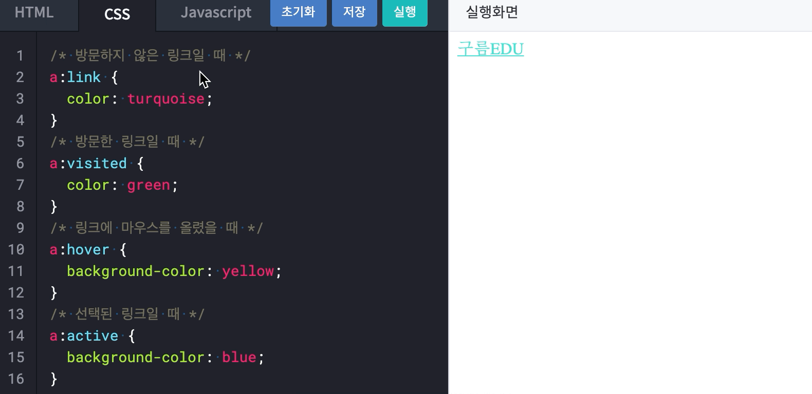
**a:visited**
- 방문한 링크 상태. 방문한 상태의 링크에 대한 스타일을 지정

**a:hover**
- 링크에 마우스를 올렸을 경우 스타일을 적용할 때 사용
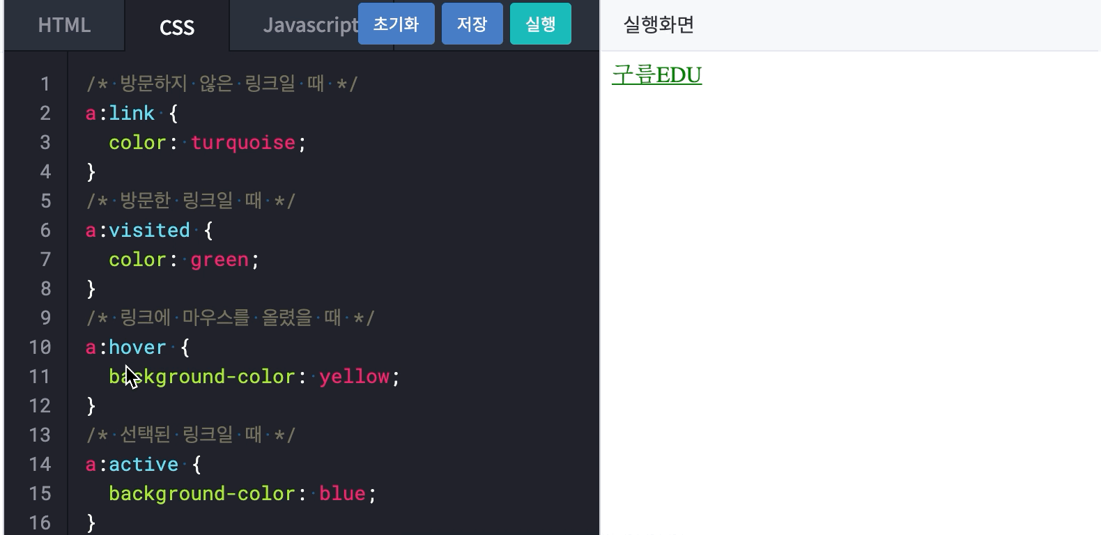
**a:active**
- 선택된 링크일 경우 스타일을 적용할 때 사용
- 링크를 마우스 왼쪽으로 클릭하였을 때 즉 링크 태그를 선택했을 때 스타일을 정의
박스(Box)모델
- HTML의 모든 요소(Element)는 상자(Box)의 형태를 갖습니다.
- 'HTML의 모든 요소가 상자 형태를 가진다'는 말은 바로 브라우저에 출력되는 이 컨텐츠가 사각형 박스 형태로 출력된다는 것을 의미

- 'HTML의 모든 요소가 상자 형태를 가진다'는 말은 바로 브라우저에 출력되는 이 컨텐츠가 사각형 박스 형태로 출력된다는 것을 의미
- 박스 모델은 내용(Content), 패딩(Padding), 경계선(Border), 마진(Margin)으로 이루어져 있다.

- 내용(Content)는 이미지나 텍스트와 같이 우리가 코드 상에서 태그 사이에 담은 내용, 즉 실제로 담고 있는 부분
- 경계선(Border)은 말 그대로 컨텐츠를 감싸고 있는 테두리
- 패딩(Padding)은 컨텐츠와 경계선 사이의 여백
- 마진(Margin)은 경계선 밖의 여백
content
- 코드를 작성한 뒤 개발자 도구를 보면 지정된
200 X 100의 사이즈를 가지는 컨텐츠 박스 두 개가 위 아래로 배치되어 있음을 확인<div id="main"> <div class="inner"> Lorem ipsum dolor sit amet, consectetur adipisicing elit. Obcaecati labore doloribus quod nulla earum facilis, fugiat culpa, modi accusantium iste ea quidem repellat omnis, quia totam repudiandae atque. Distinctio, quae! </div> <div class="inner"> Lorem ipsum dolor sit amet, consectetur adipisicing elit. Obcaecati labore doloribus quod nulla earum facilis, fugiat culpa, modi accusantium iste ea quidem repellat omnis, quia totam repudiandae atque. Distinctio, quae! </div> </div>body { background-color: skyblue; } .inner { background-color: pink; width: 200px; height: 100px; }
- 컨텐츠 박스의 내용이 컨텐츠 박스에 지정된
200 X 100보다 크더라도, 컨텐츠 박스를 기준으로 배치가 된다(마진, 패딩 등이 없는 경우).
- 컨텐츠 박스의 내용이 컨텐츠 박스에 지정된
border
**border-style**
border-style은 말 그대로 선의 스타일로, 선의 종류를 지정하는 프로퍼티, 원하는 모양의 경계선을 추가할 수 있다.border-style: none | hidden | dotted | dashed | solid | double | groove | ridge | inset | outset | initial | inherit- CSS에서는 방향이 상(Top), 우(Right), 하(Bottom), 좌(Left) 순서로 적용 제목 없음
border-width와 border-color
border-width와border-color를 이용하여 선의 두께와 색을 지정border-style없이 지정했을 땐 적용되지 않습니다.
**border의 shortcut**
- Shortcut을 이용하여 한 번에 지정
border: red solid 1px;- 만약 한 면에만 선을 지정하고 싶으면 아래와 같이 작성
border-bottom: red solid 1px;
- 만약 한 면에만 선을 지정하고 싶으면 아래와 같이 작성
**border-radius**
- border로 만든 경계선을 둥글게 표현할 때 사용

- border-radius의 값은 아래와 같은 모서리의 반지름의 값

border-radius는 테두리 존재 여부와 별개로 전체background에 적용
**border-radius shortcut과 타원형**
- shortcut을 이용하여 한 번에 지정하거나 네 방향으로 나눠 부분적으로 적용

- 추가로 타원형의 radius를 적용할 수 있음을 참고
- 가로 반지름을 먼저 적고 세로 반지름이 그 다음에 따라옵니다.

.radius { border-top-left-radius: 24px 12px; }- 네 모서리에 모두 적용하고 싶다면
/로 구분하여 차례대로 작성border-radius: 가로 반지름 / 세로 반지름;
- 네 모서리에 모두 적용하고 싶다면
- 가로 반지름을 먼저 적고 세로 반지름이 그 다음에 따라옵니다.
padding과 margin
**마진 상쇄**
- 위아래로 맞닿은 두 요소 사이 마진은 더 큰 쪽을 기준으로 결정.
- 두 요소에 각각 마진을 각각 적용하더라도 서로 맞닿아 있다면 마진이 따로 존재하지 않는다는 말과 동일

- CSS의 마진 상쇄에 의해 상하 요소 사이의 마진은 서로 상쇄. 큰 쪽의 마진을 기준으로 한다는 점 참고

- 두 요소에 각각 마진을 각각 적용하더라도 서로 맞닿아 있다면 마진이 따로 존재하지 않는다는 말과 동일
**box-sizing**
- 기본 값인
content-box의width값은 컨텐츠만의 사이즈 border-box는 컨텐츠의 크기와 패딩까지 합한 값box-sizing: content-box;width(height) = content size
box-sizing: border-box;width(height) = content size + padding + border size
폰트 종류와 웹 폰트
**font-family**
font-family를 통해 원하는 폰트의 종류를 지정font-family: '폰트이름1' '폰트이름2';- 띄어쓰기 또는 하이픈(-)이 들어간 폰트명의 경우 따옴표를 사용하여 하나의 폰트명임을 명시
/* ✅ 올바른 한 단어 폰트 이름 */ font-family : Arial; /* ✅ 올바른 한 단어 폰트 이름 */ font-family : 'Arial'; /* ❌ 잘못된 두 단어 이상 폰트 이름 */ font-family : Cute Font; /* ✅ 올바른 두 단어 이상 폰트 이름 */ font-family : 'Cute Font'; /* ❌ 잘못된 하이픈(-)이 들어간 폰트 이름 */ font-family : Noto-sans; /* ✅ 올바른 하이픈(-)이 들어간 폰트 이름 */ font-family : 'Noto-sans'; font-family를 통해 폰트의 종류를 정의할 때는 여러 개를 동시에 지정하는 경우가 많다. 모든 이용자의 기기에 동일한 폰트가 없을 수도 있기 때문에 폰트를 여러 개를 지정하여 앞 순서에 위치한 폰트부터 차례로 적용. 첫 번째 폰트가 없으면 두 번째 폰트를 적용하는 방식/* Cute Font가 없는 경우 Arial 적용 */ font-family : 'Cute Font', Arial, cursive; /* ❌ ✅ */- 항상 마지막 폰트는 모든 OS 및 브라우저에 기본으로 설치된 일반 글꼴을 두어 실행하는데 문제가 발생하지 않도록 해야 한다.
**웹 폰트(Web Font)**
- 항상 마지막 폰트는 모든 OS 및 브라우저에 기본으로 설치된 일반 글꼴을 두어 실행하는데 문제가 발생하지 않도록 해야 한다.
웹 폰트(Web Font)는 링크를 통해 폰트를 불러오는 방식
- 폰트를 로컬, 즉 내 컴퓨터의 저장소가 아닌 다른 곳에서 손 쉽게 가져올 수 있다. Google Fonts
- 예시
- Nanum Pen Script 폰트를 사용,원하는 굵기를 선택하여 Select this style을 선택

- 원하는 폰트를 선택하면 Select this style이 Remove this style로 바뀌게 됩니다. 또한, 오른쪽 상단의 메뉴 버튼에 빨간 점이 생긴 것을 볼 수 있습니다. 이 버튼을 클릭

- 아래 이미지와 같은 순서대로 클릭하고 코드를 복사

- 아래의 CSS rules to specify families에 나와 있는 정해진 이름과 프리셋을 사용

- 웹 폰트 전체적인 이용 방법에 대한 영상
- Nanum Pen Script 폰트를 사용,원하는 굵기를 선택하여 Select this style을 선택
- 예시
폰트의 크기와 형태
**font-style**
normal은 말 그대로 기본 값italic은 이텔릭체가 디자인되어 있는 폰트에서 사용oblique는 이텔릭체 디자인이 없더라도 무조건 글자를 기울여서 표현
**font-weight**
font-weight는 폰트 굵기를 지정할 때 사용bold혹은 100 단위의 숫자 값 등을 사용- 숫자 값은 100부터 900까지 가능하며, 보통
normal폰트가400,bold폰트가700의 값을 가집니다./* 아래의 두 결과는 동일 */ font-weight: 400; font-weight: normal; /* 아래의 두 결과는 동일 */ font-weight: 700; font-weight: bold; font-style,font-weight,font-size,font-family를 순서대로 띄어쓰기로 구분하여 작성/* ✅ font: font-style font-weight size font-family */ font: italic bold 24px 'Nanum Pen Script', cursive; /* ✅ font: size font-family */ font: 24px 'Nanum Pen Script', cursive;
텍스트 정렬
**text-align**
text-align프로퍼티는 텍스트를 편집할 때 꽤 자주 사용되는 텍스트 좌, 우, 중앙 정렬- 텍스트의 가로 맞춤을 설정하는데 사용
- 값으로
left,center,right를 사용- 예시
<div id="up">
	#up
	<p>#up > p 오른쪽 정렬</p>
</div>
<div id="down">
	#down
	<p>#down > p 오른쪽 정렬</p>
</div>
p { text-align: right; background-color: pink; } #up { background-color: skyblue; width: 100%; height: 200px; } #down { background-color: lemonchiffon; width: 50%; height: 200px; } #up > p { width: 80%; } #down > p { width: 50%; }-
아래와 같이 모두 부모 요소나 웹의 크기와 상관 없이
text-align이 적용된 해당 요소(#down > p
,#up > p)를 기준으로 정렬된 것을 확인
-
justify라는 값은 좌우로 띄어쓰기를 늘려 붙입니다.
-
- 예시
**line-height**
line-height는 문장 사이의 간격을 조정하는 프로퍼티line-height는px와 같이 단위가 존재하는 값 또는 단위가 없는 숫자 값으로 높이를 조정- CSS에서 실제
line-height는 line 사이의 height가 아닌 말 그대로 line의 height를 뜻합니다.
**letter-spacing**
letter-spacing은 자간, 즉 각 글자 사이의 간격을 조정
**text-indent**
text-indent는 문단의 시작부에 들여쓰기를 지정
block과 inline
display는 요소가 보여지는 방식을 지정하는 프로퍼티
**display:block과 display:inline**
display:block을 가지고 있는 요소는 항상 새로운 줄에서 시작하며, 따로 너비를 지정하지 않아도width:100%을 기본 값으로 갖습니다.div,h1~h6,p,header,footer,section등이 이에 해당
display:inline을 가지고 있는inline요소는block과 달리 새로운 줄에서 시작하지 않으며 필요한 만큼의 너비만 가집니다.- 요소의 컨텐츠 크기 만큼만 너비를 가진다는 말과 동일
span,a,img등이 이에 해당
display:block예시<!-- display: block; 📦--> <h1>h1 태그</h1> <div>div 태그</div> <p>p 태그</p> <article>article 태그</article> <li>li 태그</li> <!-- display: inline; 📏 --> <strong>strong 태그</strong> <span>span 태그</span> <a href="/">a 태그</a>h1, div, p, article, li { background-color: pink; } strong, span, a { background-color: skyblue; }block에 해당하는 요소의 경우 그대로 유지됐지만,inline에 해당하는 요소는 한 줄에 차례대로 출력
h1,div등block값을 기본으로 가지는 요소들을 보면 옆에 다른 요소들이 올 수 없도록 혼자 한 줄을 차지하며 '막고' 있다. 아래와 같이 두 요소가 한 줄에 함께 놓일 수 있음에도 불구하고 요소의 크기에 상관 없이 그 어느 요소도 한 줄에 함께 배치될 수 없다.
display:block의 경우 요소 컨텐츠의width가100%값을 가지고 있다. 하지만, 크기를 직접 지정하면 자동으로 남은 길이를margin으로 채워 옆으로 다른 요소가 오는 것을 막는다.
display:inline예시<p class="box display_block">display: block;</p> <span class="box display_inline">display: inline;</span>.display_block { background-color: pink; margin: 0; width: 100px; } .display_inline{ background-color: skyblue; }strong,span,a태그가 한 줄에 놓여 있는 것을 확인

inline의 경우 요소의 컨텐츠 크기에 한정된 크기를 가지며, 부모의 너비 안에서 한 줄에 들어갈 수 있는 만큼 일렬로 배치
block은 전체 문단과 같이 큰 맥락을 가질 때 사용하는 반면,inline은 그 안에 들어가는 단어, 링크, 이미지 등에 쓰인다.
block의 경우width,height,margin,padding을 모두 사용할 수 있다inline은width,height,margin-top,margin-bottom프로퍼티를 지정할 수 없다
inline-block
**display: inline-block**
inline-block은block과inline요소의 특징을 모두 가집니다.- 기본적인 쓰임은
inline과 동일하지만 사용할 수 없었던width,height,margin-left,margin-right을 지정 제목 없음
**display:none**
display:none으로 설정하면 브라우저에 해당 요소가 출력되지 않습니다.- 주로 자바스크립트를 이용하여 요소를 사라지거나 나타나게 할 때 쓰입니다.
position
- position은 이름 그대로 요소를 배치하는 방법을 정하는 프로퍼티
**position:static**
- 요소의
position값은static이 기본 static에서는 좌표 프로퍼티를 사용할 수 없다
**position:relative**
- relative는 말 그대로 상대 위치
- 기본 위치를 기준으로 좌표 프로퍼티를 사용하여 위치를 이동
- 좌표 프로퍼티를 사용하여 이동할 수 있다는 점만 제외하면 나머지는 static과 동일
- 예시

-
div 2에position: relative의top,left에 각각16px를 할당하면 아래와 같이position: static이 가질 위치보다 위에서16px, 왼쪽에서16px만큼 멀어지게 된다.
-
- 예시
position: absolute
- absolute는 절대 위치
- 부모 요소나 조상 요소 중
relative,absolute혹은fixed가 선언된 곳을 기준으로 좌표 프로퍼티가 작동- 예시
<div class="parent">
	<div class="box absolute">display: absolute;</div>
</div>
body { background-color: skyblue; } .box { width: 100px; height: 50px; } .parent { border: 2px solid red; width: 200px; height: 100px; position: relative; } .absolute { background-color: pink; position: absolute; bottom: 16px; right: 16px; }-
.parent에position: relative가 선언되었기 때문에.parent를 기준으로bottom과right가 적용
-
.parent를 감싸는<div>태그를 하나 더 만들고.ancestor에position:relative를 적용하면 차이가 발생<div class="ancestor"> <div class="parent"> <div class="box absolute">display: absolute;</div> </div> </div>body { background-color: skyblue; } .box { width: 100px; height: 50px; } .ancestor { border : 2px solid green; width: 400px; height: 200px; position: relative; } .parent { border: 2px solid red; width: 200px; height: 100px; } .absolute { background-color: pink; position: absolute; bottom: 16px; right: 16px; }-
.ancestor를 기준으로.absolute가 배치
-
만약 부모나 조상 프로퍼티에
relative,absolute,fixed가 없다면 최상단 태그인<body>를 기준으로 위치가 지정
-
-
- 예시
**position: fixed**
- 보이는 화면을 기준으로 좌표 프로퍼티를 이용하여 위치를 고정
**z-index**
z-index를 통해 수직으로 어떻게 쌓이는지 정하는 프로퍼티로, 값은 숫자로 표현- 숫자가 클수록 전면에 출력
static을 제외한 요소에서만 적용
float
float****프로퍼티는 말 그대로 요소를 어떻게 띄울지 결정float프로퍼티는 요소를 디자인 흐름에서 벗어나게 한 뒤, 사용자가 지정한 방향에 배치하도록 하는 프로퍼티float가 없을 때와 다르게 이미지의 파란 선과 노란 선이 같은 점에서 시작하고, 이는 마치 이미지주위를.text가 감싸는 것처럼 보인다.
flexbox에 관하여
- flexbox는 아래와 같이 부모 요소인 flex container와 자식 요소인 flex item으로 구성

- flexbox는 기본적으로 가로 혹은 세로로 정해둔 방향을 기준으로 프로퍼티를 정렬, 즉 줄을 세운다는 것이 핵심

flex container: 방향과 흐름
**flex-direction**
flex-direction으로 flex container 안에서 flex item이 배치될 기본 방향을 정할 수 있다.- 프로퍼티를 따로 지정하지 않으면
row라는 값으로 기본 설정되며 item은 왼쪽에서 오른쪽으로 정렬.container { background-color: skyblue; padding: 16px; display: flex;/* flex container에 해당하는 부분에 display: flex를 작성 */ }
- flex container인
.container에flex-direction: column을 추가하면 item이 세로 방향으로 정렬.container { background-color: skyblue; padding: 16px; display: flex; flex-direction: column; /* column은 세로방향, row는 가로방향 */ }
flex-direction의 값으로row,column이외에row-reverse와column-reverse를 사용row와column의 역순으로 item을 정렬.container { background-color: skyblue; padding: 16px; display: flex; flex-direction: row-reverse; /* column-reverse 세로 역방향, row-reverse는 가로 역방향 */ }
**flex-wrap**
- flexbox는 일반적으로 한 줄에 들어가도록, 즉 flex item이 여러 줄에 걸쳐지지 않도록 정렬
- flex item들을 여러 줄에 나열하고 싶다면 flex-wrap 프로퍼티를 사용
- flex item들을 한 줄에 담을 수 없게 되었을 때
flex-wrap: wrap을 이용하면 item이 다음 줄로 넘어가도록 할 수 있다..container { background-color: skyblue; padding: 16px; display: flex; flex-direction: row; width: 200px; flex-wrap: wrap; }
flex-wrap을 따로 지정하지 않으면 기본 값으로nowrap이 설정.container { background-color: skyblue; padding: 16px; display: flex; flex-direction: row; width: 200px; flex-wrap: nowrap; /* flex-wrap의 기본값 */ }
nowrap으로 지정하면 모든 item이 한 줄에 출력
flex-direction이column인 경우.container { background-color: skyblue; padding: 16px; display: flex; flex-direction: column; height: 100px; flex-wrap: wrap; }
**flex-flow**
flex-direction과flex-wrap은flex-flow로 한번에 지정할 수 있다.flex-flow의 값으로direction과wrap을 순서대로 써주면 된다..container { background-color: skyblue; padding: 16px; display: flex; height: 100px; flex-flow: column wrap; /* 아래와 동일 flex-direction: column; flex-wrap: wrap; */ }
flex container: 정렬1
justify-content는flex-direction으로 정해진 방향에 flex item들을 어떻게 정렬할 것인지 결정
**flex-start, center, flex-end**
flex-start,center,flex-end는flex-direction이row일 때 왼쪽 끝, 가운데, 오른쪽 끝을 기준으로 정렬
flex-direction이column면flex-start,center,flex-end는 위 끝, 가운데, 아래 끝을 기준으로 정렬
space-between, space-around
space-between은 시작과 끝에 item을 하나씩 두고 그 사이 남은 공간을 동일한 간격으로 나눠 나머지 item을 배치space-around는 시작과 끝을 기준으로 하여 item들을 동일한 간격으로 배치

flex container: 정렬2
align-items는 item을flex-direction에서 정해진 방향의 수직방향으로 정렬
**stretch**
align-items는 기본값으로stretch를 갖는데, 이는 별다른 크기가 지정되지 않았을 때 flex 아이템을 늘려서 맞춰줍니다.- 예시
.item { border: pink 4px solid; background-color: #fff; text-align: center; } .container { background-color: skyblue; height: 200px; display: flex; }-
.item에 따로 높이를 지정해 주지 않았지만 자동으로 부모 요소의 크기만큼 늘어나 있다..align-items의 기본값인stretch가 적용되었기 때문
-
align-items: flex-start를 추가하면 높이가 콘텐츠의 크기만큼으로 바뀌는 것을 확인.container { background-color: skyblue; height: 200px; display: flex; align-items: flex-start; }
-
**flex-start, center, flex-end**
flex-start는 수직이 시작하는 부분부터 정렬flex-end는 수직이 끝나는 부분부터 정렬center는 가운데 위치에 정렬

**baseline**
baseline을 값으로 가지면 글꼴의 기준선인baseline을 기준으로 flex item들을 정렬- 서로 다른 크기의 글자들에 적용해야 할 경우 아래
baseline을 기준으로 맞춘다. align-items에baseline을 적용하면 아래 그림처럼 각각의 박스 내에 있는 숫자 글꼴의 기준선을따라 박스들이 세로축으로 이동하며 정렬
- 서로 다른 크기의 글자들에 적용해야 할 경우 아래
- 세로 방향의 column에는
baseline속성이 적용되지 않는다.baseline이 가로축에서의 글꼴 기준선을 기준으로 정렬하기 때문
flex container: 정렬3
align-content는 flex item들이 여러 줄일 경우flex-direction방향을 기준으로 수직 정렬 방법을 결정
**stretch, flex-start, center, flex-end**
- 기본값은
stretch며,flex-start,center,flex-end속성은align-items와 비슷

align-content를 쓰기 위해서는flex-wrap: wrap이 꼭 포함
wrap이 없다면align-content가 적용되지 않는다.box { width: 96px; height: 48px; background-color: #fff; border: 4px solid pink; text-align: center; box-sizing: border-box; padding: 8px; } .container { display: flex; width: 400px; height: 200px; flex-wrap: wrap; /* align-content를 위해서는 반드시 필요 */ } .row { background-color: skyblue; flex-direction: row; } .column { background-color: lemonchiffon; flex-direction: column; } .start { align-content: flex-start; } .center { align-content: center; } .end { align-content: flex-end; }flex-wrap: wrap으로 item이 여러 줄에 걸쳐지게 된 이 상태에서align-content가 아닌align-items일 경우.start { align-items: flex-start; } .center { align-items: center; } .end { align-items: flex-end; }-
align-content의 경우 여러 줄에 걸친 item들이 한 몸처럼 움직이고,align-items
의 경우 각 줄이 따로 나뉘어 정렬
-
space-between, space-around
space-between은 수직 방향으로 끝과 끝에 하나씩 기준을 두고 그 사이에 배치하며,space-around는 모든 간격을 동일하게 배치

flex item
- flex item의 프로퍼티는
display: flex가 적용된 부모 요소의 자식 요소에만 사용
**flex-grow**
- flex item의 확장과 관련
- 단위 없는 숫자 값(비율)을 사용하며 기본값은 0
- 값이 0일 경우 flex container가 커져도 flex item의 크기는 커지지 않고 원래 크기를 유지
- 값이 1 이상일 경우 flex item의 원래 크기와 상관없이 flex container를 채우기 위해 flex item도 커지게 된다.

- 예시
.container { background-color: skyblue; height: 36px; padding: 12px; margin-bottom: 16px; display: flex; } .item { display: flex; justify-content: center; align-items: center; border: 1px solid #fff; background: pink; flex-grow: 1; } .target { background-color: lemonchiffon; flex-grow: 2; } .none { background-color: grey; flex-grow: 0; }-
flex-grow의 값이 1 이상인 flex item이 여러 개라면flex-grow값에 따라 flex container의 크기를 나눠 가진다. 마지막 줄의 경우 1:2:1의 비율로 크기를 나눠 가짐
-
flex-grow크기는 비율이기 때문에 flex container의 크기가 커지거나 줄어들면 동일한 비율로 크기가 커지거나 줄어든다. -
flex-grow는 flex item의 확장을 정의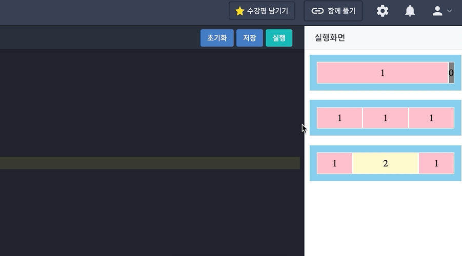
-
**flex-shrink**
- flex item의 축소와 관련
- 0과 정수(비율)를 사용하며 기본값은
flex-grow와 달리 1 - 속성값이 0일 경우 flex container 크기가 flex item의 크기보다 작아져도 flex item의 크기가 줄어들지 않고 원래 크기를 유지
- 속성값이 1 이상이면 flex container 크기가 작아질 때 flex item의 크기가 flex container 크기에 맞춰 줄어든다.

- 예시
<div class="container none">
	<div class="item">0</div>
	<div class="item">0</div>
	<div class="item">0</div>
</div>
<div class="container active">
	<div class="item">1</div>
	<div class="item">1</div>
	<div class="item">1</div>
</div>
<div class="container target">
	<div class="item">1</div>
	<div class="item">3</div>
	<div class="item">5</div>
</div>
.container { background-color: skyblue; height: 36px; padding: 12px; margin-bottom: 16px; display: flex; width: 400px; } .item { /* 텍스트 가운데 정렬을 위한 스타일*/ width: 200px; display: flex; justify-content: center; align-items: center; border: 1px solid #fff; background: pink; } .none > .item { flex-shrink: 0; } .active > .item { flex-shrink: 1; } .target > .item:first-child { flex-shrink: 1; } .target > .item:nth-child(2) { flex-shrink: 5; } .target > .item:last-child { flex-shrink: 3; }-
첫 번째 줄과 같이
flex-shrink: 0인 경우 flex item은 작아지지 않기 때문에 flex container를 벗어나게 된다. -
flex-shrink: 1인 경우 flex item은 flex container에 맞춰 줄어든다.
-
마찬가지로
flex-shrink의 값은 비율이기 때문에 flex container가 줄어들면 각 flex item에 적용한 값을 기준으로 비율에 맞춰 줄어든다. -
flex container를 줄여보기 위해 아래와 같이
.container에서width: 400px을 지워본 경우.container { background-color: skyblue; height: 36px; padding: 12px; margin-bottom: 16px; display: flex; }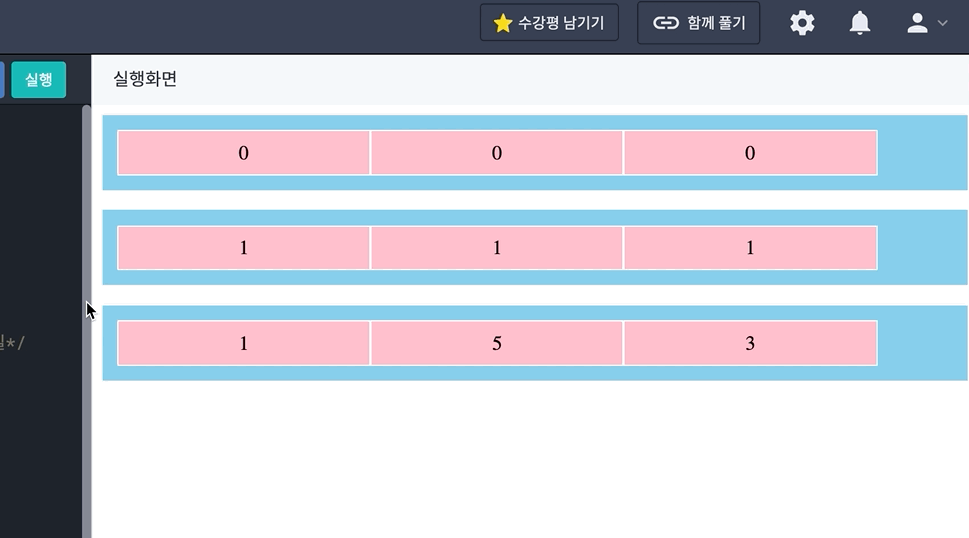
-
**flex-basis**
flex-basis는 flex item의 기본 크기를 결정하며, 기본값은auto- 단위로는 모든 크기 단위를 사용할 수 있는데,
auto로 값이 설정되면 원래 컨텐츠의 크기가 할당
- 단위로는 모든 크기 단위를 사용할 수 있는데,
**flex-basis: auto**
flex-basis의 값이auto라면 각 flex item의 크기가flex-basis로 할당- 남은 크기를
flex-grow에 따라 2:1의 비율로 나눔
- 남은 크기를
flex-basis: 0
flex-basis의 값이0이면flex-grow에 따라 각 flex item의 크기가 2:1:1 비율로 나눔
**flex-basis: 100px**
flex-basis의 값이 100px인 경우(수치를 값으로 가지는 경우) 각 컨텐츠마다100px
을 제외, 즉 총300px에 해당하는 값을 제외한 크기를 2:1:1의 비율로 나눔
**flex**
- flex는
flex-grow,flex-shrink,flex-basis를 한번에 설정할 수 있는 축약형 flex를 작성할 때는flex-grow,flex-shrink,flex-basis의 순서로 값을 넣어야 한다.flex-grow: 1; flex-shrink: 0; flex-basis: 400px; /* 위와 아래는 동일한 코드 */ flex: 1 0 400px;flex: 1혹은flex: 0과 같이 값도 축약하여 사용할 수 있다flex-grow: 1; flex-shrink: 1; flex-basis: 0%; /* 위와 아래는 동일한 코드 */ flex: 1;flex-grow: 0; flex-shrink: 1; flex-basis: 0%; /* 위와 아래는 동일한 코드 */ flex: 0;flex의 값으로 단위가 없는 값이 주어질 경우flex-grow와 동일하다고 볼 수 있다.flex-shrink의 경우 기본값인1이 할당flex-basis는 축약형에서는0으로 할당
grid layout 기본
- Grid는 격자, 즉 행렬을 통해 요소들을 좀 더 정교하고 복잡하게 정렬 및 배치할 수 있는 레이아웃 시스템
- Grid 내부는 Lines, Track, Area, Gap이라는 영역으로 이루어져 있다.
**Grid 요소들의 명칭**
- Grid Lines는 말 그대로 격자를 이루는 선의 집합. Grid를 이루는 행과 열의 선들을 모두 Grid Lines라고 함

- Grid Lines에서 행과 열은 각각 Grid column와 Grid row라고 말합니다.

- Grid는 격자로 이루어져있어 선과 선 사이에 공간이 배치된 것을 볼 수 있다. 평행한 Grid Line 두 줄 사이의 공간을 Grid Track이라 부릅니다.

- Grid Line 네 줄로 둘러싸인 공간을 Grid Area라고 부릅니다. 네 개의 Grid Line으로 둘러싸였고, 그 안이 더 이상 쪼개지지 않는 한 칸을 Grid Cell이라고도 부르는데, 한 개일 때 혹은 그 이상일 때 해당 공간을 Grid Area라고 합니다.

- 행 여러 개(Rows) 혹은 열 여러 개(Columns) 사이의 간격을 Grid Gap이라고 하며, Grid Lines의 두께이다.

**Grid의 구성**
- Gird 또한 Flexbox와 같이 Grid Container와 Grid Items로 구성되어 있다. 배치하고자 하는 요소인 Grid item들은 Grid Container 안에 담겨 있어야 합니다.
<div class="grid-container">
	<header class="grid-item">Header</header>
	<section class="grid-item">Section</section>
	<section class="grid-item">Section</section>
	<aside class="grid-item">Aside</aside>
	<footer class="grid-item">Footer</footer>
</div>
grid container: template
**display: grid / inline-grid**
**grid-template-rows/columns**
grid-template-rows와grid-template-columns는 모두 Grid Track의 크기를 정의- 행에 해당하는 Grid Track의 크기를
grid-template-rows로 지정 - 열에 해당하는 Grid Track의 크기를
grid-template-columns로 지정 grid-template적용 예시.main { display: grid; grid-template-rows: 40px 40px 40px; grid-template-columns: 40px 80px 40px; }
- 행에 해당하는 Grid Track의 크기를
grid-template-rows: 40px 40px 40px;와 같이 반복되는 값을 쉽게 할당하는 법 ⇒repeat()함수를 사용repeat()함수는grid-template-columns와grid-template-rows에서만 사용할 수 있다는 점 참고/* 2, 3번째 라인은 동일한 뜻을 지님 */ grid-template-columns: 40px repeate(4, 80px) 40px; grid-template-columns: 40px 80px 80px 80px 80px 40px; /* 6, 7번째 라인은 동일한 뜻을 지님 */ grid-template-columns: repeate(4, 40px 80px); grid-template-columns: 40px 80px 40px 80px 40px 80px 40px 80px;
fr은 fraction의 약자로 파편, 분수라는 뜻- Grid Track에서
fr은 Grid Container에 남은 공간의 비율을 나타내는 유연한 단위 - 만약 Grid Container의 너비가
500px이라면grid-template-columns: 1fr 3fr 1fr;로 설정했을 때 Grid Track을 1 : 3 : 1의 비율로 나누니 각각100px, 300px, 100px을 차지
fr은 비율이기 때문에 Grid Container의 너비가 변하더라도 해당 비율을 유지
- Grid Track에서
**grid-template-areas**
grid-template-areas를 이용하여 Grid Area의 이름을 할당
- 예시
.main {
	display: grid;
	grid-template-rows: 128px auto 240px;
	grid-template-columns: 1fr 3fr 1fr;
	grid-template-areas:
		"hd hd hd"
		"nav content ad"
		"ft ft ft";
}
header,nav,section,aside,footer {
	border: 4px solid;
	padding: 8px;
	margin: 2px;
	text-align: center;
}

header {
	grid-area: hd;
	border-color: purple;
}
nav {
	grid-area: nav;
	border-color: blue;
}
section {
	grid-area: content;
	border-color: yellow;
}
aside {
	grid-area: ad;
	border-color: red;
}
footer {
	grid-area: ft;
	border-color: green;
}
grid-template-areas가 적용되는 방식을 엑셀로 보기
grid-template-areas의 영역을 할당하는 방법은 간단. Grid Area에 붙인 이름을 원하는 칸에 배치
- 배치된 Grid Area 이름은 같은 이름을 가진 Grid Area끼리 합쳐져 오른쪽과 같은 레이아웃으로 적용

grid-template-areas의 값은""로 한 행을 표현하며, 여러 행을 띄어쓰기로 구분grid-template-areas: "1행 1행 1행" "2행 2행 2행" "3행 3행 3행" /* 둘 다 가능 🟢 */ grid-template-areas: "1행 1행 1행" "2행 2행 2행" "3행 3행 3행"- 직사각형의 모양이 되어야 무너지지 않는 점 주의
grid-template-areas: /* ㄴ 모양 ❌ */ "hd hd hd" "nav content ad" "nav nav ft"; grid-template-areas: /* ㅗ 모양 ❌ */ "hd hd hd" "nav ft ad" "ft ft ft"; grid-template-areas의 값은 Grid 전체를 나타내야 하는 점을 주의. 전체 Grid Area 수와 동일
**grid-template**
grid-template는grid-template-xxx에 해당하는 모든 프로퍼티의 단축 프로퍼티- 아래의 두 코드는 동일하게 동작
.main {
	display: grid;
	grid-template:
		"hd hd hd" 128px
		"nav content ad" auto
		"ft ft ft" 240px
		/ 1fr 3fr 1fr;
}
.main { display: grid; grid-template-rows: 128px auto 240px; grid-template-columns: 1fr 3fr 1fr; grid-template-areas: "hd hd hd" "nav content ad" "ft ft ft"; }
- 아래의 두 코드는 동일하게 동작
- grid-template-areas를 따로 지정하지 않고 grid-template-rows와 grid-template-columns를 한번에 지정
- 아래의 두 코드 동일하게 동작
.main {
	display: grid;
	grid-template: 128px auto 240px / 1fr 3fr 1fr
}
.main { display: grid; grid-template-rows: 128px auto 240px; grid-template-columns: 1fr 3fr 1fr; }
- 아래의 두 코드 동일하게 동작
grid container: gap
**grid-row/column-gap**
grid-row-gap과grid-column-gap을 통해 각 행과 열 사이의 간격을 지정- 예시
.main { display: grid; grid-template: "hd hd hd" 128px "nav content ad" auto "ft ft ft" 240px / 1fr 3fr 1fr; grid-row-gap: 16px; grid-column-gap: 16px; } header,nav,section,aside,footer { border: 4px solid; padding: 8px; text-align: center; } header { grid-area: hd; border-color: purple; } nav { grid-area: nav; border-color: blue; } section { grid-area: content; border-color: yellow; } aside { grid-area: ad; border-color: red; } footer { grid-area: ft; border-color: green; }- 행과 열에 Grid Gap을 각각 16px씩 지정하면 다음 이미지와 같이 배치

- Grid Gap이 0일 경우

- 행과 열에 Grid Gap을 각각 16px씩 지정하면 다음 이미지와 같이 배치
**grid-gap**
grid-gap은grid-row-gap과grid-column-gap의 단축 프로퍼티grid-row-gap을 처음 값으로,grid-column-gap을 두번째 값으로 사용- 값을 하나만 작성하면
grid-row-gap과grid-column-gap모두 동일한 값으로 지정grid-row-gap: 16px; grid-column-gap: 16px; /* 위와 아래의 코드는 동일합니다. */ grid-gap: 16px 16px; /* 모두 동일한 코드입니다. */ grid-gap: 16px;
grid container: auto
**grid-auto-rows/columns**
grid-auto-rows와grid-auto-columns는 크기가 지정되지 않은 Grid Track의 크기를 지정할 수 있는 프로퍼티- 예제
<article class="photos">
	<div class="card">1</div>
	<div class="card">2</div>
	<div class="card">
		Lorem Ipsum is simply dummy text of the printing and typesetting industry. Lorem Ipsum has been the industry's standard dummy text ever since the 1500s, when an unknown printer took a galley of type and scrambled it to make a type specimen book.</div>
	<div class="card">4</div>
	<div class="card">5</div>
</article>
body { background-color: #eee; } .photos { display: grid; grid-gap: 8px; grid-template-columns: repeat(3, 1fr); } .card { background: #fff; box-shadow: 0px 2px 8px rgba(0,0,0, .2); border-radius: 8px; padding: 24px; }- grid-template-rows를 이용하여 200px인 Grid Track을 3개 생성
.photos { display: grid; grid-gap: 8px; grid-template-columns: repeat(3, 1fr); grid-template-rows: repeat(3, 200px); }- 아래와 같이 내용이 밖으로 빠져 나감

- 아래와 같이 내용이 밖으로 빠져 나감
- 크기의 최대, 최소를 설정하는
minmax(최솟값, 최댓값)함수는 첫 번째 매개변수로 최솟값을, 두 번째 매개변수로 최댓값으로 받습니다. 함수를 아래와 같이 사용하면 행의 크기는 최소200px으로, 최대는auto로 설정되어 내용에 따라 자동으로 크기가 늘어난다.photos { display: grid; grid-gap: 8px; grid-template-columns: repeat(3, 1fr); grid-template-rows: repeat(3, minmax(200px, auto)); }
- 이미지 추가 한 경우
<article class="photos">
	<div class="card">1</div>
	<div class="card">2</div>
	<div class="card">
		Lorem Ipsum is simply dummy text of the printing and typesetting industry. Lorem Ipsum has been the industry's standard dummy text ever since the 1500s, when an unknown printer took a galley of type and scrambled it to make a type specimen book.</div>
	<div class="card">4</div>
	<div class="card">5</div>
	<div class="card">6</div>
	<div class="card">7</div>
	<div class="card">8</div>
	<div class="card">9</div>
	<div class="card">10</div>
	<div class="card">11</div>
	<div class="card">12</div>
	<div class="card">13</div>
	<div class="card">14</div>
</article>
- 세 번째 줄까지만 크기를 지정했기 때문에 네 번째 줄부터는 갑자기 크기가 지정되지 않은 상태로 바뀜
- 코드를 아래와 같이 수정
.photos {
	display: grid;
	grid-gap: 8px;
	grid-template-columns: repeat(3, 1fr);
	grid-auto-rows: minmax(200px, auto);
}
- 코드를 아래와 같이 수정
- 이제는 행의 갯수에 상관 없이 크기를 지정할 수 있다.

- grid-template-rows를 이용하여 200px인 Grid Track을 3개 생성
**grid-auto-flow**
grid-auto-flow는 Grid가 자동으로 배치되는 방향을 결정- 총 2개의
.card가 Grid Container 내부에 배치<article class="photos"> <div class="card">1</div> <div class="card">2</div> </article>body { background-color: #eee; } .photos { display: grid; grid-gap: 8px; grid-template-columns: repeat(2, 100px); } .card { background-color: #fff; box-shadow: 0px 2px 8px rgba(0,0,0, .2); border-radius: 8px; padding: 24px; }- .card를 하나 더 추가
- grid-template-columns로 두 열을 정의했기에 세 번째 .card는 자동으로 두 번째 행에 배치
<article class="photos">
	<div class="card">1</div>
	<div class="card">2</div>
	<div class="card">3</div>
</article>
- grid-template-columns로 두 열을 정의했기에 세 번째 .card는 자동으로 두 번째 행에 배치
- 두 번째 행에 자동으로 배치되는 이유는 grid-auto-flow의 기본 값이 row이기 때문
- grid-auto-flow를 추가
.photos {
	display: grid;
	grid-gap: 8px;
	grid-template-columns: repeat(2, 100px);
	grid-auto-flow: column;
}
- grid-auto-flow를 추가
- 세 번째 .grid가 grid-auto-flow에 따라 column 방향으로 배치

grid-auto-flow는 row, column, row dense, column dense를 값으로 가질 수 있다.- row dense는 row와 동일하게 자동 배치되는 방향을 정하지만 밀집된 형태로 정렬한다는 차이
- 첫번째 .card를 두번째 열에서 시작하도록 지정
body {
	background-color: #eee;
}
.photos {
	display: grid;
	grid-gap: 8px;
	grid-template-columns: repeat(2, 100px);
	grid-auto-flow: row;
}
.card {
	background-color: #fff;
	box-shadow: 0px 2px 8px rgba(0,0,0, .2);
	border-radius: 8px;
	padding: 24px;
}
.card:nth-child(1) {
  grid-column-start: 2; /* Grid Item 관련 프로퍼티에서 자세히 알려드리겠습니다. */
}
- grid-auto-flow: row일 때는 당연히 row 방향으로 배치하기 때문에 2와 3이 자연스럽게 다음 행으로 넘어간다. 이 상태에서 row dense로 바꿈
.photos {
	display: grid;
	grid-gap: 8px;
	grid-template-columns: repeat(2, 100px);
	grid-auto-flow: row dense;
}
- 3의 왼쪽에 있던 2가 1 왼쪽의 빈 공간으로 이동
- grid-template-columns의 개수를 늘리고, grid-column-start를 네 번째에서 시작하도록 수정
body {
	background-color: #eee;
}
.photos {
	display: grid;
	grid-gap: 8px;
	/*grid-template-columns: repeat(2, 100px);*/
	grid-template-columns: repeat(4, 100px);
	grid-auto-flow: row;
}
.card {
	background-color: #fff;
	box-shadow: 0px 2px 8px rgba(0,0,0, .2);
	border-radius: 8px;
	padding: 24px;
}
.card:nth-child(1) {
	/* grid-column-start: 2; */
  grid-column-start: 4;
}
- 이 상태에서 row dense를 적용

- row dense를 적용한 결과
- row dense가 row와 같이 행을 넘김, 먼저 다음 줄로 넘어갈 요소들을 빈 칸으로 배치하여 먼저 채우는 방식으로 적용
- column dense도 방향만 다를 뿐, 동일한 원리로 동작
- .card를 하나 더 추가
grid container: grid
grid는grid-template와grid-auto의 단축형 프로퍼티grid는세 가지 형태의 값을 가질 수 있다.grid: <grid-template>; grid: <grid-template-rows> / auto-flow <grid-auto-columns>; grid: auto-flow <grid-auto-rows> / <grid-template-columns>;
grid는gird-template로 쓸 수 있다..main { display: grid; grid: "hd hd hd" 128px "nav content ad" auto "ft ft ft" 240px / 1fr 3fr 1fr; }.main { display: grid; grid-template: "hd hd hd" 128px "nav content ad" auto "ft ft ft" 240px / 1fr 3fr 1fr; }- grid-template와 동일하게 grid-template-rows와 grid-template-columns도 한번에 적용 가능
.main {
	display: grid;
	grid: 128px auto 240px / 1fr 3fr 1fr;
	grid-template-areas:
		"hd hd hd"
		"nav content ad"
		"ft ft ft";
}
.main { display: grid; grid-template: 128px auto 240px / 1fr 3fr 1fr; grid-template-areas: "hd hd hd" "nav content ad" "ft ft ft"; }
**auto-flow /**
grid로 grid-template-rows와 grid-auto를 동시에 적용
- 아래의 두 코드는 동일한 코드
- grid의 auto-flow는 grid-auto-flow: row와 동일
- grid-auto-flow: row, grid-auto-flow: column 중 무엇을 적용할 것인지는 auto-flow의 위치에 의해 결정
- 아래와 같이 / 앞에 있는 경우 row를, /의 뒤에 있는 경우 column를 적용
- auto-flow 키워드가 있어야만 grid-auto-flow가 적용되는 점을 주의
- auto-flow가 없다면 앞의 grid-template의 형식으로 인식되며, 100px이 grid-auto-rows 값으로 들어간다
.photos {
	display: grid;
	grid-gap: 8px;
	grid: auto-flow 100px / repeat(2, 100px);
}
.photos { display: grid; grid-gap: 8px; grid-template-columns: repeat(2, 100px); grid-auto-rows: 100px; grid-auto-flow: row; }
- dense의 경우 grid-auto-flow와 비슷하게 사용
.photos {
	display: grid;
	grid-gap: 8px;
	grid: auto-flow dense 100px / repeat(2, 100px);
}
.photos { display: grid; grid-gap: 8px; grid-template-columns: repeat(2, 100px); grid-auto-rows: 100px; grid-auto-flow: row dense; }
**/auto-flow **
- auto-flow를
/뒤에 사용하기 때문에 이 형식을 쓰는 방법은grid-auto-flow: column의 값을 가짐 - 동일한 결과가 나오는 것을 볼 수 있다.
.photos {
	display: grid;
	grid-gap: 8px;
	grid: repeat(2, 100px) / auto-flow 100px;
/* 	grid: repeat(2,100px)  / auto-flow dense; */
}
.photos { display: grid; grid-gap: 8px; grid-template-rows: repeat(2, 100px); grid-auto-columns: 100px; grid-auto-flow: column; /* grid-auto-flow: column dense; */ }- grid에는 값을 주는 순서와 auto-flow 키워드의 유무에 따라 값이 적용되는 방식이 다르니 프로퍼티를 사용할 때 유의
grid container: align & justify
**align/justify/place**
align은 수직 방향 정렬을,justify는 수평 방향 정렬place는align과justify의 축약형
**content/items**
content는 Grid Container를 기준으로 Grid Cell을 정렬items는 Grid Cell 혹은 Grid Area를 기준으로 Grid Item을 정렬
**프로퍼티의 값**
-앞부분인align와justify에 영향을 받지 않고, 오로지content와items에만 영향을 받는 값 제목 없음
content에 해당하는 값들을 실제로 사용하면 다음과 같다
- items에 해당하는 값을 사용하면 다음과 같다.

**종합**
align-content: center;는 Grid Container 기준 수직 방향으로 Grid Cell들을 중앙 정렬
- justify-items:center;는 Grid Cell 혹은 Grid Area 기준 수평 방향으로 Grid Item을 중앙 정렬

**place**
place-xxx는xxx-content와xxx-items의 축약 프로퍼티align을 먼저 쓰고 그 다음justify가 따라온다place-content: <align-content> <justify-content>; place-items: <align-items> <justify-items>;- 아래의 두 코드가 동일하게 동작함
.container {
	place-content: space-around space-evenly;
	place-items: center stretch;
}
.container { align-content: space-around; justify-content: space-evenly; align-items: center; justify-items: stretch; }
- 만약 값을 하나만 할당하면 align과 justify에 동일한 값이 부여.
- 아래의 두 코드 역시 동일하게 동작
.container {
	place-content: stretch;
	place-items: end;
}
.container { align-content: stretch; justify-content: stretch; align-items: end; justify-items: end; }
- 아래의 두 코드 역시 동일하게 동작
grid item: row, column
**grid-row-xxx, grid-column-xxx**
grid-row와grid-column을 통해 Grid Item의 행, 열의 시작 위치와 끝 위치를 지정
- 각 Grid Track 사이를 Grid Lines라고 부른다.
- 해당 Grid Lines는 아래와 같이 왼쪽 위에서부터 차례로 1, 2, 3, ... 순서로 양수 인덱스를 가집니다.

- 오른쪽 아래부터 -1, -2, -3, ... 순서대로 음수 인덱스를 가집니다.

- 해당 Grid Lines는 아래와 같이 왼쪽 위에서부터 차례로 1, 2, 3, ... 순서로 양수 인덱스를 가집니다.
- Grid Lines의 인덱스를
grid-row와grid-column의 값으로 주어 Grid Item이 배치될 위치를 지정할 수 있다.
**grid-row, grid-column**
grid-row는grid-row-start와grid-row-end의 축약형grid-row-start는 해당 Grid Item의 행 방향으로의 시작 위치를 지정grid-row-end는 이와 반대로 끝나는 위치를 지정- 2~4행에 걸쳐 Grid Item을 배치

- grid-column 또한 grid-column-start와 grid-column-end의 축약형
- grid-row-xxx와 동일하며 방향만 열 방향
- 2~4열에 걸쳐 Grid Item을 배치

- grid-row와 grid-column은 grid-xxx-start / grid-xxx-end의 형태로 사용
grid-row: <grid-row-start> / <grid-row-end> grid-column: <grid-column-start> / <grid-column-end> - 예시
<div class="container">
  <div class="item">1</div>
  <div class="item">2</div>
  <div class="item">3</div>
  <div class="item">4</div>
</div>
- 첫 번째 Grid Item이 Grid Cell 두 칸을 차지하도록 배치
.item:nth-child(1) { grid-column: 1 / 3; } - 두 번째 Grid Item이 열 방향 Grid Line 1부터 3까지 차지
.item:nth-child(1) { grid-column: 1 / 3; } .item:nth-child(2) { grid-row: 1 / 3; } - 오른쪽과 같이 두 번째 Grid Item에 grid-row가 있어 1~2열에 적용되었지만 grid-column이 없기 때문에 아래와 같이 나온다. 첫 번째 Grid Item에 grid-row가 없기 때문에 grid-column만 적용되어 grid-row가 있는 두 번째 Grid Item이 먼저 배치가 되고 그 다음 남은 Grid Item들이 배치

- 해결책
- 첫 번째 방법은 첫 번째 Grid Item에 grid-row 값을 부여
- grid-row: 1은 grid-row-start: 1과 grid-row-end: auto값의 축약
.item:nth-child(1) {
  grid-column: 1 / 3;
  grid-row: 1;
}
.item:nth-child(2) {
  grid-row: 1 / 3;
}
- grid-row: 1은 grid-row-start: 1과 grid-row-end: auto값의 축약
- 두 번째 Grid Item에 grid-column값을 준다.
- grid-column: -2 대신 grid-column: 3도 가능
.item:nth-child(1) {
  grid-column: 1 / 3;
}
.item:nth-child(2) {
  grid-row: 1 / 3;
  grid-column: -2;
}
- grid-column: -2 대신 grid-column: 3도 가능
- 세 번째 Grid Item을 배치
.item:nth-child(3) {
  grid-row: 2 / 4;
}
- 첫 번째 방법은 첫 번째 Grid Item에 grid-row 값을 부여
- 해결책
- span 키워드와 숫자 값을 함께 작성하면 숫자 값 만큼 공간을 차지
- grid-row-end에 span 키워드를 사용할 경우 start를 기준으로 2칸인 2~4(2+2)열을 차지
.item:nth-child(3) {
  grid-row: 2 / span 2;
}
- grid-row-end에 span 키워드를 사용할 경우 start를 기준으로 2칸인 2~4(2+2)열을 차지
- grid-row-start에 span 키워드를 사용하면 end를 기준으로 배치
.item:nth-child(3) {
  grid-row: span 2 / 4;
}
- 첫 번째 Grid Item이 Grid Cell 두 칸을 차지하도록 배치
grid item: area
grid-area는grid-row와grid-column의 단축 속성 역할- 값을 생략할 경우
auto의 값을 가진다grid-area: <Grid Area 이름> grid-area: <grid-row-start> / <grid-column-start> / <grid-row-end> / <grid-column-end>;
- 값을 생략할 경우
grid item: self
xxx-self는 해당 Grid Item을 정렬하는데 사용
**align-self, justify-self**
align-self는 수직 정렬jusify-self는 수평 정렬
align-self,jusify-self모두 start, center, end, stretch 값을 가질 수 있다.<h1>Hello Goorm</h1><div class="container"> <div class="item">1</div> <div class="item">2</div> <div class="item">3</div> <div class="item">4</div> </div>.container { width: 400px; height: 400px; background: skyblue; padding: 16px; display: grid; grid-template: repeat(2, 1fr) / repeat(2, 1fr); grid-gap: 16px; } .item { border: 2px dashed red; background: #fff; text-align: center; width: 100px; height: 100px; font-size: 1.5rem; } .item:nth-child(1) { align-self: start; } .item:nth-child(2) { align-self: center; } .item:nth-child(3) { align-self: end; } .item:nth-child(4) { align-self: stretch; }justify-self도 방향만 다를 뿐 동일하게 동작
**place-self**
place-self는align-self와jusify-self의 단축 프로퍼티place-self: <align-self> <justify-self>;- 두 코드는 동일하게 동작
align-self: end; jusify-self: center;place-self: end center;
- 두 코드는 동일하게 동작
상속
- 상속은 부모나 조상 요소에 적용된 CSS 프로퍼티를 자식 혹은 후손 요소가 물려받는 것
- 상속된 요소는 덮어 씌울 수도 있다.
- 상속이 되지 않는 프로퍼티를 상위에서 상속 받기를 원한다면 값으로
inherit을 주어 해결할 수 있다.- 예제
<div class="main">
	main
	<div class="sub">
		inner
	</div>
</div>
.main { background-color: skyblue; width: 100px; padding: 24px; } .sub { background-color: pink; }.sub도.main과 같이padding을24px을 주고 싶으면 아래와 같이 작성하여 값을 쉽게 줄 수 있다..sub { background-color: pink; padding: inherit; }
- 예제
우선순위
**중요도**
- 중요도는 CSS가 어디에 선언되었는지에 따라 우선순위가 달라집니다.
<head>태그 내의<style>태그<head>태그 내의<style>태그 내의@import문<link>태그로 연결된 CSS<link>태그로 연결된 CSS 내의@import문- 브라우저 디폴트 스타일시트
**명시도**
- CSS는 명시도에 따라 우선순위가 달라집니다.
!important- 인라인 스타일 inline style
- 아이디 선택자 id selector
- 클래스, 속성, 가상클래스 선택자 class, attribute, pseudo class selector
- 태그 선택자 type selector
- 전체 선택자universal selector
- 상속
inherit
**선언순서**
- 선언 순서에 따라서 또한 우선 순위가 달라집니다. 나중에 선언된 스타일이 우선 적용
**transition-delay**
transition-delay에서delay는 '지연'을 뜻합니다.-
transition이 발생할 때 얼만큼 기다렸다가 실행할지 결정해주는 속성 -
단위인
s나 밀리 초 단위인ms로 나타냅니다.- 프로퍼티 값을 지정해주지 않으면 자동으로
0s가 입력되어 바로transition이 발생
- 프로퍼티 값을 지정해주지 않으면 자동으로
-
프로퍼티 값은 음수 값 지정이 가능
- 지정한 음수 값의 절대값 시간만큼 건너뛰고 시작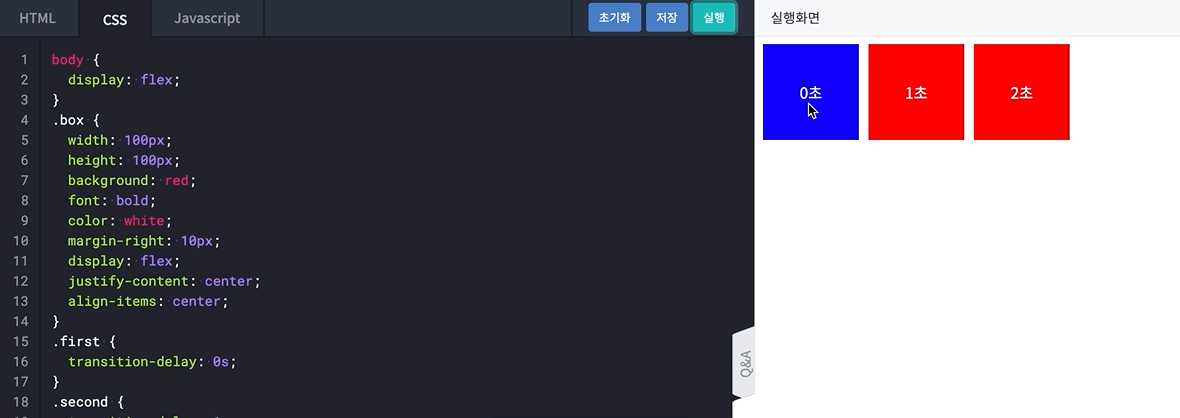
-
duration
duration은 '지속'이라는 뜻을 가진 프로퍼티-
transition이 발생하는 지속 시간을 지정 -
transition-duration을 지정하면 좀 더 애니매이션 같은 효과를 표현 -
delay와 같이 시간을 속성 값으로 가지며, 초 단위를 나타내는s나 밀리 초를 나타내는ms로 나타냅니다.
- 프로퍼티 값을 지정해주지 않으면 자동으로0s가 입력되어transition의 효과가 나타나지 않습니다.
-
property
- 속성 또는 프로퍼티는 지정하거나 변경하고 싶은 스타일 속성의 이름을 의미
transition-property는 프로퍼티를 위한 프로퍼티transition-property의 속성 값에 따라transition효과를 지정할 프로퍼티가 정해집니다.
- transition-property: all:
property의 기본 값으로, 모든 속성에transition효과가 적용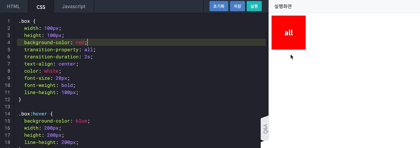

- transition-property의 값을 none으로 설정한 경우
- transition-property: none을 설정하면 다른 transition들을 무시

- transition-property: none을 설정하면 다른 transition들을 무시
- property의 값에
width를 지정한 경우- transition-property: width로 지정했으니 background-color와 height 속성은 transition-duration: 2s 효과를 받지 못합니다.
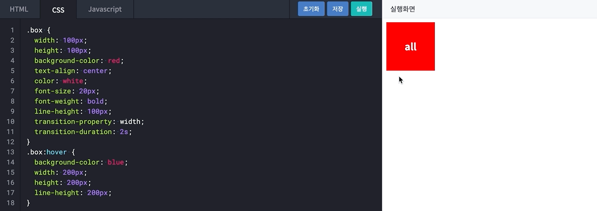
- transition-property: width로 지정했으니 background-color와 height 속성은 transition-duration: 2s 효과를 받지 못합니다.
- height와 background-color를 지정한 경우
timing-function
transition-timing-function은transition의 진행 속도를 설정하는 프로퍼티- (
transition-timing-function은 IE의 경우 버전 10부터 사용 가능한 점 참고)
- (
- cubic bezier 곡선은 부드러운 곡선을 모델링하기 위해 컴퓨터 그래픽에서 널리 쓰입니다. timing-function속성 값을 cubic bezier과 함께 설명
- 예제
박스에 마우스를 올려 보세요.
<div class="ease">ease</div>
<div class="linear">linear</div>
<div class="ease-in">ease-in</div>
<div class="ease-out">ease-out</div>
<div class="ease-in-out">ease-in-out</div>
<div class="step-start">step-start</div>
<div class="step-end">step-end</div>
.ease:hover { transition-timing-function: ease; } .linear:hover { transition-timing-function: linear; } .ease-in:hover { transition-timing-function: ease-in; } .ease-out:hover { transition-timing-function: ease-out; } .ease-in-out:hover { transition-timing-function: ease-in-out; } .step-start:hover { transition-timing-function: step-start; } .step-end:hover { transition-timing-function: step-end; }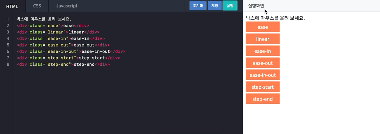
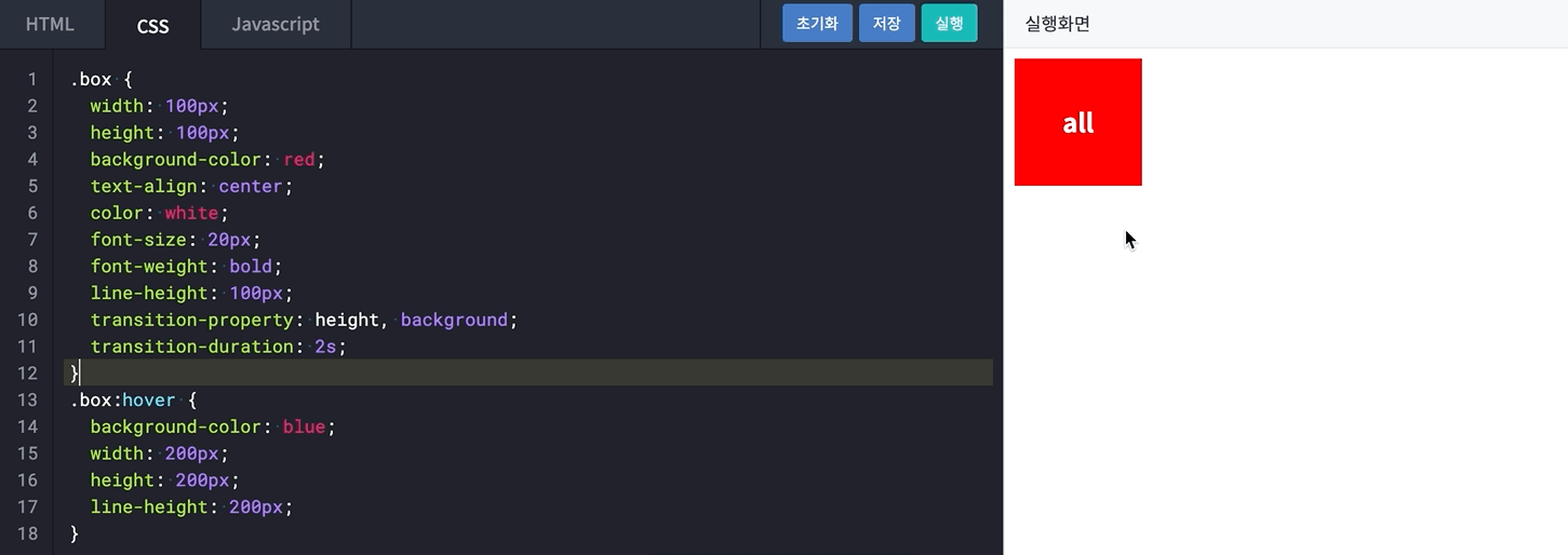
transition
- transition-property, transition-duration, transition-timing-function, transition-delay을 한번에 적용

transition : width 2s linear 1s; /* 위와 아래는 동일한 코드 입니다. */ transition-property: width; transition-duration: 2s; transition-timing-function: linear; transition-delay: 1s; - 예제
<div class="box">transition</div>.box { transition : width 2s linear 1s; }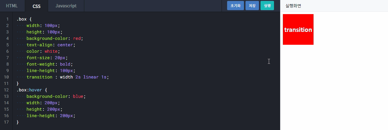
- width 속성을 2초 동안 처음부터 끝까지 일정한 속도로 1초 지연시킨 뒤에 transition 효과가 일어나는 것을 볼 수 있습니다.
scale
scale은 형태의 크기를 변환시킬 때 사용하는 프로퍼티width와height의 크기가 중심점을 기준으로 늘어나는 것을 볼 수 있습니다.
width와height를 늘리는 효과는 오른쪽 아래 방향으로 진행되나,scale을 사용하면 변형 중심점이 가운데로 지정되기 때문에 가운데를 중심으로 커지는 효과를 볼 수 있습니다.scale(1)에서 1은 100%를 뜻하기 때문에 1 이상의 값을 입력해야 변하는 모습을 확인
scale의 괄호 안에는 2가지 인자를 넣을 수 있습니다. 인자는 각각 x축, y축을 의미- x축 비율과 y축 비율을 다르게 설정
.box:hover{
	transform:scale(3, 2);
}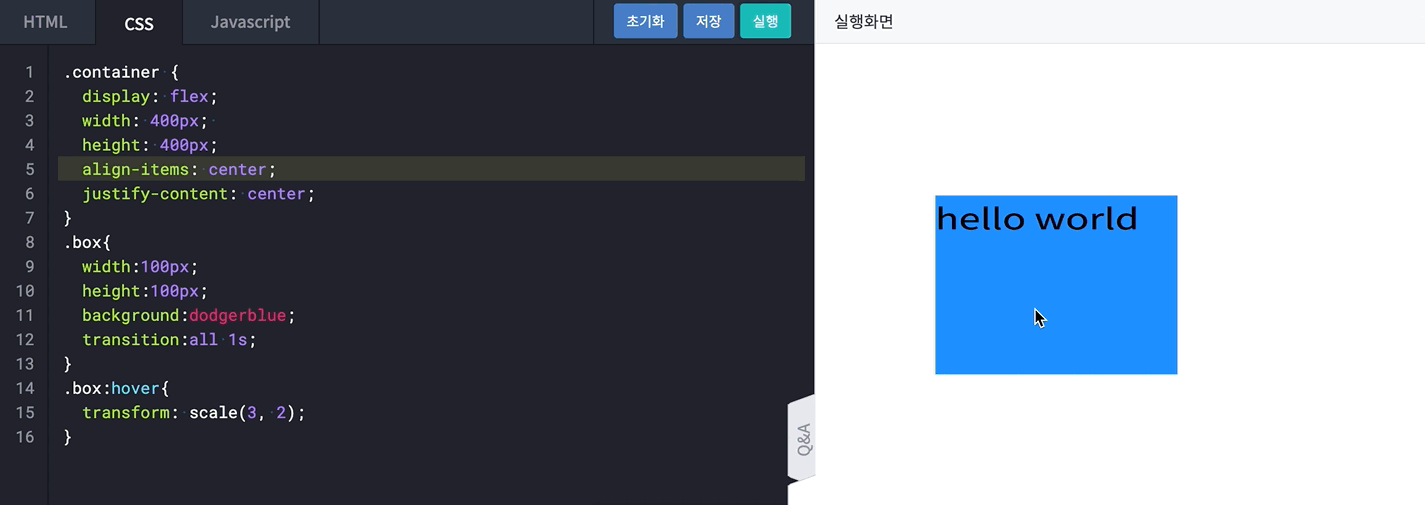
- x축 비율과 y축 비율을 다르게 설정
rotate, translate
**rotate**
rotate는 직역하면 '회전하다'는 뜻이며, 말 그대로 객체를 회전.box:hover{ transform: rotate(360deg); }
- 괄호 안에 각도 값을 입력하면 입력 값 만큼 오른쪽 방향으로 회전하며, 각도 값 단위는 deg(degree)를 사용
360deg는 한 바퀴를 뜻하는데transform:rotate(1turn)으로 또한 작성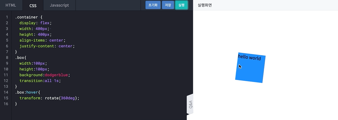
**translate**
translate는 객체를 (x, y) 지점으로 옮기고 싶을 때 사용- 괄호 안에 들어가는 값은 각각 x축, y축을 뜻합니다.

- 괄호 안에 들어가는 값은 각각 x축, y축을 뜻합니다.
- 기준점은
scale과 동일하게 가운데이며, 각 값이 증가할 때 x축 기준 오른쪽 방향으로, y축 기준 아래 방향으로 이동- 음수 값을 적용하면 반대 방향으로 이동
.box:hover{
transform: translate(100px, 100px);
}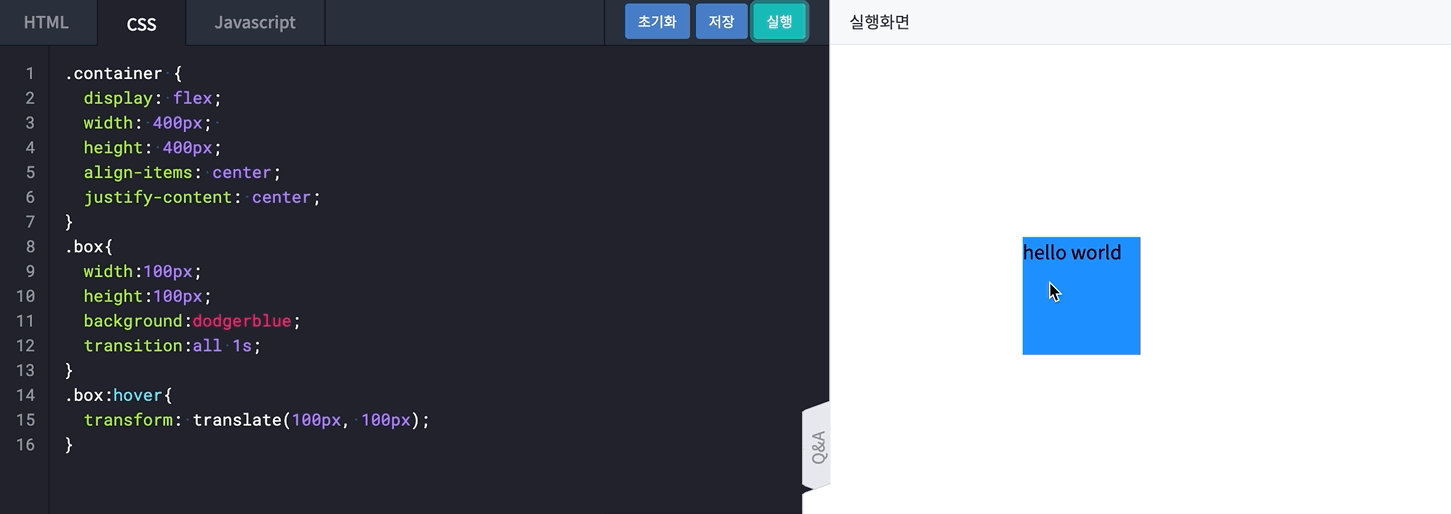
- 만약 값을 하나만 입력했을 땐
.box:hover{
transform: translate(-100px);
}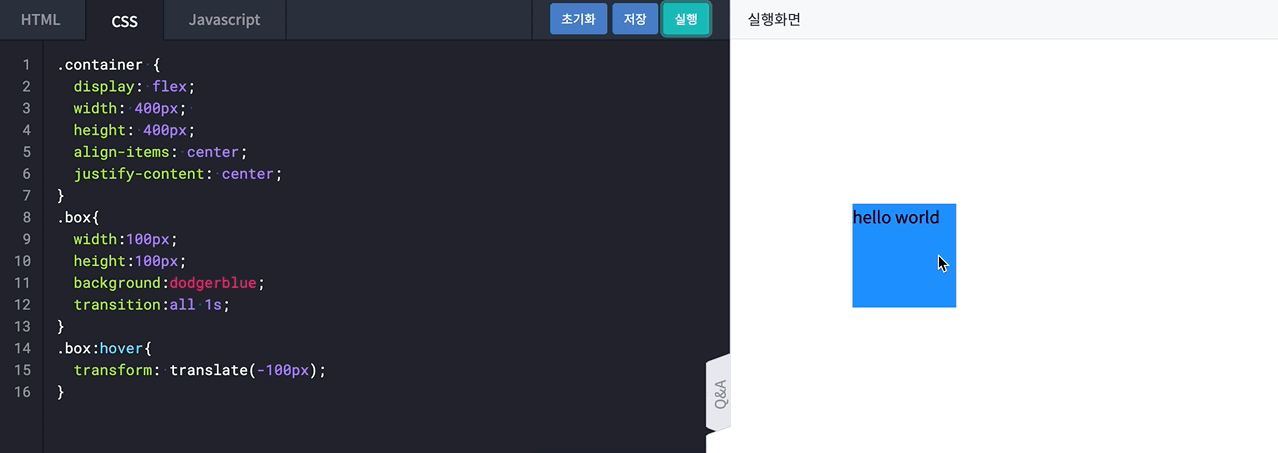
scale과 달리 x축 방향으로만 변하는 것을 확인
- 음수 값을 적용하면 반대 방향으로 이동
skew, origin
skew는 '왜곡하다'라는 단어로, 객체를 비틀거나 그 기본 형태를 왜곡하고 싶을 때 사용- 속성 값은
rotate와 같은 각도 값이며 단위 또한 deg(dgree)로 동일transform: skew(x축, y축);
- 속성 값은
- 모든
transform의 속성 값은 대문자X와Y를 붙여 따로 지정할 수 있습니다.transform: scaleX(2); transform: translateY(100px); transform: rotateX(240deg); - 객체의 기준점을 기준으로 왼쪽 상단 끝점과 오른쪽 하단 끝점을
skew에서 설정한 방향으로 설정한 각도만큼 당기는 모양 skewX를 20deg로 설정,skewX를 사용하면 X축을 기준으로 비튼다.box:hover{ transform: skewX(20deg); }
- Y축을 따라 20도를 비틀도록 설정
.box:hover{
transform: skewY(20deg);
}
- X와 Y를 모두 비튼 경우
.box:hover{
transform: skew(20deg, 20deg);
}

**transform-origin**
transform-origin을 사용하면 기준점을 원하는 위치로 설정- 왼쪽 위로 기준점을 변경하면
rotate되는 위치가 왼쪽 위부터 시작하도록 변경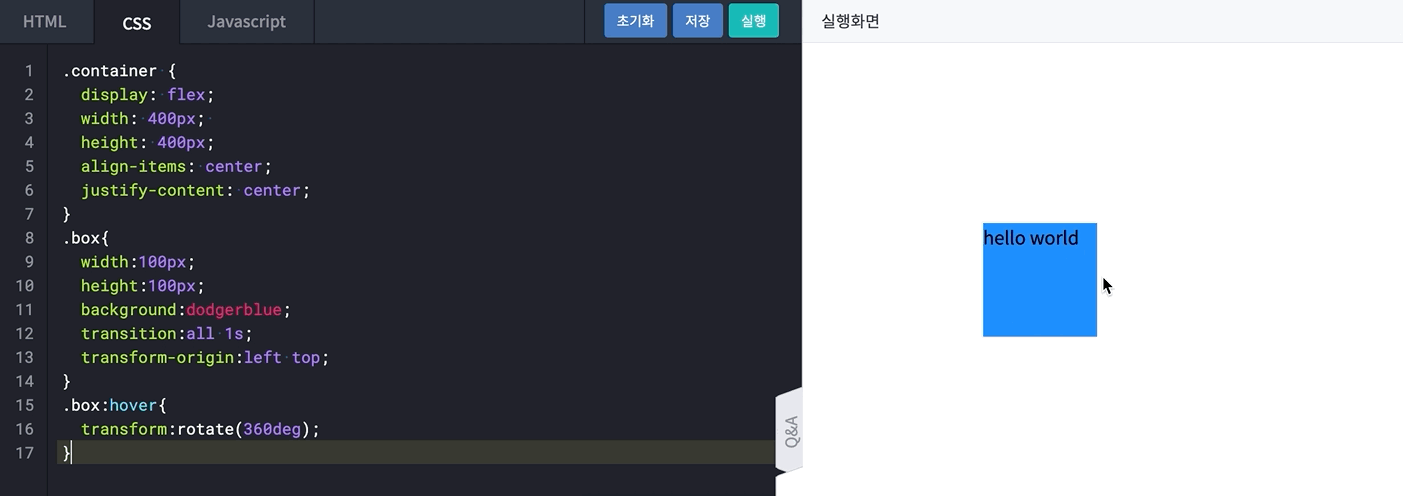
- 왼쪽 위로 기준점을 변경하면
Keyframe의 시작
**transition? animation?**
transition속성과animation속성은 Javascript의 도움 없이 대상에 직접 애니메이션 효과를 적용할 때 사용transition은 요소의 상태가 변경되어야 애니메이션을 실행animation속성은 요소의 상태 변화와 상관 없이 애니메이션을 실행
animation속성은transition과 달리@keyframes속성을 이용해 프레임을 추가- 직선적인 일반
transition의 움직임에 원하는 컨트롤을 추가하여 좀 더 역동적으로 변경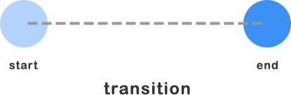

- 직선적인 일반
**Keyframe 규칙**
@keyframes은 애니메이션이 만들어지는 부분을 뜻합니다.from속성이나0%속성에 설정한 스타일부터to속성이나100%속성에 설정한 스타일로 점차 변경하며 애니메이션이 재생/* [ from ~ to 속성 ] **/ @keyframes animation-name { /** 애니메이션의 시작 프레임 **/ from { styles; } /** 애니메이션의 종료 프레임 */ to { styles; }/* [ 0% ~ 100% 속성 ] **/ @keyframes animation-name { /** 애니메이션의 시작 프레임 **/ 0% { styles; } 50% { styles; } /** 애니메이션의 종료 프레임 */ 100% { styles; }
animation과 관련된 프로퍼티_1
@keyframes은 CSS 스타일의 변화 과정을 나타낼 때 사용@keyframes을 이용한 애니메이션은transition보다 더 정밀한 효과를 구현
**animation-name**
name은@keyframes속성에서 설정한 이름을 동일하게 사용/* 키프레임 이름 == 애니메이션 이름 */ @keyframes goorm { 0% { styles; } 100% { styles; } } div{ /* 애니메이션 이름 */ animation-name: goorm; }animation-name은 다음과 같이 정해진 규칙에 따라 그 이름을 작성-
animation-name을 시작할 땐 영문 소문자, 문자열, 언더바(_), 하이픈(-)을 사용해야 합니다. -
영문 대문자, 숫자, 특수문자는 사용할 수 없습니다. (단, 파일 및 폴더 명에는 허용)
-
여러 개의
animation-name을 동시에 나열해야 할 경우 ','를 사용합니다./* [ 올바른 이름 예시 ] */ animation-name: goorm; /* 영문 소문자로 시작하는 이름 */ animtaion-name: -goorm; /* 언더바(_)로 시작하는 이름 */ animation-name: -goorm; /* 하이픈(-)으로 시작하는 이름 */ animation-name: goorm1, goorm2; /* 여러 개의 animation-name 나열 */ /* [ 잘못된 이름 예시 ] */ animation-name: Goorm-edu; /* 영문 대문자로 시작하는 이름 */ animation-name: *-goorm-ide; /* 특수문자로 시작하는 이름 */ animation-name: 1goorm; /* 숫자로 시작하는 이름 */
-
**animation-duration**
duration속성은 애니메이션의 시작부터 종료까지의 총 지속 시간을 설정할 때 사용duration값은 양수로 지정해야 그 결과를 확인- 속성 값을 0 혹은 음수로 설정하면 애니메이션이 실행되지 않으니 주의
/* [ 애니메이션이 재생되지 않는 경우 ] */
animation-duration: 0;         /* 재생시간이 0인 경우 */
animation-duration: -3s;       /* 재생시간이 음수인 경우 */

/* [ 애니메이션이 재생되는 경우 ] */
animation-duration: 3s;        /* 재생시간이 양수인 경우 */
animation-duration: 500ms;     /* 1초 이하의 재생시간을 입력할 경우 */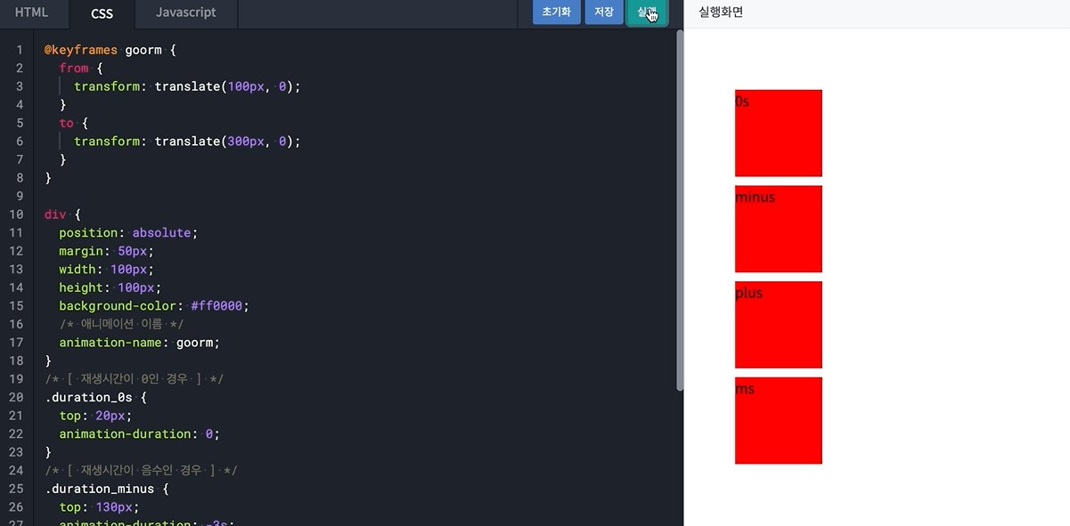
/* [ 애니메이션이 재생되지 않는 경우 ] */
animation-iteration-count: 0;         /* 재생횟수가 0인 경우 */
animation-iteration-count: -3;        /* 재생횟수가 음수인 경우 */

/* [ 애니메이션이 재생되는 경우 ] */
animation-iteration-count: 3;         /* 재생횟수가 양수인 경우 */
animation-iteration-count: 1.5;       /* 재생횟수가 실수인 경우 */
animation-iteration-count: infinite;  /* 애니메이션을 무한 반복할 경우 */
- 속성 값을 0 혹은 음수로 설정하면 애니메이션이 실행되지 않으니 주의
animation과 관련된 프로퍼티_2
**animation-iteration-count**
iteration-count속성은 애니메이션을 재생하는 횟수를 지정할 때 사용-
iteration-count속성의 기본 값은 1입니다. -
값을 0으로 지정하면 애니메이션이 재생되지 않습니다.
-
속성 값을 음수로 지정하면 기본 값인 1과 같은 결과를 출력합니다.
-
1.5와 같은 양의 유리수로 속성 값을 지정하면 애니메이션 재생 도중 첫 번째 프레임으로 돌아가 종료됩니다.
-
infinite로 값을 설정할 경우 애니메이션을 무한 반복할 수 있습니다./* [ 애니메이션이 재생되지 않는 경우 ] */ animation-iteration-count: 0; /* 재생횟수가 0인 경우 */ animation-iteration-count: -3; /* 재생횟수가 음수인 경우 */ /* [ 애니메이션이 재생되는 경우 ] */ animation-iteration-count: 3; /* 재생횟수가 양수인 경우 */ animation-iteration-count: 1.5; /* 재생횟수가 실수인 경우 */ animation-iteration-count: infinite; /* 애니메이션을 무한 반복할 경우 */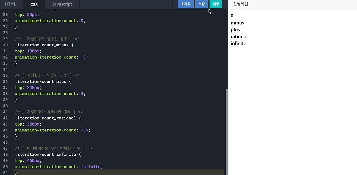
-
**animation-timing-function**
timing-function은 애니메이션@keyframes사이의 재생 속도를 조절하는 속성timing-function속성으로는ease,linear, ease-in, ease-out, ease-in-out, cubic-bezier(n, n, n, n)등이 있습니다.[ 같은 애니메이션 결과를 출력하는 속성값 ] animation-timing-function: ease; /* 기본값 */ animation-timing-function: cubic-bezier(0,25, 0.1, 0.25, 1); animation-timing-function: linear; animation-timing-function: cubic-bezier(0,0,1,1); animation-timing-function: ease-in; animation-timing-function: cubic-bezier(0.42,0,1,1); animation-timing-function: ease-out; animation-timing-function: cubic-bezier(0,0,0.58,1); animation-timing-function: ease-in-out; animation-timing-function: cubic-bezier(0.42,0,0.58,1);- 각 속성값에 대한 속도 그래프는 다음과 같으며, cubic-bezier의 n 값에 따른 변화는 https://cubic-bezier.com/에서 확인

- 각 속성값에 대한 속도 그래프는 다음과 같으며, cubic-bezier의 n 값에 따른 변화는 https://cubic-bezier.com/에서 확인
animation과 관련된 프로퍼티_3
**animation-direction**
- 애니메이션의 재생 방향을 설정할 때
direction속성을 사용 direction속성의 기본 값은normalnormal은from에 설정된 스타일에서to에 설정된 스타일대로 재생하거나,0%에 설정된 스타일에서100%에 설정된 스타일대로 재생animation-direction: normal; /* 순방향 재생 */ animation-direction: reverse; /* 역방향 재생 */ animation-direction: alternate; /* 순방향 시작, 순방향-역방향 번갈아 재생 */ animation-direction: alternate-reverse; /* 역방향 시작, 역방향-순방향 번갈아 재생 */
alternate은 순방향으로 애니메이션을 시작해 실행 횟수가 홀수일 때에는 순방향, 짝수일 때에는 역방향으로 재생alternate-reverse은 역방향으로 애니메이션을 시작해 실행 횟수가 홀수일 때에는 역방향, 짝수 일 때에는 순방향으로 재생
**animation-delay**
- 값이 양수이면 양수 값 만큼 기다렸다 애니메이션이 진행되지만, 값이 음수라면 지정된 시간이 지난 이후의 장면부터 지연 없이 애니메이션이 시작
animation-delay: 0;             /* 바로 재생 */
animation-delay: now;           /* 바로 재생 */
animation-delay: 1.5s;          /* 지연 재생 */
animation-delay: -500ms;        /* 지정 시간 이후 프레임부터 바로 재생 */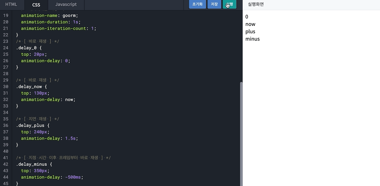
**animation-play-state**
play-state는 재생여부를 설정할 때 사용- 속성 값이
running일 경우 애니메이션을 재생하고,paused일 경우 애니메이션을 정지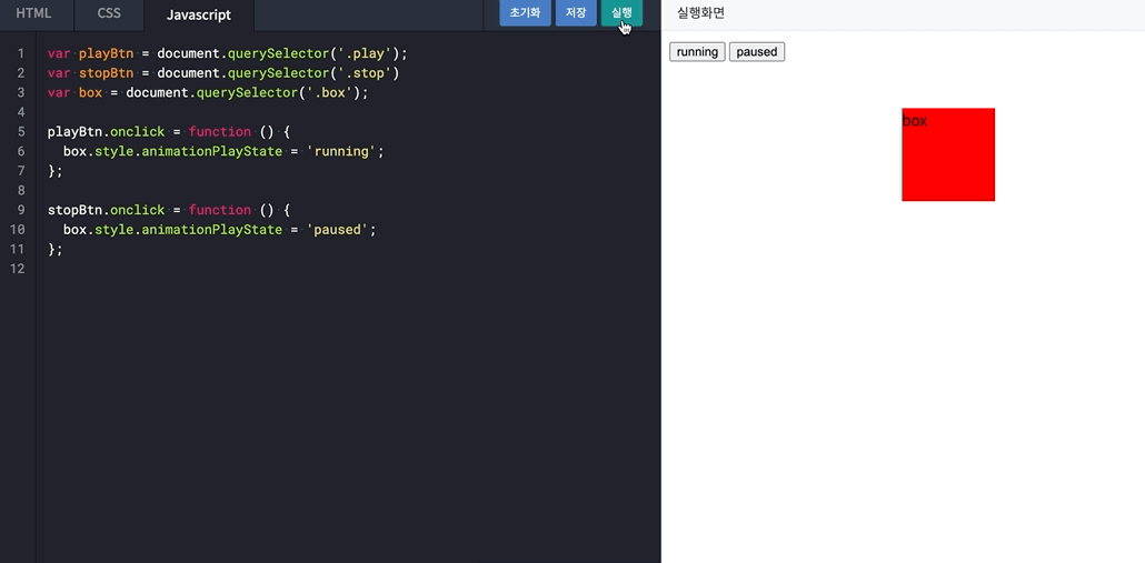
- 속성 값이