210726
저번주에 했던 ihover로 팀 학습
210727
CSS3 - animation
animation: 모션이름 시간 가속도 delay 반복횟수 방향지정;@keyframes 모션이름 {
0%{모션 시작점의 css 설정}
100%{모션 시작점의 css 설정}
}0%,100%대신 from,to 사용 가능
animation-name : 모션이름
animation-duration 시간 : 0%~100%까지의 실행속도를 초단위로 설정, 1s, 10000ms
animation-timing-function 가속도 : linear 가속도 없음, ease 가속도 있음
animation-delay : 대기시간
animation-iteration-count 반복횟수 : 0%~100%까지의 반복횟수 지정, infinite 무한반복
animation-direction 방향 : normal(0~100% 반복실행), alternative(0~100%완료시 다시 100%~0반복), reverse
animation-fill-mode : 애니메이션이 시작되기 전이나 끝나고 난 후 효과 forwards, backwards, both, none
animation-play-state : 애니메이션의 실행 상태를 설정, paused
animation-steps() : steps(10) 애니메이션 동작 지정
210728~29
position:absolute; 된 요소의 중앙정렬
margin:0 auto;가 불가하므로 다음 방법을 사용
- position:absolute;left:calc(50%-가로1/2 px);top:calc(50%-세로1/2 px);
- position:absolute;left:50%;top:50%;margin-left:-가로1/2px;margin-top:-세로1/2px;
- position:absolute;left:50%;top:50%;transform:translate3d(-50%,-50%,0)
box-sizing:border-box;
border,padding 값이 실제크기 포함 안됨
CSS로 세모 그리기
border-bottom: 20px solid #fff;
border-left: 20px solid transparent;
아래쪽 테두리 준 후 좌측은 투명
8방향 border 사용법(물방울 그리기)
border-radius:0 100% 40% 50% / 0 50% 50% 100%;
border-radius:top-left-x top-right-x bottom-right-x bottom-left-x /
top-left-y top-right-y bottom-right-y bottom-left-y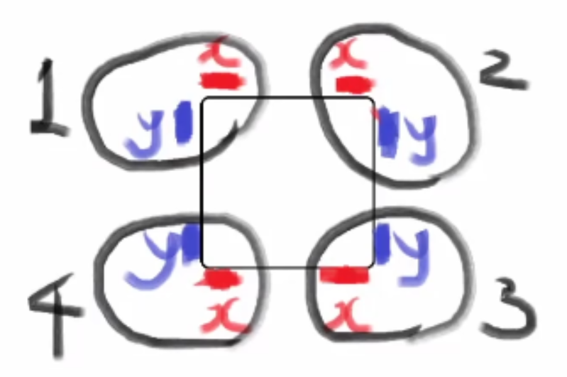
210730
라이언 이모지 만들기. 눈과 같은 대칭된 이미지 그릴 때 클래스 중앙에 점 찍은 후, 가상클래스로 대칭된 점을 찍어 연결하는 방법 사용. box-shadow도 활용.
figma 프로젝트 디자인 거의 완성. 휴가기간 중 마무리하고 자바스크립트 공부하기.