Day19,
어제에 이어 Naver 쇼핑페이지 따라만들어보기를 완료했다!
오늘 무엇을 배웠지?
Naver 메인 따라 만들어보기2
Naver-'쇼핑' : https://shopping.naver.com/
<main> - 2
html
(어제의 html 파일에 이어서)
1. <div>태그로 list-item영역을 설정하고 id를 입력한다. 하나의 리스트를 반으로 나누어 위,아래 영역으로 구분해 list-half-top, list-half-bottom으로 영역을 설정하고 class를 입력한다. 위, 아래 영역의 제목부분(<div>)과 제품영역(<ul>)을 구분 짓고, 제목부분의 이름을 <h3>로 입력한다. 제품영역은 <img>,<h3>,<span>태그로 사진을 연결하고 필요한 정보를 입력한다.
				<div class="list-item">
					<div class="list-half list-half-top shop-border">
						<div class="list-half-header list-half-bg">
							<div class="half-overlay"></div>
							<h3 class="shop-title-border">백화점 상품 그대로</h3>
						</div>
						<ul class="contents-list content-lists-3">
							<li>
								<img src="https://via.placeholder.com/102x100">
								<h3>생활공작소 과탄산 소다</h3>
								<span>1.5kg x 4입</span>
							</li>
							<li>
								<img src="https://via.placeholder.com/102x100">
								<h3>생활공작소 과탄산 소다</h3>
								<span>1.5kg x 4입</span>
							</li>
							<li>
								<img src="https://via.placeholder.com/102x100">
								<h3>생활공작소 과탄산 소다</h3>
								<span>1.5kg x 4입</span>
							</li>
						</ul>
					</div>
					<div class="list-half list-half-bottom shop-border">
						<div class="list-half-header">
							<div class="headline">HOT DEAL</div>
							<h3>백화점 상품 그대로</h3>
						</div>
						<ul class="contents-list content-lists-2">
							<li>
								<div class="content-image-wrap">
									<img src="https://via.placeholder.com/130x90">
									<span class="discount">50%</span>
								</div>
								<h3>부드럽게 감기는 말랑말랑 파우치 이불</h3>
								<span class="price"><em>21,900</em>원</span>
							</li>
							<li>
								<div class="content-image-wrap">
									<img src="https://via.placeholder.com/130x90">
									<span class="discount">50%</span>
								</div>
								<h3>부드럽게 감기는 말랑말랑 파우치 이불</h3>
								<span class="price"><em>21,900</em>원</span>
							</li>
						</ul>
					</div>
</div><div>태그로 list-item영역을 설정하고 id를 입력한다. 하나의 리스트를 반으로 나누어 위,아래 영역으로 구분해 list-half, list-row-3으로 영역을 설정하고 class를 입력한다. 이때, 테두리가 적용된 부분에는 class에 shop-border를 입력해 CSS에서 디자인한 shop-border값이 동일하게 적용되도록 한다. list-half의 양식은 1.의 list-half-bottom의 양식과 동일하므로 복사해서 입력하고, 아래의 list-row-3 영역은<div>,<img>,<span>,<h3>태그로 이미지를 연결하고 제품설명을 입력한다.
<div class="list-item">
<div class="list-half shop-border">
<div class="list-half-header">
<div class="headline">HOT DEAL</div>
<h3>백화점 상품 그대로</h3>
</div>
<ul class="contents-list content-lists-2">
<li>
<div class="content-image-wrap">
<img src="https://via.placeholder.com/130x90">
<span class="discount">50%</span>
</div>
<h3>부드럽게 감기는 말랑말랑 파우치 이불</h3>
<span class="price"><em>21,900</em>원</span>
</li>
<li>
<div class="content-image-wrap">
<img src="https://via.placeholder.com/130x90">
<span class="discount">50%</span>
</div>
<h3>부드럽게 감기는 말랑말랑 파우치 이불</h3>
<span class="price"><em>21,900</em>원</span>
</li>
</ul>
</div>
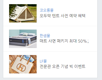
<ul class="list-row-3 shop-border">
<li>
<div class="list-image-wrap shop-border">
<img src="https://via.placeholder.com/90x60">
</div>
<div class="list-row-info">
<span>멜론티켓</span>
<h3>흥행 돌풍 마마, 돈크라이</h3>
</div>
</li>
<li>
<div class="list-image-wrap shop-border">
<img src="https://via.placeholder.com/90x60">
</div>
<div class="list-row-info">
<span>멜론티켓</span>
<h3>흥행 돌풍 마마, 돈크라이</h3>
</div>
</li>
<li>
<div class="list-image-wrap shop-border">
<img src="https://via.placeholder.com/90x60">
</div>
<div class="list-row-info">
<span>멜론티켓</span>
<h3>흥행 돌풍 마마, 돈크라이</h3>
</div>
</li>
</ul>
</div>- 모든 list-item 아래에 있는 브랜드 로고들에 대한 레이아웃으로
<div>태그로 영역을 설정하고,<ul>,<li>,<img>태그로 로고를 연결하도록 한다.
		<div class="brand-wrap shop-border">
				<ul class="brand-lists">
					<li><img src="https://via.placeholder.com/64x64"></li>
					<li><img src="https://via.placeholder.com/64x64"></li>
					<li><img src="https://via.placeholder.com/64x64"></li>
					<li><img src="https://via.placeholder.com/64x64"></li>
					<li><img src="https://via.placeholder.com/64x64"></li>
					<li><img src="https://via.placeholder.com/64x64"></li>
					<li><img src="https://via.placeholder.com/64x64"></li>
					<li><img src="https://via.placeholder.com/64x64"></li>
					<li><img src="https://via.placeholder.com/64x64"></li>
				</ul>
			</div>
		</div>
	</main>
CSS-Style
(어제의 css에 이어서)
1. .list-item 이라는 class를 가진 영역에 대해서는 모두 자식태그의 영향을 받도록 position: relative로 설정한다.
#shop-main .list-item { position: relative; }
- .list-half 영역을 디자인한다.(너비, 높이, 배경색) .list-half-top의 position을 absolute로 설정하고 위에 배채되도록 위치를 설정한다. .list-half-bottom의 position을 absolute로 설정하고 아래에 배채되도록 위치를 설정한다.
#shop-main .list-item .list-half { width: 100%; height: 240px;
		background-color: #ffffff; }
#shop-main .list-item .list-half.list-half-top { position: absolute;
	left: 0; top: 0; }
#shop-main .list-item .list-half.list-half-bottom { position: absolute;
left: 0; bottom: 0; }- .list-half-header영역을 디자인한다. (너비, 높이, 배경색, 중앙정렬) position은 relative로 설정해 자식 태그들의 영향을 받도록 설정하고 padding 값으로 위에 간격을 준다. borer-bottom으로 아래 테두리를 디자인한다. 제목영역의 배경인 .list-half-bg의 position을 absolute로 설정하고 디자인한다.(너비, 높이, 배경색) 제목영역의 제목인 .shop-title-border의 position을 relative로 설정하고 top, transform으로 중앙정렬되도록 한다. 테두리와 글자색을 설정하고 padding값으로 간격을 만든다.
#shop-main .list-item .list-half .list-half-header { width: 100%; height: 62px;
	background-color: #ffffff; text-align: center; position: relative;
	padding-top: 10px; border-bottom: solid 1px #e7e7e7; }
#shop-main .list-item .list-half .list-half-header .half-overlay {
	position: absolute; width: 100%; height: 100%; background-color: rgba(0, 0, 0, 0.5); }
#shop-main .list-item .list-half .list-half-header.list-half-bg {
	background-color: green; padding-top: 0; border-bottom: solid 1px #ffffff;}
#shop-main .list-item .list-half .list-half-header.list-half-bg .shop-title-border {
	position: relative; display: inline-block; top: 50%; transform: translateY(-50%);
border: solid 1px #ffffff; color: #ffffff; padding: 2px 4px; }- 제목 영역의 제목(
<h3>)과 제품 영역의 상품 설명에 대한 .headline 글자 크기를 디자인하고 .headline의 테두리를 디자인하고 padding, margin값으로 위치를 설정한다.
#shop-main .list-item .list-half .list-half-header h3 { font-size: 14px; }
#shop-main .list-item .list-half .list-half-header .headline {
	border: solid 1px #000000; padding: 2px 4px; display: inline-block;
font-size: 14px; margin-bottom: 5px; }- 제품 영역인 .contents-list가 자식태그들의 영향을 받도록 overflow: hidden으로 설정하고 높이를 설정한다. 그안의 태그들이 좌->우 정렬되도록 설정하고 너비가 3등분,높이는 영역을 채우도록 설정한다. 글자들을 중앙정렬하고 각 상품 사이에 경계를 만들되, 중복되지 않도록 설정한다.
#shop-main .list-item .list-half .contents-list { overflow: hidden; height: 177px; }
#shop-main .list-item .list-half .contents-list.content-lists-3 li {
	float: left; width: 33.33%; height: 100%;
	text-align: center; border-right: solid 1px #f0f0f0; }
#shop-main .list-item .list-half .contents-list.content-lists-3 li:last-child {
border-right: none; }- 제품 영역의 사진에 대해 디자인한다. 제품 영역의 상품에 대한 설명인
<h3>,<span>태그의 글자크기를 설정하고 margin값으로 둘 사이의 간격을 만든다.
#shop-main .list-item .list-half .contents-list.content-lists-3 li img {
	width: 100%; height: 100px; margin-bottom: 5px; }
#shop-main .list-item .list-half .contents-list.content-lists-3 li h3 {
	font-size: 13px; margin-bottom: 5px; }
#shop-main .list-item .list-half .contents-list.content-lists-3 li span {
font-size: 12px; }- 아래영역의 제품영역을 디자인한다. 'flex'기능으로 2개의 제품설명들이 중간에 간격을 두고 양쪽 끝으로 배치되도록 설정하고 padding-top으로 제목 영역과의 간격을 만든다. 하나의 제품을 묶는
<li>태그를 디자인(너비, 높이) 하고 각 제품 사이의 간격을 만들되, 중복되지 않도록 한다.
#shop-main .list-item .list-half .contents-list.content-lists-2 {
	display: flex; flex-wrap: wrap; justify-content: center;
	padding-top: 11px; }
#shop-main .list-item .list-half .contents-list.content-lists-2 li {
	width: 130px; height: 150px; margin-right: 8px; }
	#shop-main .list-item .list-half .contents-list.content-lists-2 li:last-child {
margin-right: 0; }- 제품영역의 제품 이미지인 .content-image-wrap의 position을 realtive로 설정하고 디자인(너비, 높이)한다. 이에 속한
<img>태그의 position을 absolute로 설정하고 너비와 높이가 이 영역에 꼭 맞도록 설정한다. 제품 이미지 위의 50% 할인이라고 되어 있는 부분인<span>태그를 디자인(너비, 높이, 글자크기, 색, 배경색, 배경디자인 등)한다. top, right 값으로 위치를 설정하고 position을 absolute로 설정한다. display를 block으로 설정해 이미지 위에<span>태그가 올라올 수 있도록 설정한다.
#shop-main .list-item .list-half .contents-list.content-lists-2 li .content-image-wrap {
	position: relative; width: 130px; height: 90px; }
#shop-main .list-item .list-half .contents-list.content-lists-2 li .content-image-wrap img {
	position: absolute; width: 100%; height: 100%; }
#shop-main .list-item .list-half .contents-list.content-lists-2 li .content-image-wrap span {
	position: absolute; display: block; width: 42px; height: 42px;
	font-size: 14px; color: #ffffff; top: 6px; right: 5px;
	border-radius: 50%; line-height: 42px; text-align: center;
	background-color: orange; }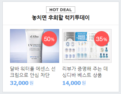
9. 제품영역의 제품 설명 영역을 디자인한다. (글자색, 글자크기, 폰트 스타일)
#shop-main .list-item .list-half .contents-list.content-lists-2 li h3 {
	font-size: 13px; }
#shop-main .list-item .list-half .contents-list.content-lists-2 li .price {
	color: #62a7ee; font-size: 12px; }
#shop-main .list-item .list-half .contents-list.content-lists-2 li .price em {
font-size: 14px; font-weight: bolder; font-style: normal; }- 쇼핑 페이지의 가장 오른쪽에 있는 .list-item중 아래 부분인 .list-row-3을 디자인한다. 위에서 설정한 shop-border와 중복되므로 border-top은 none으로 설정하고 배경색을 설정한다. .list-row-3의 각 제품을 나타내는
<li>태그들 사이의 경계를 위해 border값을 만들어 주되, 중복되지 않도록 설정하고, 제품 사진을 디자인(너비, 높이)한다.
#shop-main .list-item .list-row-3 { border-top: none; background-color: #ffffff; }
#shop-main .list-item .list-row-3 li { border-bottom: solid 1px #f0f0f0;
	padding: 14px 19px 11px 19px; display: flex; flex-wrap: wrap;
	align-items: center; }
#shop-main .list-item .list-row-3 li:last-child { border-bottom: none; }

#shop-main .list-item .list-row-3 li .list-image-wrap { width: 90px;
	height: 60px; margin-right: 10px; }
#shop-main .list-item .list-row-3 li .list-image-wrap img { width: 100%;
height: 100%; }- 제품 영역의 제품 설명의 글자 크기를 설정한다.
#shop-main .list-item .list-row-3 li .list-row-info span { font-size: 12px; }
#shop-main .list-item .list-row-3 li .list-row-info h3 { font-size: 13px;}- 쇼핑 페이지의 아래에 있는 주요 쇼핑몰 로고 영역인 .brand-lists에 대한 디자인을 한다. 'flex'기능으로 각 로고들이 일정한 간격을 두고 중앙정렬할 수 있도록 설정하고 배경색을 설정한다. 상하좌우 각 로고들 간의 간격을 주고 너비와 높이를 설정한다.

#shop-main .brand-wrap .brand-lists { padding: 18px 18px; display: flex;
	flex-wrap: wrap; justify-content: space-between; align-items: center;
	background-color: #ffffff; }
#shop-main .brand-wrap .brand-lists li { width: 64px; height: 64px; }
#shop-main .brand-wrap .brand-lists li img { width: 100%; height: 100%; }
footer 영역
(이 부분중 아주 대략적으로 설계)
html
(main_right html에 이어서)
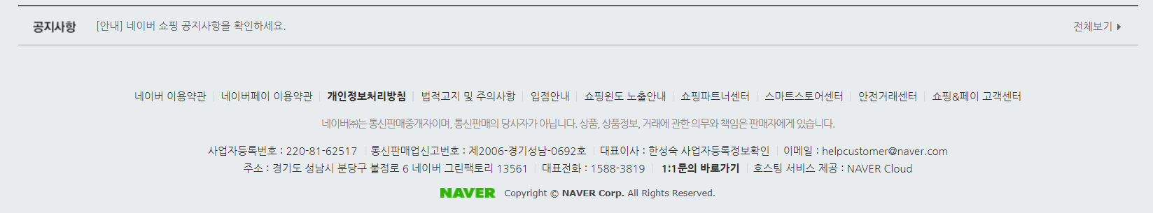
1. 두 부분으로 나누어 설계한다. <footer>영역을 만들고 그 안에 <div>태그로 쇼핑페이지 전체에 적용되는 설정을 주기 위해 class에 shop-contianer를 설정한다. 그 안에 두 부분으로 나눈 영역들이 속하도록 설정하고, 글자는 <span>태그와 <p>태그로 입력한다.
<footer id="shop-footer">
		<div class="shop-container">
			<div class="policy-wrap">
				<span>네이버 이용약관</span>
				<span>네이버 이용약관</span>
				<span>네이버 이용약관</span>
				<span>네이버 이용약관</span>
				<span>네이버 이용약관</span>
				<span>네이버 이용약관</span>
				<span>네이버 이용약관</span>
				<span>네이버 이용약관</span>
				<span>네이버 이용약관</span>
				<span>네이버 이용약관</span>
			</div>
			<p>네이버는 통신판매 당사자가 아닙니다. 거래에 관한 의무와 책임은 판매자에게 있습니다.</p>
		</div>
	</footer>
CSS-Style
(main_right css에 이어서)
1. <footer>에 있는 태그들이 중앙정렬 되도록 설정하고 padding 값으로 페이지 아래에 간격을 만든다. <main>영역과 구분되도록 border-top값을 디자인하고 경계선 사이에 간격을 margin값으로 설정한다.
#shop-footer { padding-bottom: 180px; text-align: center; }
#shop-footer .policy-wrap { border-top: solid 2px #5d5d5d;
padding-top: 27px; margin-bottom: 11px; }- .policy-wrap에 속한
<span>태그의 글자 크기를 설정하고 각 태그들 사이에 문자를 ':before' 기능으로 설정하되, 맨 앞에는 생성되지 않도록 한다.
#shop-footer .policy-wrap span { font-size: 12px; }
#shop-footer .policy-wrap span:first-child:before { content: initial; }
#shop-footer .policy-wrap span:before { content: ""; display: inline-block;
	width: 1px; height: 11px; margin: 0 8px; background-color: #d7d7d7;
vertical-align: -1; }- 마지막으로
<p>태그에 대한 글자를 디자인하고, margin값으로 간격을 만든다.
#shop-footer p { font-size: 12px; color: #888; margin-bottom: 11px; }+++ image 무료이용 가능 사이트
- pixabay : https://pixabay.com/ko/
무엇이 어려웠지?
오늘도 똑같이 입력했는데 결과가 원하는대로 안나왔다. 특히 .contents-list 를 디자인하고 나서 원하는 결과가 나올 때까지의 시간이 오래걸렸다.
어떻게 해결했지?
이번에는 오탈자가 문제였다. 자동완성으로 빨리빨리 enter치고 넘어가다 보니 class명을 제대로 입력을 안했던 거였다. 그래서 오탈자를 고치고 나니깐 깔-끔하게 해결됐다.
그래서?
네이버 쇼핑 페이지가 정말 할것이 많았다. 강의에서 최대한 필수적인 내용만 가르쳐주고 넘어가는 데도 정말 생각할 것도 디자인할것도 많았다.ㅠㅜ 아무생각 없이 봐왔던 웹사이트들이 얼마나 큰 인고끝에 만들어지는지 조금은 알게 된 날이다.
sublime3를 이용해 오늘 만들어본 파일
https://github.com/hyeriJUNG/Daegu_AI_School/tree/main/0722
