Day24,
Naver 뉴스 페이지를 따라 만들어봤다!
오늘 무엇을 배웠지?
Naver 뉴스 페이지 따라 만들어보기
Naver - '뉴스' : https://news.naver.com/
<header>
html
- new file-save(news.html), save(style0729.css)
- 기본 설정 + html, css 파일을 연동
<link>
<!DOCTYPE html>
<html>
<head>
	<meta charset="utf-8">
	<title>네이버</title>
	<link rel="stylesheet" type="text/css" href="style0729.css">
</head>
<body>

</body>
</html>
	<header id="news-header">
		<div class="news-container">
			<div class="news-flex-between">
				<nav class="news-header-left">
					<ul class="news-flex-start">
						<li class="on"><a href="#">뉴스</a></li>
						<li><a href="#">TV연예</a></li>
						<li><a href="#">스포츠</a></li>
						<li><a href="#">뉴스스탠드</a></li>
						<li><a href="#">날씨</a></li>
					</ul>
				</nav>

				<div class="news-header-right news-flex-end">
					<a href="#" class="btn-login">로그인</a>
					<button type="button" class="btn-menu"></button>
				</div>
			</div>
		</div>

		<nav class="sub-nav">
			<div class="news-container">
				<div class="news-flex-between">
					<ul class="news-flex-start">
						<li><a href="#" class="on">뉴스홈</a></li>
						<li><a href="#">속보</a></li>
						<li><a href="#">정치</a></li>
						<li><a href="#">경제</a></li>
					</ul>

					<div class="news-search-wrap news-flex-between">
						<input type="text" placeholder="뉴스 검색">
						<button type="button" class="btn-search"></button>
					</div>
				</div>
			</div>
		</nav>
	</header>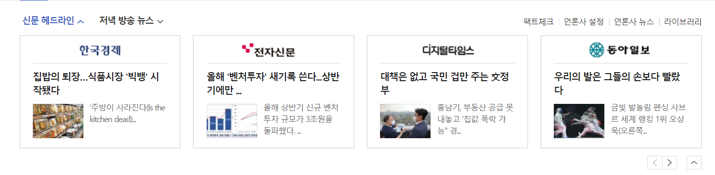
<div id="news-headline">
<div class="news-container">
<div class="news-headline-menu-wrap news-flex-between">
<ul class="main-lists news-flex-start">
<li><a href="#">신문 헤드라인</a></li>
<li><a href="#">저녁 방송 뉴스</a></li>
</ul>
<ul class="sub-lists news-flex-end">
<li><a href="#">팩트체크</a></li>
<li><a href="#">언론사 구독</a></li>
<li><a href="#">언론사 뉴스</a></li>
<li><a href="#">라이브러리</a></li>
</ul>
</div>
<ul class="news-headline-lists news-flex-between">
<li>
<a href="#">
<article>
<h3>국민일보</h3>
<div class="image-wrap">
<img src="https://via.placeholder.com/150">
<div class="overlay">
<div class="headline-info news-flex-start">
<i></i>
<div>
<span>눈물 대신 '엄지척' 져도 쿨한 '갓기'들</span>
<p>"정말 재밌었고 좋은 경험 한것 같아요"</p>
</div>
</div>
</div>
</div>
</article>
</a>
</li>
</ul>
<div class="news-headline-arrows news-flex-end">
<div class="btn-wrap news-flex-start">
<a href="#" class="btn btn-pre"></a>
<a href="#" class="btn btn-next"></a>
</div>
<a href="#" class="btn btn-up"></a>
</div>
</div>
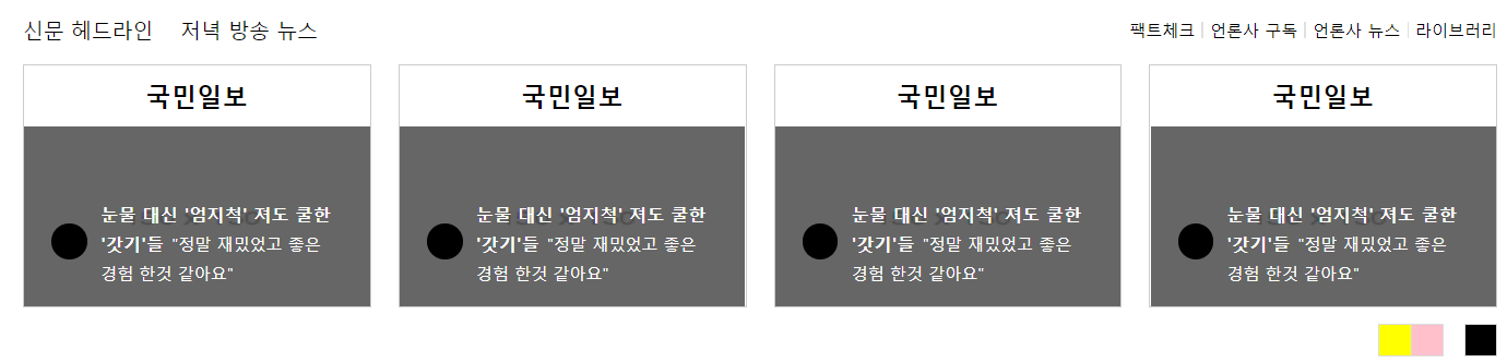
</div>CSS-Style
(어제의 css에 이어서)
1. Default CSS
* { margin: 0; padding: 0; box-sizing: border-box; }
ol, ul { list-style: none; }
a {	text-decoration: none; 	color: #000000; }
img { vertical-align: middle; }
.clearfix { clear: both; }
button { border: none; }
input, textarea { outline: none; }

/*news*/
.news-container { width: 1080px; margin: 0 auto; }
.news-flex-between { display: flex; flex-wrap: wrap;
	justify-content: space-between; align-items: center; }
.news-flex-start { display: flex; flex-wrap: wrap;
	align-items: center; }
.news-flex-end { display: flex; flex-wrap: wrap;
justify-content: flex-end; align-items: center; }- .news-header-left영역을 디자인한다. 그에 속한 태그
<ul>,<li>,<a>태그를 디자인하고<li>글자 사이에 특수문자를 입력하되, 가장 첫번째 태그앞에는 생성되지 않도록 한다.
#news-header { background-color: #3f63bf; }
#news-header .news-header-left { padding: 17px 0; }
#news-header .news-header-left ul li { font-size: 15px; }
#news-header .news-header-left ul li.on { font-size: 20px; }
#news-header .news-header-left ul li a { color: #ffffff; }
#news-header .news-header-left ul li a:before {
	display: inline-block; content: ''; width: 1px;
	height: 15px; background-color: #000; opacity: 0.2;
	margin: 0 10px; vertical-align: -1px; }
#news-header .news-header-left ul li:first-child a:before {
content: none; }- .sub-nav 영역을 디자인(배경색, 테두리)한다. 이에 속한 태그
<ul>,<li>,<a>태그를 디자인하고 .on이라는 class를 가진 태그는 글자색을 다르게 디자인한다.
#news-header .sub-nav { background-color: #ffffff;
	border-top: solid 1px #000000; border-bottom: solid 1px #e3e3e3; }
#news-header .sub-nav ul li { width: auto;
	height: 46px; margin-right: 16px; }
#news-header .sub-nav ul li a { display: block;
	width: 100%; height: 100%; border-bottom: solid 2px transparent;
		font-weight: bold; line-height: 46px; }
#news-header .sub-nav ul li a.on { color: #3f63bf;
border-bottom: solid 2px #3f63bf; }- .news-search-wrap을 디자인(너비, 높이 등)한다. 그에 속한 태그
<input>, .btn-search를 디자인한다.
#news-header .sub-nav .news-search-wrap { width: 280px;
	height: 30px; border: solid 1px #e1e1e1;
	background-color: #fafafa; }
#news-header .sub-nav .news-search-wrap input {
	width: calc(100% - 30px); height: 100%; border: none;
	font-size: 12px; color: #888888; padding: 3px 9px; }
#news-header .sub-nav .news-search-wrap input:focus {
	outline: none; }
#news-header .sub-nav .news-search-wrap .btn-search {
	width: 30px; height: 100%; background-color: blue; }
결과 ▼

- #news-headline 영역 위의 간격을 만들고 .news-container의 간격을 만든다.
#news-headline { padding-top: 20px; }
#news-headline .news-container { border-bottom: solid 1px #000000;
padding-bottom: 12px; }- .news-headline-menu-wrap에 속한 태그들을 디자인한다. .main-lists의
<li>를 디자인하고 .sub-lists에 속한 태그들을 디자인한다.<li>글자 사이에 특수문자를 입력하되, 가장 첫번째 태그앞에는 생성되지 않도록 한다.
#news-headline .news-headline-menu-wrap { margin-bottom: 15px; }
#news-headline .news-headline-menu-wrap .main-lists li {
	margin-right: 20px; font-size: 15px; }
#news-headline .news-headline-menu-wrap .sub-lists li {
	font-size: 12px; }
#news-headline .news-headline-menu-wrap .sub-lists li a:before {
	content: ''; display: inline-block; width: 1px; height: 12px;
	background-color: #e0e0e0; margin: 0 5px; vertical-align: -1px; }
#news-headline .news-headline-menu-wrap .sub-lists li:first-child a:before {
content: none; }- .news-headline-lists에 속한 태그들을 디자인한다.
<li>태그의 너비, 높이 등을 설정하고 ,<a>,<article>태그의 너비, 높이 등을 설정한다.
#news-headline .news-headline-lists { margin-bottom: 12px; }
#news-headline .news-headline-lists li { width: 255px;
	height: 178px; border: solid 1px #ccc; }
#news-headline .news-headline-lists li a { display: block;
	width: 100%; height: 100%; }
#news-headline .news-headline-lists li a article { position: relative;
	width: 100%; height: 100%; }
#news-headline .news-headline-lists li a article h3 { width: 100%;
height: 44px; line-height: 44px; text-align: center; }- .image-wrap 영역을 디자인한다. position을 relative로 설정하고 너비, 높이 등을 디자인한다. 이에 속한
<img>, .overlay, .headline-info의 position을 absolute로 설정하고 너비, 높이 등을 설정한다.
#news-headline .news-headline-lists li a article .image-wrap {
	position: relative; width: 100%; height: 132px; }
#news-headline .news-headline-lists li a article .image-wrap img {
	position: absolute; width: 100%; height: 100%; }
#news-headline .news-headline-lists li a article .image-wrap .overlay {
	position: absolute; width: 100%; height: 100%;
	background-color: rgba(0, 0, 0, 0.5); }
#news-headline .news-headline-lists li a article .image-wrap .overlay .headline-info {
	position: absolute; width: 100%; padding: 15px 20px;
	left: 0; bottom: 0; color: #ffffff; }
9..headline-info에 속한 태그들을 디자인한다. (너비, 높이, 배경색, 글자크기 등)
#news-headline .news-headline-lists .headline-info i { display: block;
	width: 26px; height: 26px; background-color: black;
	border-radius: 50%; margin-right: 10px; }
#news-headline .news-headline-lists .headline-info div {
	width: calc(100% - 38px); }
#news-headline .news-headline-lists .headline-info span {
	font-size: 13px; font-weight: bold; }
#news-headline .news-headline-lists .headline-info p { display: inline;
font-size: 12px; }- .news-headline-arrows에 속한 태그들을 디자인한다.(너비, 높이, 배경색 등)
#news-headline .news-headline-arrows .btn-wrap {
	margin-right: 15px; }
#news-headline .news-headline-arrows .btn { display: block;
	width: 24px; height: 24px; border: solid 1px #dcdddc; }
#news-headline .news-headline-arrows .btn.btn-pre {
	background-color: yellow; border-right: none; }
#news-headline .news-headline-arrows .btn.btn-next {
	background-color: pink; }
#news-headline .news-headline-arrows .btn.btn-up {
	background-color: black;
결과 ▼
<main>
html
(<header> html에 이어서)
1. 
	<main role="main" id="news-main">
		<div class="news-container">
			<div class="news-left">

			</div>

			<div class="news-right">

			</div>
		</div>
	</main>
CSS-Style
(<header> css에 이어서)
.news-left영역은 좌측에, .news-right영역은 우측에 위치하도록 설정하고 경계를 만든 후 너비를 설정한다.
#news-main .news-container { overflow: hidden; }
#news-main .news-left { float: left; width: 750px; }
#news-main .news-right { float: right; width: 327px;
	border-left: solid 1px #dfdfdf;	padding: 25px 0 40px 26px; }
무엇이 어려웠지?
오늘은 어려운 것이 없었다!
그래서?
오랜만에 조금은 여유롭게 수업을 들었다. 조금 적응이 된건지 내용이 어렵지 않았고 결과적으로도 만족스러운 결과를 얻었다!! 매일 오늘만 같았으면 좋겠다 ㅠㅜ
sublime3를 이용해 오늘 만들어본 파일
https://github.com/hyeriJUNG/Daegu_AI_School/tree/main/0729

.