position 속성
position 속성은 태그를 어떻게 위치시킬지를 정의하며, 아래의 5가지 값을 갖습니다.
- static: 기본값, 다른 태그와의 관계에 의해 자동으로 배치되며 위치를 임의로 설정해 줄 수 없습니다.
- absolute: 절대 좌표와 함께 위치를 지정해 줄 수 있습니다.
- relative: 원래 있던 위치를 기준으로 좌표를 지정합니다.
- fixed: 스크롤과 상관없이 항상 문서 최 좌측상단을 기준으로 좌표를 고정합니다.
- inherit: 부모 태그의 속성값을 상속받습니다.
좌표를 지정 해주기 위해서는 left, right, top, bottom 속성과 함께 사용합니다.
position을 absolute나 fixed로 설정시 가로 크기가 100%가 되는 block 태그의 특징이 사라지게 됩니다
적용
#box1 { position:static }
#box2 { position:absolute }
#box3 { position:relative }
#box4 { position:fixed }
#box5 { position:inherit }
예제
<html>
<head>
	<style>
		.box-container{
			width: 350px;
			border: 2px solid #e91bf5;
		}
		.box-container div{
			padding: 10px;
			border: 1px solid green;
			background-color: #e3ffe0;
		}
		#box1 { position: static; top: 20px; left: 30px; }
		#box2 { position: relative; top: 20px; left: 30px; }
		#box3 { position: absolute; top: 20px; right: 30px; }
		#box4 { position: fixed; top: 20px; right: 30px; }
	</style>
</head>
<body>
	<div class="box-container">
		<div id="box1">static 박스</div>
		<div id="box2">relative 박스</div>
		<div id="box3">absolute 박스</div>
		<div id="box4">fixed 박스</div> <!-- '출력 결과' 란이 아닌, 전체 페이지에서 고정되어 보여짐 -->
	</div>
</body>
</html>
출력결과
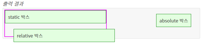
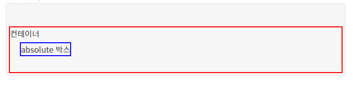
absolute와 relative
relative 인 컨테이너 내부에 absolute인 객체가 있으면 절대 좌표를 계산할 때, relative 컨테이너를 기준점으로 잡게 됩니다. (없다면 전체 문서가 기준)
예제
<html>
<head>
	<style>
		#box-container{ position: relative; height: 90px; margin-top: 40px; border: 2px solid red; }
		#box-inner{ position: absolute; top: 30px; left: 20px; border: 2px solid blue; }
	</style>
</head>
<body>
	<div id="box-container">
		컨테이너
		<div id="box-inner">absolute 박스</div>
	</div>
</body>
</html>
출력 결과
display 속성
display 속성은 요소를 어떻게 보여줄지를 결정합니다.
주로 4가지 속성값이 쓰이는데, 태그마다 기본값이 다릅니다.
- none : 보이지 않음
- block : 블록 박스
- inline : 인라인 박스
- inline-block : block과 inline의 중간
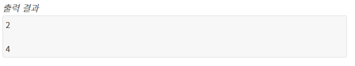
none
요소를 렌더링하지 않도록 설정합니다. visibility 속성을 hidden으로 설정한 것과 달리, 영역도 차지하지 않습니다.
예제
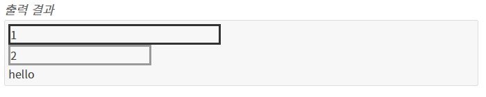
<style>
.display-none{ display: none }
.invisible{ visibility: hidden }
</style>

<div class="display-none">1</div>
<div>2</div>

<div class="invisible">3</div>
<div>4</div>
출력 결과
block
div 태그, p 태그, h 태그#,li 태그 등이 이에 해당됩니다.
기본적으로 가로 영역을 모두 채우며, block 요소 다음에 등장하는 태그는 줄바꿈이 된 것처럼 보입니다. 이는 word 같은 문서에서 문단을 표시할 때, 한 문단이 끝난 뒤에 나타나는 요소는 항상 다음 줄에 표시되던 것과 비슷한 맥락입니다.
width, height 속성을 지정 할 수 있으며, block 요소 뒤에 등장하는 태그가 그 이전 block 요소에 오른쪽에 배치될 수 있어도 항상 다음 줄에 렌더링됩니다.
예제
<style>
.block1{ width: 300px; border: 3px solid #333 }
.block2{ width: 200px; border: 3px solid #999 }
</style>

<div class="block1">1</div>
<div class="block2">2</div>
hello
출력 결과
inline
span태그,b태그,i태그,a태그 등이 이에 해당됩니다.
block 과 달리 줄 바꿈이 되지 않고, width와 height를 지정 할 수 없습니다. word 같은 문서에서 볼드, 이탤릭, 색상, 밑줄 등 글자나 문장에 효과를 주기 위해 존재하는 단위라고 할 수 있습니다. 문서에서 특정 부분에 색상을 입힌다고 다음에 나오는 글이 줄바꿈 되지 않듯이 inline 요소 뒤에 나오는 태그 또한 줄바꿈 되지 않고 바로 오른쪽에 표시됩니다.
예제
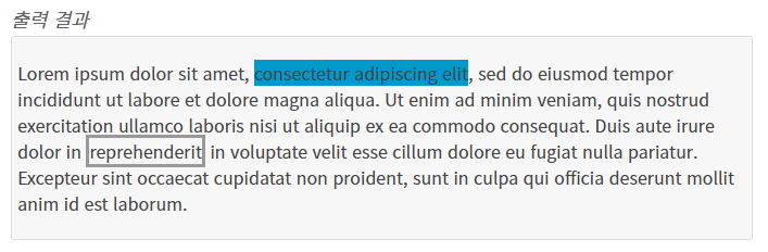
<style>
.inline1{
	background: #09c;
}
.inline2{
	width: 200px; /* 이 값은 무시됩니다 */
	border: 3px solid #999;
}
</style>

<p>
	Lorem ipsum dolor sit amet, <span class="inline1">consectetur adipiscing elit</span>,
	sed do eiusmod tempor incididunt ut labore et dolore magna aliqua.
	Ut enim ad minim veniam, quis nostrud exercitation ullamco laboris nisi ut aliquip ex ea commodo consequat.
	Duis aute irure dolor in <span class="inline2">reprehenderit</span>
	in voluptate velit esse cillum dolore eu fugiat nulla pariatur.
	Excepteur sint occaecat cupidatat non proident,
	sunt in culpa qui officia deserunt mollit anim id est laborum.
</p>
출력결과
inline-block
block과 inline의 중간 형태라고 볼 수 있는데, 줄 바꿈이 되지 않지만 크기를 지정 할 수 있습니다.
Internet Explorer 7 이하에서는 사용할 수 없습니다.
예제
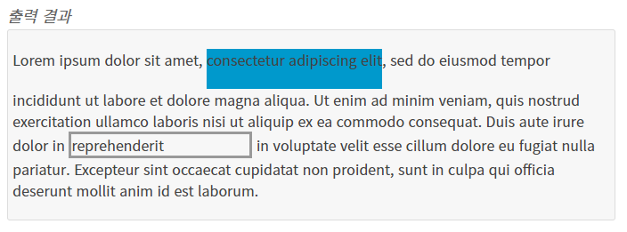
<style>
.inline-block1{
	display: inline-block;
	background: #09c;
	height: 45px;
	/* 원래 inline 요소의 높이는 글자(폰트)의 높이를 바탕으로 설정되지만,
	inline-block을 이용하면 임의로 높이 또한 설정을 할 수 있습니다. */
}
.inline-block2{
	display: inline-block;
	width: 200px; /* 이 값은 이제 정상 작동합니다 */
	border: 3px solid #999;
}
</style>

<p>
	Lorem ipsum dolor sit amet, <span class="inline-block1">consectetur adipiscing elit</span>,
	sed do eiusmod tempor incididunt ut labore et dolore magna aliqua.
	Ut enim ad minim veniam, quis nostrud exercitation ullamco laboris nisi ut aliquip ex ea commodo consequat.
	Duis aute irure dolor in <span class="inline-block2">reprehenderit</span>
	in voluptate velit esse cillum dolore eu fugiat nulla pariatur.
	Excepteur sint occaecat cupidatat non proident,
	sunt in culpa qui officia deserunt mollit anim id est laborum.
</p>
출력 결과
float 속성
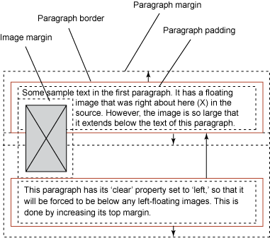
float라는 단어는 원래 ‘뜨다’ 라는 의미이며, 원래 웹페이지에서 이미지를 어떻게 띄워서 텍스트와 함께 배치할 것인가에 대한 속성입니다.
float
- inherit: 부모 요소에서 상속
- left: 왼쪽에 부유하는 블록 박스를 생성. 페이지 내용은 박스 오른쪽에 위치하며 위에서 아래로 흐름.
- right: 오른쪽에 부유하는 블록 박스를 생성. 페이지 내용은 박스 왼쪽에 위치하며 위에서 아래로 흐름. 이후 요소에 clear 속성이 있으면 페이지 흐름이 달라짐. none 이 아니라면 display 속성은 무시된다.
- none - 요소를 부유시키지 않음
left와 right를 통해 부유속성을 지정시 display는 무시됩니다. (none은 제외)
또한 이후 요소에 clear 속성이 있으면 페이지 흐름이 달라집니다.
사용법
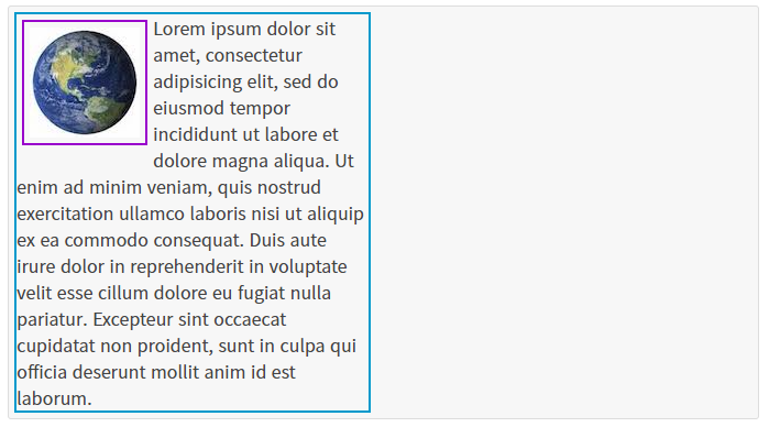
.content > img{ float: left }예제
<html>
<head>
<style>
	.float-container{
		width: 320px;
		border: 2px solid #09c;
	}
	.float-container img{
		float: left;
		margin: 5px;
		padding: 5px;
		border: 2px solid #90C;
	}
</style>
</head>
<body>
	<div class="float-container">
		<img src="/images/attach/earth.jpg">
		Lorem ipsum dolor sit amet, consectetur adipisicing elit, sed do eiusmod
		tempor incididunt ut labore et dolore magna aliqua. Ut enim ad minim veniam,
		quis nostrud exercitation ullamco laboris nisi ut aliquip ex ea commodo
		consequat. Duis aute irure dolor in reprehenderit in voluptate velit esse
		cillum dolore eu fugiat nulla pariatur. Excepteur sint occaecat cupidatat non
		proident, sunt in culpa qui officia deserunt mollit anim id est laborum.
	</div>
</body>
</html>
출력 결과
레이아웃에서의 float
`float` 속성은 원래 이미지와 텍스트 배치 용도로 등장했지만, 요즘에는 레이아웃용으로 많이 사용하고 있습니다.
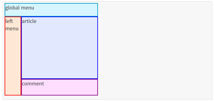
<div> 태그를 float 속성 및 width, height 속성 등을 이용하여 레이아웃을 배치하는 방식입니다.예제
<html>
<head>
<style>
	.ex-layout{ height: 310px }
	.menu{
		width: 300px;
		height: 40px;
		border: 2px solid #09c;
		background-color: #d7f5ff;
	}
	.main .left-menu{
		float: left;
		width: 50px;
		height: 254px;
		border: 2px solid red;
		background-color: #ffe7d5;
	}
	.main .content{
		float: left;
		width: 250px;
		height: 250px;
	}
	.main .content .article{
		height: 200px;
		border: 2px solid blue;
		background-color: #e2e9ff;
	}
	.main .content .comment{
		height: 50px;
		border: 2px solid purple;
		background-color: #ffddff;
	}
</style>
</head>
<body>
	<div class="ex-layout">
		<div class="menu">global menu</div>
		<div class="main">
			<div class="left-menu">left menu</div>
			<div class="content">
				<div class="article">article</div>
				<div class="comment">comment</div>
			</div>
		</div>
	</div>
</body>
</html>
출력 결과