CSS 애니메이션
- CSS 애니메이션은 CSS 스타일 변경을 부드럽게 만들어 준다. 예를 들어, 버튼의 배경색을 빠르게 변경하는 대신, CSS 애니메이션을 사용하여 그 변경을 부드럽게 전환할 수 있다.
- CSS 애니메이션은 순수 CSS로 구현되므로 JavaScript 없이도 애니메이션을 만들 수 있다. 이는 성능을 향상시킬 수 있으며, 사용자가 JavaScript를 비활성화한 경우에도 애니메이션을 볼 수 있게 한다.
- CSS 애니메이션은 브라우저의 그래픽 처리를 최적화할 수 있다. 예를 들어, 브라우저는 보이지 않는 요소에 대한 애니메이션 업데이트를 생략하여 리소스를 절약할 수 있다.
- CSS 애니메이션이 아직 모든 브라우저에서 완벽하게 지원되지 않으므로, 속성이나 기능을 사용할 떄 브라우저 호환성을 확인하는 것이 좋다.
'@keyframes' 규칙
애니메이션 중에 변화를 지정하는 데 사용된다. 즉, 각 단계에서 요소의 스타일을 어떻게 바꿀지를 정의한다.
@keyframes example {
  0%   {background-color: red;}
  50%  {background-color: yellow;}
  100% {background-color: blue;}
}- 에니메이션 중간 지점의 값을 설정하여 보다 세밀하게 중간 동작들을 제어할 수 있다.
- 에니메이션과 매칭시킬 animation-name 속성에서 사용할 이름으로 생성한다.
- 키프레임의 스타일 정보를 포함하고 있는 지점에서 사용할 %로 구성된다.
@keyframes moveToRight {
    from{
        color: red;
    }
    to {
        color: yellow;
        transform: translateX(300px);
    }
여기서, from은 0%와 같고, to는 100%와 같다.
animation
요소에 적용된 @keyframes 애니메이션의 동작과 지속 시간, 반복 횟수 등을 지정한다.
애니메이션의 하위 속성은 다음과 같다.
- animation-delay: 애니메이션을 시작하기 전에 대기하는 시간을 지정한다. 기본값은 0이다.
- animation-direction: 애니메이션의 진행 방향을 지정한다. 기본값은 'normal'로, 애니메이션이 순방향으로 진행된다. 'reverse'를 지정하면 애니메이션이 역방향으로 진행되고, 'alternate'를 지정하면 애니메이션이 순방향과 역방향을 번갈아 가며 진행된다.
- animation-duration: 애니메이션이 한 번 실행되는 데 걸리는 시간을 지정한다. 기본값은 0이다.
- animation-iteration-count: 애니메이션이 반복되는 횟수를 지정한다. 기본값은 1이며, infinite를 지정하면 애니메이션이 무한히 반복된다.
- animation-name: '@keyframes' 규칙의 이름을 지정한다. 이 규칙은 애니메이션 중에 어떤 CSS 스타일을 적용할지를 지정한다.
- animation-play-state: 애니메이션의 재생 상태를 지정한다. 'paused'를 지정하면 애니메이션이 일시 정지되고, 'running'을 지정하면 애니메이션이 실행된다. 기본값은 'running'이다.
- animation-timing-function: 애니메이션의 속도 곡선을 지정한다. 기본값은 'ease'로, 애니메이션이 천천히 시작하고, 중간에 빨라지다가 마지막에 느려진다. 'linear'를 지정하면 애니메이션이 일정한 속도로 진행된다.
- animation-fill-mode: 애니메이션이 시작되기 전이나 끝난 후에 요소에 어떤 스타일을 적용할지를 지정한다. 'forwards'를 지정하면 애니메이션의 마지막 키 프레임의 스타일이 애니메이션이 끝난 후에도 유지된다. 'backwards'를 지정하면 애니메이션의 첫 번째 키 프레임의 스타일이 애니메이션이 시작되기 전에 적용된다. 'both'를 지정하면 애니메이션의 첫 번째 키 프레임과 마지막 키 프레임의 스타일이 적용된다.
div {
  animation-name: example;
  animation-duration: 4s;
  animation-iteration-count: infinite;
}
위 예제에서는 example이라는 이름의 @keyframes 애니메이션이 div 요소에 적용되어 있다. 애니메이션의 지속 시간은 4초이며, 무한히 반복된다.
CSS 애니메이션을 사용하면 JavaScript 없이도 복잡한 애니메이션 효과를 만들 수 있다. 그러나 CSS 애니메이션은 JavaScript로 제어할 수 없으므로(예: 일시 중지, 취소, 반복), 보다 복잡한 상호 작용이 필요한 경우 JavaScript를 사용하는 것이 더 나을 수 있다.
animation-fill-mode
animation-fill-mode 속성은 애니메이션이 시작하기 전이나 끝나고 난 후에 어떻게 요소를 스타일링할지 결정하는 속성이다. 이 속성은 아래의 값 중 하나를 가질 수 있다.
- none: 이것은 애니메이션 시작 전이나 끝난 후에 아무런 영향도 미치지 않는다. 요소는 원래의 스타일로 되돌아간다. 이것이 기본값이다.
- forwards: 이것은 애니메이션의 끝 상태를 유지시킨다. 즉, 애니메이션이 완료된 후에도 애니메이션의 마지막 keyframe에 정의된 스타일이 유지된다.
- backwards: 이것은 애니메이션이 시작하기 전에 첫 번째 keyframe의 스타일이 적용되도록 한다. 이는 animation-delay 기간 동안 유지된다.
- both: 이것은 forwards와 backwards를 모두 적용하여, 애니메이션이 시작하기 전에 첫 번째 keyframe의 스타일이 적용되고, 애니메이션 완료 후에는 마지막 keyframe의 스타일이 유지된다.
CSS animation transform
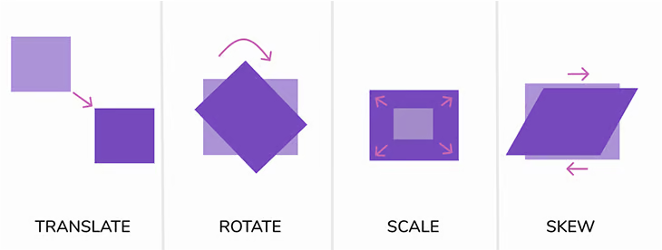
CSS 애니메이션에서 translate, scale, rotate, skew는 모두 transform의 함수들이다. 이들은 웹 페이지 요소의 모양과 위치를 변환하는데 사용된다. 각각의 기능은 다음과 같다.
- translate: 이 함수는 요소를 x 축과 y 축을 따라 이동시킨다. translate(x, y)에서 x와 y는 각각 수평 이동과 수직 이동을 의미한다. 값은 픽셀(px)이나 백분율(%)으로 제공할 수 있다. 예를 들어, translate(50px, 100px)은 요소를 오른쪽으로 50px, 아래로 100px 이동시킨다.
- scale: 이 함수는 요소의 크기를 조정한다. scale(x, y)에서 x는 요소의 너비를 조정하고, y는 요소의 높이를 조정한다. 값은 양의 실수로 제공하며, 1은 원래 크기를 의미합니다. 예를 들어, scale(2, 2)는 요소의 너비와 높이를 원래 크기의 두 배로 확장한다.
- rotate: 이 함수는 요소를 회전시킨다. rotate(angle)에서 angle는 회전 각도를 의미하며, 단위는 도(deg) 또는 라디안(rad)이다. 예를 들어, rotate(45deg)는 요소를 시계 방향으로 45도 회전시킨다.
- skew: 이 함수는 요소를 비틀어주는 효과를 준다. skew(x-angle, y-angle)에서 x-angle은 x 축을 따라 비틀기를 의미하며, y-angle은 y 축을 따라 비틀기를 의미한다. 값은 도(deg)로 제공된다. 예를 들어, skew(30deg, 20deg)는 요소를 x 축과 y 축을 따라 각각 30도와 20도 비틀어준다.
이들 transform 함수는 다양한 방식으로 조합되어 복잡한 변환 효과를 생성할 수 있다. 또한, 이들 함수는 CSS 애니메이션에서 매우 중요한 역할을 한다. 애니메이션의 키 프레임에서 이들 변환 함수를 다양하게 적용하여 동적인 시각 효과를 만들 수 있다.
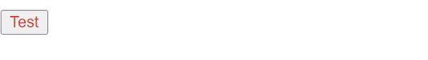
예제 1
<!DOCTYPE html>
<html lang="en">
<head>
    <link rel="stylesheet" href="./index.css">
    <meta charset="UTF-8">
    <meta name="viewport" content="width=device-width, initial-scale=1.0">
    <title>Document</title>
</head>
<body>
    <button>Test</button>
</body>
</html>
@keyframes moveToRight {
from{
color: red;
}
to {
color: yellow;
transform: translateX(300px);
}
}
button {
animation: moveToRight 2s;
animation-delay: 2s;
color: black;
}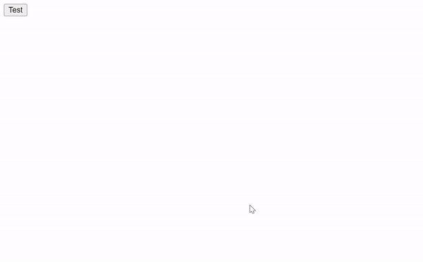
이 CSS 코드는 버튼에 애니메이션을 적용하고 있다. 애니메이션의 이름은 "moveToRight"이며, 이 애니메이션은 버튼의 색상을 빨간색에서 노란색으로 변경하고, 동시에 버튼을 오른쪽으로 300px 만큼 이동시키는 역할을 한다.
@keyframes moveToRight: 이 부분에서 moveToRight라는 애니메이션을 정의하고 있다. from 키워드로 시작하여 이동을 시작하는 시점의 스타일을 정의하고, to 키워드로 이동이 끝나는 시점의 스타일을 정의한다. 이 경우, 애니메이션은 빨간색에서 시작해서 노란색으로 변하면서 오른쪽으로 300px 만큼 이동하게 된다.
button: 이 부분에서 버튼에 대한 CSS 스타일을 설정한다.
- animation: moveToRight 2s;: 이 부분에서 애니메이션을 적용한다. moveToRight 애니메이션을 적용하고, 그 애니메이션의 전체 지속 시간은 2초이다.
- animation-delay: 2s;: 이 부분에서 애니메이션 시작 전에 대기하는 시간을 지정한다. 이 경우, 애니메이션이 시작되기 전에 2초 동안 대기하게 된다.
- color: black;: 이 부분에서 버튼의 초기 색상을 검은색으로 지정한다. 애니메이션 시작 전에는 검은색이고, 애니메이션 시작과 동시에 빨간색으로 바뀌며, 애니메이션이 종료될 때까지 점차 노란색으로 변하게 된다.
예제2(reverse)
@keyframes moveToRight {
    from{
        color: red;
    }
    to {
        color: yellow;
        transform: translateX(300px);
    }
}
button {
    animation: moveToRight 2s;
    animation-direction: reverse;
    animation-delay: 2s;
    color: black;
}
animation-direction에 reverse를 적용한 예시이다. 애니메이션이 예제1과는 다르게 역순으로 재생되는 것을 볼 수 있다.
예제3 (alternative-reverse)
@keyframes moveToRight {
    from{
        color: red;
    }
    to {
        color: yellow;
        transform: translateX(300px);
    }
}
button {
    animation: moveToRight 2s;
    animation-iteration-count: 2;
    animation-direction: alternate-reverse;
    animation-delay: 2s;
    color: black;
}
애니메이션 횟수를 2로 하고, 방향을 alternate-reverse로 했다.
이 경우, 역순으로 진행된 다음, 정순으로 진행되는 애니메이션이 재생된다.
역순과 정순은 각각 1회로 카운트된다.
예제4
@keyframes moveToRight {
    from{
        color: red;
    }
    to {
        color: yellow;
        transform: translateX(300px);
    }
}
button {
    animation: moveToRight 2s;
    animation-duration: 1s;
    animation-direction: alternate-reverse;
    animation-iteration-count: infinite;
    animation-play-state: running;
    color: black;
}
이 CSS 코드는 HTML 문서의 <button> 요소에 애니메이션을 적용하고 있습니다. 해당 애니메이션의 이름은 "moveToRight"이며, 이 애니메이션은 버튼의 색상을 빨간색에서 노란색으로 변경하고, 동시에 버튼을 오른쪽으로 300px 만큼 이동시키는 역할을 한다.
- @keyframes moveToRight: 이 부분에서 moveToRight라는 애니메이션을 정의하고 있다. from 키워드로 시작하여 이동을 시작하는 시점의 스타일을 정의하고, to 키워드로 이동이 끝나는 시점의 스타일을 정의합니다. 이 경우, 애니메이션은 빨간색에서 시작해서 노란색으로 변하면서 오른쪽으로 300px 만큼 이동하게 된다.
- button: 이 부분에서 버튼에 대한 CSS 스타일을 설정한다.
- animation: moveToRight 2s;: 이 부분에서 애니메이션을 적용한다. moveToRight 애니메이션을 적용하고, 그 애니메이션의 전체 지속 시간은 2초이다.
- animation-duration: 1s;: 이 부분에서 애니메이션의 지속 시간을 지정하는데, 이 설정은 앞에서 animation: moveToRight 2s;에서 이미 지정했으므로 중복된 설정이다.
- animation-direction: alternate-reverse;: 이 부분에서 애니메이션의 방향을 지정한다. alternate-reverse는 애니메이션을 뒤집어서 반복하게 된다. 즉, 첫 번째 반복은 뒤집히고, 두 번째 반복은 정상 방향이 된다.
- animation-iteration-count: infinite;: 이 부분에서 애니메이션 반복 횟수를 지정한다. infinite는 무한 반복을 의미한다.
- animation-play-state: running;: 이 부분에서 애니메이션의 재생 상태를 지정한다. running은 애니메이션이 재생 중임을 의미한다.
- color: black;: 이 부분에서 버튼의 초기 색상을 검은색으로 지정한다. 애니메이션 시작 전에는 검은색이고, 애니메이션 시작과 동시에 빨간색으로 바뀌며, 애니메이션이 종료될 때까지 점차 노란색으로 변하게 된다.

예제5 (animation-fill-mode: none)
- animation: moveToRight;: 이 부분에서 애니메이션을 적용한다. moveToRight 애니메이션을 적용하고, 지속 시간이나 딜레이 등이 따로 명시되지 않았으므로 기본값인 0s로 설정된다.
- animation-duration: 1s;: 이 부분에서 애니메이션의 지속 시간을 지정한다. 이 애니메이션은 1초 동안 실행된다.
- animation-delay: 2s;: 이 부분에서 애니메이션의 시작을 지연시키는 시간을 지정한다. 이 애니메이션은 페이지 로드 후 2초가 지난 후에 시작된다.
- animation-fill-mode: none;: 이 부분에서 애니메이션 시작 전과 끝난 후의 스타일을 어떻게 처리할지 지정한다. none은 애니메이션 시작 전과 끝난 후에도 아무런 스타일 변경이 없음을 의미한다. 즉, 애니메이션 도중에만 색상 변경과 이동이 발생하고, 애니메이션이 끝나면 원래의 스타일로 돌아온다.
- color: black;: 이 부분에서 버튼의 초기 색상을 검은색으로 지정한다. 애니메이션 시작 전에는 검은색이고, 애니메이션 시작과 동시에 빨간색으로 바뀌며, 애니메이션이 종료될 때까지 점차 노란색으로 변하게 된다. 애니메이션이 끝나면 다시 검은색으로 돌아온다.
button {
    animation: moveToRight;
    animation-duration: 1s;
    animation-delay: 2s;
    animation-fill-mode: none;
    color: black;
}
예제6 (animation-fill-mode: forwards)
button {
    animation: moveToRight;
    animation-duration: 1s;
    animation-delay: 2s;
    animation-fill-mode: forwards;
    color: black;
}
animation-fill-mode: forwards; 애니메이션이 완료된 이후에도, 애니메이션의 마지막 keyframe에 정의된 스타일이 유저된다. 따라서, 오른쪽으로 이동한 노란색 버튼이 된다.
예제7 (animation-fill-mode: both)
@keyframes moveToRight {
    from{
        color: red;
    }
    to {
        color: yellow;
        transform: translateX(300px);
    }
}
button {
    animation: moveToRight;
    animation-duration: 1s;
    animation-delay: 2s;
    animation-fill-mode: both;
    color: black;
}
animation-fill-mode: both 가 적용되었으므로, 시작에선 빨간색이 되고, 끝에선 노란색이 된다.
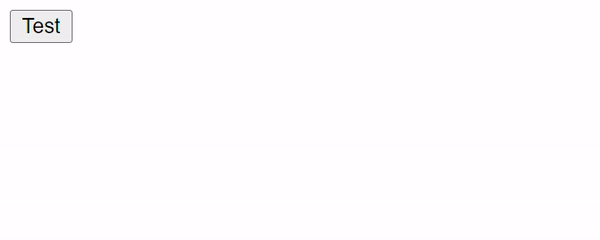
예제8 (transform:rotate(90deg)
<!DOCTYPE html>
<html lang="en">
<head>
    <link rel="stylesheet" href="./index.css">
    <meta charset="UTF-8">
    <meta name="viewport" content="width=device-width, initial-scale=1.0">
    <title>Document</title>
</head>
<body>
    <button>Test</button>
</body>
</html>
button {
color: black;
transform: rotate(90deg);
}transform에서 90도 회전이므로, 회전한다.
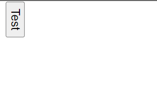
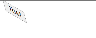
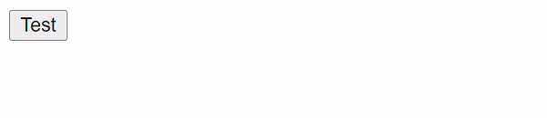
예제9 (transform: skew)
<!DOCTYPE html>
<html lang="en">
<head>
    <link rel="stylesheet" href="./index.css">
    <meta charset="UTF-8">
    <meta name="viewport" content="width=device-width, initial-scale=1.0">
    <title>Document</title>
</head>
<body>
    <button>Test</button>
</body>
</html>
button {
color: black;
transform: skew(15deg, 30deg);
}X축으로 15도, Y축으로 30도 비튼다.