
Typography
rem 을 사용하면 비율에 따라 크기를 설정할 수 있다.
- 1 rem = 16px
- 2 rem = 32px
- .display-1 = 6rem
<!-- Display Headings -->
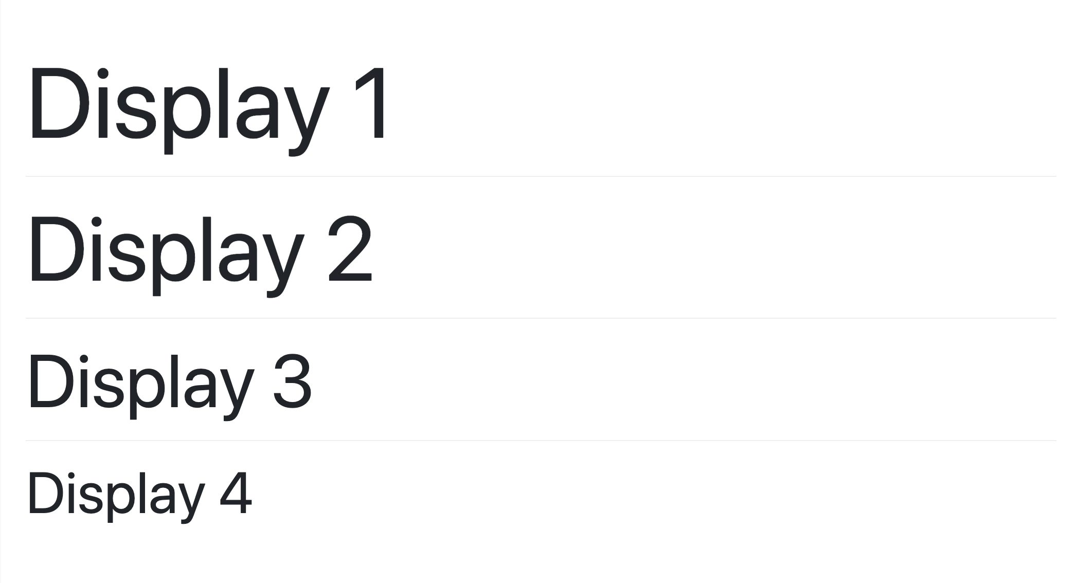
<h1>Regular H1</h1>
<h1 class="display-1 text-info">Display 1</h1>
<h1 class="display-2">Display 2</h1>
<h1 class="display-3">Display 3</h1>
<h1 class="display-4">Display 4</h1>display 클래스를 사용하여 더 큰 제목용 타이포그래피를 사용할 수 있다.
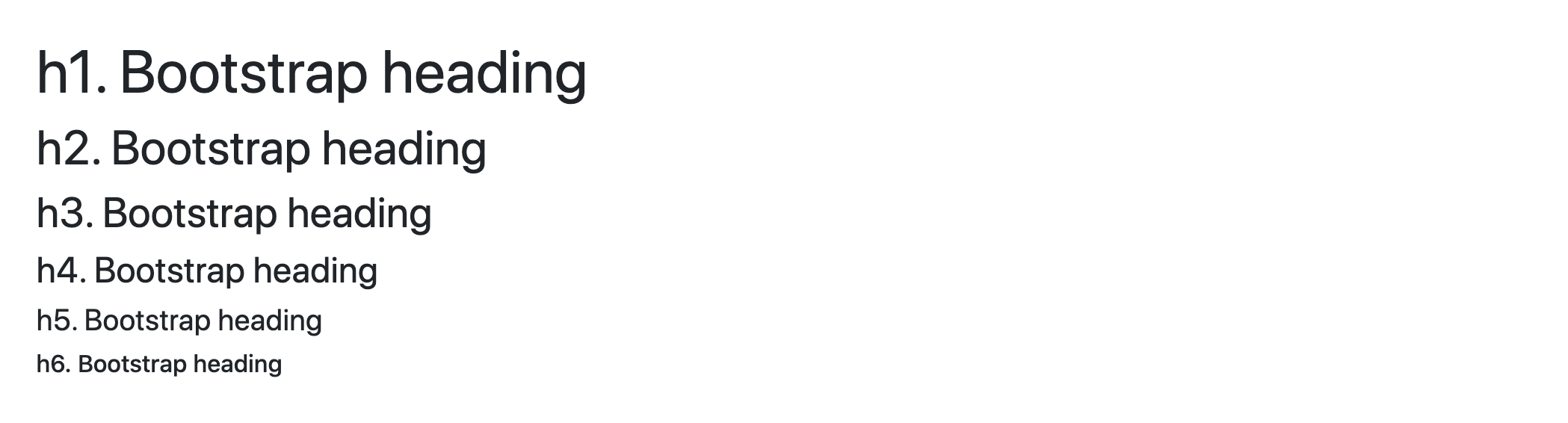
크기 비교
인용문 넣기
<blockquote class="blockquote">로 컨텐츠를 감싸면 인용문으로 작성이 된다.
    <blockquote>
        <p class="mb-0">Lorem ipsum dolor sit amet, consectetur adipiscing elit. Integer posuere erat a ante.</p>
    </blockquote>

        <blockquote class="blockquote">
        <p class="mb-0">Lorem ipsum dolor sit amet, consectetur adipiscing elit. Integer posuere erat a ante.</p>
    </blockquote>
출처를 밝히기 위해 인용구 아래에 footer를 추가할 수 있다. <footer class="blockquote-footer"> 소스의 이름은 <cite>로 감싸면 된다.
    <blockquote class="blockquote">
        <p class="mb-0">Lorem ipsum dolor sit amet, consectetur adipiscing elit. Integer posuere erat a ante.</p>
        <footer class="blockquote-footer">Written by my cat <cite title="Blue Steele">Blue Steele</cite></footer>
    </blockquote>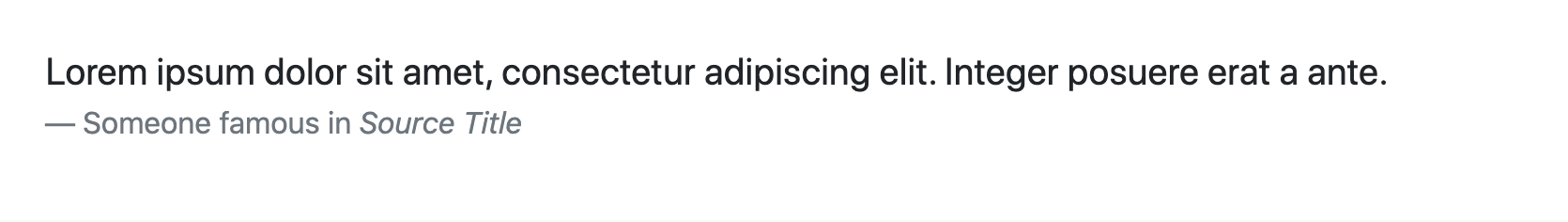
인용구를 오른쪽으로 정렬할 수 있다. text-right라는 클래스를 추가해 주면 된다. 가운데 정렬은 text-center이다.
    <blockquote class="blockquote text-right">
        <p class="mb-0">Lorem ipsum dolor sit amet, consectetur adipiscing elit. Integer posuere erat a ante.</p>
        <footer class="blockquote-footer">Written by my cat <cite title="Blue Steele">Blue Steele</cite></footer>
    </blockquote>
Flexbox Layout
Flex : 레이아웃이나 컴포넌트를 빠르게 설정할 수 있는 유틸리티
부트스트랩4 페이지에는 이렇게 설명되어 있다.
Quickly manage the layout, alignment, and sizing of grid columns, navigation, components, and more with a full suite of responsive flexbox utilities. For more complex implementations, custom CSS may be necessary.
flex behaviors 기본
display 유틸리티를 추가하여 flexbox 컨테이너를 만들고 자녀 엘리먼트를 flex item에 적용할 수 있다. flex container과 item은 추가적인 flex 프로퍼티로 수정할 수 있다.
<div class="d-flex p-2 bd-highlight">I'm a flexbox container!</div>
<div class="d-inline-flex p-2 bd-highlight">I'm an inline flexbox container!</div>
반응형 기능도 .d-flex과.d-inline-flex에 추가할 수 있다..
.d-flex
.d-inline-flex
.d-sm-flex
.d-sm-inline-flex
.d-md-flex
.d-md-inline-flex
.d-lg-flex
.d-lg-inline-flex
.d-xl-flex
.d-xl-inline-flex
방향 설정하기
flex container 안의 item 방향을 설정할 수 있다. 수평적인 컨텐츠의 기본은 왼쪽에서 오른쪽으로 진행된다. .flex-row를 사용하여 수평 진행 방향을 설정할 수 있다. 반대 방향으로 바꾸기 위해서는 .flex-row-reverse를 추가하면 된다.
<div class="d-flex flex-row bd-highlight mb-3">
  <div class="p-2 bd-highlight">Flex item 1</div>
  <div class="p-2 bd-highlight">Flex item 2</div>
  <div class="p-2 bd-highlight">Flex item 3</div>
</div>
<div class="d-flex flex-row-reverse bd-highlight">
  <div class="p-2 bd-highlight">Flex item 1</div>
  <div class="p-2 bd-highlight">Flex item 2</div>
  <div class="p-2 bd-highlight">Flex item 3</div>
</div>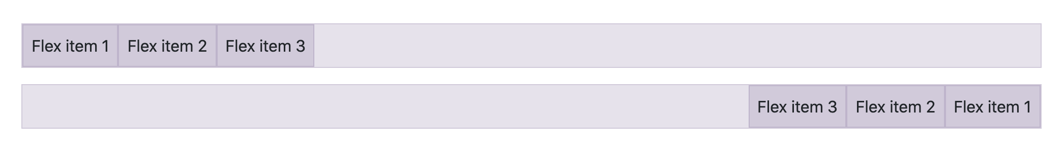
.flex-column으로 수직적 방향을 설정할 수 있다. 위와 마찬가지로 .flex-colum-reverse로 아래에서 위로 가는 방향을 설정할 수 있다.
<div class="d-flex flex-column bd-highlight mb-3">
  <div class="p-2 bd-highlight">Flex item 1</div>
  <div class="p-2 bd-highlight">Flex item 2</div>
  <div class="p-2 bd-highlight">Flex item 3</div>
</div>
<div class="d-flex flex-column-reverse bd-highlight">
  <div class="p-2 bd-highlight">Flex item 1</div>
  <div class="p-2 bd-highlight">Flex item 2</div>
  <div class="p-2 bd-highlight">Flex item 3</div>
</div>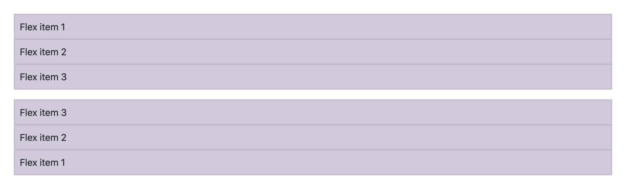
마찬가지로 반응형 웹에도 적용할 수 있다.
Responsive variations also exist for flex-direction.

.flex-row
.flex-row-reverse
.flex-column
.flex-column-reverse
.flex-sm-row
.flex-sm-row-reverse
.flex-sm-column
.flex-sm-column-reverse
.flex-md-row
.flex-md-row-reverse
.flex-md-column
.flex-md-column-reverse
.flex-lg-row
.flex-lg-row-reverse
.flex-lg-column
.flex-lg-column-reverse
.flex-xl-row
.flex-xl-row-reverse
.flex-xl-column
.flex-xl-column-reverse- flex 관련 추가적인 내용은 여기에서 확인하면 된다.
- .nav 안에 flex 유틸리티가 포함되어 있으니 추가로 d-flex를 입력할 필요는 없다.