1.1 마크업
반응형 웹을 구현할 때 어디부터 손대야 할지 막막했는데, 우선은 모바일 환경부터 (작은 것부터) 하나씩 마크업을 하자는 팀의 조언대로 작은 것부터 마크다운을 진행했다.
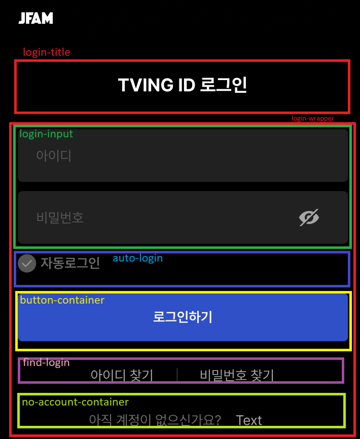
width가 비슷한 것끼리 칸을 나누어서 묶었고 상자가 여러 개가 나왔다. 제목과 커다란 login-wrapper은 따로 구현했다. HTML에서 마크업을 할 때 위에서부터 차례대로 구현했다. 마크업을 하기 전에 reset.css를 활용하여 한 번 리셋을 진행한 후 우리 팀에게 필요한 기본 코드를 구현했다. 기본 코드를 통해 사용자가 버튼을 클릭했을 때 생기는 focus와 active 속성을 따로 주기 위해 전부 none으로 없애주었다.
* {
  box-sizing: border-box;
}

input,
button {
  border: none;
}

input:focus,
input:active,
button:focus,
button:active {
  outline: none;
  box-shadow: none;
}
영역을 구분하기 어려울 때에는 border: solid 1px red;을 사용하여 영역을 찾았다. 차례대로 마크업을 진행하면서 이미 가운데 정렬을 해두었기 때문에 구현하기 쉬웠다. auto-login처럼 왼쪽에 쏠려있는 속성 빼고는 전부 width와 height를 맞추어주었다. 모바일과 테블릿 버전은 max-width를 416px로 고정했고 데스크탑 버전은 732px로 고정한 후에 100%를 주어서 설정하기가 편했다. 그렇게 width와 height를 먼저 지정한 이후에는 margin을 통해 여백을 맞추어주었다. margin은 top, right, bottom, left 순서대로 진행되기 때문에 그에 따라서 margin: 12px auto 0; 이런 식으로 진행했다.
오랜만에 html와 css를 만지니까 곧바로 justify-content, align-items, display 등등이 헷갈렸는데 팀원분이 주신 웹사이트를 참고하니 조금 더 이해가 수월했다. 앞으로도 헷갈릴 때 이 사이트를 활용하면 좋을 것 같다. 그리드 관련된 내용도 동일하게 안에 있다.
HTML 코드
<!doctype html>
<html lang="ko-KR">
  <head>
    <title>JFAM</title>
    <meta charset="UTF-8" />
    <meta
      name="description"
      content="JFAM 오리지널부터 드라마, 예능, 영화, 해외시리즈까지! 무제한으로 스트리밍해 보세요!"
    />
    <meta name="keywords" content="HTML5, CSS3, Vanilla JavaScript, swiper" />
    <meta name="author" content="JFAM" />
    <meta name="viewport" content="width=device-width, initial-scale=1.0" />
    <meta property="og:title" content="JFAM" />
    <meta property="og:url" content="---오픈그래프-url 링크" />
    <meta property="og:type" content="website" />
    <meta property="og:image" content="---오픈그래프-썸네일 이미지" />
    <meta
      property="og:description"
      content="JFAM 오리지널부터 드라마, 예능, 영화, 해외시리즈까지! 무제한으로 스트리밍해 보세요"
    />
    <link rel="icon" type="image/svg+xml" href="/src/assets/favicon.png" />
    <link rel="stylesheet" href="/src/styles/style.css" />
    <link rel="stylesheet" href="/src/styles/reset.css" />
    <link rel="stylesheet" href="/src/pages/login/login.css" />
    <!-- <script type="module" src="/main.js"></script> -->
  </head>
  <body>
    <div class="login">
      <h1 class="login-title">TIVING ID 로그인</h1>
      <form class="login-wrapper">
        <h2 class="sr-only">티빙 로그인 폼</h2>
        <div class="login-input">
          <div class="id-input-container">
            <label class="sr-only" for="input-id">아이디</label>
            <input
              id="input-id"
              class="input-id"
              type="text"
              placeholder="아이디"
            />
          </div>
          <div class="password-input-container">
            <label class="sr-only" for="input-password">비밀번호</label>
            <input
              id="input-password"
              class="input-password"
              type="text"
              placeholder="비밀번호"
            />
          </div>
        </div>
        <div class="auto-login">
          <input type="checkbox" class="form-check auto-login" id="check-all" />
          <label for="auto-login">자동로그인</label>
        </div>
        <div class="button-container">
          <button class="login-button">로그인하기</button>
        </div>
        <div class="find-login">
          <a href="" class="find-id">아이디 찾기</a>
          <span>|</span>
          <a href="" class="find-password">비밀번호 찾기</a>
        </div>
        <div class="no-account-container">
          <span class="no-account">아직 계정이 없으신가요?</span>
          <a href="" class="to-signup">회원가입하기</a>
        </div>
      </form>
    </div>
  </body>
</html>
1.2. 반응형 웹
모바일 마크업을 끝낸 이후에는 테블릿과 데스크탑 버전을 진행했다. 미디어 쿼리를 통해서 최대, 최소 width를 지정하여 창을 길게 늘리거나 줄였을 때 달라지도록 변경할 수 있었다. 모바일이 이미 기본 환경이기 때문에 다음 미디어 쿼리 구문을 두 개만 사용하면 되었다. @media screen and (min-width: 768px) 중요한 점은 달라지지 않는 속성 (색깔, 보더 크기나 위치 등등) 은 두고 달라지는 속성만 넣어둔다는 점이었다. 전체코드를 복붙하여 달라지는 속성(width, font-size, height 등등) 만 수정하였다.
기본 모바일 설정 CSS 코드
/* 기본 설정 */

* {
  box-sizing: border-box;
}

input,
button {
  border: none;
}

input:focus,
input:active,
button:focus,
button:active {
  outline: none;
  box-shadow: none;
}

.sr-only {
  position: absolute;
  width: 1px;
  height: 1px;
  padding: 0;
  margin: -1px;
  overflow: hidden;
  clip: rect(0, 0, 0, 0);
  white-space: nowrap;
  border-width: 0;
}

.login {
  width: 100%;
  height: min-content;
  min-height: 100vh;
  background-color: var(--black, #000);
  color: var(--gray-400, #898989);
  font-family: Pretendard;
  margin: 0 auto;
  text-align: center;
  padding: 1rem;
}

.login-title {
  margin-top: 28px;
  color: var(--white, #fff);
  font-size: 16px;
  font-weight: 700;
  line-height: 140%; /* 22.4px */
}

.login-input {
  margin: 28px auto 0;
  max-width: 416px;
  display: flex;
  flex-flow: column nowrap;
  gap: 8px;
}

.input-id,
.input-password {
  font-size: 12px;
  color: white;
  width: 100%;
  height: 46px;
  padding: 0px 20px 0px 16px;
  border-radius: var(--base, 4px);
  background: var(--brand-dark-bg-2, #212121);
}

.input-id::placeholder,
.input-password::placeholder {
  color: var(--gray-400, #898989);
}

.input-id:focus,
.input-password:focus {
  outline: 1px solid var(--gray-200, #e1e1e1);
}

.auto-login {
  max-width: 416px;
  margin: 8px auto 0;
  text-align: left;
  color: var(--gray-500, #6b6b6b);
  font-size: 12.003px;
  font-style: normal;
  font-weight: 600;
  line-height: 150%; /* 18.005px */
}

.button-container {
  max-width: 416px;
  margin: 16px auto 0;
}

.login-button {
  width: 100%;
  height: 42px;
  border-radius: 4px;
  background: var(--brand-red-1, #2f50c6);
  color: var(--white, #fff);
  font-size: 12.003px;
  font-weight: 600;
  line-height: 150%; /* 18.005px */
}

.find-login {
  margin: 20px auto 0;
  display: flex;
  justify-content: center;
  align-items: center;
  flex-flow: row nowrap;
  gap: 20px;
}

.find-id,
.find-password {
  color: var(--gray-300, #a6a6a6);
  font-size: 12.003px;
  font-weight: 400;
  line-height: 160%; /* 19.205px */
}

.no-account-container {
  margin: 20px auto 0;
}

.no-account {
  color: var(--gray-500, #6b6b6b);
  font-size: 12.003px;
  font-weight: 400;
  line-height: 160%; /* 19.205px */
}

.to-signup {
  color: var(--gray-300, #a6a6a6);

  font-size: 12.003px;
  font-weight: 400;
  line-height: 160%; /* 19.205px */
}
테블릿 환경 CSS 코드
@media screen and (min-width: 768px) {
  .login-title {
    margin-top: 40px;
    font-size: 28px;
  }

  .login-input {
    margin: 54px auto 0;
  }

  .input-id,
  .input-password {
    height: 54px;
    font-size: 16px;
  }

  .auto-login {
    margin: 12px auto 0;
  }

  .login-button {
    height: 50px;
    font-size: 16px;
  }

  .find-login {
    margin: 24px auto 0;
  }

  .find-id,
  .find-password {
    font-size: 16px;
  }

  .no-account-container {
    margin: 16px auto 0;
  }

  .no-account {
    font-size: 16px;
  }

  .to-signup {
    font-size: 16px;
  }
}
데스크탑 환경 코드
@media screen and (min-width: 1920px) {
  .login-title {
    margin-top: 70px;
    font-size: 37px;
  }

  .login-input {
    margin: 60px auto 0;
    max-width: 732px;
    gap: 15px;
  }

  .input-id,
  .input-password {
    font-size: 28px;
    height: 96px;
    padding: 0px 454px 0px 24px;
  }

  .auto-login {
    max-width: 732px;
    margin: 16px auto 32px;
    font-size: 21px;
  }

  .button-container {
    max-width: 732px;
  }

  .login-button {
    width: 100%;
    height: 86px;
    font-size: 28px;
  }

  .find-login {
    margin: 48px auto 0;
    gap: 57px;
  }

  .find-id,
  .find-password {
    font-size: 21px;
  }

  .no-account-container {
    margin: 44px auto 0;
  }

  .no-account {
    font-size: 21px;
  }

  .to-signup {
    font-size: 21px;
  }
}