CSS #4
1. 색상
1) 영단어 표기 (120여개)
color: red|blue|aqua|...
2) 16진수 (0~~15)
- #RRGGBB (6비트), #RGB (3비트)
- #FFFFFF : 흰색
#000000 : 검정색
3) 10진수 (0~255) + rgb (r, g, b)
- rgb(0~255, 0~255, 0~255)
- rgb(0,0,0) : 흰색
rgb(255,255,255) : 검정색
4) 투명도 + 10진수
- rgba(0~255, 0~255, 0~255, 0~1)
- 0은 투명, 1은 불투명
2. visibilty 속성
- 요소를 보이거나 보이지 않게 동작
영역 유지는 되면서 보이지만 않는다 (display:none;은 영역 유지 안 됨) - 문법
visibility: visible|hidden|collapse;
collapse는 table을 안 보이게 처리 (영역 유지 안 됨)
3. 투명도 (opacity) 속성
- 요소의 투명도 제어
- 0~1 사용
opacity: 0.3
4. 글꼴 (font)
1) 스타일 속성
font-style : normal | italic | oblique ...
2) 두께 속성
font-weight : bold | bolder | lighter | 100~900
3) 사이즈 속성
font-size : rem | px
4) 글꼴 속성
font-family : 값1, 값2, 값3;
- 값에 지정 가능한 이름 2가지
- generic family
실제 글꼴의 카테고리st
웹브라우저에서 기본적으로 제공
여러 폰트가 가지는 특별한 주요 특징을 가짐
serif, sans-serif, monospace, cursive(필기체) 등
- font family
실제 글꼴들 - font-family를 지정하지 않으면 웹브라우저의 표준 글꼴로 렌더링된다
- 지정 방법
font-family : 'Malgun Gothic', Batang, sans-serif;
(없을 경우를 대비해 여러 개 지정) - 단축표현식
font: style weight size family;
(font: italic bold 2rem 'Malgun Gothic', 'Batang', sans-serif;)
5. 구글 폰트
- 웹 폰트 (web font)라고 부름
- 로컬에 설치된 폰트와 상관없이 사용 가능
link 태그 사용해야됨 - http://fonts.google.com에서 link, css 복사해서 사용하기
6. text 관련 속성
1) 색상
color: red
2) 수평 정렬
text-align: center | left | right | justify (양쪽정렬)
3) 밑줄 및 취소선
text-decoration: underline | overline | line-throuth (취소선)
4) 대소문자, 첫 글자 대문자
text-transform: uppercase | lowercase | capitalize
5) 첫라인 들여쓰기
text-indent: 10px (들여쓸 크기 지정)
6) 줄간격
- font-size에 비례해서 적용됨
line-height: 0.5
7. FlexBox
1) 개요
- 기본적으로 레아이웃 처리할 때 사용했던 방식은 position과 float.
FlexBox 문법을 적용하면 매우 쉽게 레이아웃 및 수직 정렬, 요소 순서 (ordering), 동적 사이징 처리가 가능함 - 가로 배치
예>
.container{
	display:flex;
}

<div class="container">
    <div>item</div>
    <div>item</div>
    <div>item</div>
    <div>item
    	<div>item2</div> <== flex item 아님. 자손은 제외
	</div>
    <div class="container2"> <== 중첩 가능
        <div>item</div>
    </div>
</div>
2) 2가지 구성 요소
- 반드시 부모/자식 관계가 성립되어야 한다 (자손은 성립 X)
- 중첩 가능 (flex item이 container가 될 수 있음)
- 1차원 (행/열)으로 배치됨
- 지정된 height값 외에는 가장 큰 height값을 따른다
(1) flex container
-
display : flex; 를 적은 태그가 container가 된다
-
flex-direction : 주축의 방향 결정
row : 왼-오
row-reverse : 오-왼
column : 위-아래
column-reverse : 아래-위 -
flex-wrap
화면 크기를 줄일 때 축소되지 않고 새로운 줄에 렌더링되도록 한다
nowrap : 기본
wrap : 상단 기준
wrap-reverse : 하단 기준 -
flex-flow
flex-direction과 flex-wrap의 축약 표현식
flex-flow : direction wrap;
(flex-flow: row wrap;) -
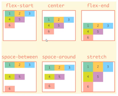
align-items
교차축에 대한 정렬
flex-start
flex-end
center
baseline : item의 컨텐츠에 맞춰 정렬
stretch : 기본값. item을 늘려서 container를 채운다 -
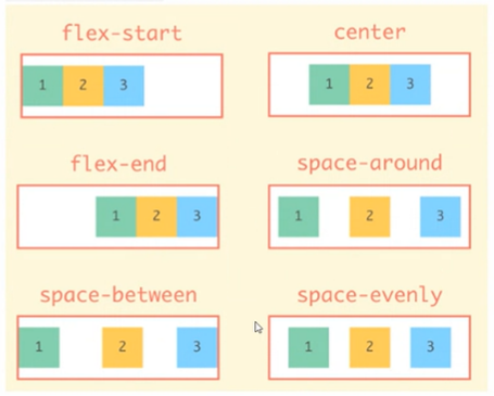
justify-content
주축에 대한 정렬
flex-start
flex-end
center
space-around
space-between
space-evenly
- align-content
반드시 wrap된 상태에서만 적용 가능!!!
align-items + justify-content 합성된 기능
flex-start
flex-end
center
baseline
stretch
space-around
space-between
space-evenly
(2) flex item
-
order
나타내는 순서 변경 가능
-1 : 앞
0 : 기본값
1 : 뒤 -
align-self
align-items : container에 지정해서 모든 item들의 교차축 정렬 제어
align-self : 개별적인 item의 교차축 정렬
flex-start
flex-end
center
baseline
stretch -
flex-grow
화면을 크게할 때 item의 동작 방식을 제어
flex-grow: 0 이 기본값
flex-grow: 1 이상 : 남은 너비를 모두 차지한다 (설정 너비보다 커질 수 있음) -
flex-shrink
화면을 작게할 때 item의 동작 방식을 제어
flex-shrink: 1이 기본값
컨텐츠에 필요한 공간까지만 축소됨
flex-shrink: 0 하면 축소 자체가 안 됨 -
flex-basis
item의 주축에 대한 크기 설정 시 사용
flex-basis: auto가 기본값
flex-basis: 30px;
flex-basis: 50%;