원문: https://medium.com/flutter-community/breaking-layouts-in-rows-and-columns-in-flutter-8ea1ce4c1316
만약 플러터에 관해 5분이라도 읽었다면 분명히 '위젯'이란 단어의 의미를 정확하게 알고 싶을 것입니다. 혹시 "플러터는 거의 모든 것이 위젯이다.' 라는 말 들어보셨나요?
네, 물론 사실입니다. 😅
저는 위젯을 UI의 구성요소와 블럭이라고 정의합니다. Appbar는 하나의 위젯이고, 그 안에 쓰여지는 단어들도 위젯이고, 텍스트에 적용되는 상태도 위젯이고, 심지어 쓰여진 단어들의 위치들도 위젯입니다. 플러터는 보여지는 그대로의 것뿐만 아니라 보여지는 것의 상태 또한 위젯입니다.
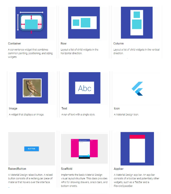
위젯에 대해서 더 많은 것을 말할 수 있지만, 우선 플러터를 사용하기 위해 꼭 필수적인 위젯들인 recommended list를 소개하겠습니다.
Row와 Column에 집중하기
플러터에서 90% 정도의 레이아웃 디자인은 Row와 Column으로 이루어집니다. 물론 Stack이나 Grid를 사용할 때도 있겠지만, 처음 플러터를 시작할 때 UI 블럭 등에서 Row와 Column은 필수요소입니다.
그러면 Row와 Colunm은 무엇일까요?
-
왼& 오른쪽 가로방향 -> Row
-
위& 아래 세로방향 -> Column
꽤 쉽죠? 🙂
아래 설명될 내용을 위해서 Container와 Stack 알아보겠습니다.
- Container : 웹개발 또는 기본 HTML의 개념에서의 div와 비슷합니다.
- Stack : 만약 여러 화면을 포개어 쌓아야 한다면, Stack를 사용합니다.
함께 UI를 만들어보겠습니다!
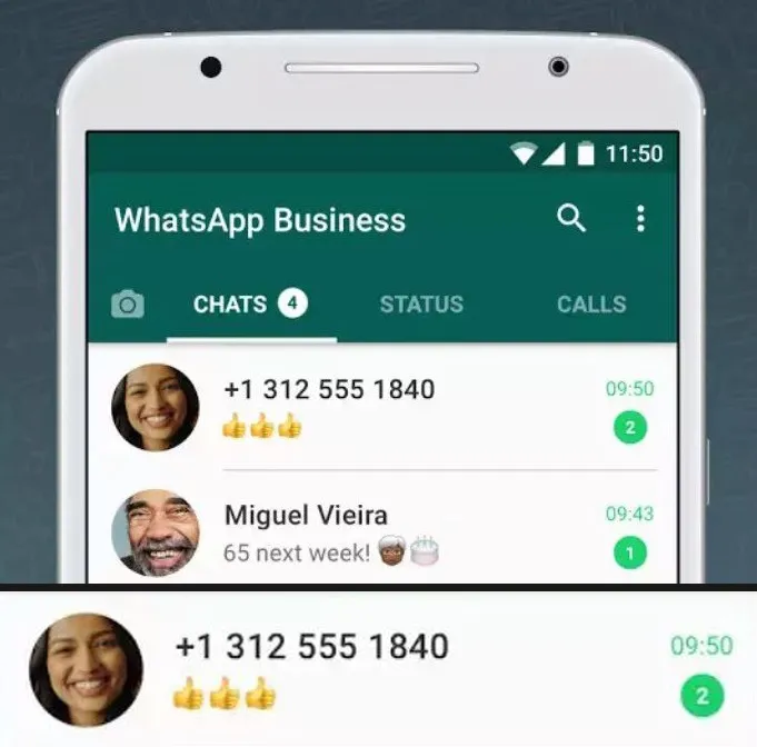
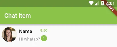
이제 코드로 확인할 시간입니다. 눈에 익숙한 레이아웃을 만들어 보고 어떻게 Row과 Column이 사용되었는지 확인보겠습니다. 첫 번째 디자인은 WhatApp Chats Screen list item입니다.
첫 번째 쪼개기
몇 개의 요소들이 보이나요?
1. 프로필 사진
2. 사용자 이름
3. 사용자의 최근 메시지
4. 최근 메시지 시간
5. 읽지 않은 메시지의 개수
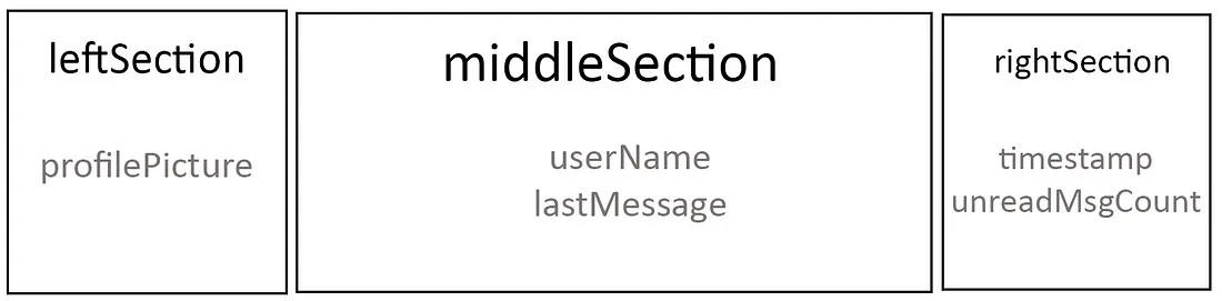
위의 모든 요소들을 하나의 container에 담아봅시다. 그리고 children을 사용하여 가로 방향으로 방향 왼쪽, 중간, 오른쪽 세 개의 부분으로 나누겠습니다.
왼쪽 부분은 프로필 사진을,
가운데 부분은 사용자 이름 아래에 최근 메시지를,
오른쪽 부분은 timeStamp 아래에 읽지 않은 메시지 숫자를.
Time to code
초보자들을 위한 다른 블로그 글과 달리 저는 제 코드를 class과 widget으로 나눌 것입니다. 그러면 코드를 정말 쉽게 읽을 수 있거든요.
main.dart
void main() => runApp(new MyApp());

class MyApp extends StatelessWidget {
  // This widget is the root of your application.
  @override
  Widget build(BuildContext context) {
    return MaterialApp(
      home: new ChatItemScreen(), //calling chat_screen_item.dart
    );
  }
}
📢 tip: class에 import하는 것을 잊지마세요. 예를 들면 main.dart에서 ChatItemScreem 클래스를 가지고 있는 chat_screen_item.dart를 import 해야합니다.
chat_item_screen.dart
class ChatItemScreen extends StatelessWidget{
  @override
  Widget build(BuildContext context) {
    return new Scaffold(
      appBar: new AppBar(
        title: new Text("Chat Item"),
        backgroundColor: Colors.lightGreen,
      ),
      body: new ChatItem(), //calling chat_item.dart
    );
  }
}
이제 시작입니다. 혹시 지금당황하셨나요? 그러실 필요 없습니다. 이제 주요 코드를 확인해보겠습니다. ChatItem 클래스는 하나의 Row를 child로 가지고 있는 Container 위젯을 리턴해줍니다. 이 Row는 children으로 우리가 곧 만들 leftSection, middleSection, rightSection 위젯을 갖게 될 것입니다.
chat_item.dart
class ChatItem extends StatelessWidget{

  final leftSection = new Container();
  final middleSection = new Container();
  final rightSection = new Container();

  @override
  Widget build(BuildContext context) {
    return new Scaffold(
    body: new Container(
      child: new Row(
        children: <Widget>[
          leftSection,
          middleSection,
          rightSection
        ],
      ),
    ),
  );

  }

}
Left Section
우리는 CircleAvatar이 필요합니다.
final leftSection = new Container(
  child: new CircleAvatar(
    backgroundImage: new NetworkImage(url),
    backgroundColor: Colors.lightGreen,
    radius: 24.0,
  ),
);
Middle Section
middleSection Container안에 우리는 사용자 이름과 마지막 메시지 내용을 보여주는, 두 개의 text 위젯을 Column으로 만들 것입니다.
final middleSection = new Container(
  child: new Column(
    children: <Widget>[
      new Text("Name"),
      new Text("Hi whatsup?"),
    ],
  ),
);
이 방식은 위젯들을 원하는 방향으로 위치시키지만 보기에는 예쁘지 않습니다. 이제 모양을 다듬어 볼 시간입니다.
final middleSection = new Expanded(
  child: new Container(
    padding: new EdgeInsets.only(left: 8.0),
    child: new Column(
      crossAxisAlignment: CrossAxisAlignment.start,
      mainAxisAlignment: MainAxisAlignment.spaceAround,
      children: <Widget>[
        new Text("Name",
          style: new TextStyle(
              color: Colors.black,
              fontWeight: FontWeight.w600,
              fontSize: 16.0,
          ),),
        new Text("Hi whatsp?", style:
          new TextStyle(color: Colors.grey),),
      ],
    ),
  ),
);- Expanded
이 부분을 여유 공간이 있게 만들기 위해서, 우리는 전체 container을 Expanded 위젯으로 감싸줍니다. 이렇게 하지 않으면 아래처럼 보여집니다.
-
Padding: 공간을 더 여유있게 만들기 위해서
-
TextStyle: text에 CSS처럼 색이나 글자 크기 변경을 위해서
-
이제 crossAxisAlignment와 mainAxisAlignment를 설명해야하는데 이 비디오보다 더 잘 설명할 수는 없을 것입니다. (2:00 to 7:30를 보시면 됩니다!)
Right Section
거의 다 왔습니다. 두 개의 위젯을 column으로 만들면 됩니다. 이번에는 children 위젯 안에 하나는 최근 메시지 시간을 위한 Textwidget과 읽지 않은 메시지 개수를 위한 CircleAvatar을 넣어주세요.
final rightSection = new Container(
  child: new Column(
    mainAxisAlignment: MainAxisAlignment.spaceAround,
    children: <Widget>[
      new Text("9:50",
          style: new TextStyle(
            color: Colors.lightGreen,
          fontSize: 12.0),),
      new CircleAvatar(
        backgroundColor: Colors.lightGreen,
        radius: 10.0,
        child: new Text("2",
        style: new TextStyle(color: Colors.white,
        fontSize: 12.0),),
      )
    ],
  ),
);
이제 준비됐습니다. 코드를 실행해보세요.
그럼 또다른 레이아웃을 분석하면서, 우리가 위의 내용을 잘 학습했는지 확인해볼까요?
두 번째 쪼개기
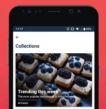
여기 포개어진 배경사진들 위로 몇 개의 text 위젯이 하나의 column으로 가지고 있는 간단한 카드 레이아웃이 있습니다. 포개어진..? 그럼 여기서 Stack을 사용해야겠죠?
네, Stack을 사용해보겠습니다.
왼쪽, 중간, 오른쪽 부분 대신에 우리는 위의 이미지를 backgroundInage 와 onTopContent로 나누겠습니다.
@override
Widget build(BuildContext context) {

  return new Container(
    padding: new EdgeInsets.all(8.0),
    height: 250.0,
    child: new Stack(
      children: <Widget>[
        backgroundImage,
        onTopContent
      ],
    ),
  );
}
Background Image
배경이미지는 하나의 Container에 background이미지가 있고, 배경을 어둡게 해주는 color filter가 있습니다.
final backgroundImage = new Container(
    decoration: new BoxDecoration(
      image: new DecorationImage(
        colorFilter: new ColorFilter.mode(
            Colors.black.withOpacity(0.6),
            BlendMode.luminosity),
        image: new NetworkImage(url),
        fit: BoxFit.cover,
      ),
    ),
);
On Top Content
어떤 걸 쓰고 싶으신가요? Row? column?
네 맞습니다. 바로 Column입니다!
final onTopContent = new Container(
  height: 80.0,
  child: new Column(mainAxisSize: MainAxisSize.max,
    mainAxisAlignment: MainAxisAlignment.spaceEvenly,
    crossAxisAlignment: CrossAxisAlignment.start,
    children: <Widget>[
      new Text("Trending this week",
      style: bigHeaderTextStyle),
      new Text("The most popular restaurants in town this week",
        style: descTextStyle),
      new Container(
        height: 2.0,
        width: 150.0,
        color: Colors.redAccent,
      ),
      new Text("30 PLACES",
        style: footerTextStyle),
      //new Container()
    ],
  ),
);
제가 만든 코드 스타일에 놀라지 마세요. 이 코드들은 플러터의 기본틀이 아니고, 이 코드에 에러가 있다는 것을 알고 있어요.
다음에는, 좀더 복잡한 레이아웃을 학습하면 기초내용부터 확인할 수 있을 거에요. 물론 다른 위젯들이 더 많은 복잡한 레이아웃을 위해 필요하겠지만, Row와 Column은 언제 어디서나 중요하기 때문에, Row 와 Column에 대한 기본 개념을 확실히 알고 넘어가는 것은 중요합니다.