✏️ Check Point
• gsap 활용
• display:grid 사용
• 자바스크립트로 구현한 슬라이드
• image-mask 활용
• background:position 활용한 애니메이션
• SplitText 텍스트 애니메이션
1. 애니메이션을 위한 gsap 활용
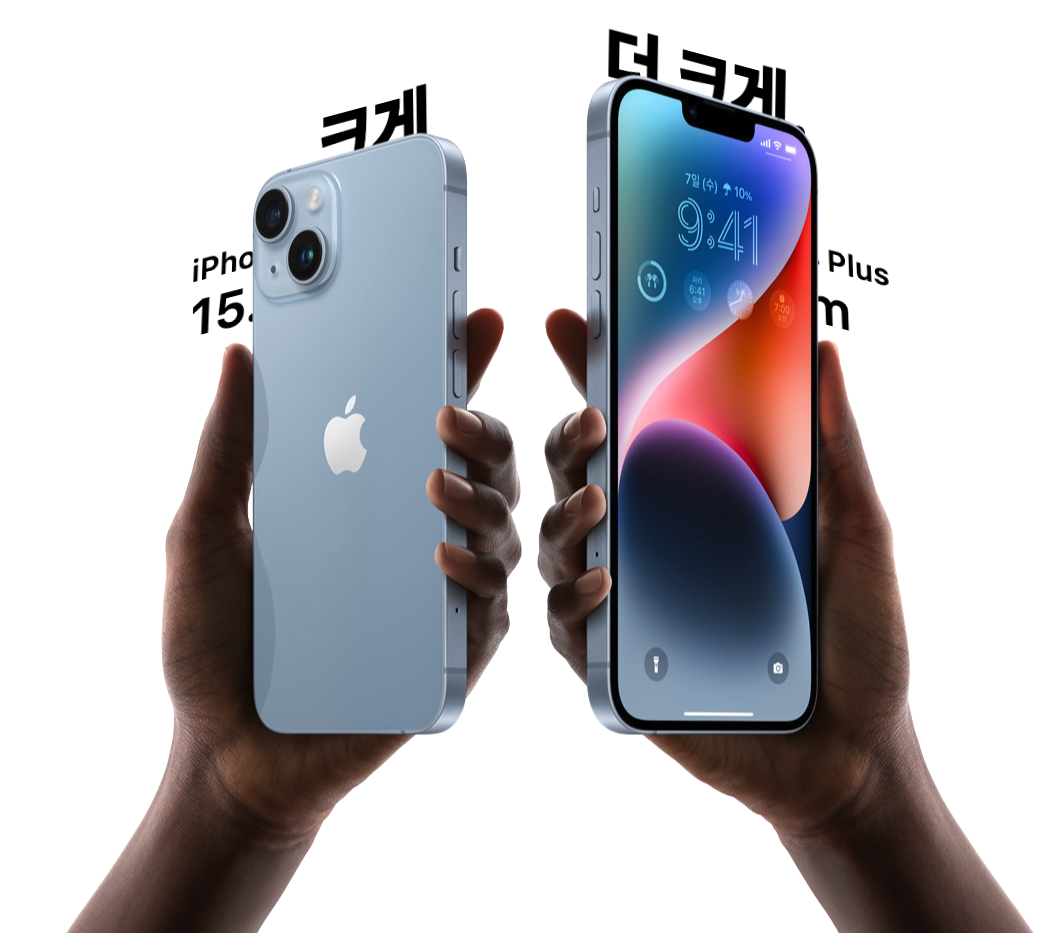
아이폰 14 공식 사이트는 다양한 애니메이션을 보여주고 있기 때문에,
gsap 라이브러리를 통해 동일한 애니메이션을 구현해보았다.
GSAP(The GreenSock Animation Platform)
프론트엔드 개발자와 디자이너들이 쉽게 사용할 수 있는 타임라인 기반의 애니메이션 자바스크립트 라이브러리이다.
CSS와 바닐라 자바스크립트만으로도 동적인 화면을 만들 수 있지만 GSAP은 세밀한 움직임과 동작의 연속성을 훨씬 간편하게 설정할 수 있다.
2. header
헤더가 scroll 0일 경우의 디자인과,
스크롤했을 때 디자인이 달라지는 것을 구현해보았다.

1. header를 2가지로 나누어, pro-header를 gnb-header에 앱솔루트로 붙혀준다.
2. gnb-header의 높이 44px을 기준으로, pro-header가 해당 높이보다 수치가 높아질 때 top 0에 고정되도록 해주었다.
//html review

<header class="header">
	<nav class="gnb-header">
		<ul class="gnb-list">
			..생략
		</ul>
	</nav>
</header>
<nav class="pro-header">
	..생략
</nav>
//js review
let lastScroll = 0; //초기화
$(window).scroll(function(){
const current = $(this).scrollTop();
if ($(this).scrollTop() > 44) {
$('.pro-header').addClass('fixed');
} else {
$('.pro-header').removeClass('fixed');
}
})3. 자바스크립트를 사용한 슬라이드
swiper로 보통 슬라이드 효과를 나타내지만,
이 부분에는 swiper의 한계가 있었기 때문에 스크립트로 구현하게되었다.
1. 슬라이드 이전 버튼, 다음 버튼 클릭했을 때 작동되는 스크립트를 만든다.
2. 이전 버튼 클릭했을 때 인덱스 크기 만큼 빼서 x축이 역순으로 빠져 처음과 동일한 상태가 유지되도록 해준다.
3. 다음 버튼 클릭했을 때 인덱스 크기 392px 이 더해져 x축이 움직여 마지막에는 모든 인덱스가 첫번째 위치에 모이도록 해준다.
//슬라이드 이전 버튼 클릭
$('.sc-lock .btn-nav.prev').click(function(){
      idx = $('.sc-lock .swiper-slide.active').index()+1;
      if(idx === 1){
        return false;
      }
      gsap.to('.sc-lock .swiper-slide.active',{
        x:-392*(idx-1)+392,
      });
      next = $('.sc-lock .swiper-slide.active').next();
      gsap.to(next,{
        x:-392*(idx-1),
        //역순 인덱스 가져와야함.
      });
      console.log(idx);

      nextall = $('.sc-lock .swiper-slide.active').nextAll();
      $(nextall).each(function(i,l){
        // console.log(l.style.transform);
        target = $(this).css('transform');
        var sResult = target.split(',');
        var length = sResult.length;
        result = parseInt(sResult[length-2])

		//슬라이드 X축 이동
        gsap.to(l,{
          x:result+392,
          //역순 인덱스 가져와야함.
        });
      })

      console.log(idx);
      $('.sc-lock .swiper-slide.active').prev().addClass('active').removeClass('hide').siblings().removeClass('active');
})

//슬라이드 다음 버튼 클릭
$('.sc-lock .btn-nav.next').click(function(){
	idx = $('.sc-lock .swiper-slide.active').index()+1;
	if(idx === 6){
		return false;
	}
	$('.sc-lock .swiper-slide.active').addClass('hide');
	siblings = $('.sc-lock .swiper-slide.active').nextAll();
	gsap.to(siblings,{
		x:-392*idx,
	});
	$('.sc-lock .swiper-slide.active').next().addClass('active').siblings().removeClass('active');
})
4. 동일 애니메이션 구현
each문을 통해 해당 클래스명을 가지고 있는 엘리먼트들에게 다 적용시키도록 하였다.
@i - 인덱스
@element - 각각엘리먼트 .link-learn 개인
1. each 문을 통해 .link-learn으로 되어있는 엘리먼트들에게 다 적용되도록 해준다.
2. 화살표 원형과 텍스트를 따로 상수로 만들어준다.
3. 화살표가 먼저 X 좌측에서 우측으로 이동하고,
이동할 때 텍스트 애니메이션이 나오도록 딜레이로 조정해준다.
$('.link-learn').each(function(i,element){

      arrowEl = $(this).find('.arrow');
      textEl =$(this).find('.text');

      arrowMotion =  gsap.timeline({
        scrollTrigger:{
          trigger:element,
          start:"0% 80%",
          end:"100% 0%",
          // markers:true,
        },
      })

      arrowMotion
      .from(arrowEl,{
        xPercent:-600,
          // duration:1
      })
      .from(textEl,{
        delay:0.2,
        opacity:0,
      })

    })
5. 영상 및 이미지 마스크 입히기
👉 백그라운드가 있는 이미지를 마스크로 배경을 감춰 뒤에서 텍스트 애니메이션 구현 필요
👉 아이폰 이미지 안에 비디오가 재생되어야하기때문에, 비디오 위 마스크 필요
위 두가지 요청을 들어주기 위해 image-mask를 사용해보았다.
이미지 구현
1. 원하는 태그에 마스크 이미지 링크를 연결시키고 마스크 사이즈를 기입해준다.
2. 여러 브라우저에서 막힘없이 열릴 수 있도록 webkit-mask도 적용시킨다.
3. 링크 걸린 이미지 안에 각 영상과 이미지가 담기게 된다.
//이미지 마스크
.sc-main-size .left-wrap .img-box{
    position: relative;
    -webkit-mask-size: 779px 1318px;
    mask-size: 779px 1318px;
    -webkit-mask-repeat: no-repeat;
    mask-repeat: no-repeat;
    -webkit-mask-image: url(../images/left-hand.png);
    mask-image: url(../images/left-hand.png);

}
.sc-main-size .right-wrap .img-box{
    position: relative;
    -webkit-mask-size: 820px 1318px;
    mask-size: 820px 1318px;
    -webkit-mask-repeat: no-repeat;
    mask-repeat: no-repeat;
    -webkit-mask-image: url(../images/right-hand.png);
    mask-image: url(../images/right-hand.png);
}
비디오 구현

//비디오 마스크
.sc-a15 video{
    position: absolute;
    top: 0px;left: 0;
    border-radius: 12px;
    display: block;
    width: 100%;
    height: 100%;
    -webkit-mask-repeat: no-repeat;
    mask-repeat: no-repeat;
    -webkit-mask-image: url(../images/a15_mask.png);
    mask-image: url(../images/a15_mask.png);
}
6. text/shape background 애니메이션
👉 text 컬러가 Green으로 채워져야함.
👉 shape 초록색 배터리 이미지가 채워져야함.
위 두가지의 목적을 가지고 아래와 같이 구현하였다.
텍스트
- background를 그라디언트로 적용해서 처음컬러와 나중컬러를 기입해준다.
- background-position-x 를 100%으로 기입해 완료된 포지션으로 기재해준뒤,
- 스크립트에는 포지션값을 0%으로 gsap.from을 입력해주면 텍스트 모션이 완성된다.
이미지
- 초록배터리 이미지를 앱솔루트로 검정배터리 동일 위치에 붙혀준다.
- clip-path로 100% 수치를 기재해준 뒤,
스크립트에는 gsap.from에 해당태그를 입력하고 동일하게 clip-path 0%로 기재해준다.
//css review
//텍스트
.sc-battery .head-area .title-big{
    font-size: 290px;
    color: #00d959;
    font-weight: 600;
    margin-left: -40px;
    background: linear-gradient(to right, rgb(0,217,89)50%, rgb(0,0,0)50%);
    background-size: 200%;
    background-position-x: 100%;
    color: transparent;
    background-clip: text;
    -webkit-background-clip: text;
}

//이미지
.sc-battery .head-area .thumb-box{position: relative;}
.sc-battery .head-area .thumb-box .bat-gr{
    clip-path: polygon(0 0, 100% 0, 100% 100%, 0% 100%);
    z-index: -1; position: absolute; top: 0; left: 438px;}
//js review
const batteryColor = gsap.timeline({
scrollTrigger:{
trigger:".sc-battery",
start:"0% 0%",
end:"100% 0%",
markers:true,
}
})
batteryColor
.addLabel('a')
.to('.sc-battery .title-big',{backgroundPositionX:'0%'},'a')
.from('.sc-battery .head-area .thumb-box .bat-gr',{'clip-path': 'polygon(0 0, 0% 0, 0% 100%, 0% 100%)'},'a')7. SplitText를 사용한 텍스트 애니메이션
👉 글자 하나하나 요소가 나뉘어 순차적인 애니메이션 필요
위 목적을 위해 gsap SplitText라는 텍스트 애니메이션으로 아래와 같이 구현하였다.
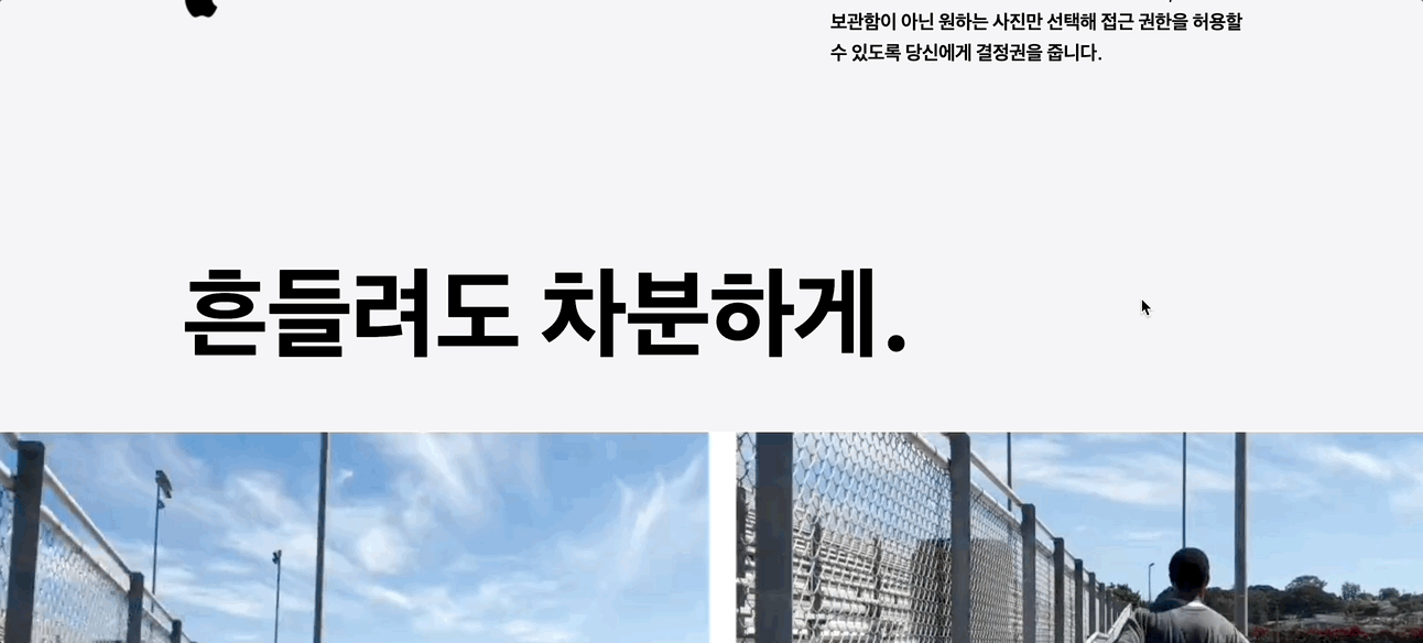
- html에는 본그대로 내용을 기입해준다.(띄어스기, 별도로 나눈것 금지)
- SplitType 안에 적용될 태그를 입력하고, 각 글자만 적용되도록 .from 안에 chars를 입력해준다.
- 마지막으로 stagger를 추가해주면 순차적으로 글자마다 적용된다.
//html review

<section class="sc-video">
	<div class="head-area">
		<div class="inner">
			<div class="text-box">
				<span class="word">
                	흔들려도 차분하게.
				</span>
			</div>
		</div>
	</div>
</section>
//js review
const videoText = new SplitType('.sc-video .word', {types: 'words,chars'})
gsap.from(videoText.chars, {
scrollTrigger:{
trigger:".sc-video",
start:"0% 100%",
end:"100% 0%"
},
duration: 1,
yPercent: 100,
opacity:0,
ease: "power3",
stagger: 0.1,
})