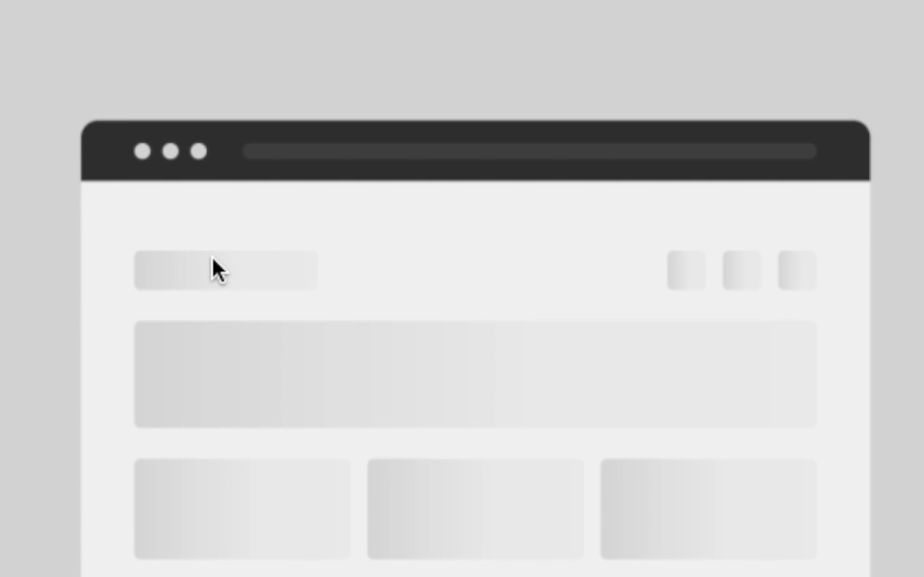
스켈레톤
웹 페이지에서 로드 시간이 짧은 것처럼 보이게 하는 몇 가지 방법들이 있는데
스켈레톤은 그 방법 중 하나
데이터가 로드되기 전에 콘텐츠의 자리비움(placeholder)를 표시
스켈레톤 컴포넌트의 장단점
장점 (Pros)
블랭크 페이지 < 스피너 < 스켈레톤 순서대로 더 빠르다고 느낌
단점 (Cons)
시간이나 비용이 많이 듬
스켈레톤 컴포넌트 사용 예시
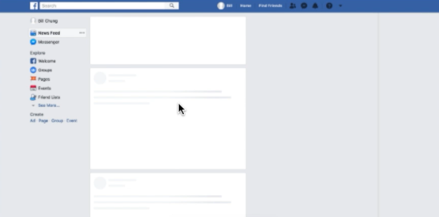
페이스북
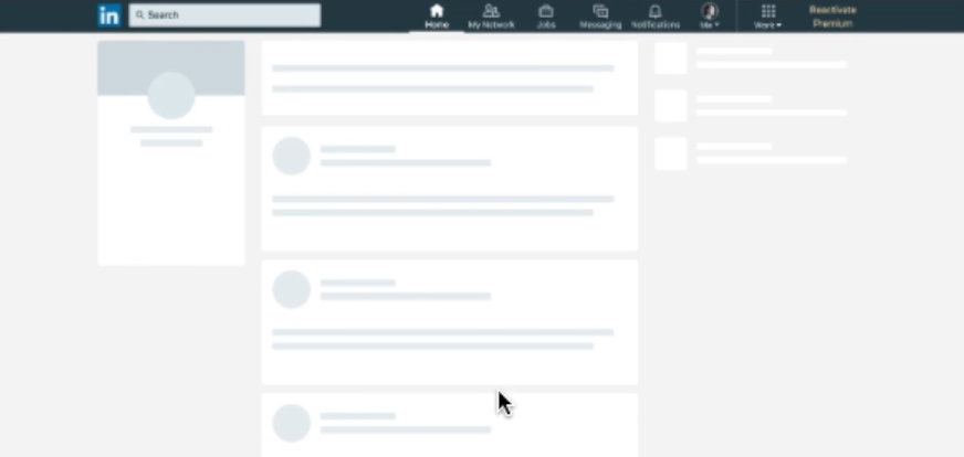
링크드인
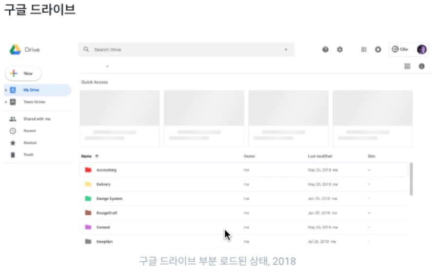
구글 드라이브
유튜브

더 나은 경험을 위한 스켈레톤 규칙
- 스켈레톤은 콘텐츠의 로드를 방해하면 안됨
- 스켈레톤을 디자인 할 때 애니메이션을 사용하는 것이 좋음
wave를 사용하는 것이 로딩 시간을 더 짧게 느끼게끔 함 - 느리고 안정적인 애니메이션을 사용하는 것이 로딩 시간을 더 짧게 느끼게끔 함.
스켈레톤 실습
Install
yarn add @emotion/styled @emotion/reactApp.tsx
import styled from "@emotion/styled/macro";
import React, { useState, useEffect } from "react";
import Img from "./assets/img/272821_111750_2151.jpg";
import Skeleton from "./components/Skeleton";
const Base = styled.div`
display: grid;
width: 100%;
grid-template-columns: repeat(5, 1fr);
column-gap: 12px;
row-gap: 24px;
`;
const Container = styled.div`
display: flex;
flex-direction: column;
box-shadow: rgb(0 0 0 / 4%) 0px 4px 16px 0px;
border-radius: 4px;
`;
const ImageWrapper = styled.div`
width: 100%;
`;
const Image = styled.img`
width: 100%;
height: 100%;
object-fit: cover;
`;
const Info = styled.div`
padding: 1rem;
display: flex;
flex-direction: column;
flex: 1 1 0%;
`;
const Title = styled.h4`
margin: 0;
padding: 0;
font-size: 24px;
`;
const Description = styled.p`
margin: 8px 0 0 0;
padding: 0;
font-size: 16px;
`;
const Placeholder: React.FC = () => (
<Container>
<ImageWrapper>
<Skeleton width={320} height={220} />
</ImageWrapper>
<Info>
<Skeleton width={150} height={29} rounded />
<div style={{ height: "8px" }} />
<Skeleton width={200} height={29} rounded />
</Info>
</Container>
);
const Item: React.FC = () => {
return (
<Container>
<ImageWrapper>
<Image src={Img} />
</ImageWrapper>
<Info>
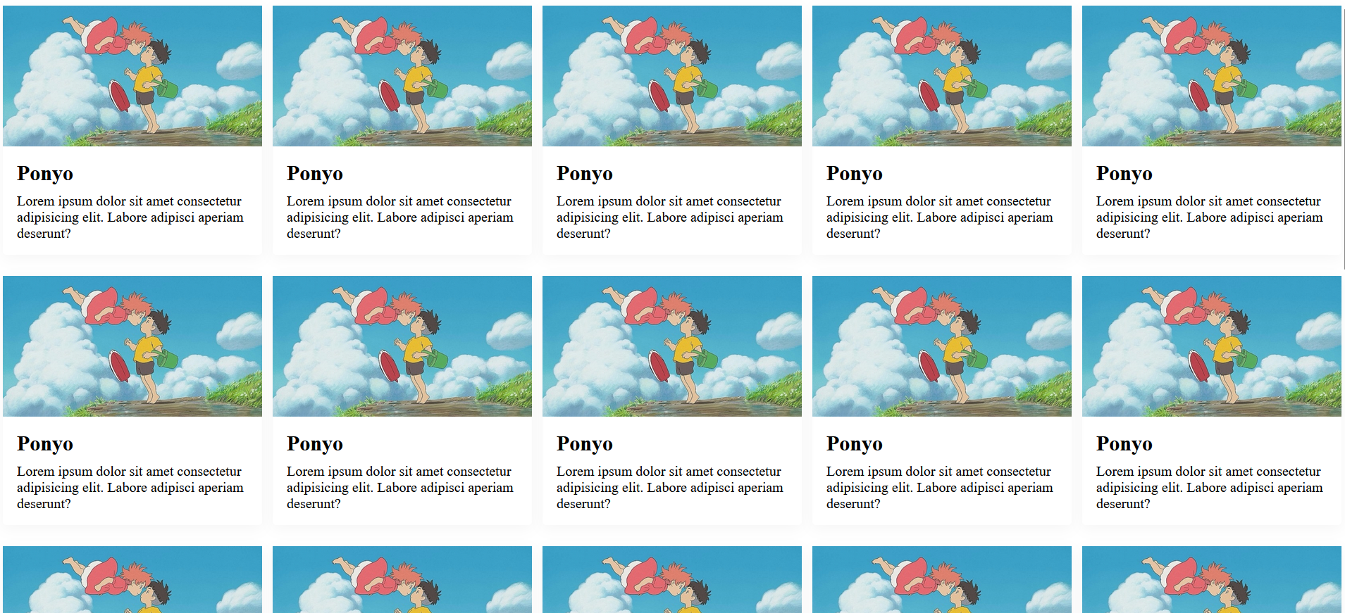
<Title>Ponyo</Title>
<Description>Lorem ipsum dolor sit amet consectetur adipisicing elit. Labore adipisci aperiam deserunt?</Description>
</Info>
</Container>
);
};
function App() {
const [loading, setLoading] = useState<boolean>(true);
useEffect(() => {
setTimeout(() => setLoading(false), 2000);
}, []);
return <Base>{loading ? Array.from({ length: 25 }).map((_, idx) => <Placeholder key={idx} />) : Array.from({ length: 25 }).map((_, idx) => <Item key={idx} />)}</Base>;
}
export default App;Skeleton.tsx
import React, { useMemo } from "react";
import styled from "@emotion/styled/macro";
import { keyframes, css } from "@emotion/react";

interface Props {
  width?: number;
  height?: number;
  geight?: number;
  circle?: boolean;
  rounded?: boolean;
  count?: number;
  unit?: string;
  animation?: boolean;
  color?: string;
  style?: React.CSSProperties;
}

const pulseKeyframe = keyframes`
  0% {
    opacity: 1;
  }

  50% {
    opacity: 0.4;
  }

  100% {
    opacity: 1;
  }
`;

const pulseAnimation = css`
  animation: ${pulseKeyframe} 1.5s ease-in-out infinite;
`;

const Base = styled.div<Props>`
  ${({ color }) => color && `background-color: ${color}`};
  ${({ rounded }) => rounded && "border-radius: 8px"};
  ${({ circle }) => circle && "border-radius: 50%"};
  ${({ width, height }) => (width || height) && "display: block"};
  ${({ animation }) => animation && pulseAnimation};
  width: ${({ width, unit }) => width && `${width}${unit}`};
  height: ${({ height, unit }) => height && `${height}${unit}`};
`;

const Content = styled.span`
  opacity: 0;
`;

const Skeleton: React.FC<Props> = ({ animation = true, unit = "px", color = "#f4f4f4", style, count, width, height, circle, rounded }) => {
  const content = useMemo(() => [...Array({ length: count })].map(() => "-").join(""), [count]);
  return (
    <Base style={style} rounded={rounded} circle={circle} width={width} height={height} animation={animation} unit={unit} color={color}>
      <Content>{content}</Content>
    </Base>
  );
};

export default Skeleton;

Reference
FastCampus React 강의
