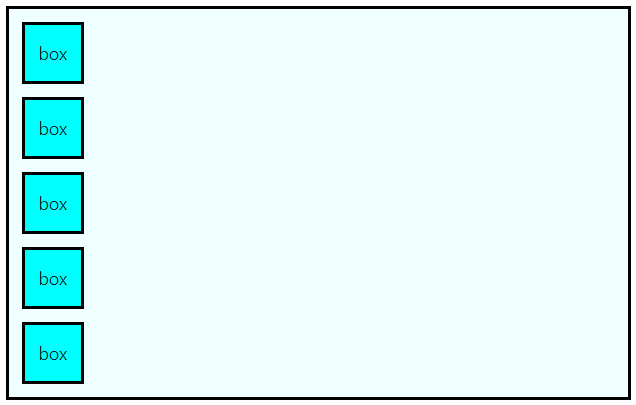
기본(flex 적용 전)
<template>
  <div class="container">
    <div class="item">item</div>
    <div class="item">item</div>
    <div class="item">item</div>
    <div class="item">item</div>
    <div class="item">item</div>
  </div>
</template>

<style scoped>
.container {
  border: solid black;
  background-color: azure;
  margin: 20px;
  width: 350px;
  height: 100px;

  /* display: flex;  */
}

.item {
  border: solid black;
  background-color: aqua;
  margin: 5px;
  width: 50px;
  height: 50px;
  display: flex;

  /* 텍스트 중앙 정렬 */
  justify-content: center;
  align-items: center;
}
</style>
display: flex
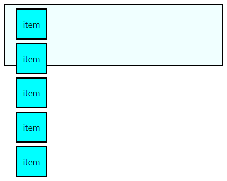
(위 코드에서 container의 flex 주석 해제 후)
flex-direction의 default값이 row
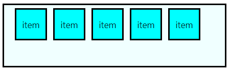
flex-basis
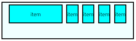
min-width을 설정하면 이를 기준으로 특정 item의 크기를 키워도 다른 item의 width를 보장하기 위해 더 이상 커지지 않는다
flex-basis : 좌우 너비가
flex-direction: 높이
.item:nth-child(1) {
    flex-basis: 100px;
}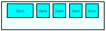
.item:nth-child(1) {
    flex-basis: 300px; // 400px도 결과 동일
}

.item:nth-child(1) {
    flex-basis: 300px;
}
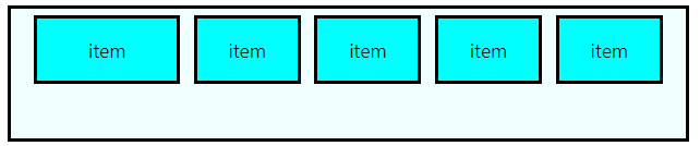
flex-grow
공간이 남은 경우 비율에 따른 너비 할당
초기값은 0이고 음수는 불가능
.item {
  flex-grow: 1;
}
.item:nth-child(1) {
  flex-grow: 2;
}
container width: 500px
container width: 500px
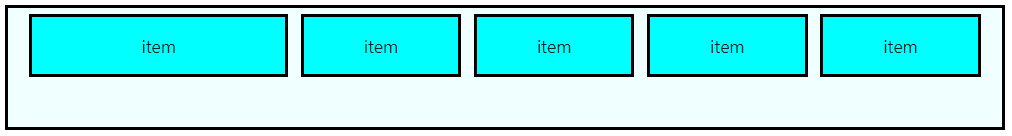
flex-shrink
공간이 부족한 경우 비율에 따른 너비 축소
초기값은 0이고 음수는 불가능
.item {
  flex-shrink: 0;
}
.item:nth-child(1) {
  flex-shrink: 2;
}
.item:nth-child(2) {
  flex-shrink: 1;
}
insea