1️⃣ createGlobalStyle : 전역 스타일 적용
// src/GlobalStyle.ts

import { createGlobalStyle } from 'styled-components'

export const GlobalStyle = createGlobalStyle`
  *{
    width: 100%;
    height: 100%;
    box-sizing: border-box;
  }

  body {
    font-family: 'Noto Sans KR', sans-serif;
    margin: 0 auto;
  }
`
// src/main.tsx
import React from 'react'
import ReactDOM from 'react-dom/client'
import App from './App.tsx'
import * as S from './GlobalStyled.ts'
ReactDOM.createRoot(document.getElementById('root')!).render(
<React.StrictMode>
<S.GlobalStyle />
<App />
</React.StrictMode>
)createGlobalStyle이라는 함수로 전역적으로 적용할 Global Style을 만들 수 있다. 이 함수는 <style> 태그를 컴포넌트로 만드는 것으로, <style> 태그가 저 위치에 생기는 건 아니고, Styled Components가 내부적으로 처리해서 <head> 태그 안에 작성한 CSS 코드를 넣어준다.
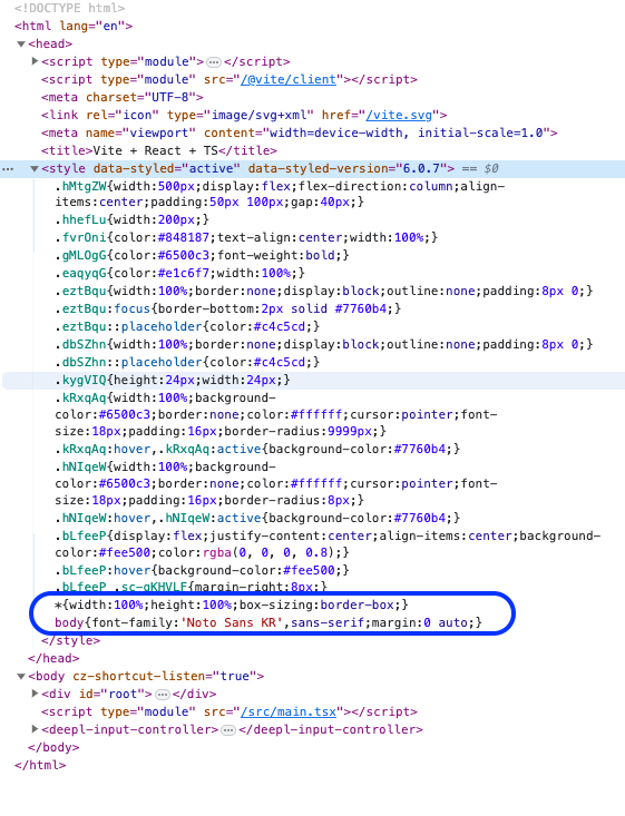
🔼 개발자 도구에서 확인 : <head /> 의 <style /> 안에 들어 있다
2️⃣ keyframes 애니메이션 적용
keyframes라는 함수를 사용해 일반 CSS의 @keyframes 기능을 쓸 수 있다. keyframes로 만든 애니메이션을 아래의 ${placeholderGlow}처럼 템플릿 리터럴에 삽입하는 형태로 사용한다.
// src/styled.ts

import styled, { keyframes } from 'styled-components'

const PlaceholderGlow = keyframes`
  50% {
    opacity: 0.2;
  }
`

export const Placeholder = styled.div`
  animation: ${PlaceholderGlow} 2s ease-in-out infinite;
`

const PlaceholderItem = styled.div`
  background-color: #888888;
  height: 20px;
  margin: 8px 0;
`

export const A = styled(PlaceholderItem)`
  width: 60px;
  height: 60px;
  border-radius: 50%;
`

export const B = styled(PlaceholderItem)`
  width: 400px;
`

export const C = styled(PlaceholderItem)`
  width: 200px;
`
// src/App.tsx
import * as S from './styled'
export default function Skeleton() {
return (
<div>
<S.Placeholder>
<S.A />
<S.B />
<S.C />
</S.Placeholder>
</div>
)
}keyframes 함수가 리턴하는 변수는 단순한 문자열이 아니라 JavaScript 객체이다. 크롬 개발자 도구로 살펴보면
{ id, inject, name, rules, toString }등이 값으로 들어가 있다. 리턴되는 값이 객체이기 때문에 반드시 styled 함수나 css 함수를 통해 사용해야 한다.
3️⃣ themeProvider 테마 설정
현재 테마로 설정된 값을 사이트 전체에서 참조할 수 있도록 Styled Components에서는 Context를 내려주는 컴포넌트로 <ThemeProvider /> 를 사용한다.
<ThemeProvider theme={theme} >로 전체 컴포넌트를 감싸고 theme에 값을 내려주면 각 styled component 에서 theme를 사용할 수 있다.
// src/App.tsx

import { useState } from 'react'
import { ThemeProvider } from 'styled-components'
import * as S from './styled'

export default function App() {
  const [theme, setTheme] = useState({ primaryColor: '#1da1f2' })

  const handleColorChange = (e: React.ChangeEvent<HTMLSelectElement>) => {
    setTheme(prev => ({ ...prev, primaryColor: e.target.value }))
  }

  return (
    <ThemeProvider theme={theme}>
      <select
        value={theme.primaryColor}
        onChange={handleColorChange}
        style={{ width: '50px', height: '50px' }}
      >
        <option value='#1da1f2'>blue</option>
        <option value='#ffa800'>yellow</option>
        <option value='#f5005c'>red</option>
      </select>
      <S.Button>버튼</S.Button>
    </ThemeProvider>
  )
}
// src/styled.ts

import styled from 'styled-components'

export const Button = styled.button`
  background-color: ${({ theme }) => theme.primaryColor};
  width: 100px;
  height: 100px;
`
4️⃣ as 다른 엘리먼트 처럼 사용
컴포넌트에 as 속성을 넣어 다른 엘리먼트의 역할을 하도록 할 수 있다.
import styled from 'styled-components'

export const Button = styled.button`
  width: 100px;
  height: 100px;
`

function App() {
  return (
    <div>
      <Button as='a' href='https://www.google.com'>구글로 가는 버튼</Button>
    </div>
  );
}
5️⃣ $ :Transient Prop
$ 을 사용하면 Styled Components로 스타일링하는 컴포넌트에서만 Prop을 사용하고, 스타일링의 대상이 되는 컴포넌트에는 Prop이 전달되지 않도록 할 수 있다.
Transient : 일시적인, 순간적인
import styled from 'styled-components';

function Link({ className, children, ...props }) {
  return (
    <a {...props} className={className}>
      {children}
    </a>
  );
};

function App() {
  return (
    <GoogleLink $underline={false} href="https://www.google.com">
      Google로 가기
    </GoogleLink>
  );
}

export default App;

const GoogleLink = styled(Link)`
  text-decoration: ${({ $underline }) => $underline ? `underline` : `none`};
`;