Styled-components
- RN 컴포넌트에 스타일 관리를 위해 사용
- Javascript 파일 안에 스타일 정보를 관리하는 CSS-in-JS 형식의 라이브러리 중 React 개발자들이 많이 사용 중인 방식
- 별도 css, scss 파일을 관리할 필요가 없음 (전역 class name 중복으로 인한 오류 발생 안되는 장점이 생김 module.css 처럼)
공식 사이트
설치 방법
- styled-components 는 React 및 React Native 를 둘다 지원하며, RN 기준으로 작성함
- TypeScript 사용을 기준으로 @type 정보가 포함된 라이브러리도 설치함
styled-components 설치
# with npm
npm install --save styled-components
# with yarn
yarn add styled-components
Type Definitions for styled-components
# Web(for React)
npm install --save-dev @types/styled-components

# React Native
npm install --save-dev @types/styled-components @types/styled-components-react-native- 위 라이브러리 설치를 통해 IDE 에서 TypeScript 타입 검출이 가능해짐
Bable Plugin 설정
npm install --save-dev babel-plugin-styled-components- React Debuging Tool 등에서 Debuging 시 class명을 확인하기 쉽게 만들어 줌
- 참고 : https://styled-components.com/docs/tooling#babel-plugin
- babel config file 에 아래와 같이 설정 필요 (ex. babel.config.js)
{
  "plugins": ["babel-plugin-styled-components"]
}
사용 방법
- styled 를 import 후 아래 2가지 예제와 같이 사용 가능
- RN Default Component (Core) 의 경우 styled.View 등과 같이 참조 하여 스타일이 적용된 컴포넌트를 얻을 수 있음
- Antd 라이브러리 와 같은 UI 컴포넌트도 styled(Button) 과 같이 참조하여 스타일을 적용 가능
- RN StyleSheet.create() API 에서 사용되는 marginTop 대신 margin-top 와 같은 CSS 문법으로 스타일링 가능
- StyledTextInput 컴포넌트 사용 예제를 보면 Props 전달 방법 참고할 수 있음
import React from 'react';
import {Button} from '@ant-design/react-native';
import styled, {css} from 'styled-components/native';

const ExamStyledComponent = () => {
  const [text, onChangeText1] = React.useState('');

  return (
    <>
      <StyledText length={text.length}>StyledView Components</StyledText>
      <StyledButton type="primary"> test Button </StyledButton>
      <StyledTextInput onChangeText={onChangeText1} value={text} />
      <StyledTextInput inputColor="blue" bold />
    </>
  );
};

interface StyledTextProps {
  readonly length?: number;
}
const StyledText = styled.Text<StyledTextProps>`
  padding: 50px;
  background-color: yellow;
  text-align: center;
`;

const StyledButton = styled(Button)`
  margin: 30px;
  background-color: blue;
`;
interface StyledTextInputProps {
  readonly inputColor?: string;
  readonly bold?: boolean;
}
const StyledTextInput = styled.TextInput<StyledTextInputProps>`
  padding: 20px;
  margin: 10px;
  color: ${props => props.inputColor || 'palevioletred'};
  background: papayawhip;
  border: none;
  border-radius: 3px;
  ${props =>
    props.bold &&
    css`
      // props 를 쓰지 않는다면 사실 굳이 css 로 감쌀 필요는 없음
      background: #523123;
      border: solid 2px;
    `}
`;

export default ExamStyledComponent;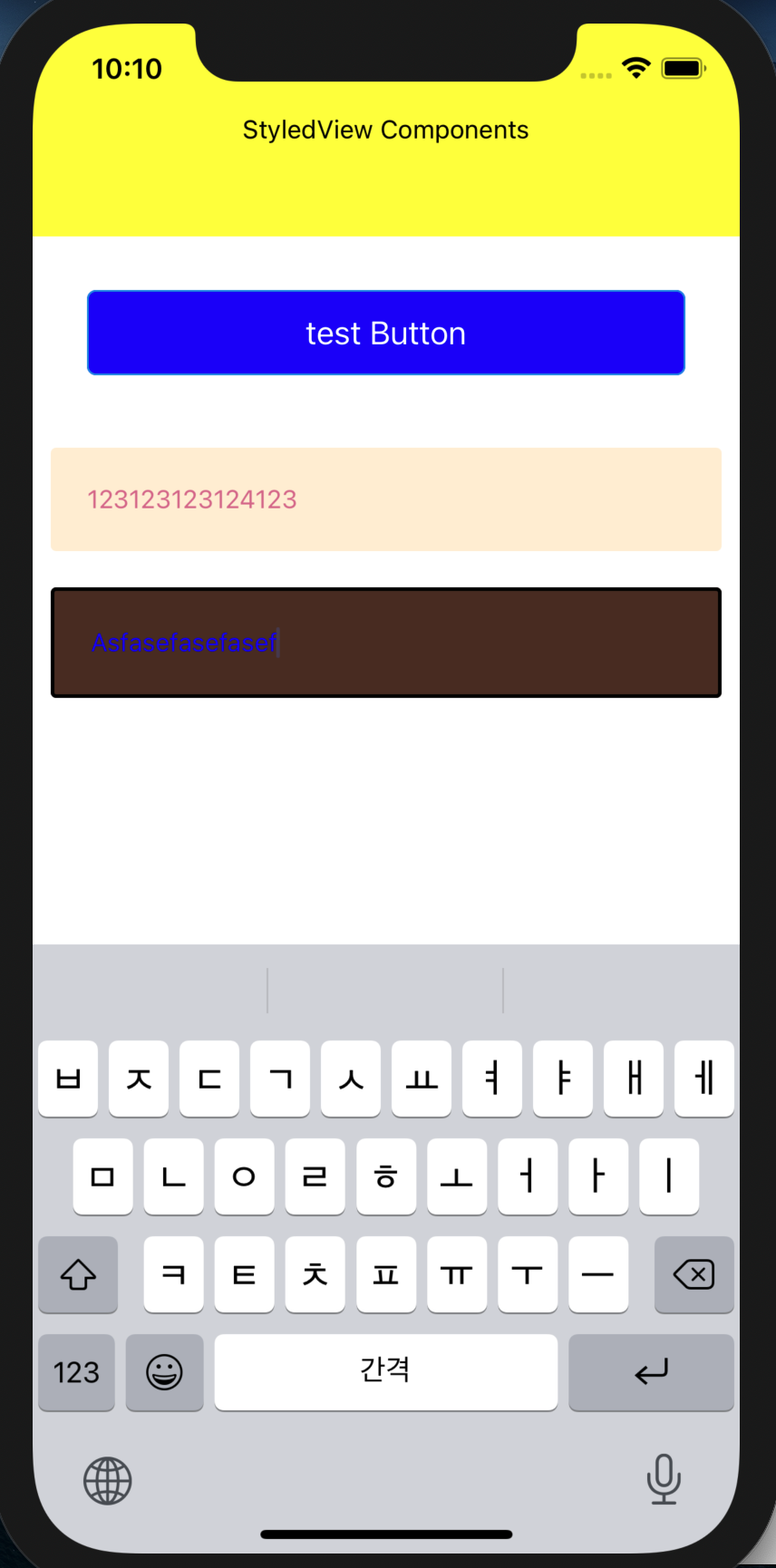
참고
-
Styled-Component 에서 사용되는 styled(Button)
~~css~~와 같은 형태는
Tagged templates 라는 javascript template literals 문법이다. -
react native 에서 styled-components의 keyframe 은 사용 불가능함 (RN Animation 참고할 것)
-
(참고 사이트)styled-components 를 사용하는 8가지 이유 -번역(https://analogcoding.tistory.com/181)