[SCC] 앱개발 종합반 2주차 정리
위젯
위젯이란?
StatefulWidget이나 StatelessWidget을 상속받은 클래스.
기본 내장위젯이나 pug.dev에서의 라이브러리 혹은 직접 작성으로 위젯을 만들 수 있다.
StatelessWidget과 StatefulWidget
StatelessWidget
변경 할 수 없는(immutable) 위젯으로 build 함수가 다시 불리기 전까지는 유지가 된다.
장점
- 상태가 변화하지 않기때문에 매우 단순하다.
- 불변이기 때문에 예측이 가능하다.
사용법
class FirstMyWidget extends StatelessWidget{
const FirstMyWidget({super.key});
Widget build(BuildContext context) {
return Text('나의 첫번째 위젯입니다.');
}
}
라이프 사이클
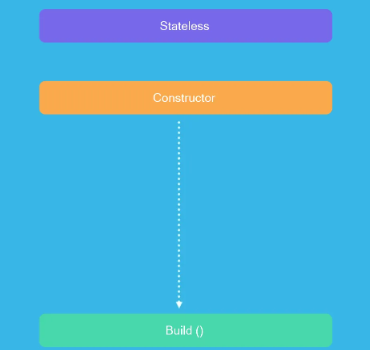
위에서 말한 그대로 바로 빌드로 넘어가게된다.
StatefulWidget
런타임중에 모양과 동작을 변경 할 수 있는 위젯.
상호작용이나 데이터 변경같은 외부 요인이 있을시 사용된다.
장점
- 위젯이 실시간으로 업데이트가 가능하기에 동적 대화형ui의 장점이 있다.
- 다양한 상태 업데이트 처리에 맞는 로직이 정의돠어 있기에 애니메이션이나 네트워크 요청같은 기능에 유연성을 제공함.
사용법
class MyWidget extends StatefulWidget {
_MyWidgetState createState() => _MyWidgetState();
}
class _MyWidgetState extends State<MyWidget> {
int _counter = 0;
void _incrementCounter() {
setState(() {
_counter++;
});
}
Widget build(BuildContext context) {
return Scaffold(
appBar: AppBar(
title: Text('StatefulWidget 예제'),
),
body: Center(
child: Column(
mainAxisAlignment: MainAxisAlignment.center,
children: <Widget>[
Text('Counting : $_counter'),
ElevatedButton(
onPressed: _incrementCounter,
child: Text('더하기'),
),
],
),
),
);
}
}
라이프 사이클
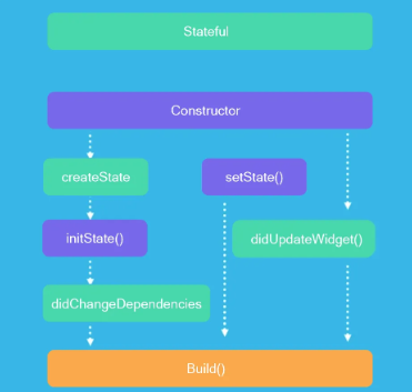
- createState()
StatefulWidget이 처음 생성이 될때 호출.
-
initState()
State객체가 처음 생성이 될때 한번 호출
-
didChangeDependencies()
State객체가 처음 생성 된후, 혹은 State객체의 종속성이 바뀔때 호출
- build(BuildContext context)
State객체가 ui를 그릴때마다 호출
위젯트리를 반환 (return Widget)
- didUpdateWidget(covariant T oldWidget)
부모 위젯이 StatefulWidget을 다시 빌드할때 호출.
이전 위젯과 비교가 가능.
- setState(VoidCallback fn):
ui를 다시 빌드해야할때 호출
라이프 사이클 관련해서는 아래 글에서 더욱 자세하게 다루고있다...
View 위젯
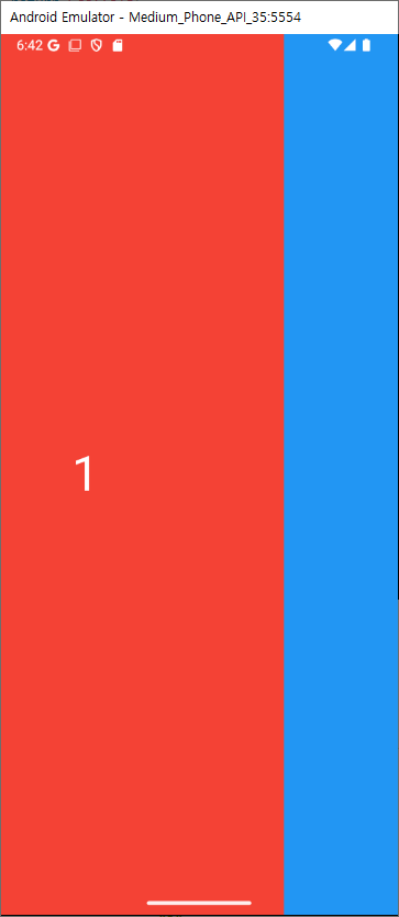
pageView
가로 혹은 세로로 스와이프하며 화면을 넘길수 있는 페이지 뷰 이다.
import 'package:flutter/material.dart';
void main() {
runApp(const MyApp());
}
class MyApp extends StatelessWidget {
const MyApp({super.key});
Widget build(BuildContext context) {
return MaterialApp(
debugShowCheckedModeBanner: false,
home: Scaffold(
body: PageView(
children: [
Container(
color: Colors.red,
child: const Center(
child: Text(
"1",
style: TextStyle(fontSize: 50, color: Colors.white),
),
),
),
Container(
color: Colors.blue,
child: const Center(
child: Text(
"2",
style: TextStyle(fontSize: 50, color: Colors.white),
),
),
),
Container(
color: Colors.yellow,
child: const Center(
child: Text(
"3",
style: TextStyle(fontSize: 50, color: Colors.white),
),
),
),
],
)),
);
}
}
세로 스크롤도 가능하며 Axis.horizontal가 기본값이다.
scrollDirection: Axis.vertical, // Axis.horizontal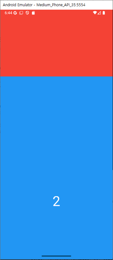
PageController로 좀더 세부적인 컨트롤이 가능하다
...
final _controller = PageController();
void initState() {
super.initState();
_controller.addListener(() {
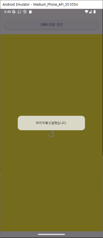
if (_controller.position.maxScrollExtent == _controller.offset) {
showDialog(
context: context,
builder: (context) => const CupertinoAlertDialog(
content: Text('마지막에 도달했습니다.'),
),
);
}
});
}
Widget build(BuildContext context) {
return Scaffold(
body: SafeArea(
child: Column(
crossAxisAlignment: CrossAxisAlignment.stretch,
children: [
Padding(
padding: const EdgeInsets.all(15.0),
child: ElevatedButton(
onPressed: () {
_controller.jumpToPage(1);
},
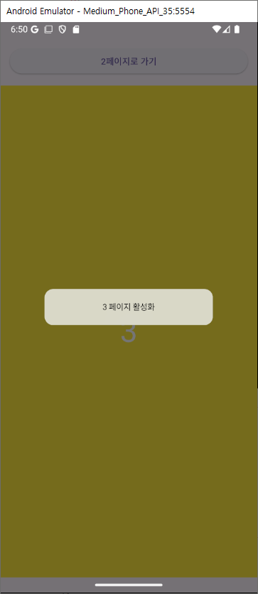
child: Text('2페이지로 가기'),
),
),
Expanded(
child: PageView(
scrollDirection: Axis.vertical,
controller: _controller,
...
pageSnapping 옵션으로 페이지에 맞게 자동 스크롤 여부를 수정할수 있다.
pageSnapping: false,
onPageChanged로 페이지가 바뀔때 호출 가능한 코드를 작성할수 있다.
onPageChanged: (int index) {
 showDialog(
   context: context,
   builder: (context) => CupertinoAlertDialog(
     content: Text('$index 페이지 활성화'),
   ),
 );
},
ListView 위젯
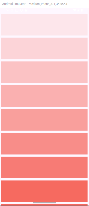
위젯들을 나열하여 스크롤할수 있는 리스트 위젯이다.
import 'package:flutter/material.dart';
void main() {
runApp(const MyApp());
}
class MyApp extends StatelessWidget {
const MyApp({super.key});
Widget build(BuildContext context) {
return MaterialApp(
debugShowCheckedModeBanner: false,
home: Scaffold(
body: ListView(
children: List.generate(
10,
(index) => Container(
width: 100,
height: 100,
margin: const EdgeInsets.all(5),
color: Colors.red.withAlpha((index + 1) * 25),
),
),
),
),
);
}
}
스크롤의 방향을 정할수 있으며 기본값은 세로이다.
scrollDirection: Axis.horizontal,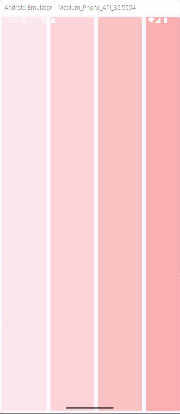
기본적인 나열 순서가 →, ↓ 방향이지만 해당 코드로 역 배치가 가능하다.
reverse: true,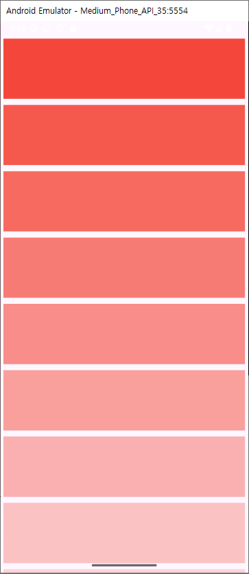
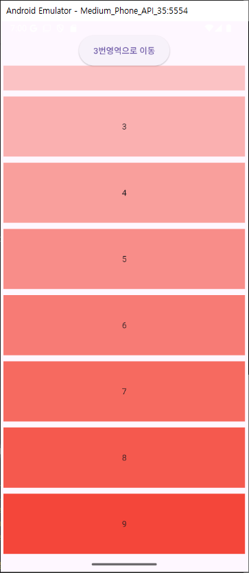
Scrollcontroller를 이용해서 더욱 다양한 컨트롤이 가능하다.
import 'package:flutter/cupertino.dart';
import 'package:flutter/material.dart';
void main() {
runApp(const MyApp());
}
class MyApp extends StatelessWidget {
const MyApp({super.key});
Widget build(BuildContext context) {
return MaterialApp(
debugShowCheckedModeBanner: false,
home: Scaffold(
body: SampleWidget(),
),
);
}
}
class SampleWidget extends StatefulWidget {
const SampleWidget({super.key});
State<StatefulWidget> createState() => _SampleWidgetState();
}
class _SampleWidgetState extends State<SampleWidget> {
final _controller = ScrollController(); // 1번
Widget build(BuildContext context) {
return Scaffold(
body: SafeArea(
child: Column(
children: [
SizedBox(
height: 50,
child: ElevatedButton(
onPressed: () {
_controller.jumpTo(330); // 3번
},
child: const Text('3번영역으로 이동'),
),
),
Expanded(
child: ListView(
controller: _controller, // 2번
children: List.generate(
10,
(index) => Container(
width: 100,
height: 100,
margin: const EdgeInsets.all(5),
color: Colors.red.withAlpha((index + 1) * 25),
child: Center(child: Text(index.toString())),
),
),
),
),
],
),
),
);
}
}
physics 옵션값을 활용해 스크롤 효과를 바꿀수도 있다.
ListView(
    controller: _controller,
    physics: const ClampingScrollPhysics(), //다른 설정의 클래스를 넣어주시면 됩니다.
    children: List.generate(
      10,
      (index) => Container(
        width: 100,
        height: 100,
        margin: const EdgeInsets.all(5),
        color: Colors.red.withAlpha((index + 1) * 25),
        child: Center(child: Text(index.toString())),
      ),
    ),
),- BouncingScrollPhysics 스크롤 범위가 내부 콘텐츠보다 큰 경우 스크롤 끝에서 반사 효과를 제공합니다. iOS 스크롤 동작과 유사합니다.
- ClampingScrollPhysics 스크롤 범위가 내부 컨텐츠보다 클 때 끝에서 반사 효과 대신 스크롤을 클램핑합니다. Android 스크롤 동작과 유사합니다.
- FixedExtentScrollPhysics 모든 아이템이 동일한 크기를 가지는 경우 사용됩니다. 스크롤을 균일한 단위로 이동합니다.
- NeverScrollableScrollPhysics 스크롤이 비활성화된 상태입니다.
상하좌우로 여백의 값 수정도 가능하다
padding: const EdgeInsets.all(50),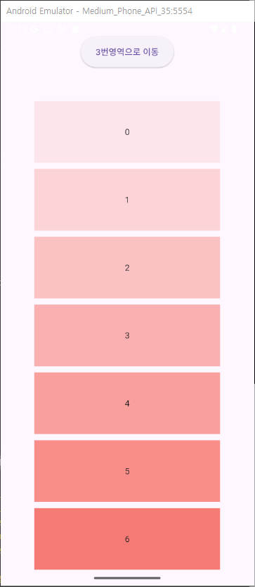
리스트의 아이템이 많을경우 스크롤할때 불러오는건 버벅임을 경험할수있다. 따라서 원하는 높이만큼 cacheExtent를 설정하면 그 높이정도의 아이템은 캐시로 미리 로드를 해둘수 있다.
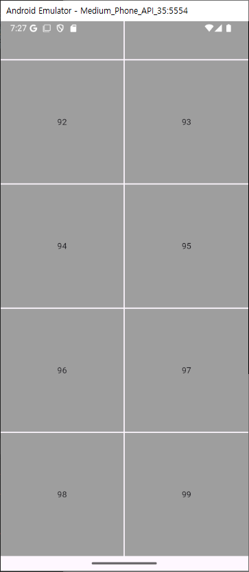
cacheExtent: 100,GridView 위젯
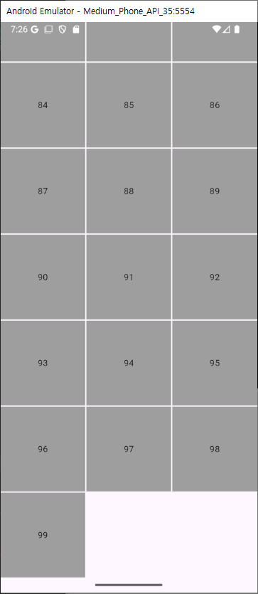
행과 열이 있는 그리드 방식의 위젯이다
gridDelegate 옵션 값이 필수이며 두가지 방식으로 그리드를 정한다.
- SliverGridDelegateWithFixedCrossAxisCount
타일의 크기에 상관없이 crossAxisCount로 정해진 열수에 의해 행이 결정된다.
import 'package:flutter/material.dart';
void main() {
runApp(const MyApp());
}
class MyApp extends StatelessWidget {
const MyApp({super.key});
Widget build(BuildContext context) {
return MaterialApp(
debugShowCheckedModeBanner: false,
home: Scaffold(
body: GridView(
gridDelegate: const SliverGridDelegateWithFixedCrossAxisCount(
crossAxisCount: 3,
mainAxisSpacing: 2,
crossAxisSpacing: 2,
),
children: List.generate(
100,
(index) => Center(
child: Container(
color: Colors.grey,
child: Center(child: Text(index.toString())),
),
),
),
),
),
);
}
}
- SliverGridDelegateWithMaxCrossAxisExtent
MaxCrossAxisExtent라는 값을 사용해 너비를 기준으로 아이템이 들어갈 개수를 계산한다.
최대 가로 300이 몇개가 들어갈수 있는지에 따라 그리드의 형태가 결정된다.
import 'package:flutter/material.dart';
void main() {
runApp(const MyApp());
}
class MyApp extends StatelessWidget {
const MyApp({super.key});
Widget build(BuildContext context) {
return MaterialApp(
debugShowCheckedModeBanner: false,
home: Scaffold(
body: GridView(
gridDelegate: const SliverGridDelegateWithMaxCrossAxisExtent(
maxCrossAxisExtent: 300,
mainAxisSpacing: 2,
crossAxisSpacing: 2,
),
children: List.generate(
100,
(index) => Center(
child: Container(
color: Colors.grey,
child: Center(child: Text(index.toString())),
),
),
),
),
),
);
}
}
mainAxisSpacing & crossAxisSpacing 의 값으로 중간의 여백 사이즈를 정할수있다.
mainAxisSpacing: 2,
crossAxisSpacing: 2,스크롤의 방향을 정할수도 있다. 기본값은 vertical
scrollDirection: Axis.horizontal, //vertical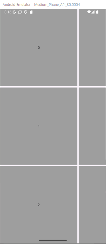
역순으로 배열이 가능하다.
reverse: true,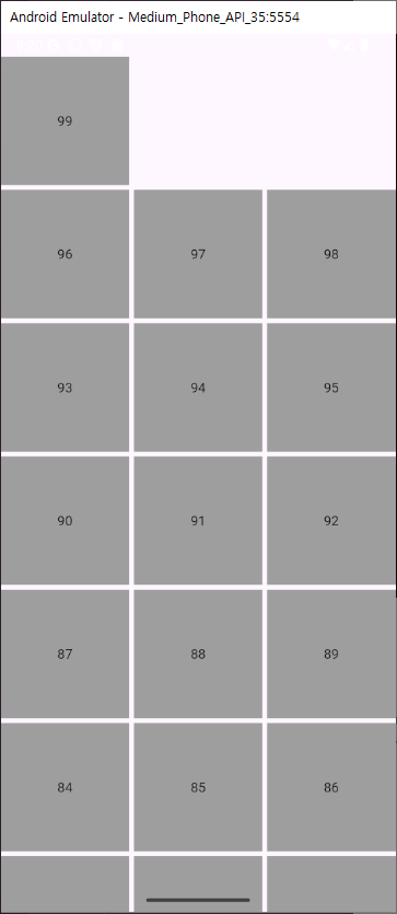
controller를 이용해 스크롤 컨트롤도 가능하다
class _SampleWidgetState extends State<SampleWidget> {
final _controller = ScrollController();
void initState() {
super.initState();
_controller.addListener(() {
// 1번
if (_controller.position.maxScrollExtent == _controller.offset) {
showDialog(
context: context,
builder: (context) => const CupertinoAlertDialog(
content: Text('마지막에 도달했습니다.'),
),
);
}
});
}
Widget build(BuildContext context) {
return Scaffold(
body: SafeArea(
child: Column(
children: [
ElevatedButton(
onPressed: () {
_controller.jumpTo(800);
},
child: const Text('28번째로 이동')),
Expanded(
child: GridView(
controller: _controller,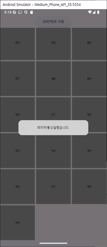
패딩값도 설정가능.
padding: const EdgeInsets.all(30),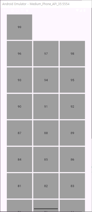
TabBar 위젯
탭바를 넣는 위젯으로 메뉴 위젯과 메뉴에 맞는 화면 위젯 두개가 필요한 위젯이다
import 'package:flutter/cupertino.dart';
import 'package:flutter/material.dart';
void main() {
runApp(const MyApp());
}
class MyApp extends StatelessWidget {
const MyApp({super.key});
Widget build(BuildContext context) {
return MaterialApp(
debugShowCheckedModeBanner: false,
home: Scaffold(body: const SampleWidget()),
);
}
}
class SampleWidget extends StatefulWidget {
const SampleWidget({super.key});
State<SampleWidget> createState() => _SampleWidgetState();
}
class _SampleWidgetState extends State<SampleWidget>
with TickerProviderStateMixin {
late TabController _tabController;
void initState() {
super.initState();
_tabController = TabController(
length: 3,
vsync: this,
);
}
Widget build(BuildContext context) {
return Scaffold(
body: Column(
children: [
TabBar(
controller: _tabController,
labelColor: Colors.blue,
unselectedLabelColor: Colors.grey,
labelPadding: const EdgeInsets.symmetric(vertical: 20),
tabs: const [
Text('메뉴1'),
Text('메뉴2'),
Text('메뉴3'),
],
),
Expanded(
child: TabBarView(
controller: _tabController,
children: [
Container(
color: Colors.blue,
child: Center(child: Text('메뉴1 페이지 ')),
),
Container(
color: Colors.blue,
child: Center(child: Text('메뉴2 페이지 ')),
),
Container(
color: Colors.blue,
child: Center(child: Text('메뉴3 페이지 ')),
),
],
),
),
],
),
);
}
}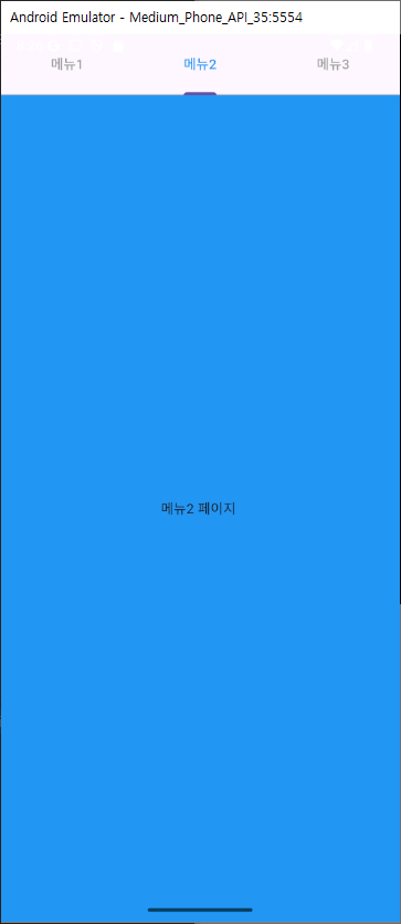
가장큰 특징으로는 TickerProviderStateMixin를 믹스인해줘야한다는점, 탭컨트롤러를 생성시에 초기화를 해주어야 한다는점이다.
class _SampleWidgetState extends State<SampleWidget>
with TickerProviderStateMixin {
late TabController _tabController;
void initState() {
super.initState();
_tabController = TabController(
length: 3,
vsync: this,
);
}Layout구성
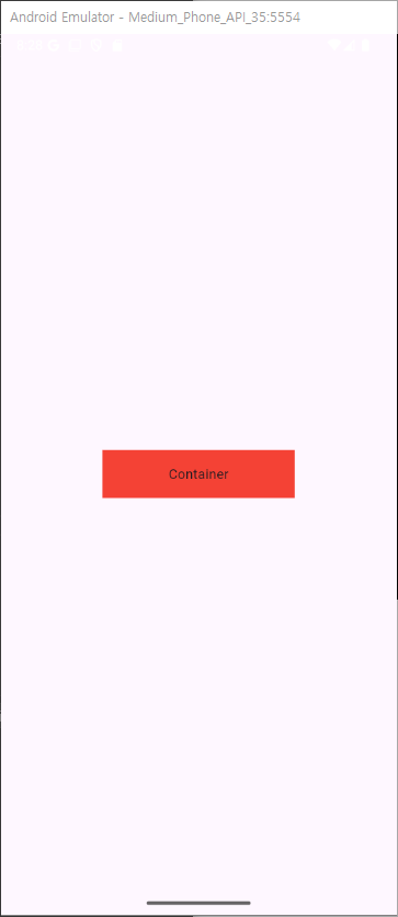
Container
가장 일반적인 위젯으로 테두리 배경색 패딩등을 꾸밀수있는 사각형 이다
Container(
          padding: const EdgeInsets.only(
            left: 20,
            right: 20,
          ),
          width: 200,
          height: 50,
          color: Colors.red,
          child: Center(child: Text('Container')),
        ),
-
padding
컨테이너 내부 간격 조절
padding: const EdgeInsets.only( left: 20, right: 20, ),``` -
width
컨테이너의 너비 설정
-
height
컨테이너의 높이 설정
width: 200, height: 150, -
color
color: Colors.red, -
decoration
그라데이션이나 선 같은 좀더 자세한 설정이 가능decoration: BoxDecoration( gradient: LinearGradient( colors: [ Color.fromARGB(255, 255, 59, 98).withOpacity(0.7), Color.fromARGB(255, 255, 59, 98) ], begin: Alignment.topLeft, end: Alignment.bottomRight, ), borderRadius: BorderRadius.circular(10), boxShadow: [ BoxShadow( color: Color.fromARGB(255, 255, 59, 98).withOpacity(0.5), spreadRadius: 5, blurRadius: 7, offset: Offset(0, 3), // changes position of shadow ), ], ),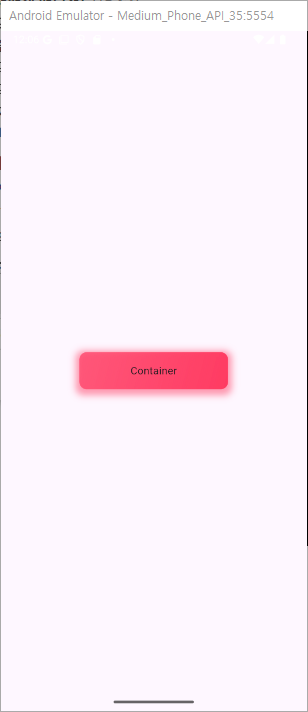
SizedBox
사이즈만을 갖고있는 Container같은 위젯으로써 여백이나 공간을 위해 사용이된다.
height, width 로 가로세로에 여백을 줄수있다.
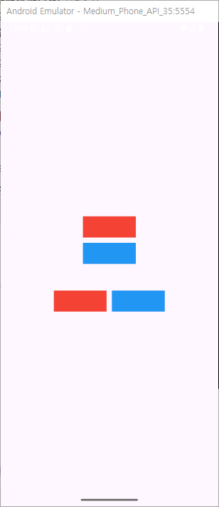
 Column(
        mainAxisAlignment: MainAxisAlignment.center,
        children: [
          Column(
            mainAxisAlignment: MainAxisAlignment.center,
            children: [
              Container(
                color: Colors.red,
                width: 100,
                height: 40,
              ),
              const SizedBox(height: 10),
              Container(
                color: Colors.blue,
                width: 100,
                height: 40,
              ),
            ],
          ),
          const SizedBox(height: 50),
          Row(
            mainAxisAlignment: MainAxisAlignment.center,
            children: [
              Container(
                color: Colors.red,
                width: 100,
                height: 40,
              ),
              const SizedBox(width: 10),
              Container(
                color: Colors.blue,
                width: 100,
                height: 40,
              ),
            ],
          ),
        ],
      )
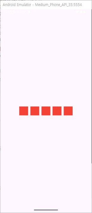
Row위젯
가로로 위젯을 배치할때 사용
Row(
  mainAxisAlignment: MainAxisAlignment.center,
  children: List.generate(
    5,
    (index) => Container(
      width: 40,
      height: 40,
      color: Colors.red,
      margin: const EdgeInsets.all(5),
    ),
  ),
),
mainAxisAlignment
가로 정렬시에 어떤 기준으로 보여줄지에 대한 옵션
총 6가지가 있다.
mainAxisAlignment: MainAxisAlignment.center,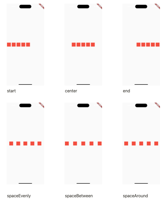
crossAxisAlignment
Row 위젯에서 main은 가로 cross는 세로가 되겠다. 세로로 보여줄 옵션을 고를수 있으며 부모의 높이가 설정이 되어있어야한다.
crossAxisAlignment: CrossAxisAlignment.center,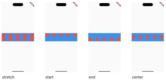
Expanded
행이나 열기준으로 사용가능한 공간을 모두 채우는용도로 사용함. 이미 사이즈로 할당된 곳을 제외한곳에서 채우는 용도
Row(
          mainAxisAlignment: MainAxisAlignment.spaceEvenly,
          children: [
            Expanded(
              child: Container(
                height: 40,
                color: Colors.red,
                margin: const EdgeInsets.all(5),
              ),
            ),
            ...List.generate(
              4,
              (index) => Container(
                width: 40,
                height: 40,
                color: Colors.blue,
                margin: const EdgeInsets.all(5),
              ),
            ),
          ],
        ),
flex
expanded를 사용하면 남은 공간에서 최대 확장이라면
flex를 이용해 비율을 정할수가 있다. flex를 설정하지 않으면 1로 계산됨.
Row(
          mainAxisAlignment: MainAxisAlignment.spaceEvenly,
          children: [
            Expanded(
              flex: 2,
              child: Container(
                height: 40,
                width: 40,
                color: Colors.red,
                margin: const EdgeInsets.all(5),
              ),
            ),
            Expanded(
              flex: 1,
              child: Container(
                height: 40,
                width: 40,
                color: Colors.blue,
                margin: const EdgeInsets.all(5),
              ),
            ),
          ],
        ),
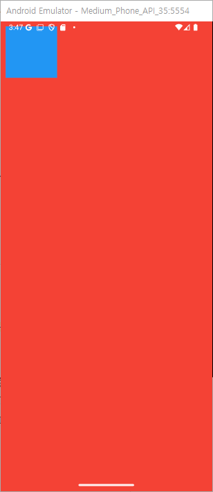
stack & Positioned
stack
두개 이상의 위젯을 겹쳐서 사용할수 있는 위젯이다.
Stack(
          children: [
            Container(
              color: Colors.red,
              width: 200,
              height: 200,
            ),
            Container(
              color: Colors.blue,
              width: 100,
              height: 100,
            ),
          ],
        ),
기본적으로 스택안의 위젯들은 좌상에 모이게 되며 먼저적은 위젯이 더 뒤쪽(아래)에 위치하게 된다.
따라서 사이즈가 작은 파랑사각형이 좌상에 보인다.
fit
fit 옵션으로 자식 위젯의 사이즈를 조절할수있다.
기본값으론 loose이며
expand로 설정을 하면 부모위젯 사이즈에 맞게 하위위젯이 확장된다.
passthrough를 사용하면 부모로의 제약이 그대로 전해진다고 하는데 아직 완벽한 예제는 확인하지 못햇다.
공식문서상에선 row를 예로 가로로는 타이트하고 세로로는 느슨한것을 자식에게 간다고 하는데 강의에서도 잘안쓰인다하여 이정도로만 하고 넘어가겠다.
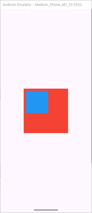
Positioned
Stack(
          children: [
            Container(
              color: Colors.red,
              width: 200,
              height: 200,
            ),
            Positioned(
              top: 10,
              left: 10,
              child: Container(
                color: Colors.blue,
                width: 100,
                height: 100,
              ),
            )
          ],
        ),
stack의 하위 위젯에서 위치를 잡아줄때 사용
stack의 특성으로 인해 좌상에 붙어있으며 넣어준 값에 맞게 여백이 생긴다 라고 생각을 하면된다.
기능성 위젯
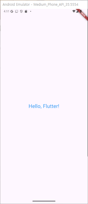
Text
가장 기본적인 텍스트 위젯.
Text(
  'Hello, Flutter!',
  style: TextStyle(
    fontSize: 24,
    color: Colors.blue,
  ),
),
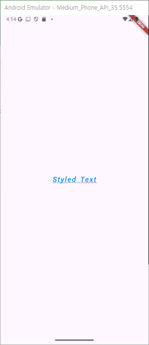
TextStyle
기본적인 텍스트에 스타일을 입힐수 있다.
Text(
        'Styled Text',
        style: TextStyle(
          fontSize: 20, // 사이즈
          fontWeight: FontWeight.bold, // 굵기
          color: Colors.blue,// 색상
          fontStyle: FontStyle.italic,// 스타일
          letterSpacing: 2.0, // 문자간격
          wordSpacing: 4.0, // 단어 간격
          decoration: TextDecoration.underline, // 장식(밑줄, 취소선)
          fontFamily: 'Roboto', // 글꼴
        ),
      )
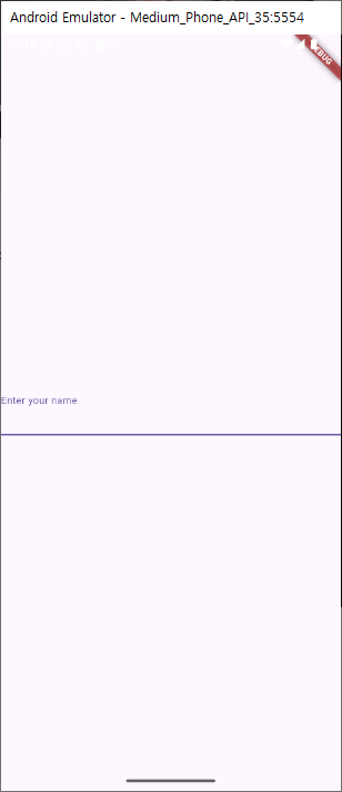
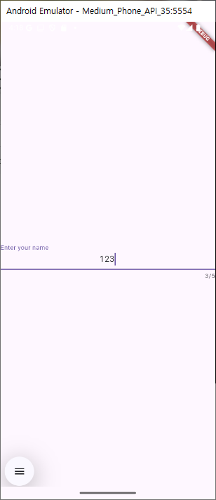
TextField
기본적인 텍스트 입력 위젯
TextField(
  decoration: InputDecoration(
    labelText: 'Enter your name',
  ),
)
옵션
TextField(
        maxLength: 5, // 최대길이
        readOnly: false, // 읽기전용
        textAlign: TextAlign.center, // 텍스트 정렬
        controller: _controller, // 컨트롤러
        decoration: InputDecoration(    // 데코레이션
          labelText: 'Enter your name',
        ),
) 
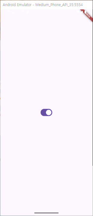
switch
스위치로 값을 수정할수있는 위젯
onchanged에서 setstate와 value값 최신화로 기본적인 기능이 가능
 Switch(
        value: value,
        onChanged: (bool newValue) {
          setState(() {
            value = newValue;
          });
        },
) 
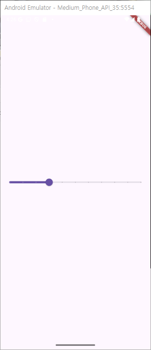
slider
슬라이더 위젯
onChanged에서 setstate로 화면을 바꿔주며 value에 값을 넣어줘야 기본적인 기능이 가능
Slider(
        value: value,
        min: 0,
        max: 100,
        divisions: 10, //
        onChanged: (double newValue) {
          setState(() {
            value = newValue;
          });
          // 슬라이더 변경값에 따른 이벤트 처리
        },
      )
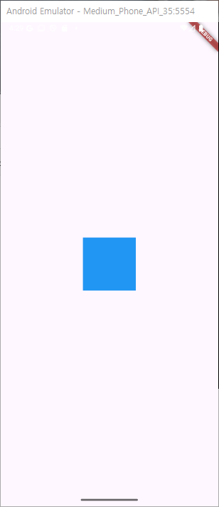
GestureDetector
기본적으로 터치 이벤트가 구현되지 않은 위젯에서 사용하는 사용자 상호작용 위젯
GestureDetector(
onTap: () {
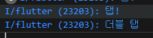
print("탭!");
},
onDoubleTap: () {
print("더블 탭");
},
child: Container(
color: Colors.blue,
width: 100,
height: 100,
),
)
HitTestBehavior
-
deferToChild 기본적인 값으로 하위 위젯의 클릭이 가능하다
-
opaque 하위 위젯의 터치 위치가 빈공간이라면 기본 deferToChild으론 터치가 안되지만(성능을 위해) 이 값으로 빈공간에도 터치 수신이 가능하다. 부모가 무조건 수신
-
translucent 자식 부모 둘다 터치 수신이 필요할때 사용한다
Image
이미지를 처리하는 위젯
 Image.network(
              'https://sudar-life.github.io/images/logo_white_mode.png',
              width: 200,
              height: 200,
            ),
asset
앱 내부 에셋이미지 처리
file
파일 형식의 이미지 처리
memory
Uint8List 에서 들고온 이미지 스트림 처리
network
네트워크 주소로 이미지 처리
