
1. 반응형 웹사이트
- 디스플레이 종류에 따라 화면의 크기가 자동으로 최적화되도록 조절되는 웹페이지
주요 기능
- PC, Tablet, Mobile 에 따라 반응되는 사이트
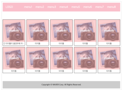
스타일 정보
- PC
header: 배경색 pink, 폰트 14 / #fff
content: 최대 가로길이 900px, 리스트 간격 10px, 리스트 폰트 14px / #000
footer: 배경색 #ccc, 폰트 14 / #000
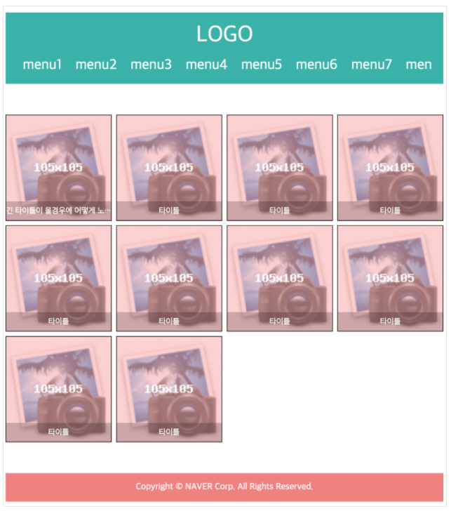
- Tablet
header: 배경색 lightseagreen, 로고폰트 40 / #fff, 메뉴폰트 25 / #fff
content: 리스트 간격 8px, 리스트 폰트 14px / #fff
footer: 배경색 lightcoral, 폰트 14 / #000
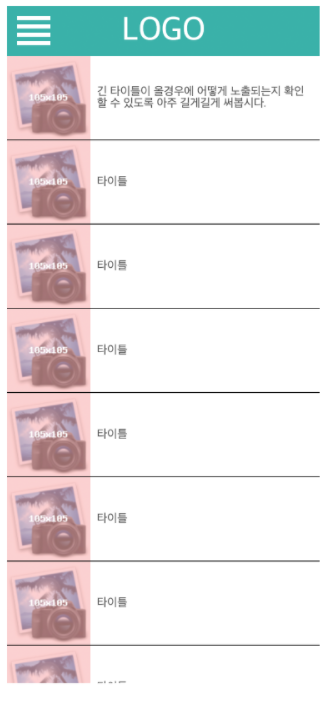
- Mobile
header: 배경색 lightseagreen, 로고폰트 40 / #fff
header GNB: 배경색 lightslategray, 폰트 25 / #fff
content: 리스트 간격 8px, 리스트 폰트 14px / #fff
footer: 배경색 lightcoral, 폰트 14 / #000
주요 태그 및 속성
- HTML
div, header, footer, nav, section - CSS
미디어 쿼리의 특성 (논리연산자 이용하기)
2. 반응형 웹 - PC
실제로는 반응형 웹 프로젝트에서 mobile first 라는 개념으로 제작을 하는 경우가 많다고 한다. 케바케지만 그래도 모바일을 선작업을 하고나서 큰화면을 미디어쿼리로 대응하는 것이 일반적이라고 함!
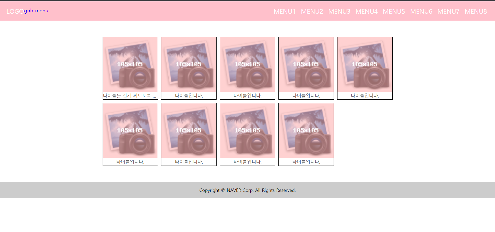
1) HTML 실습
<!DOCTYPE html>
<html lang="ko">
	<head>
		<meta charset="utf-8">
		<meta name="viewport" content="width==device-width, initial-scale=1.0">
		<title>반응형 웹</title>
		<link rel="stylesheet" href="./reset.css">
		<link rel="stylesheet" href="./responsive.css">
	</head>
	<body>
		<div class="wrap">
			<header>
				<a href="#" class="logo"><h1>LOGO</h1></a>
				<a href="#" class="gnb_menu">gnb menu</a>
				<nav>
					<a href="#">MENU1</a>
					<a href="#">MENU2</a>
					<a href="#">MENU3</a>
					<a href="#">MENU4</a>
					<a href="#">MENU5</a>
					<a href="#">MENU6</a>
					<a href="#">MENU7</a>
					<a href="#">MENU8</a>
				</nav>
			</header>
			<section>
				<ul class="list">
					<li>
						<a href="#" class="inner">
							<div class="thumb">
								<img src="thumb.png" alt="썸네일이미지">
							</div>
							<div class="title">
								타이틀을 길게 써보도록 하겠습니다. 썸네일보다 길게
							</div>
						</a>
					</li>
					<li>
						<a href="#" class="inner">
							<div class="thumb">
								<img src="thumb.png" alt="썸네일이미지">
							</div>
							<div class="title">
								타이틀입니다.
							</div>
						</a>
					</li>
					<li>
						<a href="#" class="inner">
							<div class="thumb">
								<img src="thumb.png" alt="썸네일이미지">
							</div>
							<div class="title">
								타이틀입니다.
							</div>
						</a>
					</li>

	<!-- ~~~~~~~~~~~~~~~~~~ 생 략 ~~~~~~~~~~~~~~~~~~ -->
				</ul>
			</section>
			<footer>
				Copyright © NAVER Corp. All Rights Reserved.
			</footer>
		</div>
	</body>
</html>
(1)
2) CSS 실습
@charset "UTF-8";
a{
    text-decoration: none;
}
header{
    overflow: hidden;
    background-color: pink;
    padding: 20px;
}
.logo{
    float: left;
    font-size: 20px;
    color: #fff;
}
nav{
    float: right;
}
nav a{
    padding: 0 5px;
    font-size: 20px;
    color:#fff;
}
footer{
    height: 50px;
    line-height: 50px;
    text-align: center;
    background-color: #ccc;
    font-size: 14px;
    color: #000;
}
section{
    overflow: hidden;
    max-width: 900px;
    margin: 50px auto;
}
.list{
    margin: -5px;
    overflow: hidden;
}
.list li{
    float: left;
    width: 20%;
}
.inner{
    display: block;
    margin: 5px;
    border: 1px solid #000;
}
.thumb img{
    width: 100%;
    height: auto;
    vertical-align: top;
}

/* 넘치는 텍스트 말줄임 */
.title{
    overflow: hidden;
    padding: 5px 0;
    text-align: center;
    font-size: 14px;
    color: #555;
    white-space: nowrap;
    text-overflow: ellipsis;
}
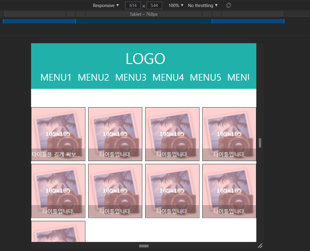
3. 반응형 웹 - Tablet
- PC로 만들어진 웹페이지를 태블릿환경에 적용되는 페이지로 변경
- 미디어쿼리의 기준은 특정 기기의 해상도를 지정한다기 보다는 해당 해상도에서 가장 최적화된 레이아웃을 갖거나 콘텐츠를 노출시키는 것 이라고 생각하는 것이 편하다.
1) CSS 실습
max-width: 768px ❗❗
@media screen and (max-width: 768px), screen and (max-height: 768px) and (orientation: landscape)  {
	header{
		background-color: lightseagreen;:
	}
	.logo{
		width: 100px;
		float: none;
		display: block;
		margin: 0 auto;
		font-size: 40px;
		text-align: center;
	}
	nav{
		overflow-x: auto;
		overflow-y: hidden;
		margin-top: 20px;
		float: none;
		white-space: nowrap;
	}
	nav a{
		font-size: 25px;
	}
	footer{
		background-color: lightcoral;
		color: #fff;
	}
	.list {
		margin: -4px;
	}
	.list li{
		width: 25%;
	}
	.inner{
		position: relative;
		margin: 4px
	}
	.title{
		position: absolute;
		left:0; right:0; bottom:0;
		padding: 10px 0;
		background-color: rgba(0,0,0,0.2);
		color:#fff;
	}
}
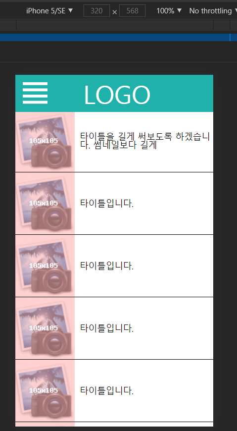
4. 반응형 웹 - Mobile
- 모바일 버전은 가로길이가 좁기 때문에 많은 컨텐츠를 PC나 태블릿처럼 한번에 많이 표현할 수 없기에 리스트같은 경우는 아래로
스크롤하며 보기 편한 레이아웃이 보편적이다.
1) CSS 실습
@media screen and (max-width: 375px), screen and (max-height: 375px) and (orientation: landscape) {
	header{
		padding: 10px 0;
	}
	nav{
		display: none;
		position: absolute;
		top: 60px;
		left:0;
		bottom: 0;
		z-index: 10;
		width: 200px;
		margin:0;
		background-color: lightslategray;
	}
	nav a{
		display: block;
		padding: 20px 10px;
		font-size: 20px;
		border-bottom: 1px solid #fff;
	}
	.gnb_menu{
		position: absolute;
		top: 12px;
		left:12px;
		display: block;
		width: 40px;
		height: 35px;
		font-size: 1px;
		color: transparent;
		background: linear-gradient(#fff 50%, transparent 50%);
		background-size: 100% 10px;
	}
	section{
		margin: 0;
	}
	.list li {
		width: 100%;
	}
	.inner{
		display: table;
		table-layout: fixed;
		width: 100%;
		margin: 0;
		border: none;
		border-top: 1px solid #000;
	}
	.thumb{
		display: table-cell;
		width: 100px;
	}
	.title{
		display: table-cell;
		position: relative;
		right:auto;
		left: auto;
		bottom: auto;
		vertical-align: middle;
		background-color:#fff;
		padding: 8px;
		color:#000;
		text-overflow: inherit;
		white-space: inherit;
		text-align: left;
	}
}
2) 주의할 점
아래의 코드를 html파일 - head에 추가한다.
<meta name="viewport" content="width==device-width, initial-scale=1.0">- 모바일 버전에서 추가된 gnb_menu를 PC버전에서는 보이지 않아야 하기 때문에 아래의 코드를 PC버전의 css 코드에 추가한다.
.gnb_menu{
    display: none;
}- 이 코드는 모바일의 미디어쿼리에서는
display: block으로 적용되면서 모바일 화면에서만 노출이 되게 된다.

I can be your Genie🧞♀️ How ‘bout Aladdin? 🧞♂️