리액트 컴포넌트 스타일링 - CSS Module
1. CSS Module
1-1. CSS Module 이란
- CSS 클래스가 중첩되는 것을 완벽히 방지
CSS Module 만들 경우
- 리액트 컴포넌트 파일에서 해당 CSS 파일 불러올 때 CSS 파일에 선언한 클래스 이름들이 모두 고유해짐
- 고유 CSS 클래스 이름이 만들어지는 과정
- 파일 경로, 파일 이름, 클래스 이름, 해쉬값 등이 사용 가능
Box.module.css
.Box {
  background: black;
  color: white;
  padding: 2rem;
}
.Box2 {
  background: black;
  color: white;
  padding: 2rem;
}
Box.js
import React from 'react'
import styles from './Box.module.css'

function Box() {
  return (
    <>
      <div className={styles.Box}>{styles.Box}</div>
      <div className={styles.Box2}>{styles.Box2}</div>
    </>
  )
}

export default Box
- className을 설정 할 때
- styles.Box를 import 불러옴
- styles 객체 안에 있는 값을 참조
고유한 이름 생성
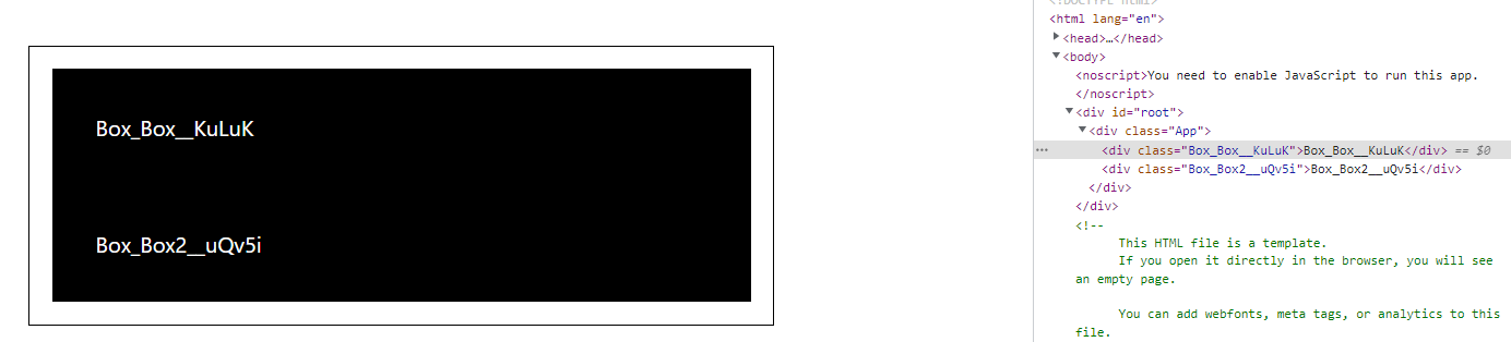
- 클래스 이름에 대하여 고유한 이름들이 만들어짐
- 실수로 CSS 클래스 이름이 다른 관계 없는 곳에서 사용한 CSS 클래스 이름과 중복되는 일에 대해 걱정할 필요 없음
- 유용한 상황
- 레거시 프로젝트에 리액트 도입
- 기존 프로젝트에 있던 CSS 클래스와 이름이 중복되어도 스타일이 꼬이지 않음
- CSS 클래스를 중복되지 않게 작성하기 위함
- CSS 클래스 네이밍 규칙을 만들기 귀찮을 때
- 레거시 프로젝트에 리액트 도입
CSS 클래스 네이밍 규칙
- 컴포넌트의 이름은 다른 컴포넌트랑 중복되지 않게 함
- 컴포넌트의 최상단 CSS 클래스는 컴포넌트의 이름과 일치
- Button.js 컴포넌트의 css 시작은 .Button
- 컴포넌트 내부에서 보여지는 CSS 클래스는 CSS Selector을 잘 활용
- .MyForm .my-input
2. 체크박스 예제
CheckBox.js 컴포넌트 생성
import React from 'react'

function CheckBox({ children, checked, ...rest }) {
  return (
    <div>
      <label>
        <input type="checkbox" checked={checked} {...rest} />
        <div>{checked ? '체크됨' : '체크 안됨'}</div>
      </label>
      <span>{children}</span>
    </div>
  )
}

export default CheckBox
- ...rest 사용한 이유 : CheckBox 컴포넌트에게 전달하게 될 name, onChange 같은 값을 그대로 input에게 넣어주기 위함
CheckBox 흐름
- 1) CheckBox 컴포넌트의 checkbox의 기본 옵션인 checked가 있음
- 2) CheckBox를 체크하면 checked
- true -> 체크됨
- false -> 체크 안됨
- 3)
<span>{children}</span>에서 children은 App.js의 CheckBox 안에 있는 '다음 약관에 모두 동의' 내용 반환
label 감싸기
- input이 아닌 텍스트 부분을 선택해도 값이 바뀜
- label 태그로 감싸줬기 때문
App.js에 빌드
import { useState } from 'react'
import './App.scss'
// import Button from './components/Button'
import Box from './components/Box'
import CheckBox from './components/CheckBox'

function App() {
  const [check, setCheck] = useState(false)
  const onChange = (e) => {
    setCheck(e.target.checked)
  }
  return (
    <div className="App">
      <CheckBox onChange={onChange} checked={check}>
        다음 약관에 모두 동의
      </CheckBox>
      <p>
        <b>check: </b>
        {check ? 'true' : 'false'}
      </p>
    </div>
  )
}

export default App
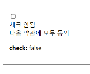
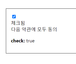
CheckBox 흐름
- 4) 체크할 경우 onChange 함수 호출
- checked 옵션에 따라 true/false 값을 check 변수로 전달
- 5) 체크 누를 경우 onChange에서 checked 값을 setCheck에 저장
- 초기값은 false, 체크하면 true로 변경 -> check:true 됨
3. 체크박스 스타일링 하기
react-icons 라이브러리 설치
- npm install react-icons
CheckBox 컴포넌트 스타일링
import React from 'react'
import { MdCheckBox, MdCheckBoxOutlineBlank } from 'react-icons/md'

function CheckBox({ children, checked, ...rest }) {
  return (
    <div>
      <label>
        <input type="checkbox" checked={checked} {...rest} />
        <div>{checked ? <MdCheckBox /> : <MdCheckBoxOutlineBlank />}</div>
      </label>
      <span>{children}</span>
    </div>
  )
}

export default CheckBox
CheckBox.module.css
.checkbox {
  display: flex;
  align-items: center;
}

.checkbox label {
  cursor: pointer;
}

/* 실제 input을 숨기기 위한 코드 */
.checkbox input {
  width: 0;
  height: 0;
  position: absolute;
  opacity: 0;
}

.checkbox span {
  font-size: 1.125rem;
  font-weight: bold;
}

.icon {
  display: flex;
  align-items: center;
  /* 아이콘의 크기는 폰트 사이즈로 조정 가능 */
  font-size: 2rem;
  margin-right: 0.25rem;
  color: #adb5bd;
}

.checked {
  color: #339af0;
}
- CSS Module을 작성 할 때
- CSS 클래스 이름이 다른 곳에서 사용되는 CSS 클래스 이름과 중복될 일이 없음
- .icon, .checkbox 같은 짧고 흔한 이름을 사용해도 상관 없음
- 고유한 class로 만들어짐
- CSS Module 사용할 때
- styles.icon 이런 식으로 객체 안에 있는 값을 조회할 때 번거로움
- classnames 라이브러리에 bind 기능 사용
4. classnames의 bind 기능 사용
라이브러리 설치
- npm install classnames
CheckBox.js 수정
import React from 'react'
import { MdCheckBox, MdCheckBoxOutlineBlank } from 'react-icons/md'
import styles from './CheckBox.module.css'
import classNames from 'classnames/bind'

const cx = classNames.bind(styles)

function CheckBox({ children, checked, ...rest }) {
  return (
    <div className={cx('checkbox')}>
      <label>
        <input type="checkbox" checked={checked} {...rest} />
        <div className={cx('icon')}>{checked ? <MdCheckBox className={styles.checked} /> : <MdCheckBoxOutlineBlank />}</div>
      </label>
      <span>{children}</span>
    </div>
  )
}

export default CheckBox
- classnames의 bind 기능 사용 -> cs 클래스 이름을 지정할 때, cx('클래스 이름')과 같은 형식으로 편하게 사용 가능
- 여러개의 css 클래스를 사용
- 조건부 스타일링에 사용
cx('one', 'two')
cx('my-component', {
  condition: true
})
cx('my-component', ['another', 'classnames'])