본 글은 다음과 같은 순서로 진행됩니다.
- toast 알림?
- 다양한 toast 관련 라이브러리
- react-toastify 소개
- react-toastify 활용 코드
- 총평
Toast 알림?
토스트 알림은 사용자에게 이벤트 발생을 알립니다. 알림은 각 애플리케이션에서 일관된 위치에 있어야 합니다. 주로 우측 상단에 배치합니다. 간단한 알림으로 추가적인 사용자 이벤트를 받지 않는 것이 대부분입니다.
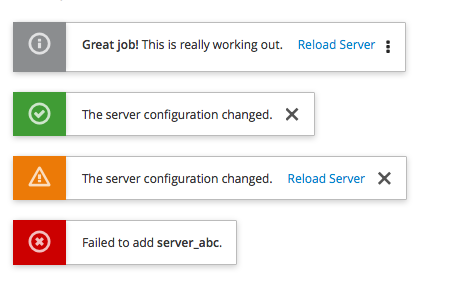
이런 느낌의 알림을 한 번쯤은 받아본 적이 있으리라고 생각합니다.
아래에서 이러한 Toast 알림을 React에서 간편하게 구현할 수 있도록 도와주는 외부 라이브러리들을 살펴보도록 하겠습니다.
다양한 toast 관련 라이브러리
대표적으로 현재 프로젝트에서 사용하는 react-toastify입니다.

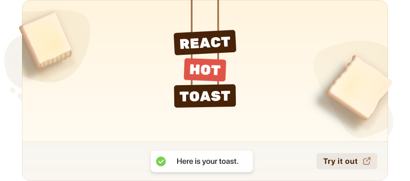
두 번째로 react-hot-toast입니다.
세 번째로 react-toast-notifications입니다.

이 중 마지막 react-toast-notifications는 현재 maintain이 더 이상 되지 않으므로 이에 대해서는 더 언급하지 않도록 하겠습니다.
그렇다면 남은 두 라이브러리를 주요하게 살펴보겠습니다.
react-toastify의 기본 문법은 다음과 같습니다.
  import React from 'react';

  import { ToastContainer, toast } from 'react-toastify';
  import 'react-toastify/dist/ReactToastify.css';

  function App(){
    const notify = () => toast("Wow so easy!");

    return (
      <div>
        <button onClick={notify}>Notify!</button>
        <ToastContainer />
      </div>
    );
}toast('🦄 Wow so easy!', {
position: "top-right",
autoClose: 5000,
hideProgressBar: false,
closeOnClick: true,
pauseOnHover: true,
draggable: true,
progress: undefined,
theme: "light",
});react-hot-toast의 기본 예제는 다음과 같습니다.
import toast, { Toaster } from 'react-hot-toast';

const notify = () => toast('Here is your toast.');

const App = () => {
  return (
    <div>
      <button onClick={notify}>Make me a toast</button>
      <Toaster />
    </div>
  );
};toast('Hello World', {
duration: 4000,
position: 'top-center',
// Styling
style: {},
className: '',
// Custom Icon
icon: '👏',
// Change colors of success/error/loading icon
iconTheme: {
primary: '#000',
secondary: '#fff',
},
// Aria
ariaProps: {
role: 'status',
'aria-live': 'polite',
},
});세부적인 문법이나 지원하는 custom은 조금씩 다르지만 기본적으로 활용하는 방식은 상당히 유사합니다.
둘을 여러 가지로 비교해보겠습니다.
npm download 지표
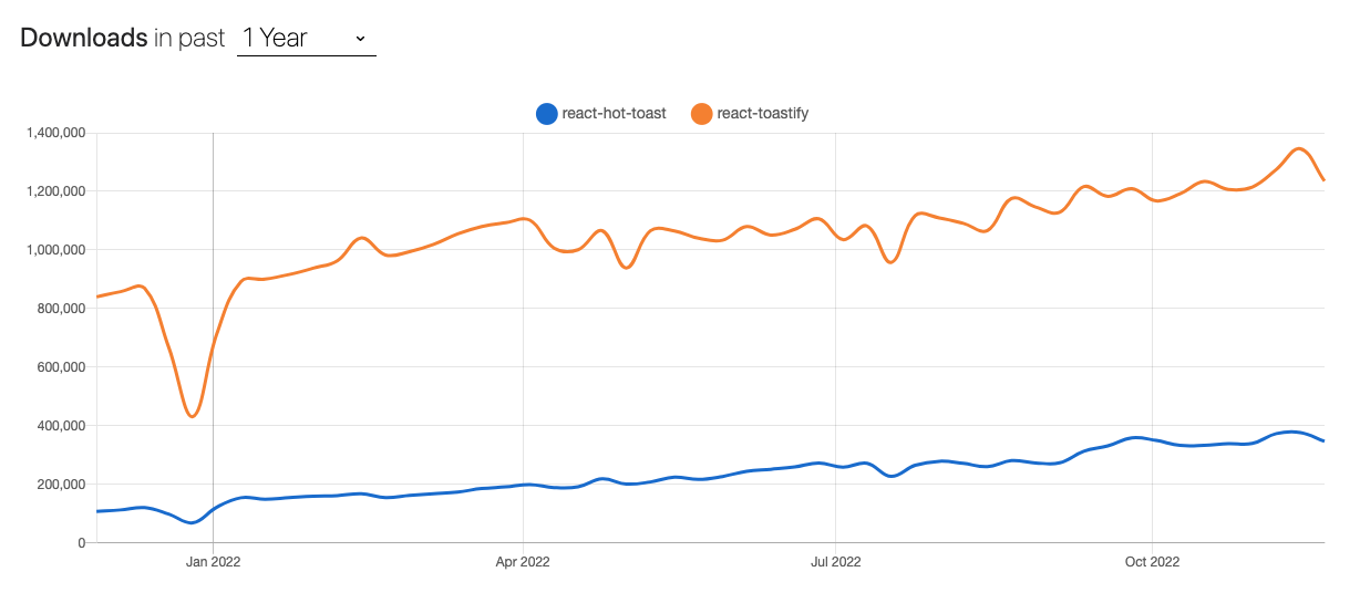
npm trends를 통해 살펴본 두 라이브러리의 다운로드 수 그래프입니다. 둘 다 우상향 그래프를 그리며 react-toastify가 우세를 보이고 있습니다.
bundle size
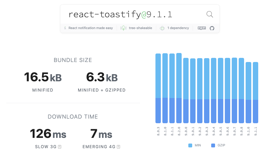
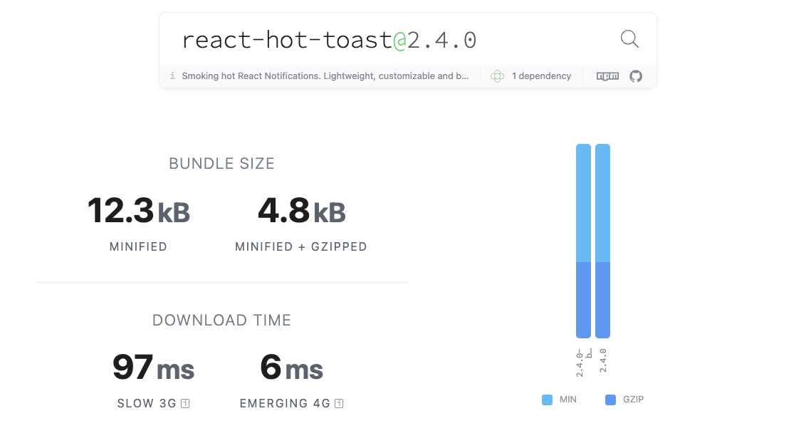
bundle size에서는 react-hot-toast가 미세한 우위를 가져가지만 사실상 차이는 거의 없다고 봐도 무방합니다.
둘 다 굉장히 많은 다운로드 수를 자랑하는 라이브러리인 만큼 훌륭합니다.
저는 이들 중에서 react-toastify를 선택했습니다. toast 자체의 디자인을 섬세하게 다듬을 시간이 없기에 기본적으로 제공하는 toast view가 가장 괜찮은 라이브러리를 선택했고, 제 기준에서는 react-toastify가 제공하는 기본적인 디자인들이 더 좋아 보입니다. 그렇다면 제가 선택한 react-toastify에 대해서 조금 더 자세히 살펴보도록 하겠습니다.
react-toastify 소개
다양한 간단한 예제들을 통해 react-toastify를 소개하도록 하겠습니다.
아래는 기본적으로 react-toastify를 통해 다양한 toast 알람을 보내는 방법들입니다.
import React from 'react';
  import { toast, ToastContainer } from 'react-toastify';
  import "react-toastify/dist/ReactToastify.css";


  function Example() {
    const notify = () => {
      toast("Default Notification !");

      toast.success("Success Notification !", {
        position: toast.POSITION.TOP_CENTER
      });

      toast("Custom Style Notification with css class!", {
        position: toast.POSITION.BOTTOM_RIGHT,
        className: 'foo-bar'
      });
    };

     return (
        <>
          <button onClick={notify}>Notify</button>;
          <ToastContainer />
        </>
      );
  }
toast에 바로 message를 주입하거나, 또는 success, error, warn 등 다양한 기본 제공 디자인이 있는 toast를 보내는 것 역시 가능하며, className 등을 통해 css를 추가로 주입해주는 것 역시 가능합니다.
추가적으로 toast 알람 안에 내가 원하는 component를 주입하는 것도 가능합니다.
import React from 'react';
import { ToastContainer, toast } from "react-toastify";

const Msg = ({ closeToast, toastProps }) => (
  <div>
    Lorem ipsum dolor {toastProps.position}
    <button>Retry</button>
    <button onClick={closeToast}>Close</button>
  </div>
)

function App(){
  const displayMsg = () => {
    toast(<Msg />)
    // toast(Msg) would also work
  }

  return (
  <div>
    <button onClick={displayMsg}>Click me</button>
    <ToastContainer />
  </div>
);
}
toast 함수 안에 내가 작성한 컴포넌트를 주입함으로써 위와 같이 내가 원하는 컴포넌트를 토스트 알람 안에 띄워줄 수 있습니다. 이 때, toast 안에 주입되는 컴포넌트는 toast 함수로부터 closeToast, toastProps를 기본적으로 주입받습니다.
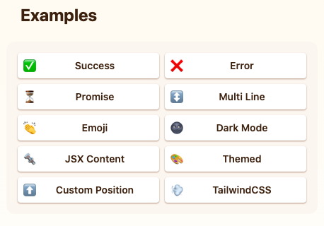
이외에도 추가적으로 다양한 기능들이 있지만 지면상 생략하도록 하겠습니다. 추가적인 이야기들은 아래의 참고 링크의 공식 문서를 통해 확인할 수 있습니다.
react-toastify 활용 코드
저는 util 폴더에 notification.ts로 구성해두고 사용했습니다.
import { toast } from 'react-toastify';

type ToastType = 'error' | 'warning' | 'success';

export const pushNotification = (msg: string, type: ToastType) => {
  toast[type](msg, {
    position: 'top-right',
    autoClose: 5000,
    hideProgressBar: false,
    closeOnClick: true,
    pauseOnHover: true,
    draggable: true,
    progress: undefined,
  });
};
본 프로젝트에서 총 3가지의 toast를 보내기로 하였고, toastify에서 기본적으로 지원하는 다양한 toast 타입 중 위의 ToastType 세가지를 선택하였습니다. 추가적으로 msg prop을 통해 들어가는 message와 기본적인 toast 속성을 설정해주었습니다.
위와 같은 함수를 사용하기 위해 최상단에 Toastcontainer를 배치하였습니다.
import React, { Suspense } from 'react';
import { ToastContainer } from 'react-toastify';
import 'react-toastify/dist/ReactToastify.css';

import '@/styles/font.css';
import Router from <'@/routes';
import { AuthenticationContextProvider } from './hook/AuthenticationContext';

const App: React.FC = () => {
  return (
    <Suspense>
      <AuthenticationContextProvider>
        <ToastContainer />
        <Router />
      </AuthenticationContextProvider>
    </Suspense>
  );
};

export default App;
총평
- 라이브러리의 크기가 작다
- 다양한 커스텀 기능을 지원한다
- 공식 문서가 훌륭하다
- 기본 디자인이 훌륭하다
- TS 지원도 잘 되어 있는 것 같다
참고
react-toastify official document
react-hot-toast official document