요소를 효율적이고 동적으로 배열할 수 있는 레이아웃 모델
Flexbox Components
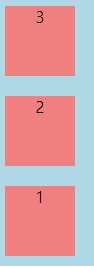
Flex Container: Flexbox의 구성 요소는 표시를 flex또는 inline-flex로 설정하여 상위 요소의 속성 정의
Flex items: Flex Container의 직계 자식요소
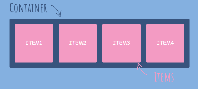
출처:https://eunyoe.tistory.com/103
Flexbox Properties
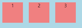
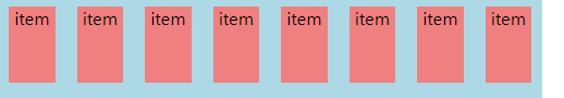
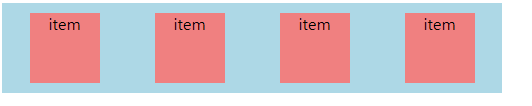
<!DOCTYPE html>
<html lang="en">
  <head>
    <title>Document</title>
    <style>
      .flexbox {
        background-color: lightblue;
        width: 500px;
        height: 500px;
        display: flex;
      }
      .flexitem {
        text-align: center;
        margin: 10px;
        width: 70px;
        height: 70px;
        background-color: lightcoral;
      }
    </style>
  </head>
  <body>
    <div class="flexbox">
      <div class="flexitem">1</div>
      <div class="flexitem">2</div>
      <div class="flexitem">3</div>
    </div>
  </body>
</html>
Flex Container Properties
-
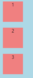
flex-direction
-
row: 가로 정렬
-
columm: 세로 정렬
-
row-reverse: 가로 역방향 정렬
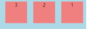
-
column-reverse: 세로 역방향 정렬
-
-
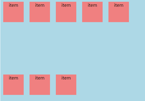
flex-wrap: 아이템이 늘어나면 줄 바꿈 시킴
-
nowrap 기본값
-
wrap: 위에서 아래로 여러 줄로 줄 바꿈
-
wrap-reverse: 아래에서 위로 줄 바꿈
-
-
flex-flow: flex-direction및 flex-wrap속성의 약어, 함께 플렉스 컨테이너의 기본축과 교차축을 정의
flex-flow: column wrap;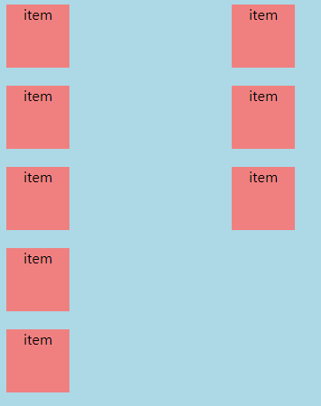
-
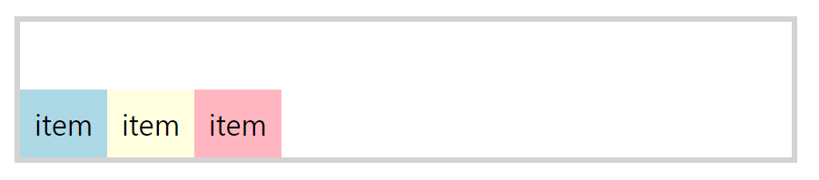
justify-content: 주축을 따라 정렬을 정의
- flex-start
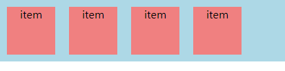
- flex-end
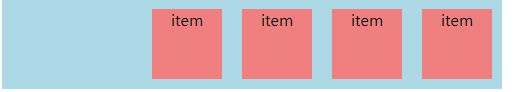
- center

- space-between
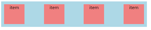
- space-around
- space-evenly
- flex-start
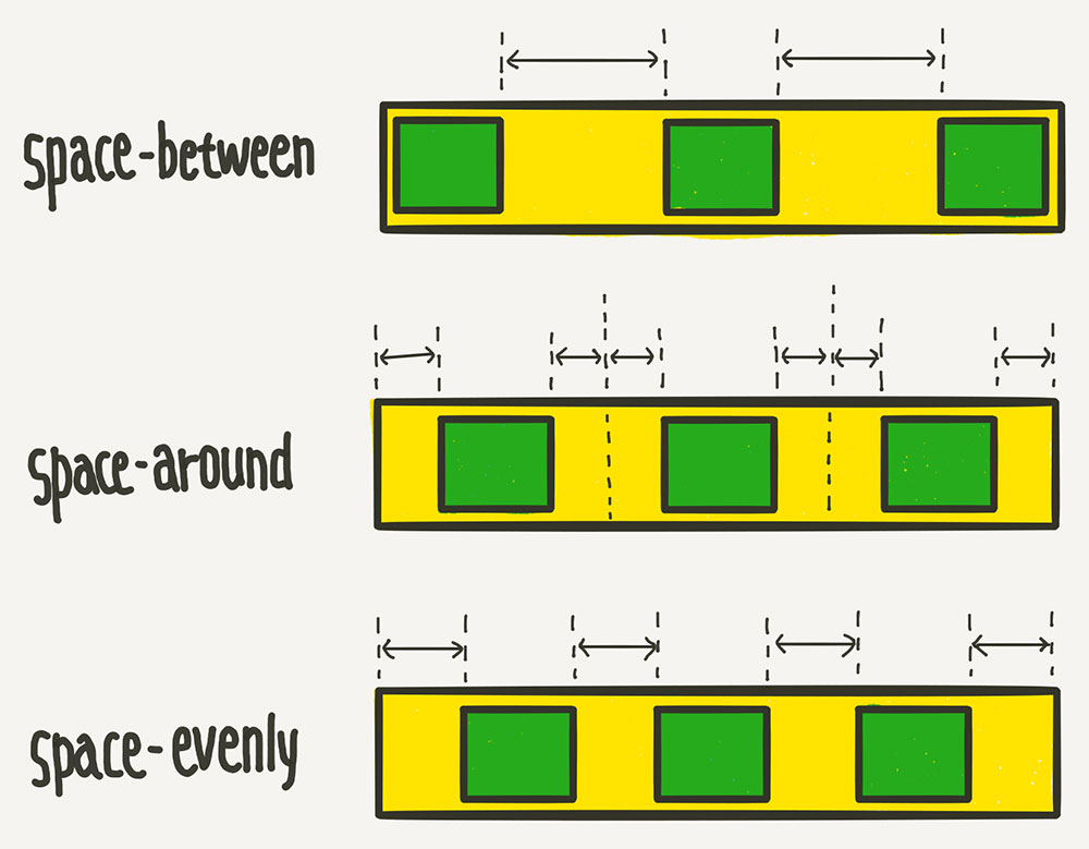
출처:https://youngbinkwon.tistory.com/103
-
aligin-items: 축의 수직 방향을 기준으로 정렬
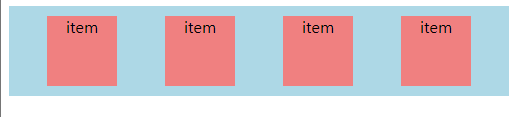
<!DOCTYPE html> <html lang="en"> <head> <title>Document</title> <style> .flexbox { border: 6px solid lightgray; display: flex; height: 150px; margin: 100px; } .flexitem { color: black; font-size: 2rem; padding: 1rem; text-align: center; } .flexitem:first-child { background-color: lightblue; } .flexitem:nth-child(2) { background-color: lightyellow; } .flexitem:last-child { background-color: lightpink; } </style> </head> <body> <div class="flexbox"> <div class="flexitem">item</div> <div class="flexitem">item</div> <div class="flexitem">item</div> </div> </body> </html>-
flex-start: 시작 정렬
-
flex-end: 끝 정렬
-
center: 가운데 정렬
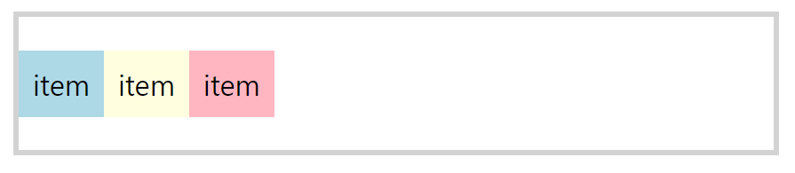
-
stretch: 처음부터 끝까지 사용
-
baseline: 글자를 가운데 정렬
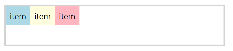
<!DOCTYPE html>
<html lang="en">
  <head>
    <title>Document</title>
    <style>
      .flexbox {
        border: 6px solid lightgray;
        display: flex;
        height: 150px;
        margin: 100px;
        align-items: baseline;
      }
      .flexitem {
        color: black;
        font-size: 2rem;
        padding: 1rem;
        text-align: center;
      }
      .flexitem:first-child {
        background-color: lightblue;
        padding-bottom: 2rem;
      }
      .flexitem:nth-child(2) {
        background-color: lightyellow;
        padding-top: 3rem;
      }
      .flexitem:last-child {
        background-color: lightpink;
        padding-top: 1rem;
      }
    </style>
  </head>
  <body>
    <div class="flexbox">
      <div class="flexitem">item</div>
      <div class="flexitem">item</div>
      <div class="flexitem">item</div>
    </div>
  </body>
</html>
-
-
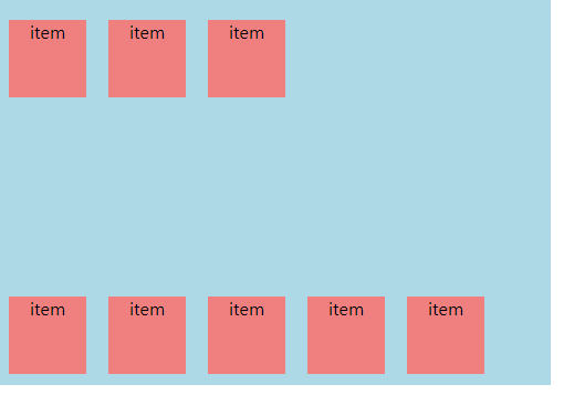
aligin-content:
-
aligin-items은 한 줄을 기준으로 하지만 aligin-content는 두 줄부터 사용하는 의미가 있음.
-
두 줄의 flex-wrap: wrap인 상태에서 사용해야함.
-
aligin-contents는 수직 축의 라인을 기준으로( 두 줄 이상 ) 라인 자체 정리
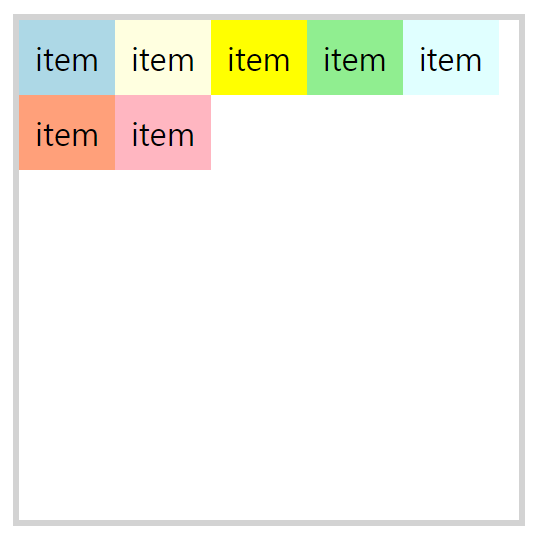
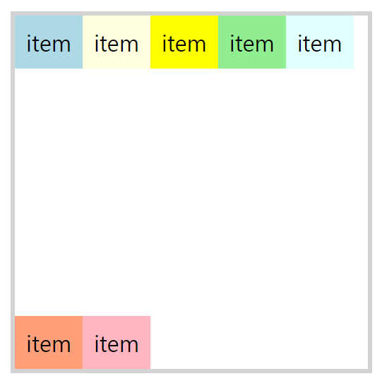
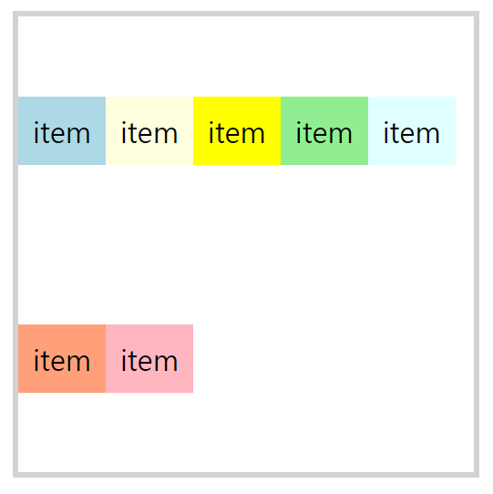
<!DOCTYPE html> <html lang="en"> <head> <title>Document</title> <style> .flexbox { border: 6px solid lightgray; display: flex; width: 500px; height: 500px; margin: 100px; flex-wrap: wrap; } .flexitem { color: black; font-size: 2rem; padding: 1rem; text-align: center; } .flexitem:first-child { background-color: lightblue; } .flexitem:nth-child(2) { background-color: lightyellow; } .flexitem:nth-child(3) { background-color: yellow; } .flexitem:nth-child(4) { background-color: lightgreen; } .flexitem:nth-child(5) { background-color: lightcyan; } .flexitem:nth-child(6) { background-color: lightsalmon; } .flexitem:last-child { background-color: lightpink; } </style> </head> <body> <div class="flexbox"> <div class="flexitem">item</div> <div class="flexitem">item</div> <div class="flexitem">item</div> <div class="flexitem">item</div> <div class="flexitem">item</div> <div class="flexitem">item</div> <div class="flexitem">item</div> </div> </body> </html> -
flex-start
-
flex-end
- space-between
- space-around
-
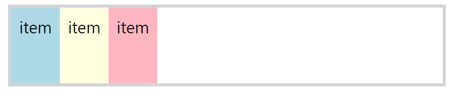
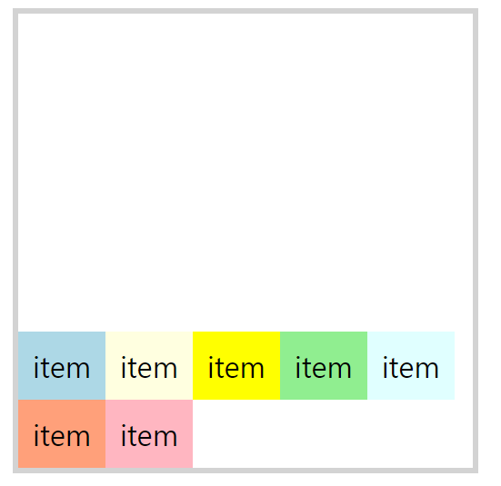
- align-self: 개별 플렉스 항목에 대해 기본 정렬을 재정의 할 수 있다.
<!DOCTYPE html>
<html lang="en">
  <head>
    <title>Document</title>
    <style>
      .flexbox {
        border: 6px solid lightgray;
        display: flex;
        width: 500px;
        height: 500px;
        margin: 100px;
        flex-wrap: wrap;
        align-items: flex-start;
      }
      .flexitem {
        color: black;
        font-size: 2rem;
        padding: 1rem;
        text-align: center;
      }
      .flexitem:first-child {
        background-color: lightblue;
      }
      .flexitem:nth-child(2) {
        background-color: lightyellow;
      }
      .flexitem:nth-child(3) {
        background-color: yellow;
        align-self: stretch;
      }
      .flexitem:nth-child(4) {
        background-color: lightgreen;
        align-self: flex-end;
      }

      .flexitem:last-child {
        background-color: lightpink;
      }
    </style>
  </head>
  <body>
    <div class="flexbox">
      <div class="flexitem">item</div>
      <div class="flexitem">item</div>
      <div class="flexitem">item</div>
      <div class="flexitem">item</div>
      <div class="flexitem">item</div>
    </div>
  </body>
</html>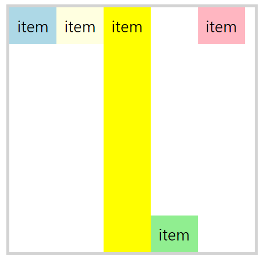
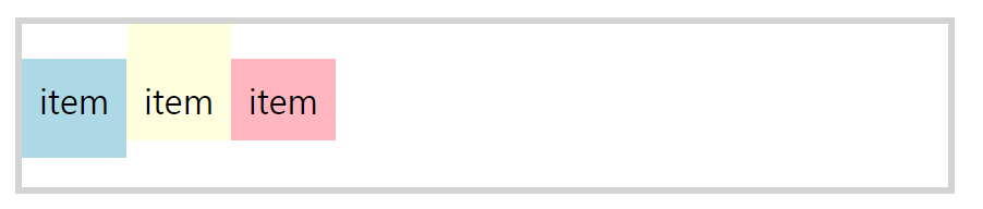
Flex Items Properties
- order: flex 컨테이너에 나타내는 순서 제어
<!DOCTYPE html>
<html lang="en">
  <head>
    <title>Document</title>
    <style>
      .flexbox {
        border: 6px solid lightgray;
        display: flex;
        margin: 100px;
      }
      .flexitem {
        color: black;
        font-size: 2rem;
        padding: 1rem;
        text-align: center;
      }
      .flexitem:first-child {
        background-color: lightblue;
      }
      .flexitem:nth-child(2) {
        background-color: lightyellow;
        order: -1;
      }
      .flexitem:nth-child(3) {
        background-color: yellow;
        order: 4;
      }
      .flexitem:nth-child(4) {
        background-color: lightgreen;
      }

      .flexitem:last-child {
        background-color: lightpink;
      }
    </style>
  </head>
  <body>
    <div class="flexbox">
      <div class="flexitem">item1</div>
      <div class="flexitem">item2</div>
      <div class="flexitem">item3</div>
      <div class="flexitem">item4</div>
      <div class="flexitem">item5</div>
    </div>
  </body>
</html>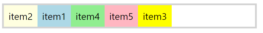
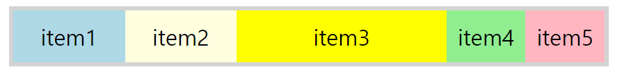
- flex-grow: flex 아이템 기본 너비를 자동으로 늘림(기본값 0)
<!DOCTYPE html>
<html lang="en">
  <head>
    <title>Document</title>
    <style>
      .flexbox {
        border: 6px solid lightgray;
        display: flex;
        margin: 100px;
      }
      .flexitem {
        color: black;
        font-size: 2rem;
        padding: 1rem;
        text-align: center;
      }
      .flexitem:first-child {
        background-color: lightblue;
        flex-grow: 1;
      }
      .flexitem:nth-child(2) {
        background-color: lightyellow;
        flex-grow: 1;
      }
      .flexitem:nth-child(3) {
        background-color: yellow;
        flex-grow: 4;
      }
      .flexitem:nth-child(4) {
        background-color: lightgreen;
      }

      .flexitem:last-child {
        background-color: lightpink;
      }
    </style>
  </head>
  <body>
    <div class="flexbox">
      <div class="flexitem">item1</div>
      <div class="flexitem">item2</div>
      <div class="flexitem">item3</div>
      <div class="flexitem">item4</div>
      <div class="flexitem">item5</div>
    </div>
  </body>
</html>
- flex-shrink: flex 아이템 기본 너비를 자동으로 줄임(기본값 1)
- flex-wrap속성을 부여한 경우 적용 X
<!DOCTYPE html>
<html lang="en">
  <head>
    <title>Document</title>
    <style>
      .flexbox {
        border: 6px solid lightgray;
        display: flex;
        margin: 100px;
      }
      .flexitem {
        color: black;
        font-size: 2rem;
        padding: 1rem;
        text-align: center;
        width: 150px;
        flex-shrink: 0;
      }
      .flexitem:first-child {
        background-color: lightblue;
      }
      .flexitem:nth-child(2) {
        background-color: lightyellow;
      }
      .flexitem:nth-child(3) {
        background-color: yellow;
      }
      .flexitem:nth-child(4) {
        background-color: lightgreen;
      }

      .flexitem:last-child {
        background-color: lightpink;
        flex-shrink: 1;
      }
    </style>
  </head>
  <body>
    <div class="flexbox">
      <div class="flexitem">item1</div>
      <div class="flexitem">item2</div>
      <div class="flexitem">item3</div>
      <div class="flexitem">item4</div>
      <div class="flexitem">item5</div>
    </div>
  </body>
</html>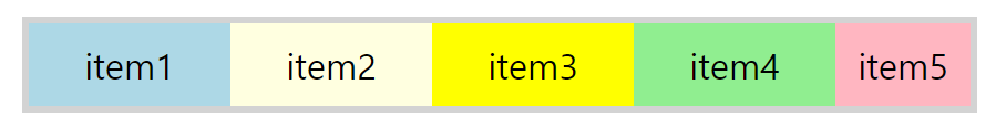
- flex-wrap속성을 부여한 경우 적용 X
- flex-basis: flex item의 기본 사이즈를 지정하는 속성(기본값 :auto)
- flex: flew-grow, flex-shrink 및 flex-basis가 결합된 약어
- 값이 한 개일 때
- 단위가 없으면 flex-grow값이 된다
- 단위가 있다면 flex-basic값이 된다
- 값이 두 개일 때
- 첫 번째 값은 단위가 없는 숫자여야함. flex-grow가 됨
- 두 번째 값은 단위가 없으면 flex-shrink, 단위가 있거나 auto이면 flex-basic이됨
- 값이 세 개일 때
- 첫 번째 값: flex-gorw(단위 없어야함)
- 두 번째 값: flex-shrink(단위 없어야함)
- 세 번째 값: flex-basic(단위 있거나 auto)
- 값이 한 개일 때