
horizontal center
block 요소는 한 줄을 모두 차지하고 있기 때문에 width값을 주면 더 이상 늘어나지 않는다. block 요소의 대표적인 div 태그 또한,
- div는 문서를 작성하기 위해 있는 tag이므로 ❗️ 한 줄을 모두 차지하는 block이다.
width 값을 설정해서 줄이면 크기만 줄어들 뿐 소유는 한 줄 전체를 모두 하고 있는 것이다. 이 때 가운데 정렬을 위해 margin:auto;를 쓸 수 있다.
❗️ margin: auto;
소유하고 나서 남은 나머지, 가용 공간을 가져다 쓸 수 있다는 말
margin-left : auto; 문서가 왼쪽 모서리부터 시작하는 특성상, 오른쪽으로 배치가 되는 것을 볼 수 있다.
margin-top과 margin-bottom는 한 block을 차지하는 div의 기본 특성상, auto가 적용되지 않는 것을 볼 수 있다.
margin : auto; 로 하면, top과 bottom은 적용이 되지 않기 때문에 left와 right에만 적용되어 가운데 정렬이 되는 것을 볼 수 있다.
.center {
  margin: auto;
  width: 50%;
  border: 3px solid green;
  padding: 10px;
}
- width 속성이 설정되어 있지 않거나 100%로 설정되어 있으면 가운데 정렬되지 않는다
.parents {
  width: 400px;
  height: 400px;
  background-color: orange;
  margin: auto;
}

.children {
  width: 150px;
  height: 150px;
  background-color: orangered;
}
-
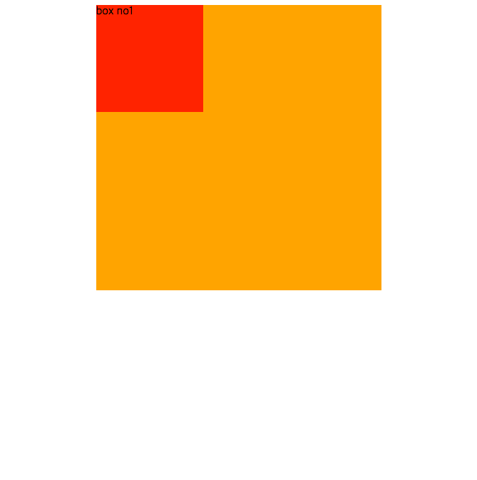
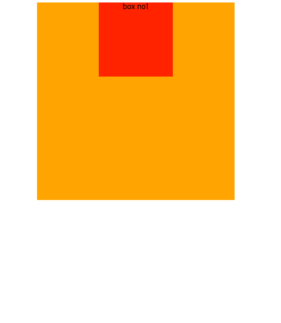
자식요소인 div.children은 div.parent에 소속되어 그대로 같이 이동되었지만, parent 안에서 자체적으로 가운데 정렬을 하고 싶다면,
.children css 값에도 margin: auto;를 주면 된다. -
div.children안에 있는 text인 box no1을 가운데 정렬하고 싶다면, text-align : center;를 주면 된다.
.parents {
  width: 400px;
  height: 400px;
  background-color: orange;
  margin: auto;
}

.children {
  width: 150px;
  height: 150px;
  background-color: orangered;
  margin: auto;
  text-align: center;
}
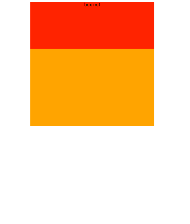
❗️ div.children값에서 width값이 지정되지 않았을 때(auto)일 때, 가운데 정렬이 되지 않는다. block요소는 기본값이 auto이기 때문에 부모크기만큼 꽉 차는 것을 볼 수 있다. 그래서 margin:auto;를 주더라도 양옆의 마진이 없기 때문에 적용되지 않는 것을 볼 수 있다.
.parents {
  width: 400px;
  height: 400px;
  background-color: orange;
  margin: auto;
}

.children {
  height: 150px;
  background-color: orangered;
  margin: auto;
  text-align: center;
}
💡 요약
margin: auto; margin으로 가운데정렬 해주는 것은 block요소
text-align : center; block 요소안에 주되 block 요소안에 있는 inline text에도 영향을 준다.
여기까지는 가로 가운데 정렬!
vertical center
가로, 세로 가운데 정렬을 위해서는 position 속성을 이용해야한다.
position 값을 주게 되면 margin:auto; 값은 무시된채 새로운 방식으로 흘러가게 된다.
- div의 display 속성인 block 의 기본 속성 처럼 한 줄이 모두 채워져있어야 하지만(부모 크기만큼 전체가 채워져야 하지만), absolute를 주는 순간 content 크기만큼 채워지게 된다.
- 또한, top, left, right, bottom 또한 parent요소의 영향을 받는 지점부터 지정된다.(parent가 없을 경우, document body가 기준이 된다)
body {
background-color: darkgrey;
}
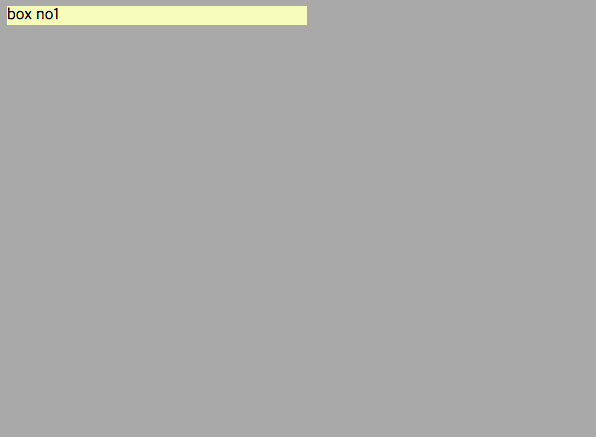
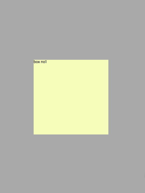
.center {
background-color: rgb(248, 249, 193);
width: 300px;
margin: auto; //auto값이 적용되지 않는 것을 볼 수 있다
position: absolute;
}
body {
  background-color: darkgrey;
}

.center {
  background-color: rgb(248, 249, 193);
  width: 300px;
  height: 300px;
  position: absolute;
  left: 50%; //parent인 document기준으로 50% 이동
  margin-left: -150px;
  top: 50%; //parent인 documnet기준으로 50% 이동
  margin-top: -150px;
} 
margin left와 top을 이용해 width, height값의 반만큼 계산하여 negative margin 값을 적용한다.
❗️ problem
이렇게 한다면 width값과 height값을 주지 않았을 때 적용할 수 없다는 점, 그리고 값을 변경해줄 때도 margin-left와 margin-top 값 또한 일일이 변경해줘야 하는 번거로움이 있다.
margin-left와 margin-top 대신 transform: translate(-50%, -50%); 이렇게 줌으로써 해결
top: 0; /위쪽으로 바짝 붙여라!
left: 0; /왼쪽으로 바짝 붙여라!
결과적으로 왼쪽 모서리에 붙는 것을 볼 수 있다. 여기에 right: 0; 값 또한 준다면, left와 right 모서리에 모두 붙어, width가 100%가 주는 듯하게 나온다. bottom 또한 값을 0으로 주게 된다면, 화면 전체가 채워지는 것을 볼 수 있다.
body {
background-color: darkgrey;
}
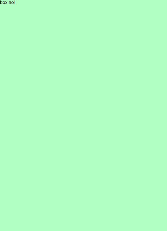
.center {
background-color: rgb(193, 249, 198);
position: absolute;
top: 0;
left: 0;
right: 0;
bottom: 0;
}
body {
  background-color: darkgrey;
}

.center {
  background-color: rgb(193, 249, 198);
  position: absolute;
  top: 0;
  left: 0;
  right: 0;
  bottom: 0;
  margin: 50px;
  padding: 30px;
  border: 20px solid green;
}
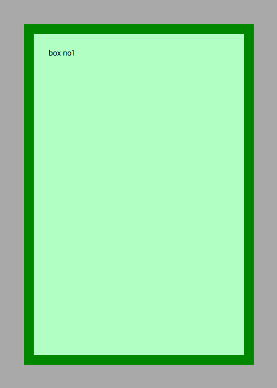
margin, padding, boder 값도 모두 적용되는 것을 볼 수 있다.
💡 요약
div의 width, height
width : <length>, <percentage> 부모 요소의 너비만큼 width값이 지정된다
height : <length>, <percentage> 자식 요소의 너비만큼 width값이 지정된다
width : auto; 요소의 부모 크기 기준으로 가득 찬다
height: auto; 요소의 자식 크기 기준으로 가득 찬다
width : auto; height : auto; 인 경우,
div는 block 요소이기 때문에 width는 부모 크기만큼 가득 차고, 자식이 없기 때문에 높이가 0이다. width 값을 작게 준다하더라도, 눈에 보이지 않는 div가 차지하고 있는 공간이 존재한다. 이것을 margin : auto;로 가운데정렬을 할 수 있는 것
물론 이것을 한 방에 해결할 flex box가 있다
to be continued...
parent children관계라고 모두 상속받지 않는다!
property 별 상속 받는 요소인지 알고싶을 때,
https://www.w3.org/TR/CSS2/propidx.html
width의 Percentages : refer to width of containing block