
Create a custom line chart to display historical price data | SwiftUI Crypto App #21
CryptoApp: Line Chart
구현 목표
- 수치 정보를 통해 차트 UI 구현
구현 태스크
- 차트 데이터 구현
- X축과 Y축에 따라 데이터 표현
- 애니메이션 효과
핵심 코드
private var chartView: some View {
        GeometryReader { geometry in
            Path { path in
                for index in data.indices {
                    let xPosition = geometry.size.width / CGFloat(data.count) * CGFloat(index + 1)
                    let yAxis = maxY - minY
                    let yPositionPercent = 1 - (data[index] - minY) / yAxis
                    let yPosition: CGFloat = yPositionPercent * geometry.size.height
                    if index == 0 {
                        path.move(to: CGPoint(x: xPosition, y: yPosition))
                    }
                    path.addLine(to: CGPoint(x: xPosition, y: yPosition))
                }
            }
            .trim(from: 0, to: percentage)
            .stroke(lineColor, style: .init(lineWidth: 2, lineCap: .round, lineJoin: .round))
            .shadow(color: lineColor, radius: 10, x: 0, y: 10)
            .shadow(color: lineColor.opacity(0.5), radius: 20, x: 0, y: 10)
            .shadow(color: lineColor.opacity(0.2), radius: 30, x: 0, y: 10)
            .shadow(color: lineColor.opacity(0.1), radius: 40, x: 0, y: 10)
        }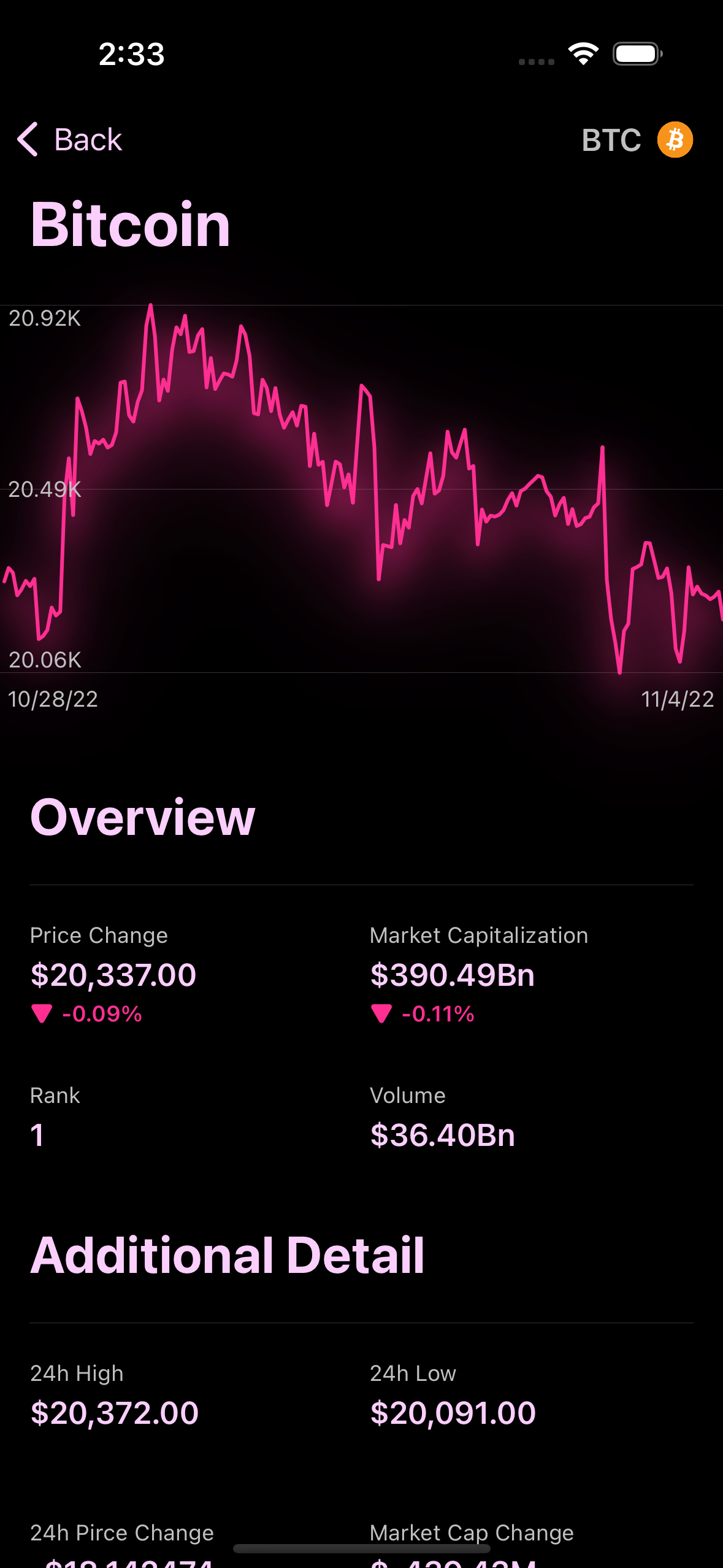
}GeometryReader를 통해 현재 뷰의 프레임을 유동적으로 체크- 해당 코인 데이터의 가격 정보
prices을 통해 차트 그래프 UI 그리기 - 데이터의 개수가 X 축, 데이터의 최고-최저점을 통해 Y축 표시
.onAppear {
            DispatchQueue.main.asyncAfter(deadline: .now() + 0.2) {
                withAnimation(.linear(duration: 2.0)) {
                    percentage = 1.0
                }
            }
}trim에서to의 값이 되는percentage값이 유동적으로 변화되기 때문에 애니메이션 효과 적용 가능
소스 코드
import SwiftUI

struct ChartView: View {
    private let data: [Double]
    private let maxY: Double
    private let minY: Double
    private let lineColor: Color
    private let startingDate: Date
    private let endingDate: Date
    @State private var percentage: CGFloat = 0.0
    init(coin: CoinModel) {
        self.data = coin.sparklineIn7D?.price ?? []
        self.maxY = data.max() ?? 0.0
        self.minY = data.min() ?? 0.0
        let priceChange = (data.last ?? 0.0) - (data.first ?? 0.0)
        lineColor = priceChange > 0 ? Color.theme.green : Color.theme.red
        endingDate = Date(coinGeckoString: coin.lastUpdated ?? "")
        startingDate = endingDate.addingTimeInterval(-7 * 24 * 60 * 60)
    }
    var body: some View {
        VStack {
            chartView
                .frame(height: 200)
                .background(chartBackground)
                .overlay(chartYAxis.padding(.horizontal, 4), alignment: .leading)
            chartDateLabels
                .padding(.horizontal, 4)
        }
        .font(.caption)
        .foregroundColor(Color.theme.secondaryText)
        .onAppear {
            DispatchQueue.main.asyncAfter(deadline: .now() + 0.2) {
                withAnimation(.linear(duration: 2.0)) {
                    percentage = 1.0
                }
            }
        }
    }
}- 전체적인 차트 뷰
coin을 입력받아 코인 데이터 모델이 가지고 있는 가격 변동 사항을 차트로 표현
extension ChartView {
    private var chartView: some View {
        GeometryReader { geometry in
            Path { path in
                for index in data.indices {
                    let xPosition = geometry.size.width / CGFloat(data.count) * CGFloat(index + 1)
                    let yAxis = maxY - minY
                    let yPositionPercent = 1 - (data[index] - minY) / yAxis
                    let yPosition: CGFloat = yPositionPercent * geometry.size.height
                    if index == 0 {
                        path.move(to: CGPoint(x: xPosition, y: yPosition))
                    }
                    path.addLine(to: CGPoint(x: xPosition, y: yPosition))
                }
            }
            .trim(from: 0, to: percentage)
            .stroke(lineColor, style: .init(lineWidth: 2, lineCap: .round, lineJoin: .round))
            .shadow(color: lineColor, radius: 10, x: 0, y: 10)
            .shadow(color: lineColor.opacity(0.5), radius: 20, x: 0, y: 10)
            .shadow(color: lineColor.opacity(0.2), radius: 30, x: 0, y: 10)
            .shadow(color: lineColor.opacity(0.1), radius: 40, x: 0, y: 10)
        }
    }

    private var chartBackground: some View {
        VStack {
            Divider()
            Spacer()
            Divider()
            Spacer()
            Divider()
        }
    }

    private var chartYAxis: some View {
        VStack {
            Text(maxY.formattedWithAbbreviations())
            Spacer()
            Text(((maxY + minY) / 2).formattedWithAbbreviations())
            Spacer()
            Text(minY.formattedWithAbbreviations())
        }
    }

    private var chartDateLabels: some View {
        HStack {
            Text(startingDate.asShortDateString())
            Spacer()
            Text(endingDate.asShortDateString())
        }
    }
}
- X축과 Y축을 그리기 위한 데이터 수치화
- 시각적 효과를 위한 애니메이션 및 색깔, 쉐도우 효과 등 적용
구현 화면
Path를 통해 그래프를 그리고, 애니메이션 효과를 주기 위해trim에 넘겨줄to의 변수값을 1로 변경하자!

JUST DO IT